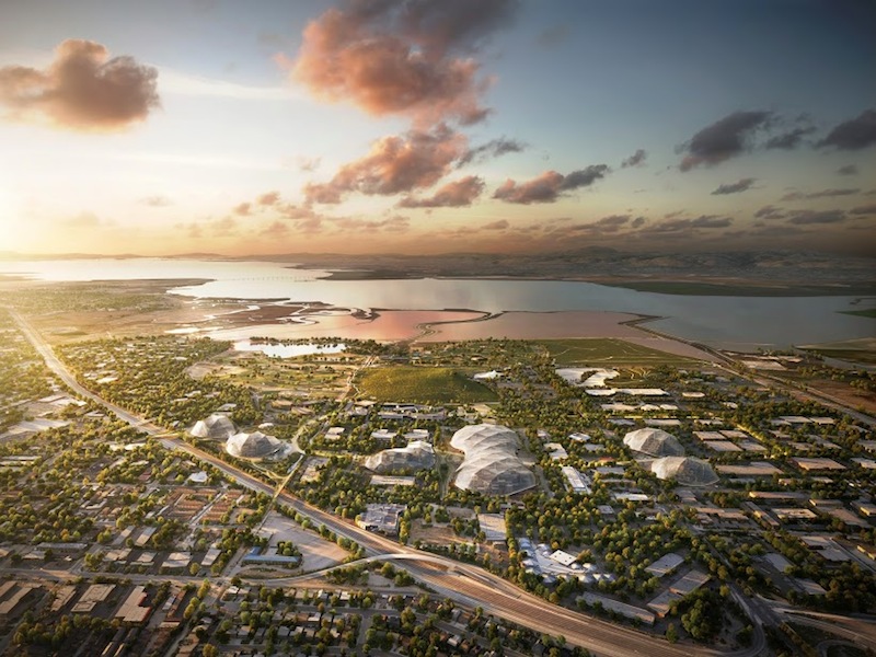
Flexibility. Transparency. Nature. These are the primary qualities of Google's newly released proposal to remake its four existing campuses in Mountain View, Calif. For the first time, the tech giant is designing and building offices from scratch.
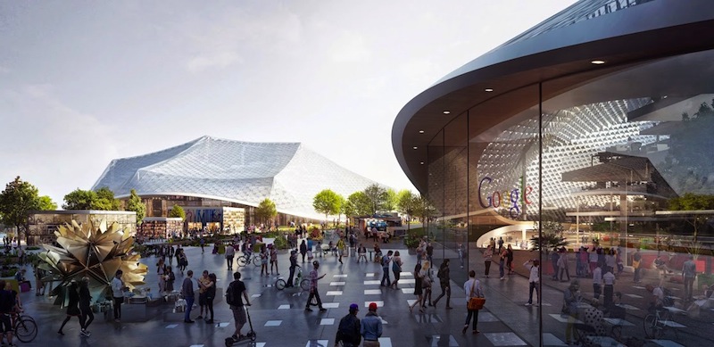
The master plan, a collaboration by Bjarke Ingels of BIG and Thomas Heatherwick of Heatherwick Studio, calls for covering a series of highly-flexible, amenity-rich office blocks with circus-tent-like canopies made of a translucent material (material is still unknown, perhaps a ETFE pillow system).
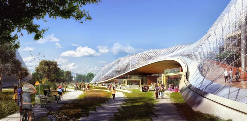
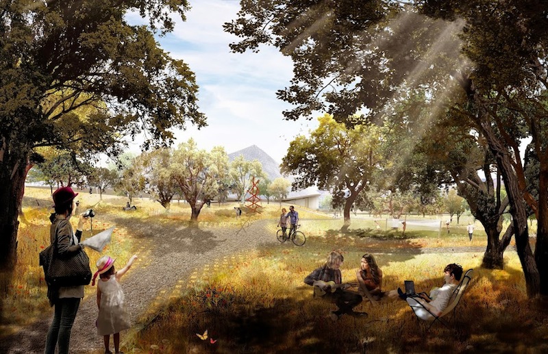
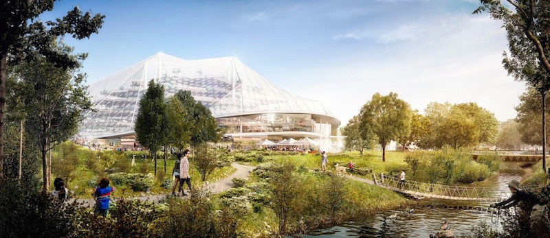
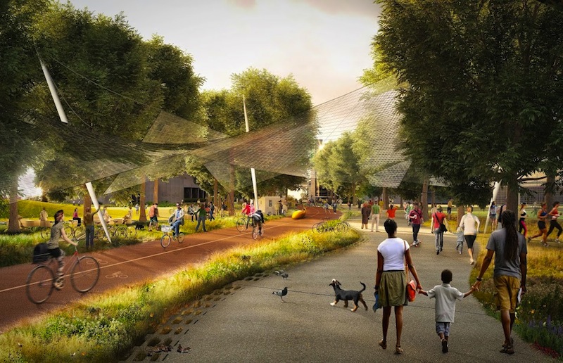
The scheme moves parking below grade, replacing the current sea of asphalt parking lots with parks, tree-shaded meadows, a bike path (called the Green Loop), community gardens, and a winding creek criss-crossed by pedestrian bridges, according to Fast Company. It also includes a public plaza with retail space.
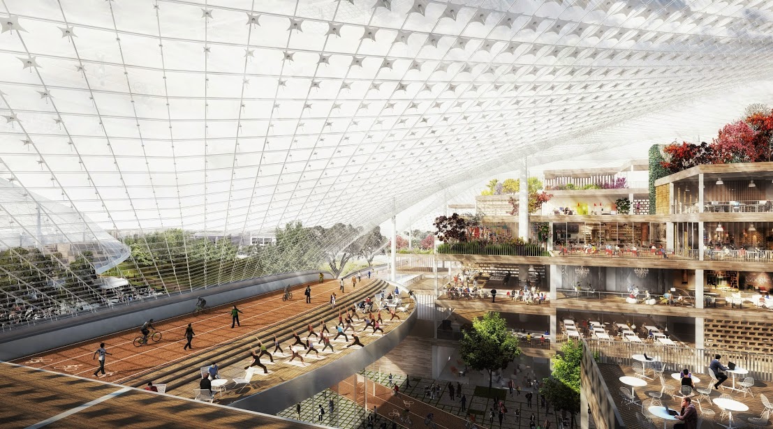
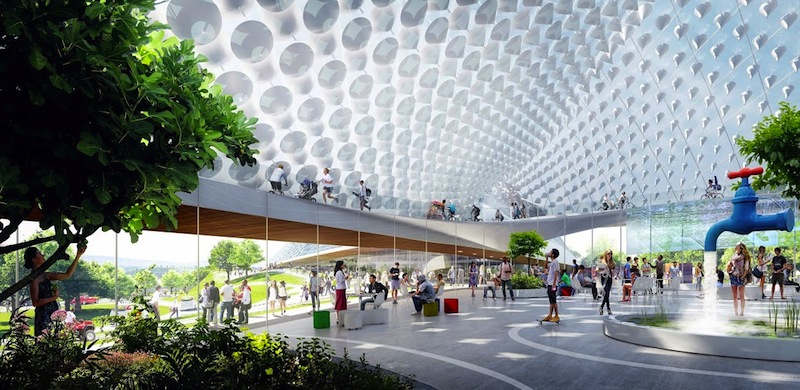
The strong connection with nature extends inside the buildings, as well. The soaring translucent canopies create expansive atrium spaces complete with lush gardens, running tracks, eating areas, and places of respite. The Green Loop path will weave through urban and natural areas, including the interior spaces.
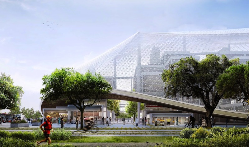
Within the canopies, building segments operate like furniture—light, tactile, and reconfigurable, according to Google.
"The idea is simple," said Google's Vice President of Real Estate, David Radcliffe. "Instead of constructing immoveable concrete buildings, we’ll create lightweight block-like structures which can be moved around easily as we invest in new product areas. Our self-driving car team, for example, has very different needs when it comes to office space from our Search engineers."
In a blog post titled, "Rethinking office space," Radcliffe offered more details on the project:
Not the sexiest title for a blog post, I know. But as we’ve inhabited a variety of workplaces—including a garage in Menlo Park, a farmhouse in Denmark and an entire New York city block—we’ve learned something about what makes an office space great. And we’re excited to put that into practice, starting here at our home in Mountain View.
Today we’re submitting a plan to redevelop four sites—places where we already have offices but hope to significantly increase our square footage—to the Mountain View City Council. It's the first time we'll design and build offices from scratch and we hope these plans by Bjarke Ingels at BIG and Thomas Heatherwick at Heatherwick Studio will lead to a better way of working.
The idea is simple. Instead of constructing immoveable concrete buildings, we’ll create lightweight block-like structures which can be moved around easily as we invest in new product areas. (Our self-driving car team, for example, has very different needs when it comes to office space from our Search engineers.) Large translucent canopies will cover each site, controlling the climate inside yet letting in light and air. With trees, landscaping, cafes, and bike paths weaving through these structures, we aim to blur the distinction between our buildings and nature.
Of course, this project is about much more than just office space; it’s about doing more with the local community as well. So we’re adding lots of bike paths and retail opportunities, like restaurants, for local businesses. We also hope to bring new life to the unique local environment, from enhancing burrowing owl habitats to widening creek beds. And we’re committed to do everything we can to save energy—our recent agreement to offset our energy consumption in North Bayshore with renewable energy includes the development of this proposal.
We chose Mountain View for our headquarters 15 years ago because we love the beauty of the bay, the close proximity to great universities, the family-friendly environment and the chance to work in a city at the heart of Silicon Valley. Today, we want to create office spaces that don’t just provide a great home for Google, but which also work for the city that has given us so much.
We look forward to working with our neighbors at the City Council on this proposal—and the future of Mountain View’s North Bayshore.
Related Stories
| Aug 11, 2010
Top of the rock—Observation deck at Rockefeller Center
Opened in 1933, the observation deck at Rockefeller Center was designed to evoke the elegant promenades found on the period's luxury transatlantic liners—only with views of the city's skyline instead of the ocean. In 1986 this cultural landmark was closed to the public and sat unused for almost two decades.
| Aug 11, 2010
200 Fillmore
Built in 1963, the 32,000-sf 200 Fillmore building in Denver housed office and retail in a drab, outdated, and energy-splurging shell—a “style” made doubly disastrous by 200 Fillmore's function as the backdrop for a popular public plaza and outdoor café called “The Beach.
| Aug 11, 2010
Integrated Project Delivery builds a brave, new BIM world
Three-dimensional information, such as that provided by building information modeling, allows all members of the Building Team to visualize the many components of a project and how they work together. BIM and other 3D tools convey the idea and intent of the designer to the entire Building Team and lay the groundwork for integrated project delivery.
| Aug 11, 2010
Inspiring Offices: Office Design That Drives Creativity
Office design has always been linked to productivity—how many workers can be reasonably squeezed into a given space—but why isn’t it more frequently linked to creativity? “In general, I don’t think enough people link the design of space to business outcome,” says Janice Linster, partner with the Minneapolis design firm Studio Hive.
| Aug 11, 2010
Great Solutions: Products
14. Mod Pod A Nod to Flex Biz Designed by the British firm Tate + Hindle, the OfficePOD is a flexible office space that can be installed, well, just about anywhere, indoors or out. The self-contained modular units measure about seven feet square and are designed to serve as dedicated space for employees who work from home or other remote locations.


