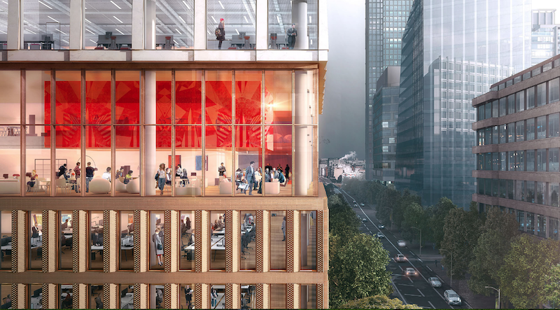
The site for a new 21-story office building, dubbed Friars Bridge Court, from PLP Architecture is unique in terms of the surrounding architecture. The new building will replace an old office building from 1991 at the northern end of Blackfriars Road in the London Borough of Southwark. What makes the site unique, and, ultimately, what will make the building itself unique, is that buildings fairly uniform in height characterize the southern half of Blackfriars Road, but the northern half has a more varied street wall that culminates in a series of object towers near the northern terminus, according to the architect’s website.
In an effort to complement both the southern and northern buildings, the new tower will employ a series of transitional elements into its design. As the firm explains on its website, the building “is designed to strengthen the end of the block in which it sits and announce through its scale the transition to the more singular buildings towards the river.”
The design proposes a “volumetric extrusion” of a height similar to that of the mid-rise buildings nearby. The volume is then split vertically into two volumes. The Western volume is lowered in order to establish a street height with the other buildings adjoining the site. The volume, which has already been divided into two, is then divided further, horizontally across its base this time, to form an upper and lower component. The lower component, which includes the shorter western volume to form an “L” shape, is meant to anchor the building into the immediate context (meaning the uniform, smaller buildings on the south side of the street), while the upper component is to be perceived in the wider townscape setting.
Between the upper and lower volumes will be a large gallery space, providing open views into and out of the building. This gallery space exists at a point that works to strengthen datum lines on the facades of surrounding buildings. A recessed double-height lobby space is added at the ground level.
The building’s form is not the only transitional aspect of the tower. The masonry envelope will also differ between volumes. The lower portion of the building will be clad in a denser grain façade expressed through the use of light-colored brick. The upper volume’s facade will be a light sandstone colored mineral finished grid.
The result of all of these transitional elements is a building that manages to fit in with the smaller buildings immediately surrounding it while also softening the height difference between the southern and northern buildings.
The completed tower will provide 196,800 sf of office space and 7,300 sf of retail space. Additionally, the tower will emphasize flexibility in its office space, something the old building could not provide. Friars Bridge Court will also provide amenity spaces and two roof top terraces.
 Rendering courtesy of PLP Architecture.
Related Stories
Office Buildings | Jan 26, 2022
BlackRock’s Innovation Hub in Atlanta showcases its global design guidelines
The two-story space harkens to the city’s culture and past.
Coronavirus | Jan 20, 2022
Advances and challenges in improving indoor air quality in commercial buildings
Michael Dreidger, CEO of IAQ tech startup Airsset speaks with BD+C's John Caulfield about how building owners and property managers can improve their buildings' air quality.
3D Printing | Jan 12, 2022
Using 3D-printed molds to create unitized window forms
COOKFOX designer Pam Campbell and Gate Precast's Mo Wright discuss the use of 3D-printed molds from Oak Ridge National Lab to create unitized window panels for One South First, a residential-commercial high-rise in Brooklyn, N.Y.
Headquarters | Oct 28, 2021
Florida’s Seagate Development Group tackles design-build projects from a developer’s vantage
A “single point of contact” for clients, says its CEO.
Office Buildings | Oct 26, 2021
A massive office reno project in Detroit sought to create destination spaces for returning workers
The interior design firm Pophouse relied heavily on employee input for a pilot remodel.
Cladding and Facade Systems | Oct 26, 2021
14 projects recognized by DOE for high-performance building envelope design
The inaugural class of DOE’s Better Buildings Building Envelope Campaign includes a medical office building that uses hybrid vacuum-insulated glass and a net-zero concrete-and-timber community center.
Office Buildings | Oct 21, 2021
Swinerton opens new regional headquarters in Charlotte
Redline Design Group designed the adaptive reuse project.
Office Buildings | Oct 18, 2021
Henning Larsen designs new headquarters building for KAB
The project is located in Copenhagen.
Glass and Glazing | Sep 30, 2021
Plans move forward on Central Place Sydney, duel towers with an AI-driven façade system
SOM and Fender Katsalidis are designing the project.
Office Buildings | Sep 29, 2021
Walmart’s new Home Office is the largest mass timber campus project in the U.S.
The project will occupy approximately 350 acres.


