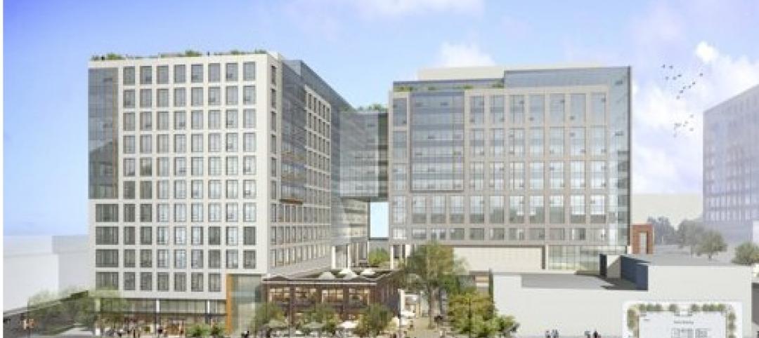
A new Foster + Partners-designed office building in Belval, Luxembourg has broken ground.
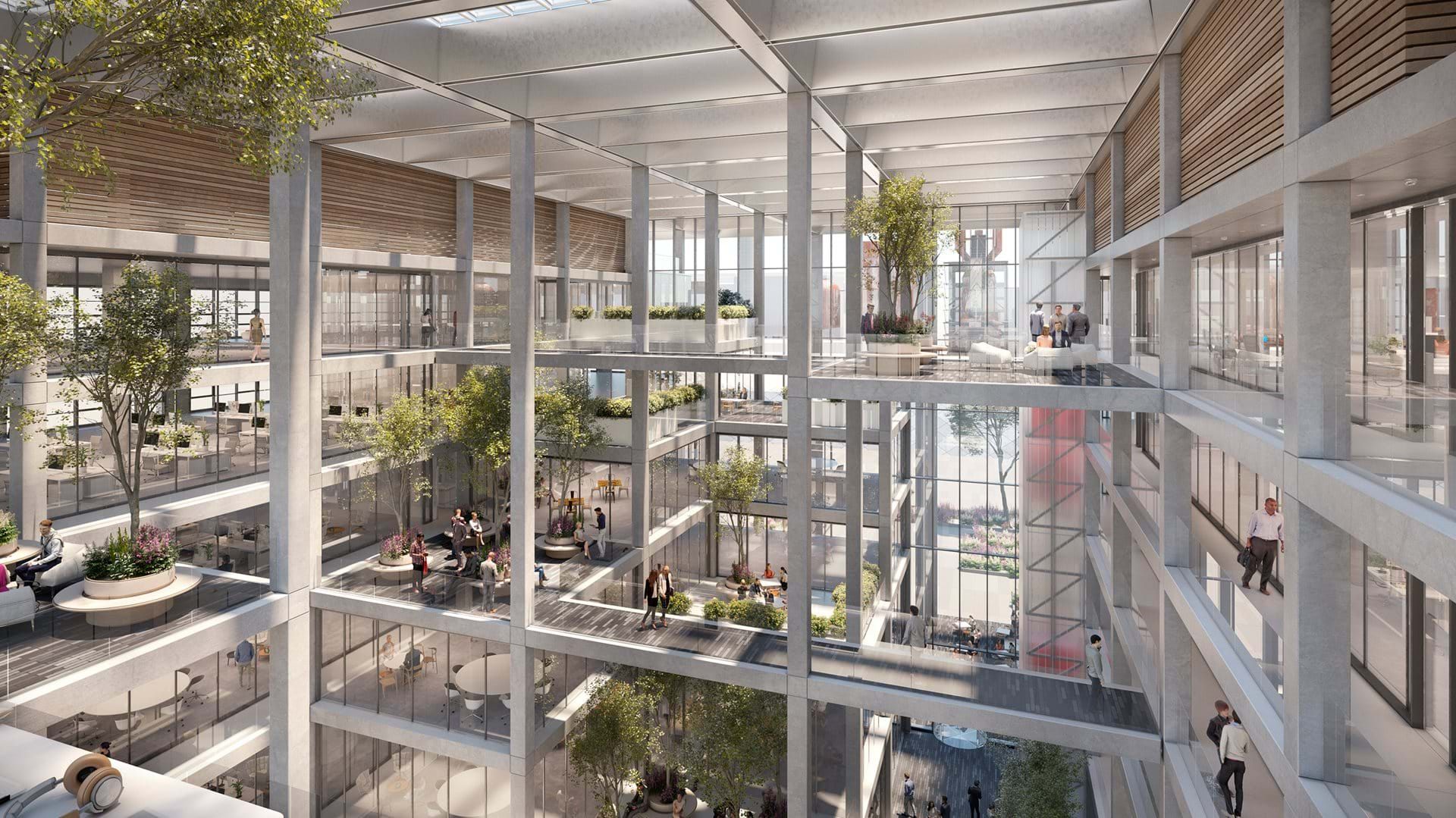
Dubbed ICÔNE, the 202,000-sf office complex has an interior reminiscent of an Escher painting, filled with light and greenery. The flexible layout encourages collaboration and addresses the need for safe working environments and the changes to the workplace that will emerge in the future.
“The project is designed to have open, flexible workspaces that respond to the emerging models of work today,” said Darron Haycock, Partner, Foster + Partners, in a release. “The atrium is a green light-filled space that is very much the social heart of the project, providing visual connectivity and a dynamic atmosphere for both work and play. Biophilia, the green landscaping, natural ventilation and visual connectivity all promoting collaboration and healthy wellbeing.”
![]()
The building was also designed to reference the industrial heritage of Belval and revitalize the area by making a positive contribution to the site and its surroundings. It is wrapped by an orthogonal facade and roof that emphasize the structural grid and give the building a unified industrial look. The façade is both structural and environmentally responsive, providing an integrated solution which allows for internal column-free office spaces as well as solar shading and maximized internal daylight.
The scheme releases to its neighboring buildings and addresses the different characteristics of the principal axes to the east and west. Entrances are articulated differently in response to the urban street and civic plaza while the building edge along Porte de France contains shops. Cafes and restaurants on the ground floor complement Place de l'Académie.
![]()
ICÔNE is arranged as two wings enclosing the central atrium. The atrium resolves the level changes between the street and the plaza though a series of stepped terraces that create an arrival sequence. The open circulation features communal terraces for informal meetings and break out spaces at higher levels overlooking the central volume. Glimpses of interior green spaces can be see-through a series of punched volumes that intersect the gridded structure.
The design, created in collaboration with Beiler Francois Fritsch, aims for a BREEAM Excellent rating and will be WELL Building Standard® certified.
![]()
![]()
Related Stories
| May 11, 2011
DOE releases guide for 50% more energy-efficient office buildings
The U.S. Department of Energy today announced the release of the first in a new series of Advanced Energy Design Guides to aid in the design of highly energy efficient office buildings. The 50% AEDG series will provide a practical approach to commercial buildings designed to achieve 50% energy savings compared to the commercial building energy code used in many areas of the country.
| May 10, 2011
Google hires Ingenhoven Architects to design new Mountain View office
The current Googleplex is straining at the seams and yet the company is preparing its biggest hiring surge ever, so Google decided now’s the time to build its own office space—a first for the Internet giant. The company hired Ingenhoven Architects, a German firm that specializes in sustainable architecture, to create plans for what could be a 600,000-sf office.
| Apr 13, 2011
Office interaction was the critical element to Boston buildout
Margulies Perruzzi Architects, Boston, designed the new 11,460-sf offices for consultant Interaction Associates and its nonprofit sister organization, The Interaction Institute for Social Change, inside an old warehouse near Boston’s Seaport Center.
| Apr 13, 2011
Red Bull Canada HQ a mix of fluid spaces and high-energy design
The Toronto architecture firm Johnson Chou likes to put a twist on its pared-down interiors, and its work on the headquarters for Red Bull Canada is no exception. The energy drink maker occupies 12,300 sf on the top two floors of a three-story industrial building in Toronto, and the design strategy for its space called for leaving the base building virtually untouched while attention was turned to the interior architecture.
| Apr 13, 2011
Former department store gets new lease on life as MaineHealth HQ
The long-vacant Sears Roebuck building in Portland, Maine, was redeveloped into the corporate headquarters for MaineHealth. Consigli Construction and local firm Harriman Architects + Engineers handled the 14-month fast-track project, transforming the 89,000-sf, four-story facility for just $100/sf.
| Mar 29, 2011
Chicago’s Willis Tower to become a vertical solar farm
Chicago’s iconic Willis Tower (formerly the Sears Tower) is set to become a massive solar electric plant with the installation of a pilot solar electric glass project.
| Mar 29, 2011
Read up on Amazon.com's new green HQ
Phase IV of Amazon’s new headquarters in Seattle is nearly complete. The company has built 10 of the 11 buildings planned for its new campus in the South Lake Union neighborhood, and is on-track for a 2013 grand opening.
| Mar 11, 2011
Blockbuster remodel transforms Omaha video store into a bank
A former Hollywood Video store in Omaha, Neb., was renovated and repurposed as the SAC Federal Credit Union, Ames Branch. Architects at Leo A Daly transformed the outdated 5,000-sf retail space into a modern facility by wrapping the exterior in poplar siding and adding a new glass storefront that floods the interior with natural light.
| Mar 11, 2011
Chicago office building will serve tenants and historic church
The Alter Group is partnering with White Oak Realty Partners to develop a 490,000-sf high-performance office building in Chicago’s West Loop. The tower will be located on land owned by Old St. Patrick’s Church (a neighborhood landmark that survived the Chicago Fire of 1871) that’s currently being used as a parking lot.
| Mar 9, 2011
Hoping to win over a community, Facebook scraps its fortress architecture
Facebook is moving from its tony Palo Alto, Calif., locale to blue-collar Belle Haven, and the social network want to woo residents with community-oriented design.


