25 Kent is a new tech campus in Brooklyn designed as a social campus for innovators, startup founders, and tech leaders. The project is Williamsburg’s first speculative office space in over 50 years.
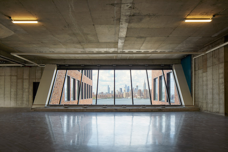
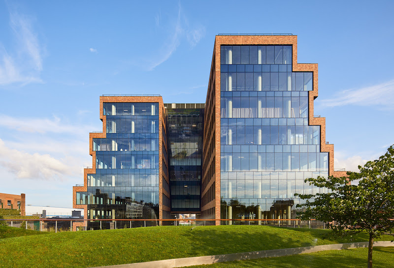
The 500,000-sf building, which occupies a full city block, has staggered floors to create a ziggurat-shaped building that juts in and out as it rises. The short ends of the facade are capped in floor-to-ceiling windows that bring natural light into the building and provide views of the Manhattan skyline and Brooklyn. The building’s exterior takes its cues from the neighborhood’s industrial character as it stacks a series of brick forms that are an homage to the materials and proportions of nearby warehouses.

25 Kent’s H-shaped plan creates advantages over a generic donut office building. Instead of a typical 45-foot span between the core and the walls, 25 Kent achieves 70-foot spans with three-sided window exposure. Mechanical and circulation cores, of which each wing of the building has its own, were distributed throughout to create flexible floor plates that can be used by single tenants, two tenants, or adapted for a large quantity of multi-tenant configurations. A shared central space connects the two wings and acts as a space for tenants to socialize and collaborate informally.
See Also: River Rock mixed-use community breaks ground in Chattanooga
The interior features highly flexible floor plates designed to support a wide variety of tenants. Several types of workspaces, such as fully-equipped maker spaces, open plan office floors with shared coworking spaces, collaborative lounges, and glass-enclosed conference rooms, offer tailored environments to each tenant’s particular needs.
Related Stories
| Aug 11, 2010
Top of the rock—Observation deck at Rockefeller Center
Opened in 1933, the observation deck at Rockefeller Center was designed to evoke the elegant promenades found on the period's luxury transatlantic liners—only with views of the city's skyline instead of the ocean. In 1986 this cultural landmark was closed to the public and sat unused for almost two decades.
| Aug 11, 2010
200 Fillmore
Built in 1963, the 32,000-sf 200 Fillmore building in Denver housed office and retail in a drab, outdated, and energy-splurging shell—a “style” made doubly disastrous by 200 Fillmore's function as the backdrop for a popular public plaza and outdoor café called “The Beach.
| Aug 11, 2010
Integrated Project Delivery builds a brave, new BIM world
Three-dimensional information, such as that provided by building information modeling, allows all members of the Building Team to visualize the many components of a project and how they work together. BIM and other 3D tools convey the idea and intent of the designer to the entire Building Team and lay the groundwork for integrated project delivery.
| Aug 11, 2010
Inspiring Offices: Office Design That Drives Creativity
Office design has always been linked to productivity—how many workers can be reasonably squeezed into a given space—but why isn’t it more frequently linked to creativity? “In general, I don’t think enough people link the design of space to business outcome,” says Janice Linster, partner with the Minneapolis design firm Studio Hive.
| Aug 11, 2010
Great Solutions: Products
14. Mod Pod A Nod to Flex Biz Designed by the British firm Tate + Hindle, the OfficePOD is a flexible office space that can be installed, well, just about anywhere, indoors or out. The self-contained modular units measure about seven feet square and are designed to serve as dedicated space for employees who work from home or other remote locations.


