For every architect and designer, there are objects out there that resonate for them in a profound manner and can even shape their design philosophies. These can be buildings, products – even materials – but no matter what you call them, they are “Objects of Design.”
Today Andrew and I are going to talk about a list of what we are calling “Objects of Design” and these are all things that we feel have some design sensibility to them that speaks to each us of in a special sort of way. It might be about the materiality, the design philosophy behind the object, the effort reflected in the fabrication of construction of the object under discussion … really, it can be almost anything.
Rather than just make this a list of things we like – and by extension – things we think you should like as well, we are going to dig a bit deeper and talk about the story behind each item we discuss today. In a sense, it’s that story that should make today’s podcast interesting … just that fact that WE think it’s interesting probably isn’t good enough so we are stepping up our game.
The rules are simple – Andrew and I were each tasked with identifying a handful of items that we think are worthy of being labeled “Objects of Design” and we are going to present them in an alternating fashion. We are going to be keeping score because, at the end, I want my list to be better than Andrew’s list of garbage.
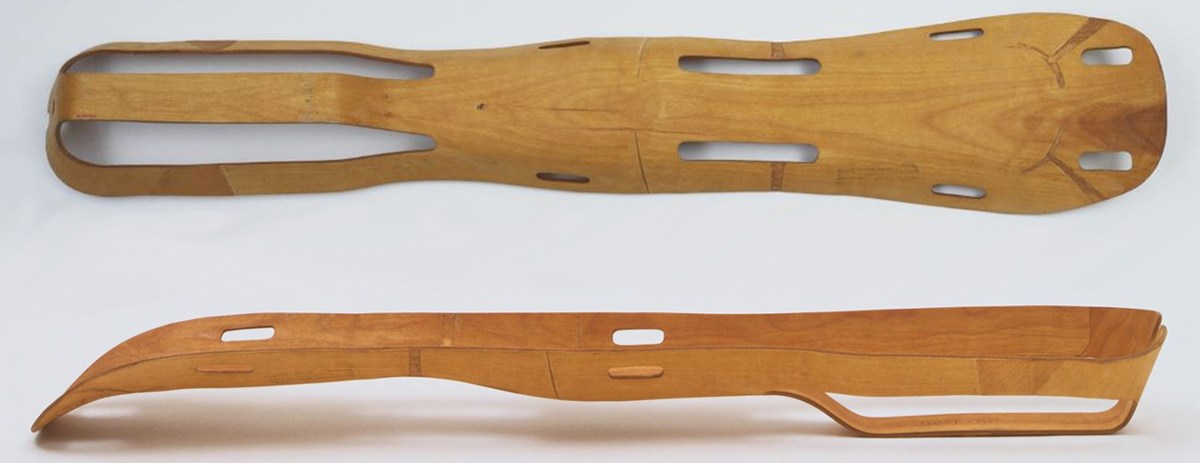 Eames Leg Splint – Image Courtesy of MOMA
Eames Plyform Leg Splint [3:37 mark]
That’s right … I have an 80-year-old wooden leg splint on my list – because this particular object embodies the very best about what design can accomplish. It’s clever, solved a problem, was inventive in its solution, and had a major impact on the world of design, even if you didn’t realize it. It took the invention of “The Kazam! Machine” to bring their idea to reality (a crazy story in and of itself) and the idea of bending and forming plywood was born.
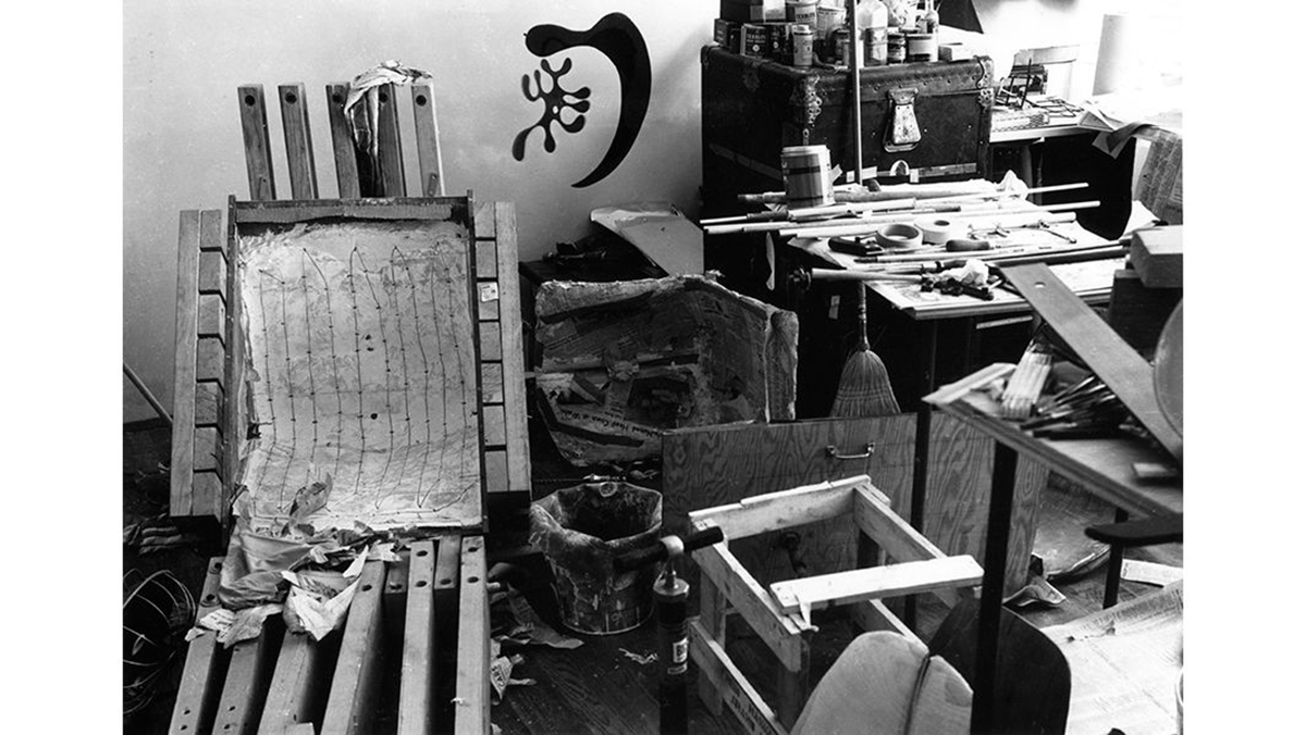 Eames Kazam Machine – Image Courtesy of Vitra
The image above is the “Kazam! Machine” and this is how it worked: The process begins by placing a sheet of wood veneer into the Kazam! machine mold and then adding a layer of glue on top of it. This process was repeated five to eleven times to build up the form. Then, a bicycle pump was used to inflate a rubber balloon after the machine had been clamped shut, and it was this balloon that pushed the wood against the form. Once the glue was set, Charles and Ray released the pressure and removed the seat from the mold. Lastly, they would use a handsaw to create the final shape and then sand the edges to make them smooth.
But let’s get back to the leg splint – which was the first production item to be made using molded plywood. The entire story includes how the Eames met Dr. Wendall G. Scott who had heard about this molding process and had the original concept idea for a leg splint and ultimately helped secure a contract with the US Navy to produce leg splints as part of the WWII efforts. From there, we discuss the financial challenges associated with fulfilling this contract (the Eames’s were trying to make these splints in the second bedroom of their LA apartment), the creation of the “Plyformed Wood Company” with John Entenza, who was the publisher of Arts & Architecture Magazine, and Colonel Evans of Evans Products – a giant US wood company. These two people would help provide funding and fabrication facilities and all the Eames had to do was give up the patent rights and the design of the leg splint.
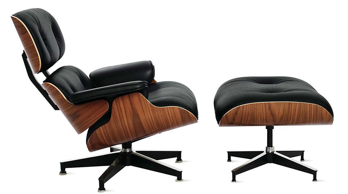
Eames Lounge Chair [or Chair 670/671] [19:45 mark]
If you know anything about me, you know that I hold this chair in high regard. I am somewhat obsessed with it. The reason I love this chair is maybe somewhat beyond explanation. I believe it to be an elegant solution to the intent of the design. It has qualities that I admire. This simplicity and minimal nature of the design combined with the complexity of its process and level of detail are aspects that I think every designer should strive for. The reason this one is different from the other chairs designed by Charles and Ray Eames is that it was MEANT to be a luxury item.
The chair was originally debuted in 1956 on an NBC TV show, “The Home Show”. You can probably find the clip on the web with a quick search. At that point, the chair became an icon. It is on display in the Museum of Modern Art in NYC, and several other museums in the US. The chair was designed for the Herman Miller Company which has been constantly producing it since the beginning in 1956. Up until the 1990s, it was only produced in its original Brazilian Rosewood but ceased production due to the unsustainability of the wood. It was replaced with a more sustainable Palisander Rosewood that is similar in grain to the original veneer. The chair has also been made with Walnut, Ash, Cherry along with a few other veneers over its lifespan.
Most of Charles & Ray Eameses’ other designs were meant to be mass-produced and affordable so that they could be utilized by everyone and support the idea that design was for all persons no matter of income or status. Their influence from the 1950s can be seen in the likes of Ikea and other stores today. One could argue that the Eameses’ concepts are the origin of this now highly accepted ideology.
This chair was a little different in its creation. While it did use the molded plywood technology uses of their other furniture, it had some additional luxury. Charles once stated he wanted it to look and feel of “the warm receptive look of a well-used first baseman’s mitt.” The chair was intended to be a modern version of the English Club chair; a traditional, “stuffy”, fully upholstered chair of a bygone era. The chair is created using their iconic molded plywood shells with additional limited upholster to provide that extra bit of luxury. The chair strikes a balance of the modern sleek iconography and the comfort of a slouchy lounge chair. The chair is also referred to as the 670/671 Chair as those are the part numbers for the plywood molds Herman Miller uses to create the chair.
I could go on and on about the very intricate and thoughtful details put into this chair like the seat attachments, the shock mounts, and how it was designed to have no visible screws or bolts in the wood, but I will leave that for another time. This is in my opinion and notable object of design.
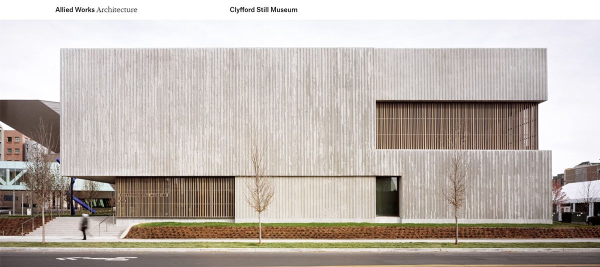
Clyfford Still Musem [29:04 mark]
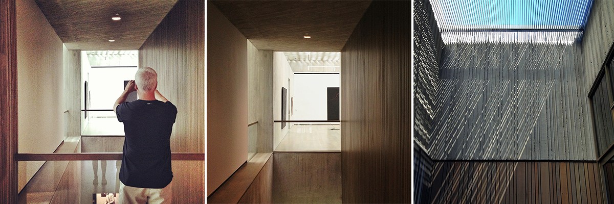
I put this building on my list because not only is it a beautifully designed building that uses some of my most favorite architectural materials like site-cast architectural concrete – where the concrete was allowed to ooze out from between the formwork in very slender vertical expressions that were then irregularly “snapped off” allowing an ebb and flow to the edge. In addition to beautiful concrete, it uses (what I believe) is Douglas fir wood which exudes a pleasant visual warmth to compliment the site-cast concrete. There is also an amazing, highly sculptural perforated and cast-in-place concrete ceiling at the second level which normalizes and addresses the natural sunlight. The geometry of openings in the ceiling creates an even field of soft and ever-changing daylight within each of the 9-galleries on the second level.
It is truly a beautiful museum … but that’s not why I put it on my list. To get to the “why”, I need to tell you a little bit about Clyfford Still and the story behind one of the more celebrated artists that didn’t want his work displayed … at least in the traditional manner – because he was fed up with how galleries and museum’s operated.
The whole story is kind of long (you should really listen to the podcast for this episode) but here is the short version:
Almost 25 years after his death, in August 2004, the City of Denver, Colorado announced it had been chosen by Patricia Still over 20 other competing cities, to receive the artworks contained within the Clyfford Still Estate – roughly 825 paintings on canvas and 1575 works on paper – drawings and limited-edition fine-art prints. Probably most of those had been sitting in the Maryland estate “barn”.
We need to put some scale on this since we are talking about a lot of paintings from someone who was the master of the Abstract Expressionist movement. In 2011, there were 4 paintings that were sold in order to support the endowment and collection-related expenses associated with the Clyfford Still Museum. PH-351 (1940) for US$1.2 million, 1947-Y-No. 2 (1947) for US$31.4 million, 1949-A-No. 1 (1949) for US$61.7 million and PH-1033 (1976) for US$19.6 million. The proceeds from the sales, US$114 million, all went to the Clyfford Still Museum. That’s $114 million for four paintings and at the time of his death, there were 825 paintings on canvas.
That back story is a big part of why this building is on my list. It isn’t all that common that a museum is designed specifically to present the life work of a singular artist. They knew all the pieces that could go on display and because the museum is designed so that you experience Still’s work chronologically, the design was able to take into consideration the size of the pieces that they knew would be on display on which walls. Remember, part of what defines the Abstract Expressionists is that the paintings are monumental in size. Knowing which painting would go where and how big the wall needed to be to properly display the work is clearly a consideration.
Gullwing Doors [45:16 mark]
My fascination with this specific automotive design element can easily be traced back to the 1980s. The car featured in the blockbuster film “Back to the Future” featured a DMC DeLorean with gull-wing doors. Thus began my infatuation. Also during that time in my life, luxury autos were on the top of my interests; Ferrari, Lamborghini, Lotus, McLaren, etc.
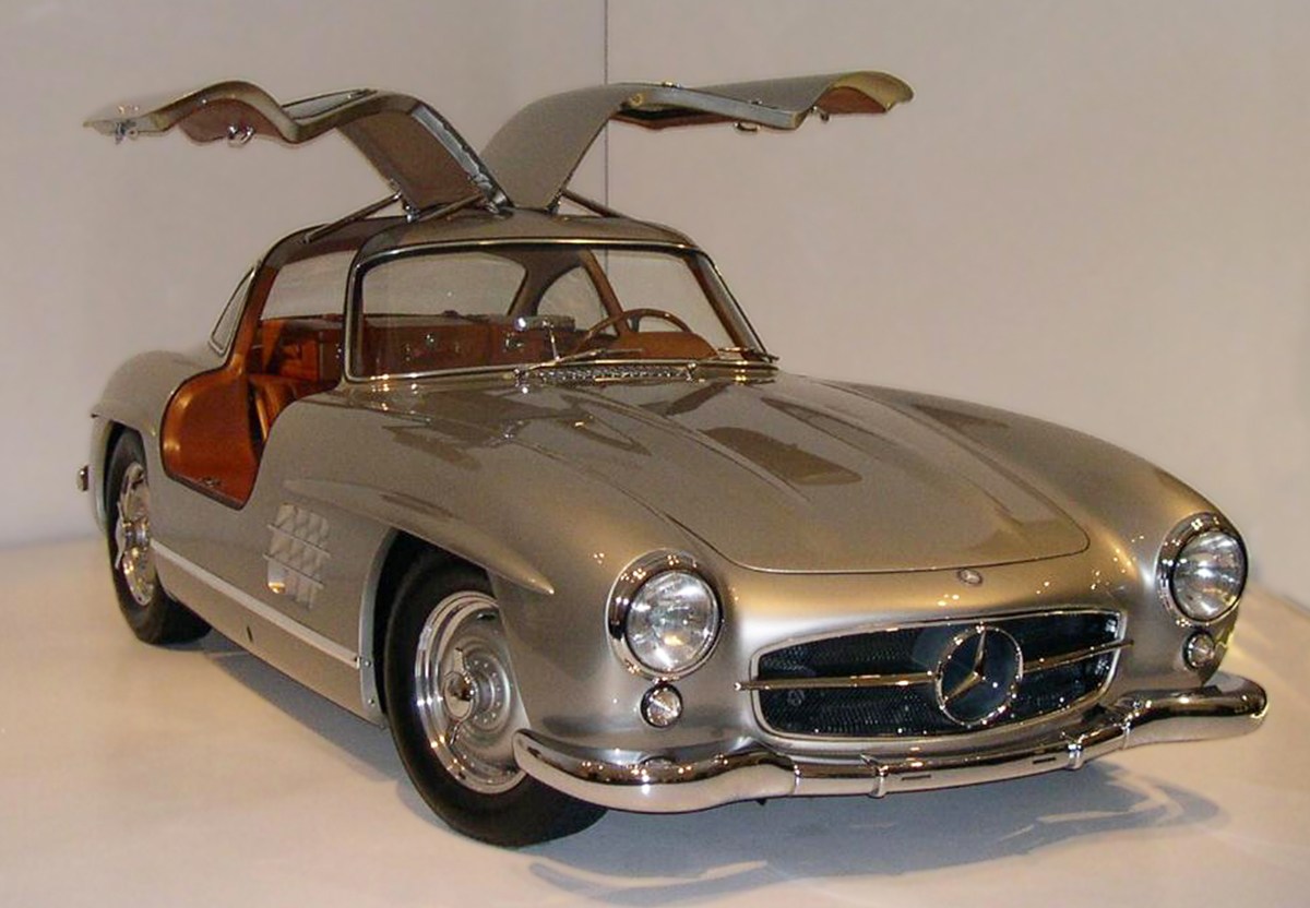
Also known as the “Falcon wing” door or an “Up” door”, this door design has been around for many years. The design creates a door that is hinged on the top rail of the roof and opens upward. It does not attach to the front side fender as typical on most cars. Many other alternate door swings still originate from the front fender hinge point although their opening action may be unique.

The most commonly cited car to originate the gull-wing door is the 1954 Mercedes Benz 300SL. It is often simply called the 1954 Mercedes Gullwing. It is an iconic car. But the story behind the gullwing door actually goes back much further. It all started in 1930s Germany, a man named Hanns Trippel actually could be credited with the original design of this door. Hanns has an interesting history. His life involved amphibious cars, Hitler and Nazi Germany, Bugatti, prison, Paris, and a slew of other items. It is quite a tale that weaves a tangled web that ties so many pieces together. To shorten that story, Hanns was essentially captivated by creating a floating car; one that worked on land and water. To his credit, he eventually did become somewhat successful in that endeavor, but it was a long hard road which along the way brought out the gullwing door. Hanns had already had some troubles with Nazis and prison when in 1950 he showed one of his amphibious car prototypes, the Trippel SK-10 at an automotive show in Hanover, Germany. This was a very small car that was meant to also float on water. The passenger side of this car had a gullwing door. The reason for this type of door was to increase the “weathertight-ness” of the car. By opening above the proposed waterline of the car when it was floating. So it was a practical implementation that led to the design of the door, albeit on an impractical car. People from Mercedes were at that event and about a year or so later bought his patent for the gullwing door. As can been seen, a few years later Mercedes used the idea to create the doors required for the 300SL. Here the use of the door was due to the construction of the car which had required structural framework in areas of the typical car door.

The Gullwing door has been used since the 1950s on various types of cars, mostly of high-end origin. But the design is always recognizable and again emits a certain aura of upper echelon and luxury. Apart from the Mercedes-Benz 300SL of the mid-1950s and the experimental Mercedes-Benz C111 of the early 1970s, the best-known examples of road-cars with gull-wing doors are the Bricklin SV-1 from the 1970s, the DMC DeLorean from the 1980s, the 2010-2015 Mercedes SLS AMG, and the Tesla Model X of the 2010s.
This design has always intrigued me because of its iconic nature. It visually presents a certain grandeur and elegance. While I am not certain it applies to my design process directly, I feel that from an early age in my life this door taught me to look at typical objects from a different perspective; to think about the alternative “out of the box” solution that could be created.

BFK Chair (Butterfly Chair) [58:30 mark]
If I were to tell you that my last Object of Design was the BFK chair, how many people do you think would actually know what chair I was talking about? Okay, let me refer to it as the “Butterfly” chair and ask the same question … I bet the number goes up.
The B.K.F. Chair—also known as the Knoll Hardoy Chair, Butterfly Chair, Safari Chair, Sling Chair, or Wing Chair—was designed in 1938 Buenos Aires by Antonio Bonet, Juan Kurchan and Jorge Ferrari Hardoy, three architects who were working in Le Corbusier’s studio, and its original name “BFK Chair” credit those three designers. It was designed specifically for an apartment building.
So here is where it gets interesting – or at least a bit amusing. In early 1940, a picture of the chair appeared in a US magazine titled “Retailing Daily”, where the chair was pictured and described as a “newly invented Argentine easy-chair . . . for siesta sitting”. Just a few months later, the chair was awarded 2nd prize by the National Cultural Commission at the 3rd Salón de Artistas Decoradores exhibition in Argentina. Apparently – between these two events happening, it drew the attention of the Museum of Modern Art in New York. At the request Edgar Kaufmann Jr. – of Fallingwater fame and the director of MoMA’s Industrial Design Department, Jorge Hardoy sent 3 chairs to New York. One obviously went to Fallingwater, Kaufmann Jr.’s home in Pennsylvania (talk about leveraging your position!), another went to MoMA, while the third is believed to have been delivered to Clifford Pascoe of Artek-Pascoe, Inc., New York … which in case you didn’t know, Artek-Pascoe was a furniture store opened by Alvar and Aino Aalto along with furniture designer Clifford Pascoe. Isn’t that crazy?!?
Artek-Pascoe produced the chair from 1941 to 1948, sending royalties back to Argentina and the BFK group. In 1947, Knoll acquired US production rights of the Hardoy chair which brought international notice and commercial success to the design. A rash of inferior copies prompted legal action by Knoll in 1950. After losing their claim of copyright infringement, Knoll dropped the chair from its line in 1951. More than five million copies of the chair were estimated to have been produced by numerous manufacturers during the 1950s alone.
If you want to read the post on how I picked up my “original” Butterfly chairs, you’ll just have to listen to the podcast.

This week’s hypothetical question has us debating whether or not “by land or by sea” is the right decision. [67:54 mark]
"Would you rather live on a boat that doesn’t sail, or a camper that doesn’t drive?"
It is clear that Andrew and I were not thinking of the same level of campers and boats. The fact that we are arguing about different things isn’t all that unusual, but it might make more sense knowing that Andrew was thinking more of a houseboat and I was thinking of a sailboat that you can live in … just not the luxurious kind.
So there you have it. Is there a clear winner? Who chose the best Objects of Design? Either way, we hope we’ve given you some insight into these objects or provided some new information that you never even knew! Now you can use these stories the next time your at a cocktail party because these are definitely all fascinating tales of creation and design. The fact that many of these iconic objects also have compelling stories behind them seems to insinuate that greatness comes from struggle, hard work, and a fair amount of happenstance. This is something to always remember as a designer, creator, and architect.
Cheers and stay safe,


