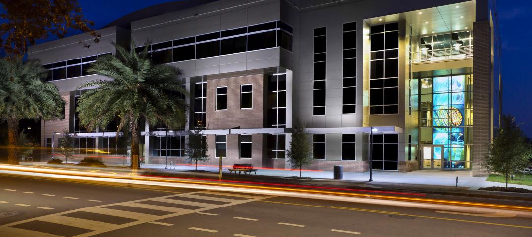
In the nearly five decades since its founding, in 1969, HMFH Architects, Cambridge, Mass., has established itself as one of the leading education-sector design firms in New England. The 45-person firm does its share of university work, but Pre-K to Grade 12 is its bread and butter. HMFH-designed schools dot the landscape from Rhode Island to New Hampshire, with the heaviest swath cutting through Boston and environs.
HMFH has been an innovator in K-12 work, using design to bring communities into the schools, mix vocational and academic programs in a single building, and experiment with nontraditional grade configurations. The firm has designed schools with fabrication labs and maker spaces. It is known for the joyous use of color in its K-12s.
A few years ago, the superintendent of a client school district described the concerns being raised by the teaching staff: Having to use the cafeteria for large-scale, hands-on activities. Students sitting on the floor in the corridors to work on group projects. Insufficient space in school libraries for big, collaborative activities. No place to properly display completed work.
The client challenged HMFH Senior Principal Laura Wernick, FAIA, REFP, LEED AP, and her colleagues to consider a radical proposition: learning happens everywhere, not just in the traditional classroom or school library. It was time for a fresh look at how spaces in schools could be used to encourage new learning modalities in elementary education.
HMFH picked up the gauntlet and designed three elementary schools based on the premise that project-based activities promote engagement, critical thinking, creativity, and collaboration.
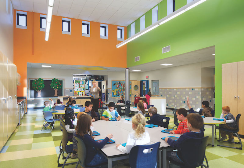
The physical outcome of the design process was a learning commons in the core of each of the three new schools. Each commons was a collection of interconnected spaces:
Project areas equipped with sinks, storage areas, and flexible seating could be used for large-scale activities (book making, science projects). These works-in-progress could be left up for several days at a time.
Amphitheaters for student skits, guest speakers, or large-group discussions.
Storytelling rooms to host quiet reading or “buddy reading,” where older students read to their young charges.
Breakout spaces for individual students to catch up on work, or for small-group work under teacher supervision. Special-needs teachers could use these spaces for isolated one-on-one support with a child. The breakout spaces are located between every pair of classrooms and also open into the learning commons.
A media space, a book-collections room, and spaces with dedicated resources for reading, speech, and other special needs were also provided. Traditional classrooms surround the commons.
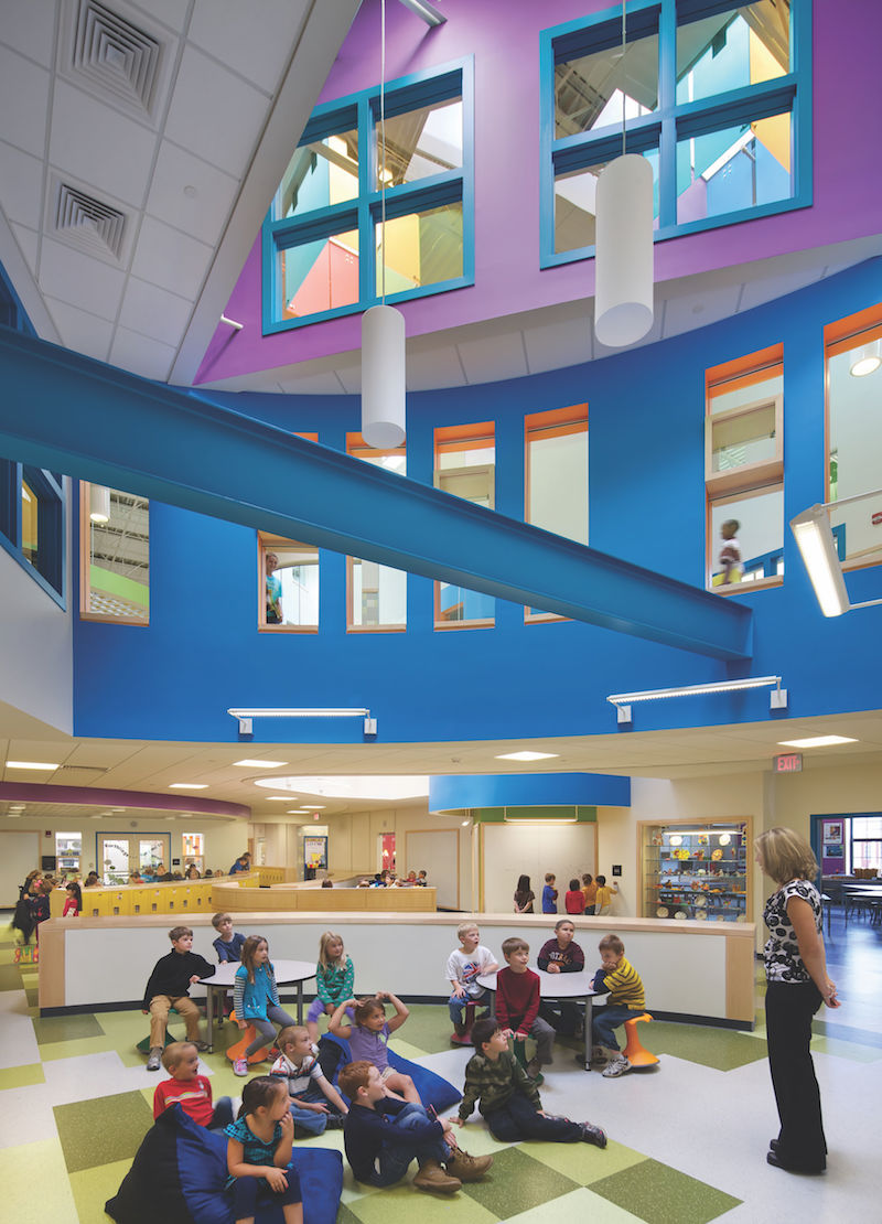 Project area in an HMFH-designed school, one of three that were the subject of a post-occupancy evaluation. Response to the learning commons from educators was ‘overwhelmingly positive,’ but there was room for improvement. Photo: Ed Wonsek.
HMFH also relied on research that showed physical movement to be integral to learning. Providing a variety of spaces would get students up off their duffs and moving around. A change in environment for loud, hands-on activities would, it was believed, help students recalibrate on a topic and find a new focus for the work at hand.
The three schools—two K-5s and a Pre-K-2—opened in 2013, but HMFH was not done with them. Last spring, the firm hired an outside research firm, Community Circle, Lexington, Mass., to conduct a post-occupancy evaluation to determine what was working well, what could work better in the learning commons—information that the firm hoped would help it design even better learning commons in the future.
The consultant, Daphne Politis, AICP, a city planner and architectural studies professional, conducted written surveys and interviews with teachers, principals, and specialty educators. She observed how the spaces were being used at each school for a full day.
Her 97-page report confirmed the validity of many of the premises on which HMFH based its designs for the learning commons. But the research also unveiled a number of small surprises—and one big one—that will inform HMFH’s work in the future.
passing WITH FLYING COLORS
The chief finding of the POE report: the response to the learning commons was “overwhelmingly positive.” The project areas were the most used, and the story rooms proved to be a big hit. “I love the learning commons,” said one teacher. “We are so lucky.” Teachers liked the variety of spaces, especially for small-group projects and “alternative spaces” for “special activities.”
But noise and visual distraction created by the more open environment were cited as negatives by many teachers and principals. “The noise level from the learning commons areas can be an issue for the surrounding classrooms and office spaces,” said one faculty member. A second-grade teacher said, “It is a little too open. We sometimes have small staff meetings in the project areas. If we as adults can’t focus, I know the kids can’t focus.”
Some teachers suggested putting in physical partitions; others said that would spoil the openness of the project areas.
Other key findings:
• Most teachers used the spaces that were closest to their classrooms, regardless of design intent or the ability of the space to support a specific type of activity. This was particularly true for teachers of younger children, who felt the need to keep an eye on their students.
• The need for supervision was greater than anticipated. Teachers expressed concern that their charges were spending too much time playing games on their iPads (all students had them), not enough on the subject matter. “The younger kids cannot be left alone,” one teacher said. “It is our responsibility to supervise them.”
• Project areas were deemed too small by some teachers who wanted to be able to take the entire class into the space so they could keep an eye on all their children.
• More innovative uses of the spaces evolved over time as principals encouraged teachers to experiment, and teachers observed how others were using the spaces.
• Teachers really got into the weeds with suggestions: “More storage.” “Put Eno boards in all spaces.” “Provide a mix of child-sized and adult furniture.” “Don’t put the amphitheaters in the center of the learning commons.” “Better sight lines.”
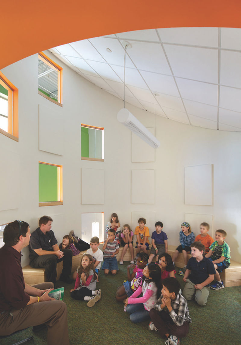 Circular reading room. Photo: Ed Wonsek / Courtesy HMFH Architects.
The big surprise of the study—and it’s a good lesson in why POEs can be so valuable—is how student demographics affected the use of the learning commons. In two of the schools, spaces designed for group learning were being used for collaboration, particularly by “high-functioning” and older children. In the third school, which had the highest level of special-needs students and English language learners, collaborative spaces were being devoted to one-on-one tutoring, calming a student, or providing a quiet space in which to focus.
Even though these spaces were not being used primarily as designed, “they were still deemed useful,” the consultant stated in her report. But she also recommended providing adequate spaces for special-needs learners and one-on-one tutoring so that faculty didn’t feel compelled to use breakout rooms for such purposes, rather than for their intended use.
LOOK BACK AT YOUR WORK
The HMFH study reminds me of something I asked three years ago in an editorial (http://bit.ly/2aHM1gs): Why aren’t more AEC firms doing POEs? I suggested that Building Teams need to make a regular practice of going back to their projects to see how well they’re working: Did you get the indoor comfort right? How’s the daylighting? Are the occupants satisfied? A site visit should be the minimum. An arm’s-length POE conducted by an outside consultant, like the one HMFH did, would be the ideal.
Wernick and her colleagues stuck their necks out by commissioning the POE, but they learned some valuable lessons in the process—lessons they would never have garnered without the research. Thanks to that enlightenment, the firm will design even better learning commons in the future.
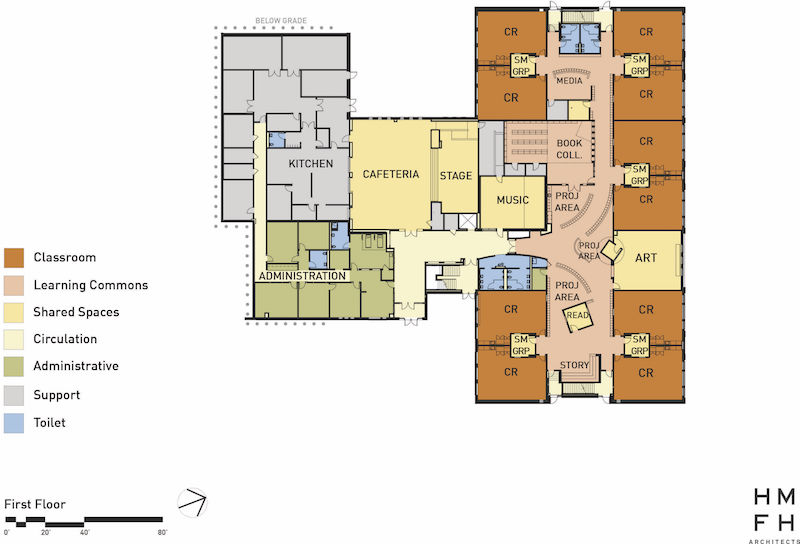 First-floor plan shows the position of the learning commons vis à vis classrooms (“CR” ). “We want our students to be able to spread out,” said one principal. Image courtesy HMFH Architects.
Related Stories
| Dec 27, 2011
BD+C's Under 40 Leadership Summit update
The two-day Under 40 Leadership Summit continued with a Leadership Style interactive presentation; Great Solutions presentations from Under 40 attendees; the Owner’s Perspective panel discussion; and the Blue Ocean Strategy presentation.
| Dec 20, 2011
Gluckman Mayner Architects releases design for Syracuse law building
The design reflects an organizational clarity and professional sophistication that anticipates the user experience of students, faculty, and visitors alike.
| Dec 10, 2011
BIM tools to make your project easier to manage
Two innovations—program manager Gafcon’s SharePoint360 project management platform and a new BIM “wall creator” add-on developed by ClarkDietrich Building Systems for use with the Revit BIM platform and construction consultant—show how fabricators and owner’s reps are stepping in to fill the gaps between construction and design that can typically be exposed by working with a 3D model.
| Dec 5, 2011
Fraser Brown MacKenna wins Green Gown Award
Working closely with staff at Queen Mary University of London, MEP Engineers Mott MacDonald, Cost Consultants Burnley Wilson Fish and main contractor Charter Construction, we developed a three-fold solution for the sustainable retrofit of the building.
| Dec 2, 2011
What are you waiting for? BD+C's 2012 40 Under 40 nominations are due Friday, Jan. 20
Nominate a colleague, peer, or even yourself. Applications available here.
| Dec 2, 2011
Goody Clancy awarded Ohio State residential project
The project, which is focused on developing a vibrant on-campus community of learning for OSU undergraduates.
| Nov 18, 2011
Centre for Interactive Research on Sustainability opens
Designed to exceed LEED Platinum, the Centre for Interactive Research on Sustainability (CIRS) is one of the most innovative and high performance buildings in North America today, demonstrating leading-edge green building design products, technologies, and systems.
| Nov 11, 2011
Streamline Design-build with BIM
How construction manager Barton Malow utilized BIM and design-build to deliver a quick turnaround for Georgia Tech’s new practice facility.
| Nov 10, 2011
Grousbeck Center for Students & Technology opens doors
New Perkins School for the Blind Building is dedicated to innovation, interaction, and independence for students.
| Nov 8, 2011
$11 million business incubator Florida Innovation Hub at the University of Florida completed by Charles Perry Partners, Inc.
The facility houses the UF Office of Technology Licensing, UF Tech Connect, other entities, and more than 30 startup technology tenants.


