How does scale factor into the practice of architecture? For any architect, scale and proportion are two skills that appear to be the most challenging to master. Scale and proportion are also where a good architect makes their living.
Scale systems 2:45
First, we are going to discuss some of the more well-known scaling systems throughout history. We both learned about these during our architectural education but also both admit that we do not typically use them for reference points in our daily design processes. We also noticed that no one really seems to be exploring this issue any longer beyond the idea of those who study ergonomics and such things.
Maybe the idea of a one size fits all mentality is no longer in our design thinking playbook? Maybe this was all destroyed at the end of modernism or the push back against those ideals often associate with that movement. We seem to be more about the flexibility to adjust to multiple shapes and sizes now; a type of individual customization from a flexible mass-produced system.
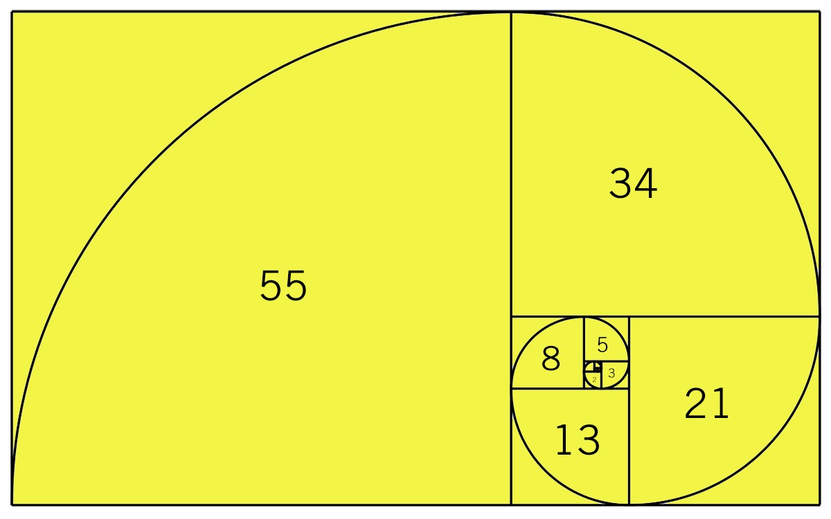
Golden Section / Golden Ratio / Golden Mean – it goes by many names but whatever you call it, it a mathematical ratio that’s commonly found in nature, closely related to the Fibonacci Sequence (0, 1, 1, 2, 3, 5, 8, 13, 21, 55, 89 which is each new number is the sum of the previous two) When you put it into squares you end up with the golden spiral that just about everyone is familiar with.
This scaling system has been in use for at least 4,000 years and possibly longer – some people argue that the Ancient Egyptians used this principle when building the pyramids. I was introduced to the Golden Principle when we studied Greek Architecture – it is frequently seen in use as a width-to-height ratio. Leonardo da Vinci used the Golden ration extensively in his paintings – most notably in ‘The Last Supper’.
This is something that I would guess every architect has been exposed to during their education. The real question here is does any one of them use this in their practice now? Is it a tool used to design projects? Bob and I agree that we never really use it to create projects. I use it to teach my students and have them create projects based on this system, but I am not certain how often they use it after that exercise. Why is that?
Speaking of Leonardo da Vinci, he developed the Vitruvian Man, a drawing which depicts a man in two superimposed positions with his arms and legs apart and inscribed in a circle and square. The drawing he created is supposed to depict ideal human body proportions.
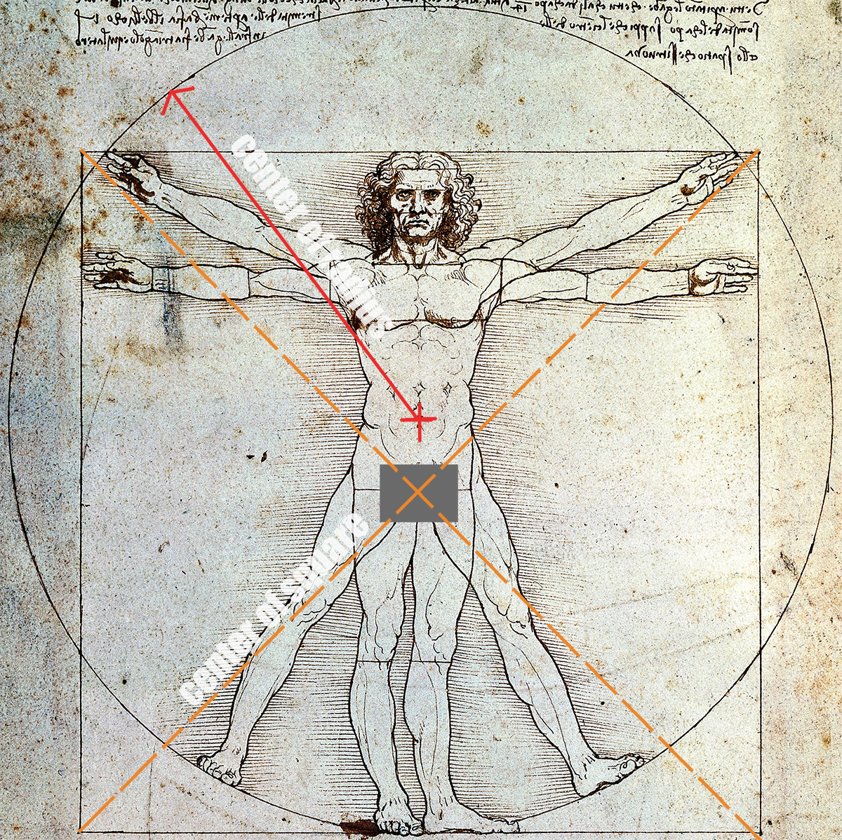
The Vitruvian Man is a drawing created by Leonardo da Vinci during the Renaissance (approximately 1490 AD) based on the work of the architect Vitruvius. The drawing is based on the correlations of ideal human proportions with geometry described by the ancient Roman architect Vitruvius in Book III of his treatise 'De Architectura.'
Vitruvius described the human figure as being the principal source of proportion among the Classical orders of architecture. Vitruvius used parts of the body to set scales such as the palm of hands, length of fingers, and other combinations to describe the proportions of the human scale.
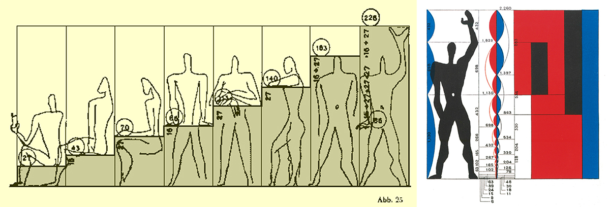
Swiss-born French architect Le Corbusier developed the Modulor – an anthropomorphic scale of proportions – in the long tradition of Vitruvius, Leonardo da Vinci’s Vitruvian Man, and Leon Battista Alberti, where the goal was to find the mathematical relationship between human dimensions and nature and then to use that knowledge to improve both the appearance and function of architecture.
The system is based on a number of variables including human measurements, the double unit, the Fibonacci numbers, and the golden ratio but in a literal sense, almost all of these proportioning systems are based on human parts such as your foot, thumb, palm, leg, forearm, etc.
Did you know that the modular was originally based on a 5’-9” Frenchman but was changed in 1946 to that of a 6’ tall Caucasian man? Supposedly it was a result of the influence of western movies as the hero of any story was always a 6′-0″ tall man. Not sure if that is really the reason, but it was modified from the original height.
Architectural Scale Figures 22:30
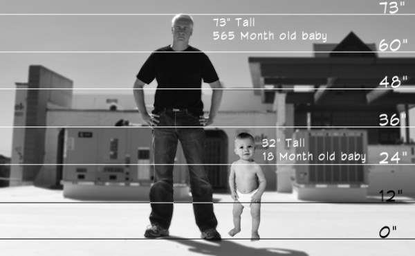
We use these as devices to put our project into scale and context. If place appropriately we can understand the way a space should feel and look. The issue is that at times, these figures can be placed actually out of scale! As we have reviewed some of the past entries into the LoaA Playhouse competitions in the past, many of the submissions would modify the scale figure to fit the intended space or use of a playhouse.
But when you actually started to look at dimensions or even deduce them, a child that was skipping rope and dancing with joy was a whopping 22″ tall. That is roughly the size of a 5-month-old baby. So unless they are really gifted, they would not be partying quite as depicted in this wonderful playhouse. I think that many young architects and architectural students fall into this category of not truly understanding scale.
Scale FOR Design 25:52
The use of scale and proportion to impact the perception and feeling of a space. An architect can use these to manipulate the way a person feels when in the space. A wide and tall space can seem cavernous and make a person feel smaller. Think Gothic churches or modern convention centers. Also, a small tight space can make a person feel pressured and compressed.
Frank Lloyd Wright used this technique quite often in his entryways to make the next space feel larger than it actually was dimensionally. But the sequence of compression small space to any larger space can make it feel even larger. This notion can also work in the inverse, scale and proportion can make a space feel terrible. For example, a 6′ x 8′ powder room with a 14′-0″ ceiling will feel very weird. Why is this toilet at the bottom of a well? So if not considered, scale and proportion for design can negatively impact a space just the same as they can amplify its positive features. The concept of using scale and proportion can affect the way a person perceives, interprets, and even feels in a particular space.

Scoreboard 29:45
We have had a few clients that have absolutely demanded that the ceilings be a certain height. One client in particular – we’ll call her “Mrs. Pickle” – was a particularly frustrating piece of work (and I’m not even going to focus on her clunky shoes or the homemade tattoo on her ankle that was of poor quality even by Turkish prison standards). She thought she had loads of great taste and style (which for the record, not having my taste does not mean I think you have bad taste) but what really drove the motivation that defined Mrs. Pickle’s taste was what other people had that she could throw money at and top.
In my office, we call this “scoreboarding” because you don’t have to defend your decision; it’s like when one team beats another, it doesn’t matter why you won, even if you shouldn’t have, you can simply point to the final score and say “scoreboard”. You can list all the could of’s and should of’s you want but in the end, all that matters is the scoreboard.
Mrs. Pickle had a friend who had just finished a house that had 12-foot ceilings throughout so as a result, Mrs. Pickle wanted 14-foot ceilings throughout. See what I mean? “Scoreboard.”
We decided that we did not want to work with this person and decided to call them into the office so we could end our professional relationship … and that’s when things went a bit sideways. YOu’ll just have to listen to the episode if you want to hear the entire story.
Scale AS Design 35:40
Working at different scales as you design any project. And that design happens at every scale. We all start at some point in the design process. That seems to vary based on individual preferences. Yet no matter where an architect starts the process there is no doubt that they will shift between scales of design as they move through the project.
Site scale, building scale, room scale. and detail scale all require attention as we move through our design process. Bob and I agree that we tend to bounce around within these various scales as we design. But I would also bet there are architects who approach this scale of design in a rather linear fashion as well. It might start big and move to small or it could possibly work in reverse and have one small detail drive the entire project out to its largest scale.
This notion of going from big to small as you work through a project and that every part of a project is designed means that details matter as much as the big picture. The person detailing the project is probably designing more of the building than the person who started off with a blank piece of paper.
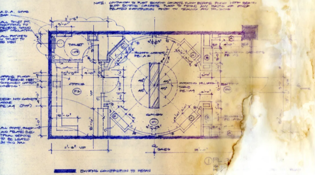
My First Project: The Best Project Ever Designed that Wasn’t 43:31
This was my first “real” project – the one where I was completely responsible for the client, the project, the design, drawings, construction administration … the works. Of course, I was mostly excited to find myself in this position, but there was a part of me that was slightly concerned that I would screw something up.
Despite only being 24 years old at this point, the only thing I was really worried about messing up was the scale of the display cases and the circulation space around the main transaction counter. With this event taking place so early on in my career, I did not have a wealth of experience to fall back upon that would help me feel confident in the sense of scale of the items I was completely responsible for executing.
Looking back, some 25 plus years later, this project was the launching point for what turned out to be a fairly long and intensive fascination I’ve had with creating items of scale and proportion.
The bonus is you get to see my first real project in all of its hand-drawn glory.
Scale OF Design 47:36
As an architect, we have to look at our projects on various scales OF design. By this, I mean the idea that multiple scales are impacted by the design decisions we make as architects. The global scale, the regional scale, the local scale, the contextual scale, the urban scale, natural scale, site scale, and the human scale; all of these are impacted by the results of our designs.
Good architects consider these appropriate issues of scale during their design projects. Energy consumption is a global scale issue. Water consumption may be a regional or local scale issue. The way the building fits into or speaks with the surrounding context or urban scale could be critical. The natural scale of a residence alone in a field. Those are the types of scale issues that relate to this idea about Scale Of Design.
Every project has decisions to be made about these types of scales. Maybe not every last one, but definitely a majority of these are to be considered when creating thoughtful architecture.

We are taking on one of Andrew’s hypothetical’s … which are always hard because no matter what the answer could be, you can be sure that it will be unpleasant 57:06
"You and a person you deeply love are placed in separate rooms with a button next each of you. You have been told that you will both be killed unless one of you presses your button before 60 minutes pass; furthermore the first to press the button will save the other person but will be immediately killed. What would you do?"
Bob and I seem to be in agreement on this one and as the initial answer is an easy one, we spend more time trying to complicate the scenario to change our response.
Scale and proportion while difficult for many to master, are essential in the work that every architect creates. It seems that the study and focus on this part of our knowledge has somewhat fallen out of fashion in many ways. No one seems to be searching for the “perfect proportioning system” any longer. That may be because we have moved on from the design notion that one size can fit all. But whether is the grand white paper gesture or the smallest door detail, it still should consider proper scale and proportion. In this age of fast and furious, it still IS an aspect that should be considered when doing our jobs as good architects.
Cheers,


