Many companies utilize their signature colors for the exterior and interior of their office suites, buildings, and more. But for a product strategy and design firm in Austin, Texas, just one simple hue was needed to represent the brand.
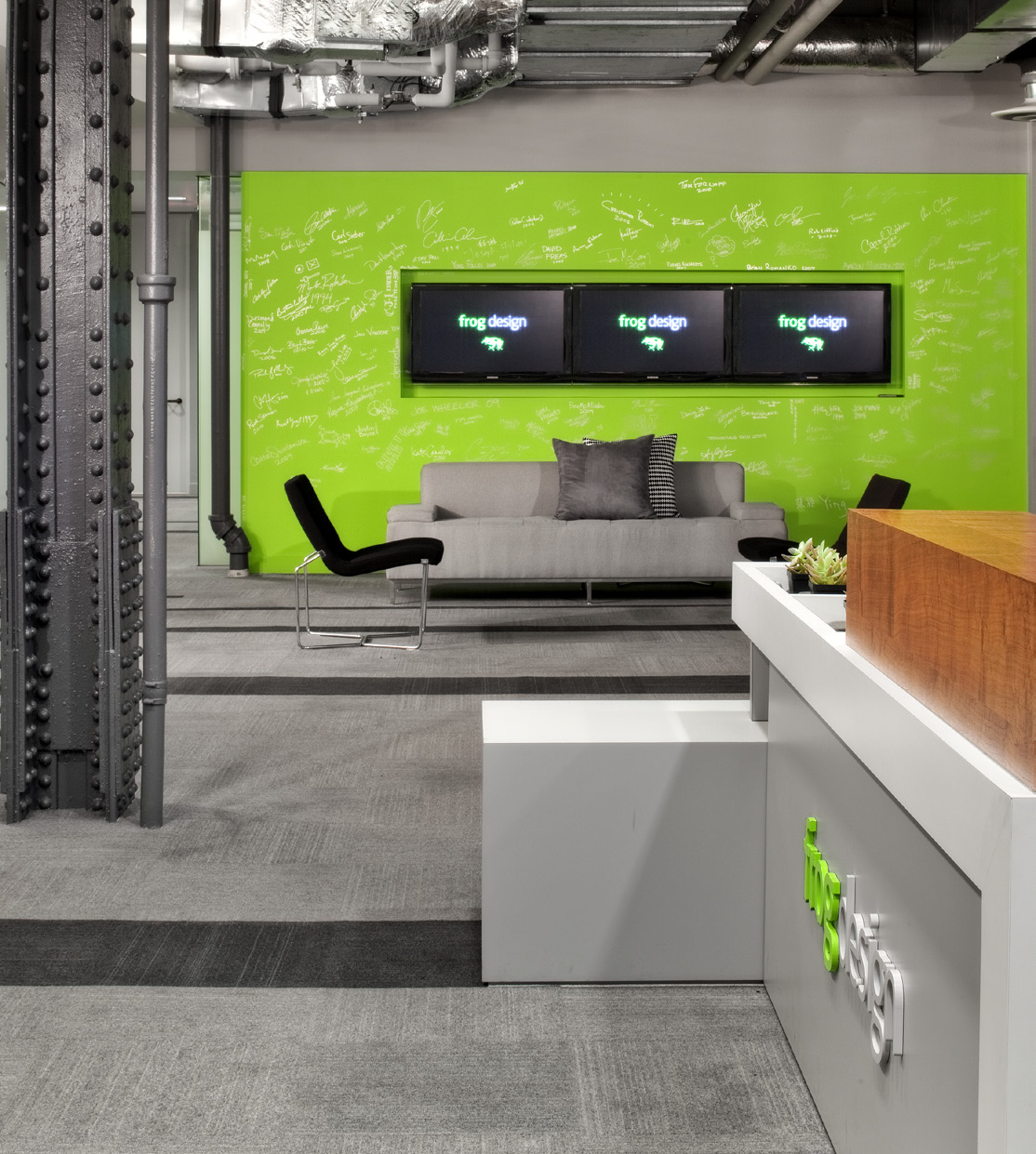
Walk into the newly decorated frog design office, and the eye is immediately drawn to the bright green objects throughout the space. The colors are like a highlighter on the page, attracting attention to different architectural features of the office, including chairs around the table and panels along the wall.
That shade of green is frog design’s signature color, and when lauckgroup was tasked with designing the new office, they chose to feature the distinctive shade prominently in the space. The office primarily features white and shades of gray, with a yellow used sparsely—but it is the green that really stands out amidst the gray carpeting, the white and gray desks and walls. The team made green a prominent part of the design early on in the planning process, “to pay homage to the history of the firm and those that created great products before frog.”
“The frog employees love the space. The client-facing conference rooms are designed distinctively for presentations and video conference, while the back of the house remains casual with the flexibility for teams to relocate often when they have new engineering assignments,” said lauckgroup senior project designer April Warner, RID, LEED ID+C.
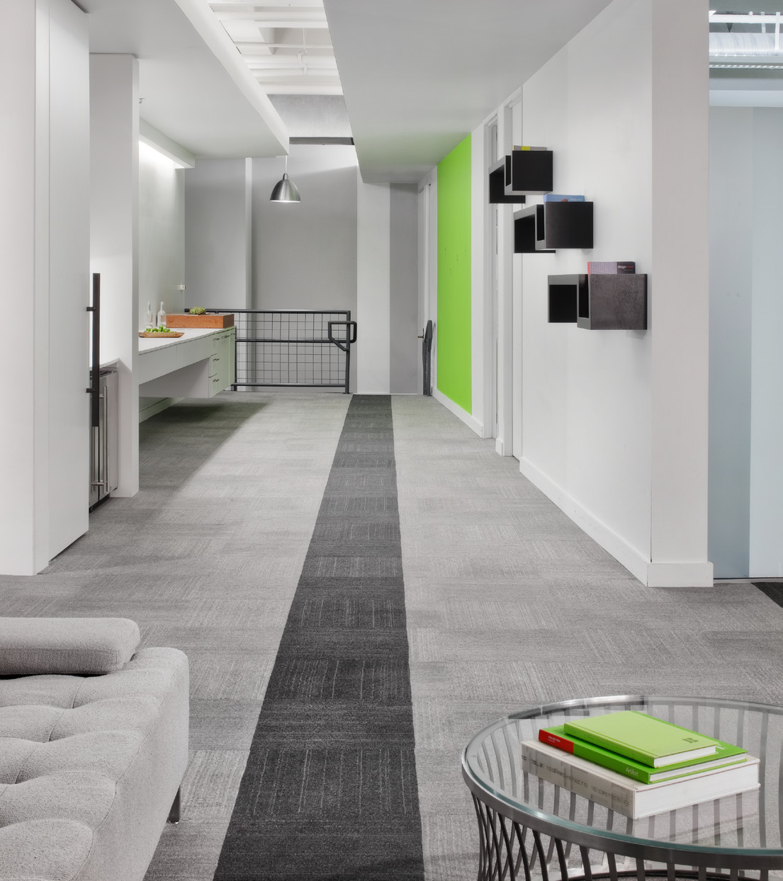
From the office lobby, the color can be seen in the company logo on the front desk, the books on the table, and in the chairs. One particularly prominent use of the color is a signature wall where employees can write down their ideas. “We also highlighted the main ‘tunnel’, which abstractly signified the timeline of the when the company was established,” Warner said. “Striking a line through the green tunnel in a graphic signals the event of becoming a frog.”
The building that houses frog design was previously a Google office, and so the design took advantage of the elements already in place in the structure. “We carefully removed the main Google branding elements and colors, but kept all of the heavily engineered infrastructure,” explained Joe Gowing, RID, lauckgroup’s principal-in-charge for the project.
Employees of frog design are enjoying the new space and the clean look the color palette creates. The effective use of a signature color took frog design’s branding into a direction that was both creative and simple.
Related Stories
Architects | Aug 5, 2020
Final report: BD+C's 2020 Color Trends Report
This special research report from the editors of BD+C explores the leading trends and drivers related to the use of color on commercial, institutional, and multifamily building projects.
Sponsored | | Jan 15, 2018
Innovations Pave the Way for High-Performing Metallic Coatings
Valspar's durable metallic coating systems are made to last while providing a vibrant sparkle
Sponsored | | Oct 10, 2017
Tracing Color Trends and the Paint Industry Through the Years
Innovations in technology mean today's architects have endless options when it comes to coating options.
Sponsored | | Sep 6, 2017
Special Effects: Going Beyond the Color Spectrum for Exteriors
AEC teams have endless options when it comes to choosing hues and effects for architectural coatings
Sponsored | | Jun 14, 2017
Psychology in the Coloring of Built Environments
Expert says some of color trend research really comes down to human psychological and emotional responses
Sponsored | | Apr 26, 2017
Advancements in Materials Open Up Color Trend Possibilities
For color experts, predicting trends before they happen requires a trained eye and being able to understand people
Sponsored | Color Innovations Series | Aug 9, 2015
Campus Branding With Color
Iconic and identifiable colors play role in higher ed branding on campuses. - See more at: http://www.bdcnetwork.com/campus-branding-color#sthash.ijEP68Iy.dpuf


