With the completion of the Anne T. and Robert M. Bass Biology Research Building at Stanford University, biology faculty and students who were once spread across campus were brought together under one roof. The five-story structure is dedicated to research in life sciences, providing a shared environment that fosters intellectual and social interaction.
The building is the cornerstone of Stanford’s new quad, connecting with the School of Medicine via a pedestrian axis called Discovery Walk.
After the architectural process was complete, Stanford wanted an additional layer of design to crown the new building, especially given its high-profile location. Knot, a firm specializing in landscape architecture and experiential graphic design, was hired to conceive this next phase of design.
“We were tasked with telling stories of science in a non-literal, abstract way and were given broad artistic license to explore multiple themes and variations,” said Michael Yun, Knot Principal, Director of Anti-Disciplinary Design.
Knot designers created a one-of-a-kind interactive public art piece called Morphogenesis.
CREATING A BEACON OF SCIENCE
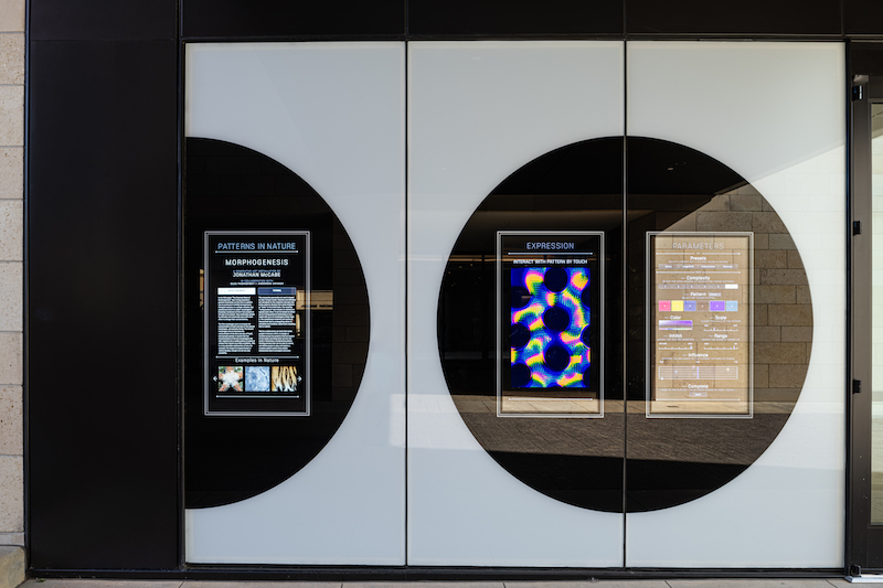
Morphogenesis is the first installation that connects user interaction with a large-scale media mesh platform. Based on Alan Turing’s theory of Morphogenesis, which describes how spots and stripes manifest in nature, users of Morphogenesis interact with a generative algorithm by manipulating parameters via a touchscreen at the building’s main entrance.
Users play with the interactive interface. By saving the patterns they create, those settings populate the permanent art piece shown on the display. The longer this generative artwork is running, the more diverse its content will become.

Students and faculty can interact with the metal artwork via the touchscreens. Photo: Gabe Border
DIGGING INTO THE SPECIFICATION
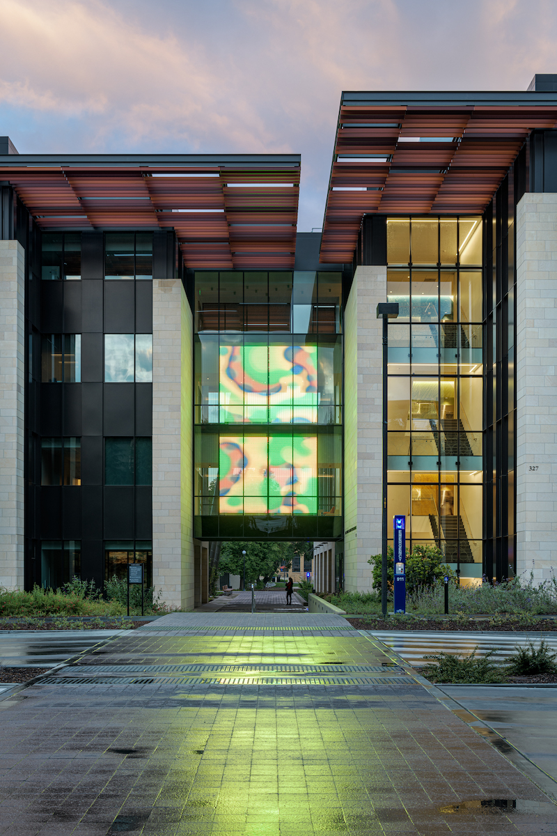
The public art piece was meant to be highly visible and interactive. The design team saw an opportunity to install it on a glass bridge spanning Discovery Walk. GKD Metal Fabrics fabricated the 32-foot-tall display using its proprietary product, GKD Mediamesh.
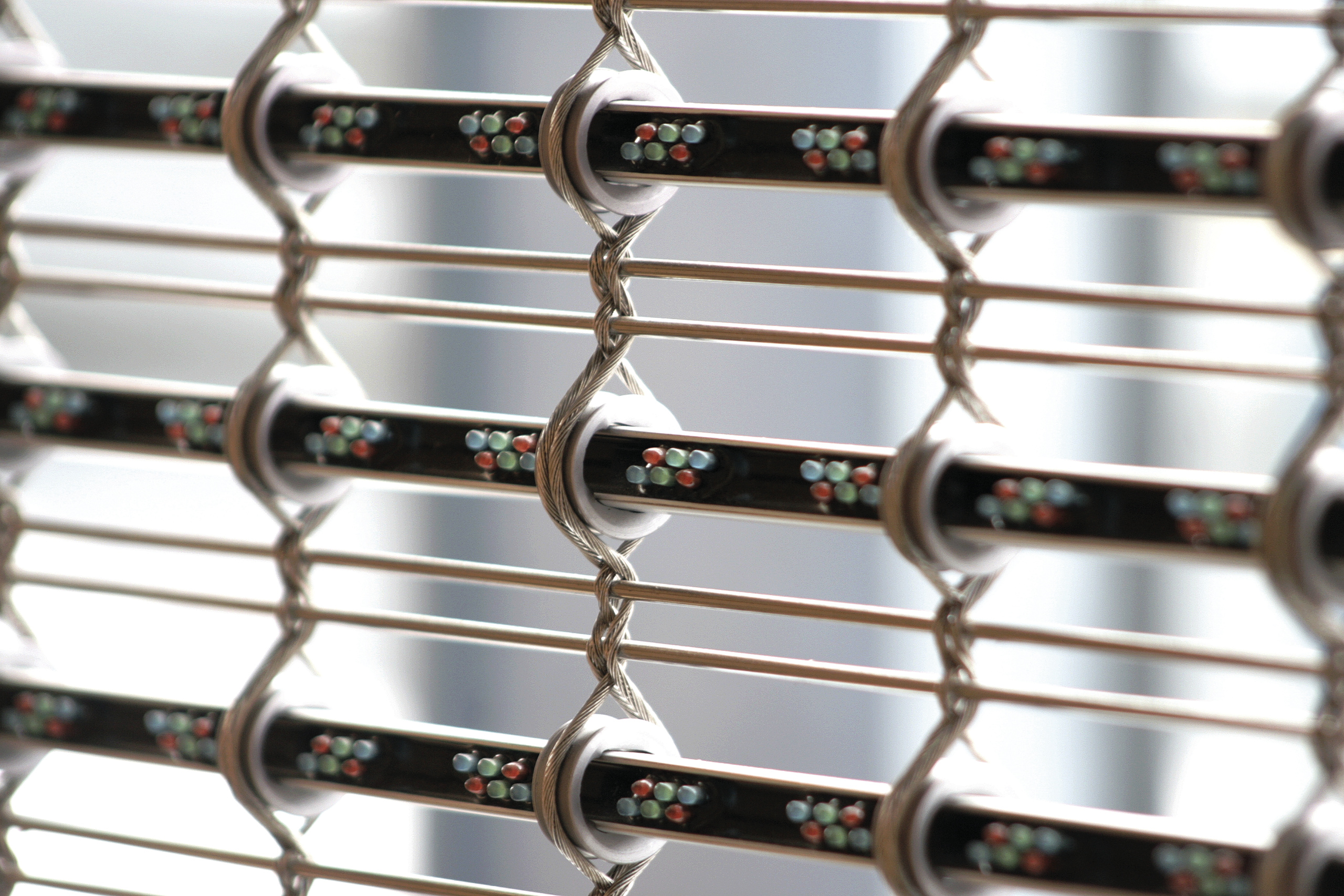
Mediamesh is a stainless steel mesh interwoven with LED lights. It is recommended for large-scale applications and can cover four times the surface area of traditional media displays with as much as 80% less electricity. With up to 60% transparency, the mesh still allows for natural daylighting.
“Stanford wanted to have impact, something that was large- scale and took advantage of the position on campus,” said Yun. “Mediamesh was most appropriate because it’s an architectural material and perfect for the scale of the piece.”
The team ran into seismic concerns related to building codes that prevented the media mesh from being installed onto the building’s exterior. Instead, they hung the media façade between large glass panels located just inside the building envelope. Mediamesh uses electronic power supplies which are extremely efficient and do not require energy-consuming fans.

Closeup of architectural mesh with LED light nodules. Photo: Courtesy GKD
CONCERN ABOUT CLEANLINESS AND SAFETY
“Knowing that we were going to have potentially thousands of people interacting with the display every day, we had to make sure it was clean and safe,” said Mike Leonard, Assoc. AIA, DSCE, GKD Technical Director of Mediamesh Systems. With it located in one of the worst seismic zones in the United States, safety was also a design concern. Logistically, it was on a busy campus and we had to crane the mesh crates through windows because there were no freight elevators or other transport large enough to accommodate delivery of the materials.”
One unique requirement of the project team was determining how to engineer an interactive interface to control a 32-foot-tall Mediamesh. Morphogenesis functions using custom-coded touch sensors that integrate hardware and software for user interaction with a kiosk that serves as a visual synthesizer to create an infinite variety of moving patterns and colors.
Visibility also took careful evaluation. “With every project we evaluate the viewing angles of the display and customize where the LEDs are targeted,” said Leonard. “We conduct a viewing angle analysis of the site and the location of the screen to ensure the impact of the display is at optimal brightness.”
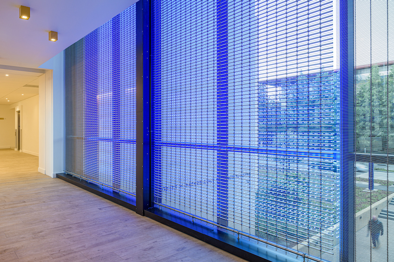
In this particular case, the display is located behind glass with the intent to display to an exterior viewing audience. This required a careful calculation of brightness to the outside as well as reflection level into the room behind it.

Interior view of the GKD architectural mesh screen for the Morphogenesis art piece. Photo: Gabe Border
NEW TYPOLOGY OF INTERACTIVE PUBLIC ART
Morphogenesis realized Stanford’s vision for abstracted storytelling. The design team created and deployed a new typology of interactive, public art that leverages large-scale digital signage technology in new ways. Morphogenesis is a beacon that draws visitors from Stanford’s medical campus into the science quad.
“From the beginning, we had an idea of how we wanted it to look and feel,” said Yun. "The first day we had the display up and running the piece, we were standing on Discovery Walk to see how it looked. I said, ‘Wow, this looks exactly like the rendering. It’s exactly as we envisioned it.’”
Flad Architects and Ennead Architects contributed to the project.


