Heineken USA’s new headquarters in White Plains, N.Y., consolidates the beer maker’s corporate offices from two other locations. Spector Group, the primary interior architect for the redesign project, focused on two primary improvements: the expansion of the company’s bar and social zones, and the enhancement and densification of the existing 60,000-sf bi-level office space.
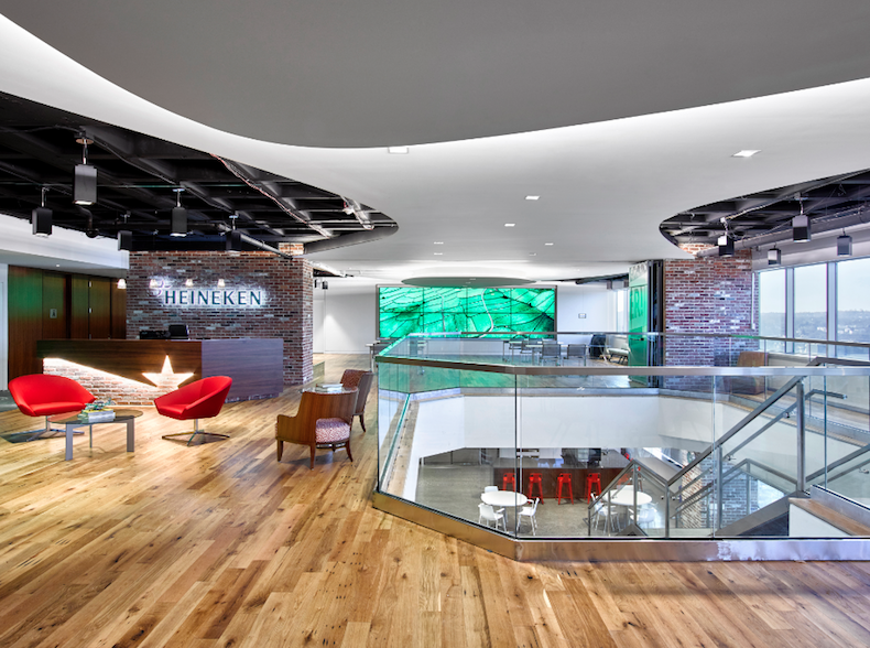
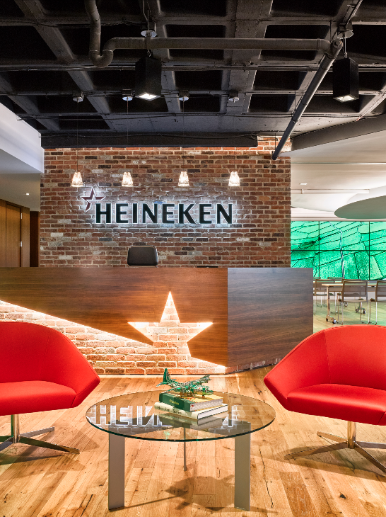
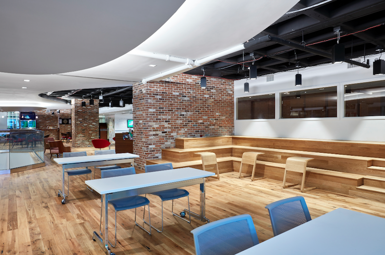
Employees and guests enter the building and are immediately greeted with a palette of simple, raw materials—brick, wood, and white walls and ceilings. These materials are offset by modern design elements located throughout the expansive bar, “insperience” hub, and reception area.
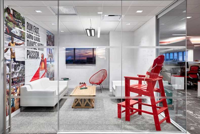
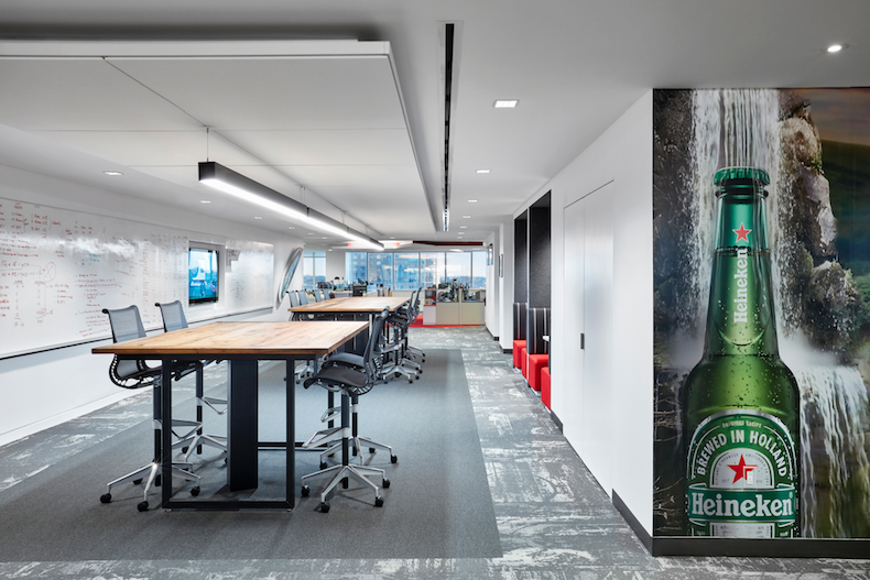
To create an open work style, the dedicated office spaces were converted to meeting and team rooms, each of which is fitted with colorful graphics that showcase the Heineken portfolio.
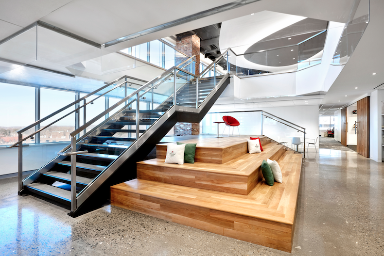
A centrally located café is meant to increase the sense of community among employees. Platforms at the base of the intercommunicating stairway provide casual breakout spaces.
Also on the Building Team: Cuoco Structural Engineers (SE) and C+F Consulting Engineers (MEP).
Related Stories
| Aug 11, 2010
Top of the rock—Observation deck at Rockefeller Center
Opened in 1933, the observation deck at Rockefeller Center was designed to evoke the elegant promenades found on the period's luxury transatlantic liners—only with views of the city's skyline instead of the ocean. In 1986 this cultural landmark was closed to the public and sat unused for almost two decades.
| Aug 11, 2010
200 Fillmore
Built in 1963, the 32,000-sf 200 Fillmore building in Denver housed office and retail in a drab, outdated, and energy-splurging shell—a “style” made doubly disastrous by 200 Fillmore's function as the backdrop for a popular public plaza and outdoor café called “The Beach.
| Aug 11, 2010
Integrated Project Delivery builds a brave, new BIM world
Three-dimensional information, such as that provided by building information modeling, allows all members of the Building Team to visualize the many components of a project and how they work together. BIM and other 3D tools convey the idea and intent of the designer to the entire Building Team and lay the groundwork for integrated project delivery.
| Aug 11, 2010
Inspiring Offices: Office Design That Drives Creativity
Office design has always been linked to productivity—how many workers can be reasonably squeezed into a given space—but why isn’t it more frequently linked to creativity? “In general, I don’t think enough people link the design of space to business outcome,” says Janice Linster, partner with the Minneapolis design firm Studio Hive.
| Aug 11, 2010
Great Solutions: Products
14. Mod Pod A Nod to Flex Biz Designed by the British firm Tate + Hindle, the OfficePOD is a flexible office space that can be installed, well, just about anywhere, indoors or out. The self-contained modular units measure about seven feet square and are designed to serve as dedicated space for employees who work from home or other remote locations.


![Strong brew: Heineken HQ spurs innovation through interaction [slideshow] Strong brew: Heineken HQ spurs innovation through interaction [slideshow]](/sites/default/files/OPENER%20Screen%20Shot%202017-06-02%20at%2011.33.34%20AM.png)


