Google’s King’s Cross Campus has taken another step forward as the company recently submitted an application for planning permission to Camden Council.
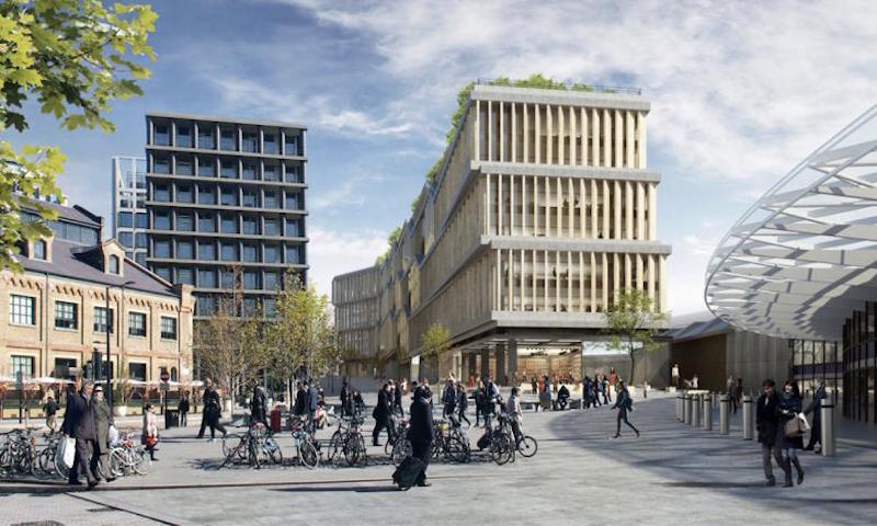
The London HQ, which will be purpose-built and is designed by BIG and Heatherwick Studio, will rise 11 stories and comprise over 1 million sf. Google will occupy 650,000 sf of the new campus. The building will include cafes, gym and pool facilities, a covered multi-use games area, an Events Center, and staff training facilities.
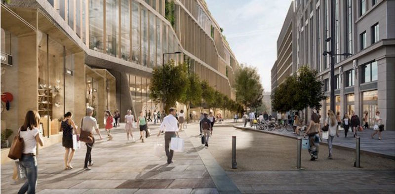
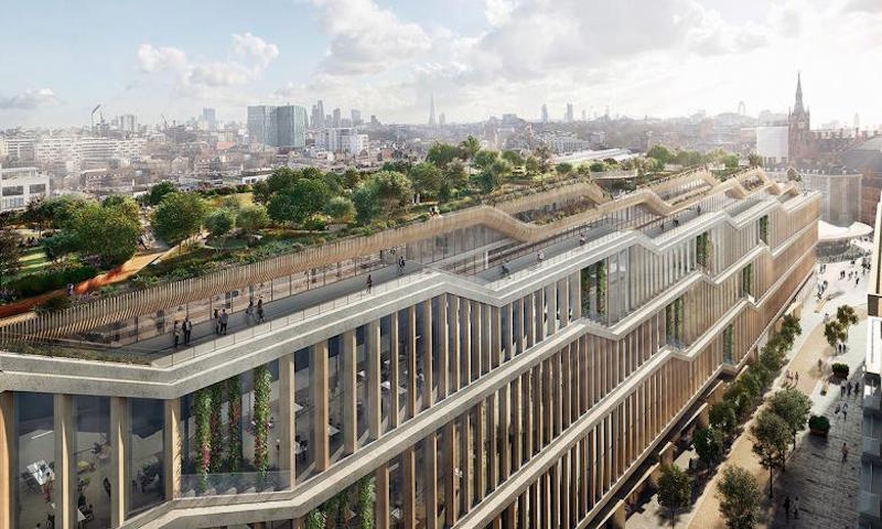
A landscaped roof will include terraces and a walking trail that stretches the length of the building while the ground floor will provide space for retail. “By opening up the ground floor and activating the roofscape, the light and airy workspaces are sandwiched between the terraced gardens on the roof and market halls, auditoria, and shops on the ground,” says Bjarke Ingels, Founding Partner at BIG, in a release.
The building has been designed from a family of interchangeable elements that allow the headquarters’ workspaces to quickly and easily adapt to change. When combined with the current building at 6 Pancras Square and an additional third building, the new campus has the potential to house up to 7,000 Google employees.
 Rendering courtesy of HayesDavidson.
Three main points are laid out about the project’s design in the application’s Executive Summary of Inclusivity:
— The design principles are extremely coherent and aim to produce a building that has a high degree of architectural legibility and therefore ease of use.
— The organization of major floor plates and minor floor plates provides a wide range of features that will assist users in their navigation of what could otherwise be a complex building.
— The ground plane provides a great opportunity for the public to interact with the building, creating permeability and a transition between the private spaces and the public realm.
 Rendering courtesy of HayesDavidson.
If the application is approved, the project could break ground in 2018.
You can view the entire application for planning permission here.
 Rendering courtesy of HayesDavidson.
 Rendering courtesy of HayesDavidson.
Related Stories
| Aug 11, 2010
Top of the rock—Observation deck at Rockefeller Center
Opened in 1933, the observation deck at Rockefeller Center was designed to evoke the elegant promenades found on the period's luxury transatlantic liners—only with views of the city's skyline instead of the ocean. In 1986 this cultural landmark was closed to the public and sat unused for almost two decades.
| Aug 11, 2010
200 Fillmore
Built in 1963, the 32,000-sf 200 Fillmore building in Denver housed office and retail in a drab, outdated, and energy-splurging shell—a “style” made doubly disastrous by 200 Fillmore's function as the backdrop for a popular public plaza and outdoor café called “The Beach.
| Aug 11, 2010
Integrated Project Delivery builds a brave, new BIM world
Three-dimensional information, such as that provided by building information modeling, allows all members of the Building Team to visualize the many components of a project and how they work together. BIM and other 3D tools convey the idea and intent of the designer to the entire Building Team and lay the groundwork for integrated project delivery.
| Aug 11, 2010
Inspiring Offices: Office Design That Drives Creativity
Office design has always been linked to productivity—how many workers can be reasonably squeezed into a given space—but why isn’t it more frequently linked to creativity? “In general, I don’t think enough people link the design of space to business outcome,” says Janice Linster, partner with the Minneapolis design firm Studio Hive.
| Aug 11, 2010
Great Solutions: Products
14. Mod Pod A Nod to Flex Biz Designed by the British firm Tate + Hindle, the OfficePOD is a flexible office space that can be installed, well, just about anywhere, indoors or out. The self-contained modular units measure about seven feet square and are designed to serve as dedicated space for employees who work from home or other remote locations.


