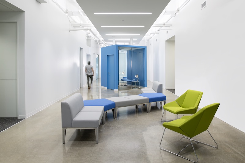
Securus Technologies tagline, “Connecting what matters,” was the inspiration behind the lauckgroup-designed renovation of its 154,000-sf North Texas headquarters building. The redesigned space infuses elements of company culture into the design.
The unique H-shape of the building allows for an abundance of daylighting and greenery to reach all interior viewpoints, something that was considered a vital component for the building that is used around the clock.
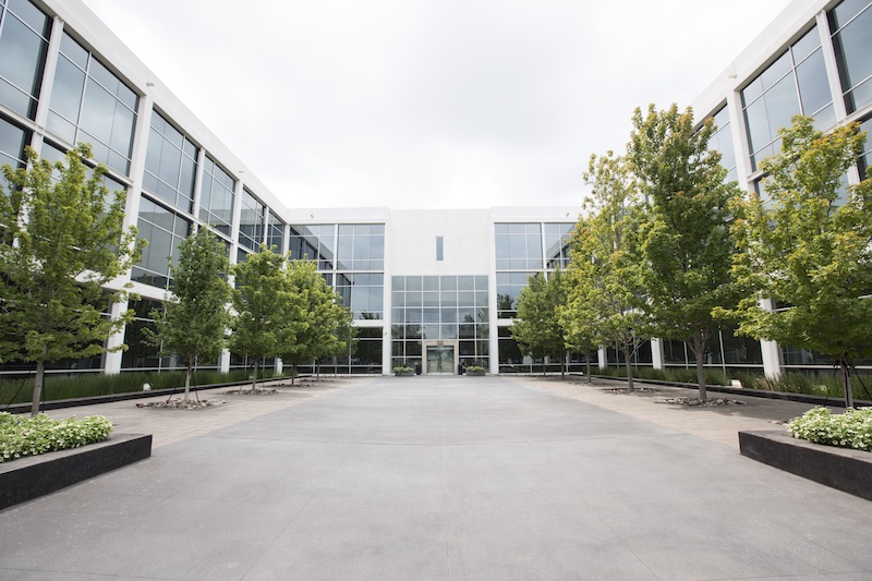 Photo: Justin Clemmons.
The main entrance features a two-story atrium space with a large display of Securus patents, a branded graphic, an employee comment wall, and a wood veneer with digital screens. Moving through to the west wing of the building, employees will see displays of customer experiences that line the walls to the warehouse space and the large employee breakroom and training center. The east wing takes occupants toward the auditorium and customer call center.
An active core zone with collaborative areas, additional breakrooms, wellness rooms, phone rooms, and enclosed conference and training spaces occupy the second and third floors. Instead of cubicles, lauckgroup created this core zone to foster ease of knowledge transfer between departments, remind employees of the company’s mission, and provide a respite from the typical office layout. The zones feature high ceilings, concrete floors, and graphic walls.
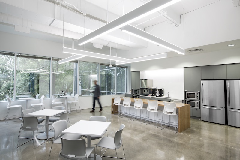 Photo: Justin Clemmons.
Employees move north and south from the central core into the “arms” of the H-shape to enter the work areas. The work areas are grouped by department and include private offices, open workstations, and breakout teaming spaces. Eco-conscious materials, such as low VOC paint, sustainably forested countertop wood, and ceiling tiles made of stone wool containing 42% recycled content, were incorporated into the work spaces.
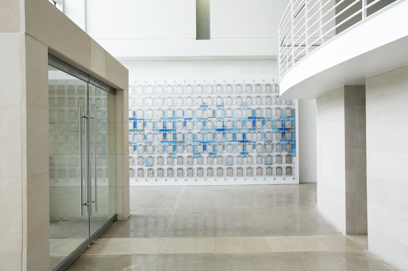 Photo: Justin Clemmons.
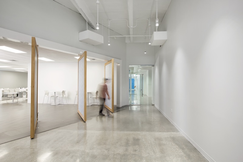 Photo: Justin Clemmons.
Related Stories
| Aug 11, 2010
Top of the rock—Observation deck at Rockefeller Center
Opened in 1933, the observation deck at Rockefeller Center was designed to evoke the elegant promenades found on the period's luxury transatlantic liners—only with views of the city's skyline instead of the ocean. In 1986 this cultural landmark was closed to the public and sat unused for almost two decades.
| Aug 11, 2010
200 Fillmore
Built in 1963, the 32,000-sf 200 Fillmore building in Denver housed office and retail in a drab, outdated, and energy-splurging shell—a “style” made doubly disastrous by 200 Fillmore's function as the backdrop for a popular public plaza and outdoor café called “The Beach.
| Aug 11, 2010
Integrated Project Delivery builds a brave, new BIM world
Three-dimensional information, such as that provided by building information modeling, allows all members of the Building Team to visualize the many components of a project and how they work together. BIM and other 3D tools convey the idea and intent of the designer to the entire Building Team and lay the groundwork for integrated project delivery.
| Aug 11, 2010
Inspiring Offices: Office Design That Drives Creativity
Office design has always been linked to productivity—how many workers can be reasonably squeezed into a given space—but why isn’t it more frequently linked to creativity? “In general, I don’t think enough people link the design of space to business outcome,” says Janice Linster, partner with the Minneapolis design firm Studio Hive.
| Aug 11, 2010
Great Solutions: Products
14. Mod Pod A Nod to Flex Biz Designed by the British firm Tate + Hindle, the OfficePOD is a flexible office space that can be installed, well, just about anywhere, indoors or out. The self-contained modular units measure about seven feet square and are designed to serve as dedicated space for employees who work from home or other remote locations.


