The American Institute of Architects (AIA) has selected 11 recipients for the 2017 Small Project Awards. The AIA Small Project Awards Program, now in its 14th year, was established to recognize small-project practitioners for the high quality of their work and to promote excellence in small-project design. This award program strives to raise public awareness of the value and design excellence that architects bring to projects, no matter the limits of size and scope.
Award recipients are categorized into two groups:
Category 1: small project construction, object, work of environmental art or architectural design element up to $150,000 in construction cost.
Category 2: small project construction, up to $1,500,000 in construction cost.
Category 3: small project construction, object, work of environmental art or architectural design under 5,000 square feet
Category 1
La Cage aux Folles; Los Angeles
Warren Techentin Architecture
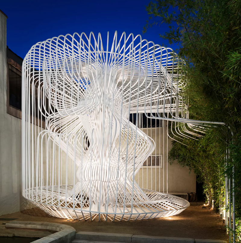 Photo: Nicolas Alan Cope
Installed in the courtyard gallery of Materials & Applications, this project is an experimental bent steel tube structure that explores the craft of pipe bending, joining form, computational procedures, and fabrication processes into a complex structure that assumes various postures and porosities through looping and layering. La Cage aux Folles actively engages the neighborhood by opening the courtyard to the sidewalk as a pocket park, albeit a small one. In this way, the design team wanted the project to lay within the traditions of both landscape architecture and urbanism. Its engagement with the street provided a space for both unscripted use and curated performances. La Cage aux Folles has become a social condenser for the neighborhood and host to many activities during its run, including a three-person dance performance and a video animation of hummingbirds mid-flight—in slow motion—projected through multiple scrims.
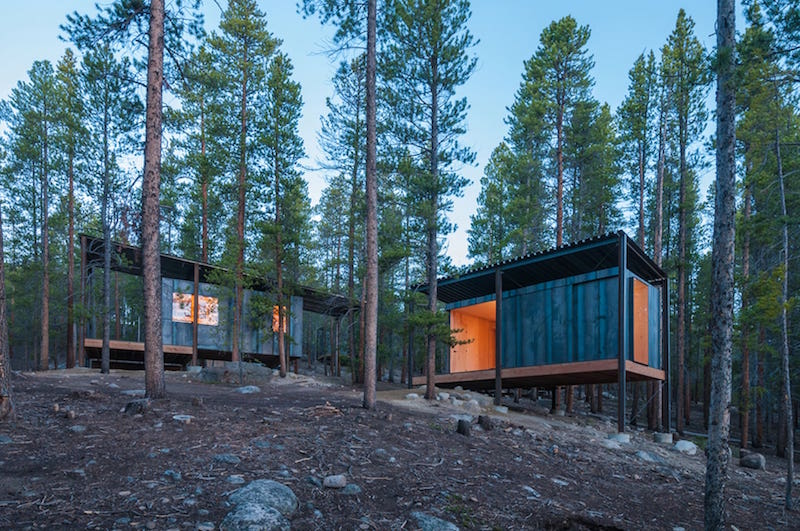 Photo: Jesse Kuroiwa
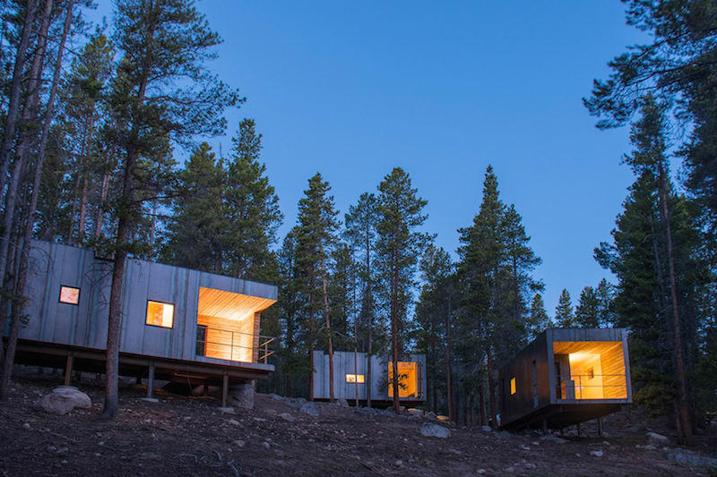
Located in a lodgepole forest 10,000 feet above sea level, these 21 unique cabins are an exploration in micro housing and prefabrication. The initial 14 cabins were designed as seasonal housing for temporary staff. To satisfy lodging and storage, the cabins were conceived as two elements: ‘box’ and ‘frame.’ The ‘frame’ acts as storage for the educator’s gear while also housing the ‘box.’ The second set of seven cabins were designed as year-round housing for permanent staff. The initial concept was reduced to just the ‘box’ through the implementation of structurally insulated panels. Cedar clad porches are carved from the ‘box’ creating private spaces. The hot-rolled steel rainscreen blends with the trees, minimizing visual impact. Prefabricated birch plywood brings warmth to the interiors and connects to the surrounding environment. Each set of cabins was completed in three weeks of on-site construction by 28 graduate students.
Sunset Pavilion; Firestone, Colorado
Tomecek Studio Architecture
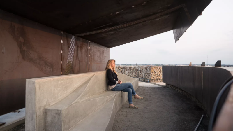 Photo: Tomecek Studio Architecture
Standing atop and overlooking the park entry—framing panoramic views of the Rocky Mountains—the Sunset Pavilion marks the intersection of multiple paths along a regional trail system. Along with eight additional structures, the pavilion celebrates the simplicity of construction of natural materials. The prefabricated steel structure cantilevers from grade, shielding visitors from the harsh Colorado sun. Acting as a lens, the pavilion's details emphasize the phenomenal qualities of the sun's path. Perforations along the overhead plane track the sun's movement during the autumnal and vernal equinox. The steel plate and gabion walls below frame the distant view of the mountains while editing out the roadway and development in the foreground. The fluid shape of the concrete bench within invites visitors to sit, climb, recline, and view the landscape, allowing the pavilion to reference the emotional landscape present while placing it within the larger geographic context.
Category 2
Lightbox; Point Roberts, Washington
Bohlin Cywinski Jackson
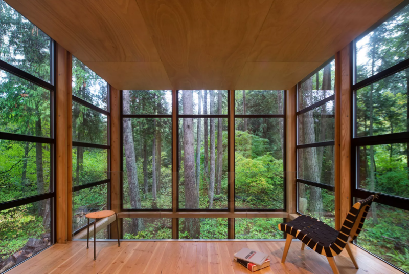 Photo: Nic Lehoux
Designed as a home and studio for a photographer and his young family, this project is located on a densely forested site on a peninsula that extends south from British Columbia across the border to Point Roberts. A south-facing two-story glass cage for living captures the sun and view as it celebrates the interplay of light and shadow in the forest. To the north, stairs are contained in a thin, black-stained wooden box with narrow apertures. The home was made decidedly modest, in size and means, with a building skin utilizing simple materials in a straightforward yet innovative configuration. The result is a structure crafted from affordable and common materials, such as exposed wood beams that form the structural frame and directly support a prefabricated aluminum window system of standard glazing units, uniformly sized to reduce the complexity and overall cost.
Laura's Place; Portland, Oregon
ARCHITECTURE BUILDING CULTURE
 Photo: Joshua Jay Elliot
Laura’s Place is a supportive transitional housing facility for pregnant or parenting women who have graduated from an in-patient treatment facility. It offers mothers who have successfully completed their treatment programs a communal home where they can take their next step in the recovery process. Laura’s Place serves an average of 16 women and 16 children every year. The fundamental role of this expansion project was one of reflecting, supporting, and transforming the cultural context of the residents. This was done in a number of ways, from the overall site planning to the design of the new transitional housing units. The emphasis was to create a safe, supportive, and propelling transitional home for the mothers and their children. Critical to the project’s success was the collaborative effort, in part pro bono, by the entire project team and project partners.
Little House; Seabeck, Washington
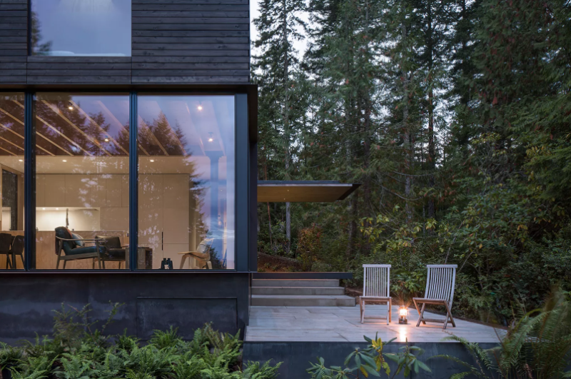 Photo: Andrew Pogue
The project is nestled into a lush second-growth forest on a north-facing bluff overlooking Hood Canal. Built over an existing foundation, the new building is just over 20 square feet. Early discussions focused on a compact, modern structure that was simple and efficient. Visitors approach the site from the south, where a thin canopy marks the entry and frames views of the canal. The more transparent north and west elevations pull the landscape and distant view into the space. Oxidized black cedar and blackened cement infill panels clad the exterior while lightly painted panels and soft pine plywood warm and brighten the interior. On a sunny western corner, a large patio reaches into the landscape—a jumping off point to trails wandering down to the water’s edge. The resulting project hopes to capture the essence of the modern cabin, small in size but much larger than its boundaries.
Prospect House; Dripping Springs, Texas
Max Levy Architect
 Photo: Casey Dunn
Prospect House is a wedding and event space standing in a twenty-acre field of rolling native prairie. It can accommodate celebrations in numerous configurations indoors, outdoors, and on a huge screened-in porch. Above the main hall is a large wind vane. Its mast extends down into the room and supports a 12-foot diameter ring that can be decorated. The ring turns with the breezes, connecting festivities inside with the world outside. This is modernism reflecting an old-fashioned approach: boards, white paint, and corrugated sheet metal, generously open to almost any function, reframing peoples’ awareness of simple things.
Gemma Observatory; New Hampshire
Anmahian Winton Architects
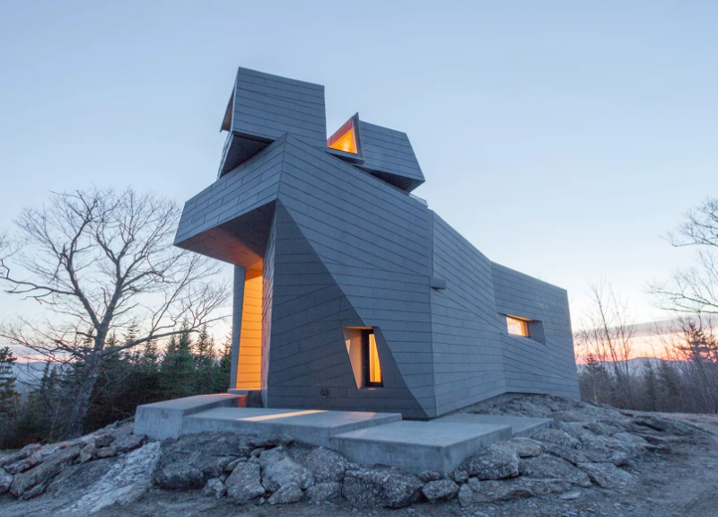 Photo: Anmahian Winton Architects and Client
This private astronomical observatory is located in the mountains of central New Hampshire on a site characterized by gray granite outcroppings. Gemma’s siting, form, and materials are rooted in the practical requirements of minimizing building movement and dissipating heat gain, and in symbolic relationships to both celestial and environmental landmarks. The design rejects a traditional dome in favor of a synthesized architectural form, providing more usable space and emphasizing the observatory’s aesthetic relationship to its stark geographic context. Patterned zinc cladding integrates the site’s irregular topography with the building’s geometry. Its dimension, color, and patina evoke a material relationship to the austere environment. A helical stair leads from the cantilevered entry canopy to a fissure in the cladding that opens onto the exterior observation deck. Continuing, it arrives at the primary viewing platform inside the faceted turret, whose corner window frames Polaris when locked in the southern cardinal position.
Category 3
Funny Girl Farm Produce Barn; Durham, North Carolina
Szostak Design, Inc.
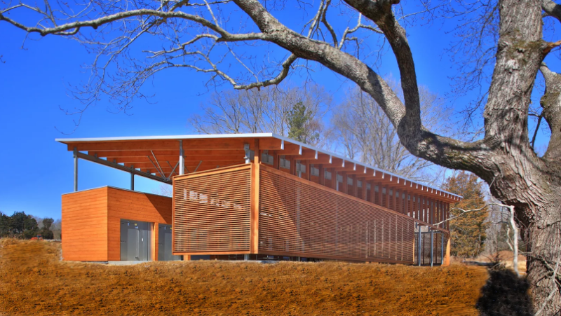 Photo: Jim Sink Photography
Designed as an open-work shed for produce handling, this 4,300-square-foot barn reflects its agrarian function in its economy of form and materials. The barn shelters a large open workspace and equipment storage area, flanked by a linear bar of enclosed utility spaces. A limited palette of wood and steel articulates the barn’s clearly defined plan. These materials were chosen for durability, to withstand the elements and heavy use. The enclosing screen walls and sloping roof are designed to be responsive to site and climate, and to provide shelter from sun and water while also harnessing wind to provide ventilation. The shed’s simple structure plainly represents its utilitarian function; its refined materials palette and architectural detailing elevate the design.
Lady Bird Loo; Austin, Texas
Mell Lawrence Architects
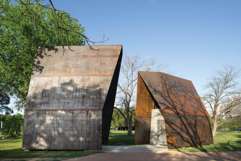 Photo: Whit Preston
The Lady Bird Loo is located near Austin’s wild and busy downtown, in a stretch of hike-and-bike trails paralleling the river that bisects the city. The clients needed two single restrooms, low maintenance and vandal-resistant with great ventilation and a sense of safety for the occupant. The design team wanted spirited shelters scaled to the well treed riverside park space, with each having its own personality. The interiors give a sense of momentary pause and respite; they are safe and airy with great light and views of trees and sky. Requiring no special finishes or maintenance, the project is built entirely of steel and concrete left raw and unfinished. Changing sunlight animates the whole experience; it amplifies details and narrow edges, reemphasizes the faceted forms, darts light-slivers through intentional gaps between material, and creates useful shade and fun shadow patterns.
De Maria Pavilion; Bridgehampton, New York
Gluckman Tang Architects
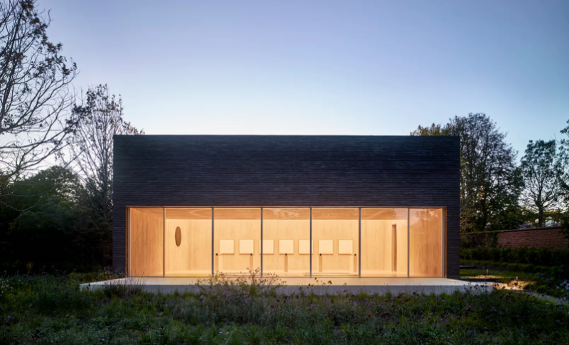 Photo: Nikolas Koenig
The De Maria Pavilion is part of an informal art walk that links several contemporary sculptures on an estate. Set within a walled 1920s “kitchen garden,” the design inverts the typical formal garden by reintroducing indigenous plantings: cedars, bayberry, white oaks and grasses. The board-formed, concrete interior frames works by Walter De Maria, day-lit by a large skylight and window-wall. Light levels are modulated by light-diffusing glazing and motorized shades mounted above Alaskan Yellow Cedar rafters. The facades of the pavilion reference the surrounding wall and dark granite of Large Grey Sphere, a 32-ton outdoor sculpture. Composed of 24-inch bricks, the east and west faces are set in a random bond pattern with alternating courses corbeled to create emphatic horizontal shadow lines. At the north and south, the brick is split and set in a header-only bond, creating a coarse texture that is a counterpoint to the polished surfaces of the art within.
The jury for the 2017 Small Project Awards includes: Jean Dufresne, AIA (Chair), Space Architects + Planners; Richard Fernau, FAIA, Fernau + Hartman; Joyce Hwang, AIA, Ants of the Prairie; Jack Travis, FAIA, Jack Travis FAIA Architect and Kulapat Yantrasast, wHY.
Related Stories
| Aug 11, 2010
Nurturing the Community
The best seat in the house at the new Seahawks Stadium in Seattle isn't on the 50-yard line. It's in the southeast corner, at the very top of the upper bowl. "From there you have a corner-to-corner view of the field and an inspiring grasp of the surrounding city," says Kelly Kerns, project leader with architect/engineer Ellerbe Becket, Kansas City, Mo.
| Aug 11, 2010
Two Rivers Marketing: Industrial connection
It was supposed to be the perfect new office. In July 2003, Two Rivers Marketing Group of Des Moines, Iowa, began working with Shiffler Associates Architects on a 14,000-sf building to house their rapidly growing marketing firm. Over the next six months they put together an innovative program that drew on unprecedented amounts of employee feedback.
| Aug 11, 2010
AIA Course: Historic Masonry — Restoration and Renovation
Historic restoration and preservation efforts are accelerating throughout the U.S., thanks in part to available tax credits, awards programs, and green building trends. While these projects entail many different building components and systems, façade restoration—as the public face of these older structures—is a key focus. Earn 1.0 AIA learning unit by taking this free course from Building Design+Construction.
| Aug 11, 2010
AIA Course: Enclosure strategies for better buildings
Sustainability and energy efficiency depend not only on the overall design but also on the building's enclosure system. Whether it's via better air-infiltration control, thermal insulation, and moisture control, or more advanced strategies such as active façades with automated shading and venting or novel enclosure types such as double walls, Building Teams are delivering more efficient, better performing, and healthier building enclosures.
| Aug 11, 2010
Glass Wall Systems Open Up Closed Spaces
Sectioning off large open spaces without making everything feel closed off was the challenge faced by two very different projects—one an upscale food market in Napa Valley, the other a corporate office in Southern California. Movable glass wall systems proved to be the solution in both projects.
| Aug 11, 2010
High School in a Hurry
One of the more compelling arguments for charter schools is their theoretical ability to streamline decision making. Eliminate all those layers of bureaucratic fat that clog the arteries of most public school systems, the argument goes, and decisions can be made to flow much more smoothly, even when it comes to designing and building a major school project.
| Aug 11, 2010
Right-Sizing Healthcare
Over the past 30 years or so, the healthcare industry has quietly super-sized its healthcare facilities. Since 1980, ORs have bulked up in size by 53%, acute-care patient rooms by 77%. The slow creep went unlabeled until recently, when consultant H. Scot Latimer applied the super-sizing moniker to hospitals, inpatient rooms, operating rooms, and other treatment and administrative spaces.
| Aug 11, 2010
Silver Award: Pere Marquette Depot Bay City, Mich.
For 38 years, the Pere Marquette Depot sat boarded up, broken down, and fire damaged. The Prairie-style building, with its distinctive orange iron-brick walls, was once the elegant Bay City, Mich., train station. The facility, which opened in 1904, served the Flint and Pere Marquette Railroad Company when the area was the epicenter of lumber processing for the shipbuilding and kit homebuilding ...
| Aug 11, 2010
Special Recognition: Durrant Group Headquarters, Dubuque, Iowa
Architecture firm Durrant Group used the redesign of its $3.7 million headquarters building as a way to showcase the firm's creativity, design talent, and technical expertise as well as to create a laboratory for experimentation and education. The Dubuque, Iowa, firm's stated desire was to set a high sustainability standard for both itself and its clients by recycling a 22,890-sf downtown buil...
| Aug 11, 2010
Hilton President Hotel
Once an elegant and fashionably trendy locale, the Presidential Hotel played host to the 1928 Republican National Convention where Herbert Hoover was nominated for President, and acted as a hot spot for Kansas City Jazz in the '30s and '40s. The hotel was eventually abandoned in 1984, at which point it became a haven for vagabonds and pigeons, collecting animal waste and incurring significant s...


