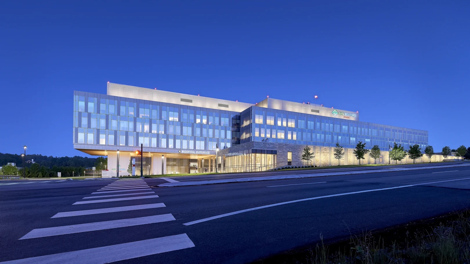
The American Institute of Architects (AIA) Academy of Architecture for Health (AAH) is recognizing 10 projects with its 2023 Healthcare Design Awards.
The awards recognize cutting-edge designs that help solve aesthetic, civic, urban, and social problems while also being functional and sustainable. Eligible projects can include healthcare building design, healthcare planning and healthcare design-oriented research.
This year’s projects were awarded by a six-person jury:
- Eurico Francisco, AIA, (Chair), Callison RTKL, Dallas
- Asia Allen, AIA, Gresham Smith, Nashville, Tenn.
- Walter Jones, AIA, Campus Transformation at the MetroHealth System, Cleveland
- Ashley Mulhall, AIA, Orcutt | Winslow, Phoenix
- Akshay Sangolli, AIA, Page Southerland Page, Inc., Denver
- Molly M. Scanlon, FAIA, Univ of Arizona Mel & Enid Zuckerman College of Public Health, Coronado, Calif.
Here are the 2023 Healthcare Design Awards winners by category (photos and project descriptions courtesy AIA):
Category A: Built: Less than $25 million (construction cost)
Broadway Youth Center | Wheeler Kearns Architects | Chicago
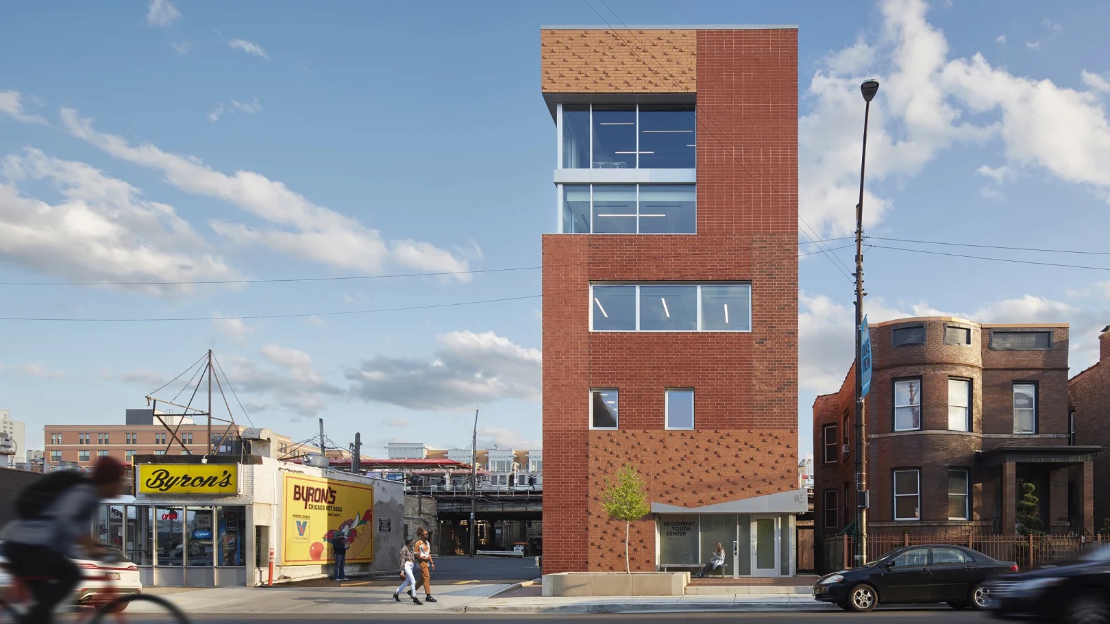
Thanks to its thoughtful design approach, Howard Brown Health's Broadway Youth Center is a welcoming and inclusive space that offers comprehensive healthcare services and social programs for LGBTQ+ young people in Chicago. Built on a tight urban site, the center is at the intersection of multiple transit lines, making it a resource for the local neighborhood while also accessible to young people throughout the wider city.
Howard Brown Health (HBH) has been offering services in Chicago since 1985, and its Broadway Youth Center, founded in 2004 as a trauma-informed alternative to traditional care environments, had moved from location to location throughout Chicago’s north side. As the center’s lease expired, and demand for services and clinic waiting times soared, HBH turned to the design team to develop the organization’s first ground-up new building.
The new building is more than four times larger than the center’s previous facility with double the exam and therapy spaces. It also boasts a commercial kitchen, a multipurpose room, and dedicated space for the center’s transgender and nonconforming program. Through its new facility, HBH expects to increase its client base by more than 200%, serving nearly 6,000 patients seeking healthcare services and 4,500 clients with social service needs.
The team’s design incorporates the unique values and identities of the center’s community into the building’s physical fabric. Its outermost layer is a symbolic facade composed of a patchwork of large masonry panels that feature varying shades and patterns of bricks which wrap the building like a quilt. Inside, a series of safe and inviting spaces await patients and clients. Accent colors and murals on every floor mingle with airy spaces and comfortable furnishings, imbuing the therapeutic spaces with the community’s youthful and artistic spirit.
Trauma-informed design principles were incorporated throughout, ensuring positive individual outcomes and the overall program’s success. The team’s use of warm wood and colorful furnishings lend the center a sense of home, helpful for community members who are experiencing homelessness. Safety and empowerment are bolstered by clear sightlines that allow patients and clients to see where they are and monitor their space.
Inside the clinical rooms, which are typically window-less and sterile, daylight, color, and soft furnishings create a calming atmosphere. Those spaces also feature enhanced filtration and high-performing glazing that improves acoustic isolation from the nearby elevated train.
By acknowledging the unique journey of each person it serves, the center is addressing health inequalities and greatly enhancing the well-being of Chicago’s LGBTQ+ youth, especially those experiencing homelessness. Inside, the community is treated to a vibrant and light-filled facility that encourages young people to heal and flourish.
Family Tree Clinic | Perkins&Will | Minneapolis
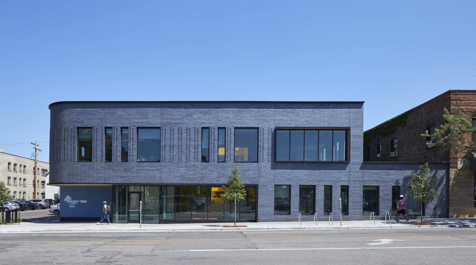
For more than half a century, Minneapolis’ Family Tree Clinic has provided underserved populations in the Twin Cities with reproductive and sexual health services. But in recent years, the clinic’s clients, largely BIPOC, LGBTQ+ individuals, and those living below the poverty line, have faced long waiting lists and barriers to cutting-edge medical care. This new clinic, just 1.2 miles from downtown Minneapolis and connected to bike shares, three mass transit lines, and two major interstates, ensures its patients that they matter, are seen, and will be cared for.
The clinic engaged the design team in 2017 when it was operating out of an old schoolhouse that was disconnected from the core of the Twin Cities. Through the team’s social purpose program, the nonprofit clinic received pro bono professional services. The resulting discovery phase and visioning session uncovered the needs of patients and staff, establishing the project goals and drivers before design began.
During the earlier phases of the process, the team considered several potential sites, which included retrofitting existing buildings; major renovations to the clinic’s existing building; and new construction. The pre-occupancy evaluation revealed a critical need for the clinic to be in a location more rooted in the LGBTQ+ community, and the new building’s site on Nicollet Avenue meets that goal.
From its position on a busy retail corridor, the new building is a welcoming, safe, and connected respite for patients and members of the LBGTQ+ community. Its simple brick volume reflects the scale and material patterns of the surrounding environment, and the team’s material choice gives the building a sense of permanence in the community. Murals created by local BIPOC and LGBTQ+ artists wrap the building and express the power of healing.
The building was designed to be an inviting oasis for patients and a safe, trauma-informed place of respite. The clinic is located at the rear of the second floor to provide privacy, and its waiting room offers views of the thoroughfare below. The first floor contains community and staff spaces that are wrapped in glass, beckoning visitors to enter. Further in, an intimate and protected courtyard draws daylight into the interior spaces and creates strong connections to the outdoors.
The clinic opened in the fall of 2021, and its impact was immediate. With the new facility, the clinic can expand its care amid growing demand and limited availability in the region. It now serves an additional 10,000 patients annually.
Fora Health | Holst Architecture | Portland, Oregon
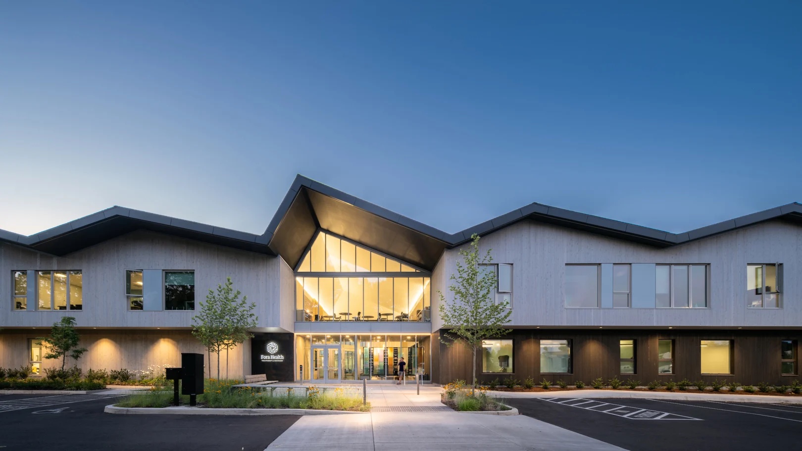
Combining trauma-informed design and community space, Fora Health’s new treatment campus in Portland helps free Oregonians from addiction while tripling the organization's capacity. The new facility removes barriers to treatment by combining its administrative offices and residential and outpatient services under one roof for the first time.
Fora Health, founded in 1974 by the Portland Society of St. Vincent de Paul, has served more than 40,000 people over the years. In 2018, the organization contemplated selling its aging facilities in Downtown Portland, which had limited accessibility and potential for institutional growth. Its new facility serves the entire community, from low-income to private-pay patients, ensuring Fora Health’s future financial health.
The new building offers a full continuum of care where patients can receive evidence-based medical treatments and engage in activities that allow for expression and the development of healthy habits. At Fora Health, addiction is not viewed as a failure of personal willpower but rather a medical issue that requires a compassionate approach to life-saving services. Uniting its programs in one building was a critical component of the design’s integrated approach.
Purposeful integration is first found in the building’s massing, which embraces a central courtyard that offers plentiful outdoor space and creates an environment of openness and hope that advances Fora Health’s mission and contributions to the community. A gradual transition in the courtyard from hardscape to naturally wooded areas kept existing trees on the site while also providing space for activity and meditation. Inside, the central lobby’s floor-to-ceiling glass, gabled ceiling, and ethereal grand stair present a welcoming intake experience, and a serene interior palette evokes a spa-like environment. The lobby opens onto the courtyard and directs patients to the three primary program areas. A connected community room offers divisible space for fundraising events and community meetings for up to 100 participants.
The new facility contains 24 beds for medical withdrawal management, 70 inpatient residential beds, and an outpatient program that serves more than 1,000 people each year. Reflective of Fora Health’s commitment to caring for the whole person, the campus also includes an art studio, group dining room, fitness center, library, and commercial kitchen. The new building also includes an elevator—a Veterans Administration requirement—allowing Fora Health to serve those living with mobility issues.
OhioHealth Neuroscience Wellness Center | Gensler | Columbus, Ohio
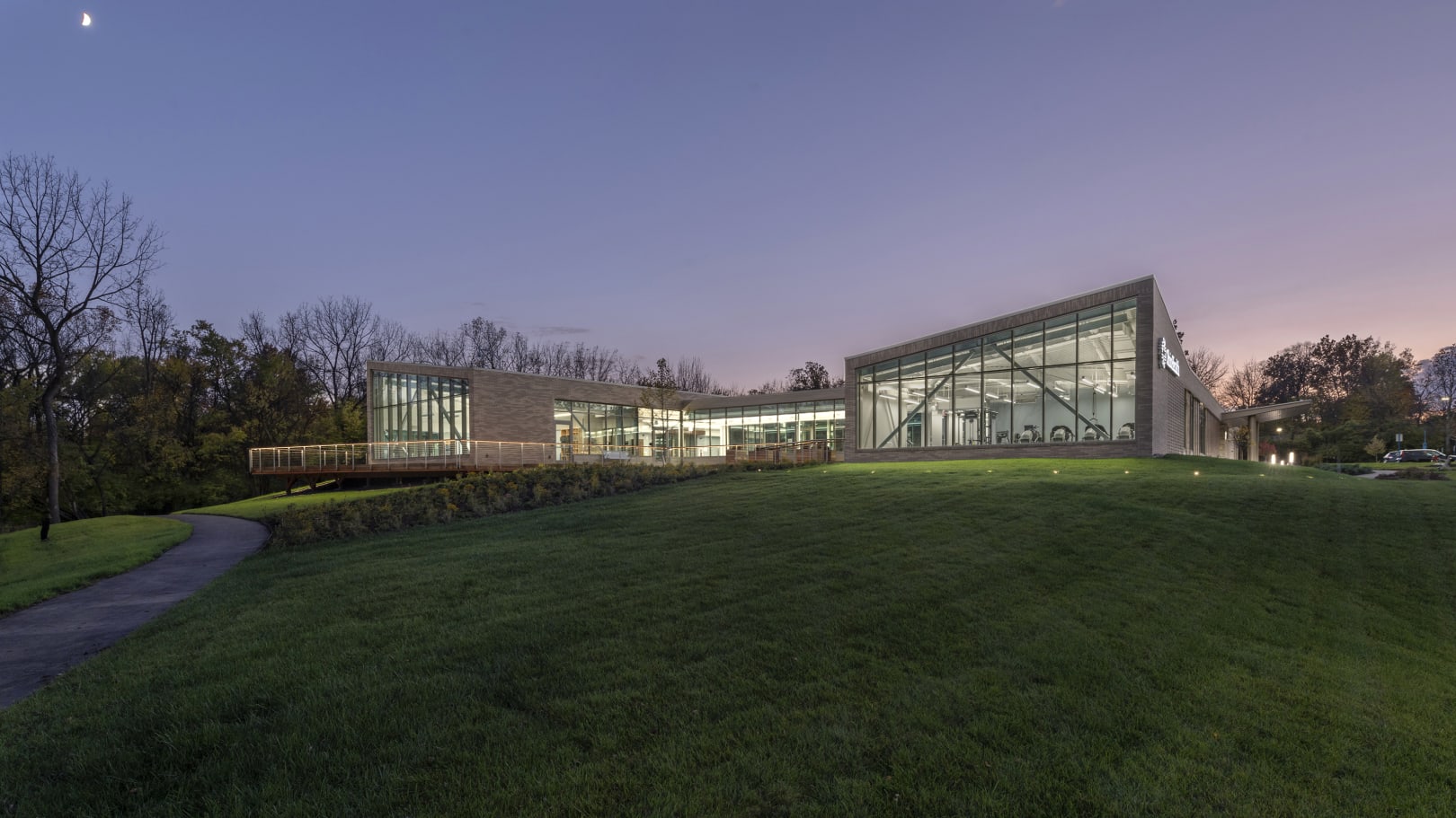
In medicine, neurological disorders present the most challenging treatment protocols, requiring care that stretches beyond clinical options to a focus on quality of life and enhanced support for individuals and their support network. This new center in Columbus delivers that care in a first-of-its-kind freestanding facility that is a beacon of resiliency and community spirit.
Designed to uplift and inspire, the OhioHealth Neuroscience Wellness Center sits adjacent to a forested wetland on the perimeter of the health system’s Riverside Methodist Hospital campus. The interdisciplinary center’s programs serve people living with significant conditions like stroke, multiple sclerosis, and Parkinson’s disease. Its modest architecture, unusual for such an active major medical campus, prioritizes the surrounding landscape and access to daylight.
Initially led by the pioneering Dr. Janet Bay, the 13th female neurosurgeon in the United States, the center’s design began in 2017 with a series of workshops and visioning sessions comprising users, community members, and administrators. The process helped the team identify the appropriate site on OhioHealth’s campus, which informed the overall concept and sustainable approach. With a light touch on the land, the center hinges on orientation, planning, and a targeted facade design that maximizes daylight through the efficient building envelope. Site and program work in concert to drive movement and light through the building, a strategy that bolsters universal access.
On the exterior, a mix of contextually driven materials allows the center to fit with the surrounding buildings and its forest context. Masonry and a sustainably harvested hardwood facade marry the manmade and the natural, strengthening the connection between the building and its landscape.
Inside, the center hinges on movement, and its architecture allows people of all abilities to experience and move in harmony with nature. Its program includes wellness and exercise studios with overhead harnessing for additional balance support, a quiet studio for mind-body classes, a geriatric clinic, a cafe, multipurpose fitness rooms, and administrative workspace. Throughout the spaces, the team paid careful attention to frictionless design considerations, which include intuitive wayfinding and subtle transitions that better suit those living with neurological challenges.
Organized around a central courtyard and hearth, each of the center’s programs expresses a unique identity. The courtyard is also wrapped with an interior walking track that offers tree-top views and further access to wellness studios that overlook the nearby forest to the south and learning and support spaces to the north. A network of nature trails and outdoor spaces further connect the center to the surrounding forest and wetlands, an amenity for the OhioHealth community as well as residents in surrounding neighborhoods.
Category B: Built: More than $25 million (construction cost)
Allegheny Health Network Wexford Hospital | HKS | Wexford, Pennsylvania

Aiming to bring healthcare closer to home, Alleghany Health Network’s Wexford Hospital, located in a suburb of Pittsburgh, is a new medical campus that expands the continuum of care by supporting healthy lifestyles and offering a full spectrum of patient services. Designed with the patient at the forefront, the 160-bed hospital offers a value-based approach to design that focuses on patient experiences, efficient operations, and financial and environmental sustainability.
The team organized the hospital around a choreographed sequence of connected public spaces and circulation that all reinforce connections to nature. Those connections also inform the hospital’s wayfinding, beginning at the main entry that sits below a dramatic wood-clad cantilever that relies on a first-of-its-kind structural system. The lobby, with its natural materials and warm tones, is bathed in natural light, and views to the exterior foster a home-like feeling. Further inside, a feature stair connects to the second level that includes a surgery waiting area and meditation room. Visitors also have access to a cafe and community center that are attached to a garden courtyard.
Throughout, the hospital offers large patient rooms with views and ample daylight, services for patients, and a hotel-like concierge experience. The rooms incorporate the latest innovations in healthcare technology: bedside access to electronic health records, telemedicine and remote monitoring, and an interactive video board that captures a patient’s daily care schedule and updates from the care team.
For this integrated design project, the client envisioned a collaborative process between owner, architect, and construction team, all working toward common schedule, cost, and quality goals. Three specialty contractors combined their building information modeling to perform what is believed to be the first integrated multi-trade prefabrication in western Pennsylvania. The contractors produced fully constructed corridor racks and installed them intact at the site. The racks included all of the above-ceiling mechanical and electrical distribution and equipment, fully fireproofed and finished with drywall. The collaboration among trades was a direct response to the construction manager’s desire to use as much prefabrication as possible for the project.
Community engagement within the township was a critical component of the process, and it yielded specific elements, including a clearly identifiable front door, the location of the hospital’s meeting space, and careful placement of the helicopter pad, which was acoustically analyzed to minimize the impact on the surrounding community.
Since opening in June 2021, the hospital has exceeded expectations. While it was initially programmed for 100 beds, the health system expanded the scope during construction, and all units have been operating at capacity. Its emergency room has already been recognized for its excellence, and the entire project was recognized as the 2022 ENR Mid-Atlantic Healthcare Project of the Year and received a 2021 Master Builder Award from the Master Builders’ Association of Western Pennsylvania.
Parkland Moody Outpatient Center | HKS | Dallas
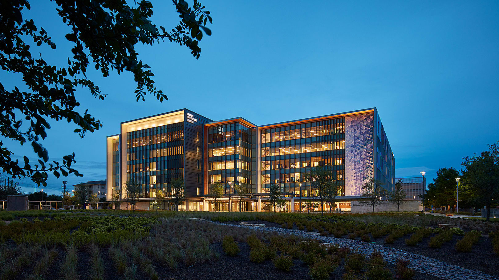
For more than 125 years, the Parkland Health and Hospital System has been Dallas’ primary treatment center for the city’s sickest patients, often those with no access to health insurance and living below the poverty line. When Parkland replaced its massive acute care hospital, its multiple clinics were still located in outdated facilities across the city. This project elegantly unites the 24 disparate clinics in a central building on Parkland’s new campus, creating a dignified health community for all.
Built on a former industrial site that was later turned into a parking lot, the clinic’s massing and landscape plan, which aims to “put the park back in Parkland,” emphasize wellness. A network of greenspaces stretch between the clinic and the main hospital, and a new park celebrates those arriving by public transit and pedestrians traveling to the clinic from the main hospital. In placing park land on the former parking lot, the hospital has signaled its investment in the county’s biosphere and community. The clinic also includes a new rehab garden that helps Dallas’ young athletes get back on the court or field quickly, as well as a walking trail that meanders through a new garden on the southwest portion of the site.
The tax-funded hospital aims to be the foundation for a healthier Dallas, and the clinic’s design team paid careful attention to both initial cost and long-term flexibility. Standardization and modularity, from prefabricated wall panels on the exterior to standardized clinic pods within, help bring quality and flexibility to the LEED Gold-certified building.
The team developed a new clinic module that works for each of the specialty clinics within and maximizes flow to adjacent ones, a programming strategy that allows for quick conversions and potential future changes in healthcare system operations and management. High-volume functions, such as the intake and visitor areas, are located on the ground floor, while others, like the signature Moody Center for Breast Health, are easy to locate across the six floors. The team spent several months analyzing and documenting existing spaces for each of the clinics in the program, discovering that each operated in isolation with different processes and private spaces. By developing a standardized clinic pod model, the team standardized processes for the unified building, which, in turn, accommodates change-readiness and flexibility.
Today, under one roof, the Parkland Moody Outpatient Center serves a daily population of more than 800 patients with serious conditions such as breast cancer, HIV, diabetes, and severe injuries. Through the collaborative process that drove the project, the clinic boasts 60 additional exam rooms with just a fraction of added square footage.
Sarasota Memorial Hospital-Venice | Flad Architects | Venice, Florida
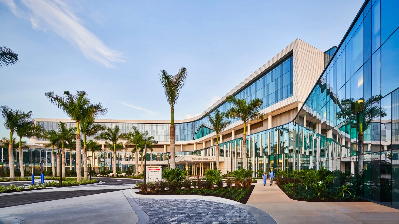
Sarasota Memorial Hospital-Venice is a new source of high-quality medical services for the growing population of Venice, Florida. As the first inpatient facility off of its central campus, the new hospital bolsters Sarasota Memorial Health Care System’s commitment to innovative care and is the system’s most significant expansion in nearly a century.
One of the largest healthcare providers in Florida, Sarasota Memorial Health Care System is renowned for the advanced care it provides across its elegant spaces. This new five-story hospital, both gracious and inviting, builds on that brand while also extending the reach of the system’s top-ranked emergency and medical services. As it embarked on creating a new greenfield hospital campus, the system aimed to create a full-service hospital reflective of its existing post-war architectural style that could be easily navigated and expanded, if needed.
The resulting hospital includes 110 private patient rooms, medical and surgical care rooms, an intensive care unit, and women’s health services. Its surgical center features eight leading-edge operating rooms, including two C-section rooms and two cardiac catheterization labs. A medical office is connected to the hospital, offering direct access to outpatient services to improve overall patient care and physician accessibility. Perhaps most important, the master plan for the facility allows it to more than triple its current size through two additional patient towers planned for the rear of the hospital, avoiding any disruption to the main entrance and patient experience. Because of overall demand and the closure of a competing hospital, construction of one of those towers is underway and expected to open in late 2024.
The team carefully considered the patient’s journey through the hospital, including the period before they enter it. Thoughtful site planning and highly visible entry points offer clarity for patients and visitors and help alleviate distress. As they enter the expansive, double-height lobby, patients, families, and visitors are directed to registration, imaging, and surgical services, while food and nutrition amenities remain within view.
A central courtyard across from the main entrance is enlivened by a lit water feature with outdoor seating—a central landmark visible from the hospital’s primary exterior and interior corridors. Check-in desks, waiting areas, places of respite, and vertical circulation points are scattered along the interior paths, where serpentine lighting coves flow from the lobby to various departments. The lighting, in addition to shaping a pleasant atmosphere, reinforces the intuitive navigation.
Construction of the hospital began in spring 2018 and faced numerous delays during the COVID-19 pandemic and due to hurricane-related shutdowns. Despite the challenges, the hospital opened on time and on budget in fall 2021. Within a week, the hospital was full, a testament to the quality of care and the urgency of demand.
Seattle Children's Building Care: Diagnostic and Treatment Facility | ZGF Architects | Seattle
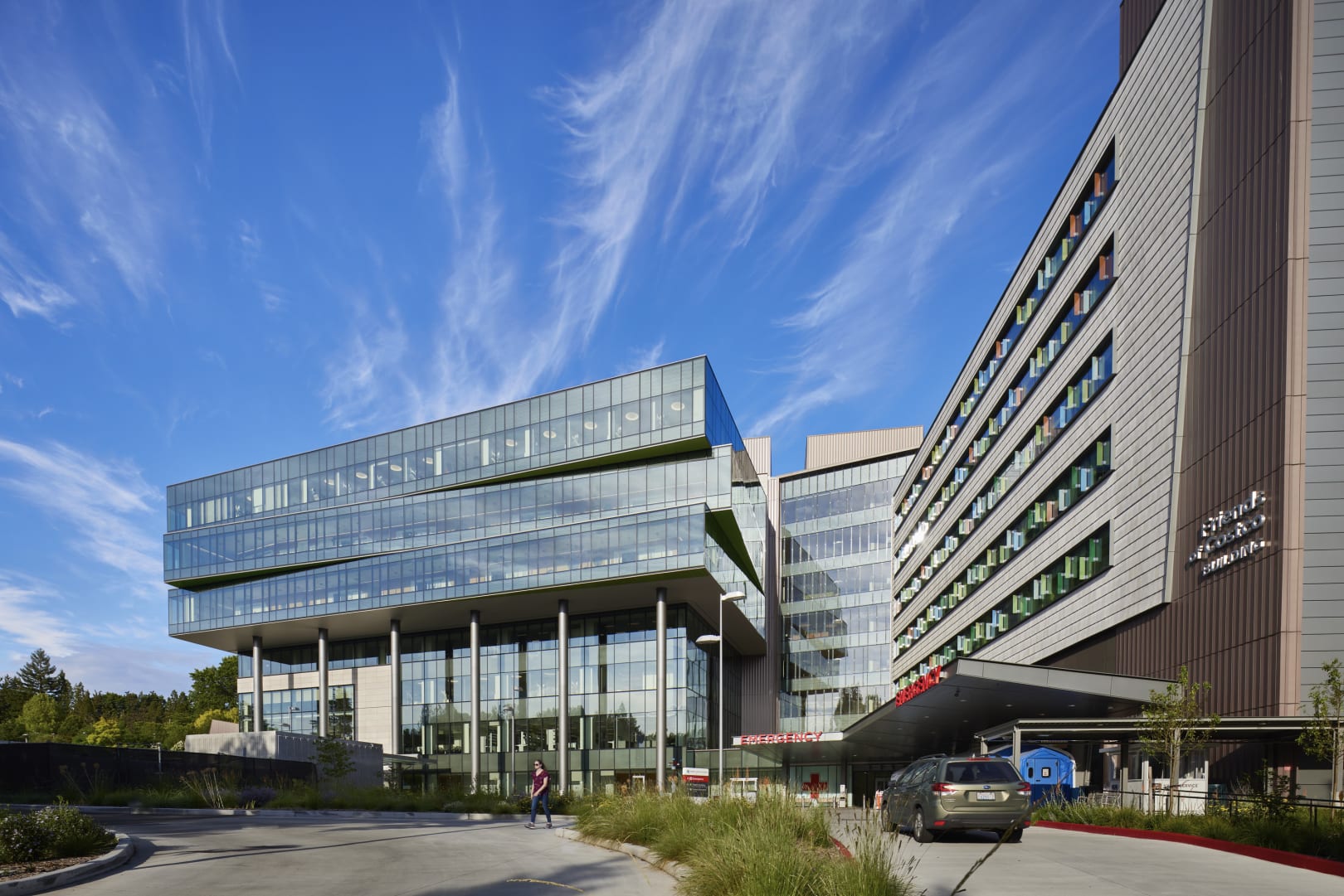
Despite steady growth over the years, demand for Seattle Children’s services has outpaced its capabilities. This project, which hinges on a more than 20-year relationship between the design team and health system, expands the hospital by 485,500 square feet to ensure the region’s children receive the quality care they deserve, including life-saving treatments and surgeries.
Seattle Children’s was founded more than a century ago by a group of philanthropists to care for children regardless of their backgrounds or their family’s ability to pay. That legacy of giving is reflected in this project, which aimed to modernize and expand access to critical diagnostic and treatment services for the region’s sickest children.
Hundreds of hospital employees, families, and community members joined the design team for 55 immersive planning and design workshops in pursuit of a high-performing and patient-centered model of care. Such a high level of engagement also reinforces the hospital’s efforts to address health disparities and improve the lives of all members of the greater community.
The expansion serves as the hospital’s new front door and fully explores the notion of transformative care, which, for children and families, begins and ends with an easy hospital journey where they can focus on the care instead of the process. For the hospital staff, that means an optimized work environment that allows each person to focus on delivering quality care with dedicated amenities and spaces for respite nearby.
Across eight above-ground floors and three levels of underground parking, the expansion delivers eight new operating suites, two catheterization labs, 20 flexible inpatient rooms, a new outpatient clinic specializing in cancers and blood disorders, two pharmacies, and numerous laboratories. It is connected physically and programmatically to an earlier project phase, an inpatient bed tower and emergency department the team also designed. The pending third phase will bookend this expansion with yet another inpatient tower.
A crucial driver of the design was the creation of horizontal connections across the hillside campus, maximizing connectivity across the sloped site. Treatment spaces sit adjacent to the inpatient beds, minimizing transport times and placing vital services closer to the hospital’s high-acuity patients.
A wayfinding “discovery trail” ties all four zones of the hospital together, drawing on themes from forest, river, mountain, and ocean biomes. This new expansion houses the forest zone, where connections, or “trails,” stretch from its third level to the rest of the lower campus and from its seventh level to the upper campus. They allude to the forest pathways found throughout the Pacific Northwest’s natural habitats. A story pole, created by Native American artist Shaun Peterson, serves as a gathering point at the new front door and marks the beginning of the team’s comprehensive wayfinding strategy. Nearby, a large and interactive map demonstrates how all four zones are connected and highlights the easiest pathways to a destination.
VA Worcester Community-Based Outpatient Clinic | SmithGroup | Worcester, Massachusetts
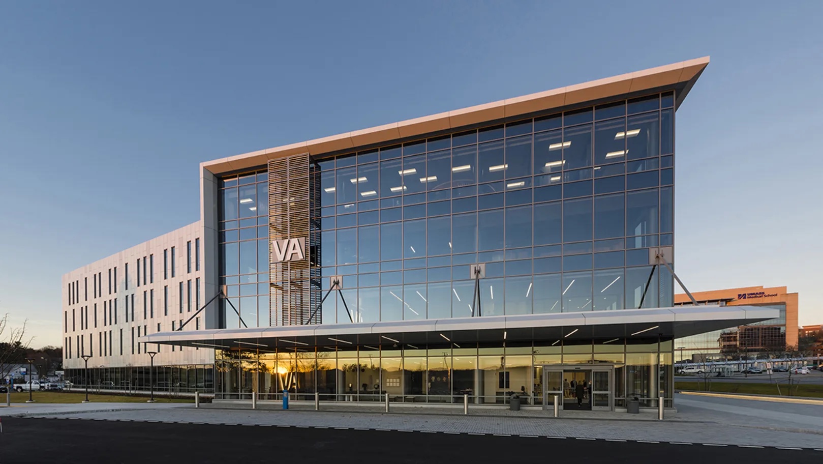
Born from a design-build partnership between architect and contractor, this four-story medical office building is among the newest additions to the University of Massachusetts Chan Medical School Campus. Its design approach is twofold, honoring the service and sacrifice of the nation’s veterans and fitting seamlessly into the campus’ larger context. The design process incorporated the Department of Veterans Affairs Community-Based Outpatient Clinic model, a nationwide effort to reduce barriers veterans often face in seeking care and expand the department’s capacity to provide quality outpatient primary care.
The team’s dual approach to the project can be found in the building’s grand design moves and the subtle details—materials, graphics, and patterning—throughout. The project relates to the rest of the campus through its terracotta, glass, and metal panel façade, which echoes the features of the adjacent academic setting. Its massing also aligns with the established campus geometry with just one deviation: a glass corner that is framed with crisp white lines that highlights the veterans’ entrance.
An awareness of veterans’ combat experience informed the clinic’s design and layout. The team recognized that many veterans who have experienced combat conditions do not encounter a building in the same way the civilian population does. Facing away from the campus, the east elevation acknowledges veterans with its energetic rhythm of slender windows. Exit stairs are enclosed in glass to provide escape route and egress clarity for those living with post-traumatic stress disorder. One stair features a four-story American flag supergraphic. Together, these design gestures embedded in the architecture symbolize respect and permanence, and that veterans should be recognized every day.
The Department of Veterans Affairs leases the first two floors of the building, offering 90% of the services veterans seek in a single, convenient location. The clinical spaces rely on the department’s Patient Aligned Care Team template for outpatient services, including radiology, cardiology, mental health, rehabilitation, and pharmacy and laboratory services. The upper floors are reserved for UMass outpatient and administrative programs and are connected to a five-story parking structure by a pedestrian bridge. The structure adds 160 new parking spaces dedicated to veterans’ use.
The clinic was designed to meet a Two Green Globes rating as required by the Department of Veteran Affairs’ lease agreement. Additionally, the clinic meets the Massachusetts LEED Plus green building standard and has achieved LEED Silver certification.
Overall, the clinic is a salute to those who need care and those who provide it. Its official opening in fall 2021 was a testament to its importance, drawing dignitaries and elected officials from all levels of government, including the secretary of veterans affairs.
Category C: Renovations/Remodeled: Primarily built within existing hospital or clinical space or adaptive reuse of an existing building to a healthcare use.
Penn State Health Milton S. Hershey Medical Center Children's Hospital Vertical Expansion | Payette | Hershey, Pennsylvania
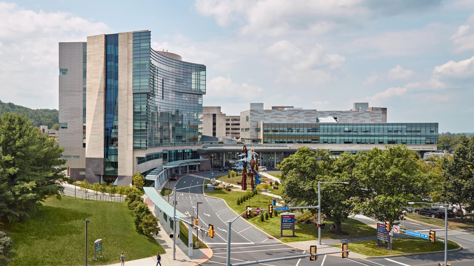
This project in Hershey, Pennsylvania, is the final piece of Penn State Children’s Hospital’s Clinical Quadrangle Master Plan, which charted the medical center’s largest expansion since its original construction in the early 1960s by adding more than 500,000 square feet of new construction. The vertical expansion crowns the hospital with three new floors that bolster its ability to provide pediatric inpatient care, completing a strategy envisioned by the team during the design and construction of the hospital in 2012.
An overarching goal of the project was to create an integrated facility by consolidating related programs that were previously dispersed throughout the campus. The expansion has collocated the labor and delivery section of Penn State’s women’s health program with its well-baby nursery and the neonatal intensive care unit. Centralizing these critical areas of care has allowed the medical center to improve and expand services for new mothers and babies, including critically ill infants.
The new LEED Silver-certified facility was designed as a continuation of the hospital’s architecture, providing visual continuity as it flows along the campus’ “arc,” a sweeping form that establishes the alignment of the campus buildings, landscape, and infrastructure. That continuity is enhanced through subtle exterior plane shifts that introduce slight articulations that mark the expansion. The exterior walls are integrated seamlessly into the hospital, presenting it as a single building. A double-height lobby welcomes families on the seventh level, which floats above the main hospital lobby and functions as a soft-glowing beacon.
Throughout the master planning process, the campus was envisioned as a garden hospital organized around a network of courtyards and gardens that connect patients and their families with nature. In the children’s hospital, that concept is enhanced through a palette of shapes, colors, and materials that reinforce the theme of healing through nature. The theme now extends into the vertical expansion where finishes and colors shape an uplifting, healing environment that aims to bring hope and joy to families and visitors.
Through its design, the building choreographs how patients and families experience the hospital. The first floor emphasizes movement through sweeping pathways that carry visitors to a café, family resources, meditation room, garden, conference center, and other features. Corridors on the floors above are designed as extensions of the patient rooms and were envisioned as eddies and streams. A primary tributary arcs toward a gathering area where cascading glass, reminiscent of a waterfall, offers views of the campus.
The team organized the expansion’s clinical areas to optimize workflow while simultaneously maximizing staff productivity, resulting in flexible spaces for providers and staff members. While functional, the spaces are also colorful and comfortable and create a cohesive and welcoming healing environment. A centrally located room in every unit combines clean supplies, medication storage, and preparation areas. They are paired with a shared open area for care team providers that facilitates collaboration.
More on the 2023 Healthcare Design Awards winners.
Related Stories
| Aug 11, 2010
Stimulus funding helps get NOAA project off the ground
The award-winning design for the National Oceanic and Atmospheric Administration’s new Southwest Fisheries Science Center replacement laboratory saw its first sign of movement last month with a groundbreaking ceremony held in La Jolla, Calif. The $102 million project is funded primarily by the American Recovery and Reinvestment Act.
| Aug 11, 2010
National Intrepid Center tops out at Walter Reed
SmithGroup, Turner Construction, and the Intrepid Fallen Heroes Fund (IFHF), a nonprofit organization supporting the men and women of the United States Armed Forces and their families, celebrated the overall structural completion of the National Intrepid Center of Excellence (NICoE), an advanced facility dedicated to research, diagnosis, and treatment of military personnel and veterans sufferin...
| Aug 11, 2010
Alabama hospital gets a four-story addition
Birmingham, Ala.-based Hoar Construction has completed the North Tower addition at Thomas Hospital in Fairhope, Ala. The four-story, 123,000-sf addition accommodates an ER on the first floor, 32 private patient rooms and nursing support on the second and third floors, and room for 32 planned patient rooms on the top floor.
| Aug 11, 2010
America's Greenest Hospital
Hospitals are energy gluttons. With 24/7/365 operating schedules and stringent requirements for air quality in ORs and other clinical areas, an acute-care hospital will gobble up about twice the energy per square foot of, say, a commercial office building. It is an achievement worth noting, therefore, when a major hospital achieves LEED Platinum status, especially when that hospital attains 14 ...
| Aug 11, 2010
Hospital Additions + Renovations: 14 Lessons from Expert Building Teams
Two additions to a community hospital in Ohio that will double its square footage. A 12-story addition on top of an existing 12-story tower at Houston's M.D. Anderson Cancer Center. A $54 million renovation and addition at the University of Virginia Medical Center. A 67-bed, $70 million addition/renovation to a community hospital that is only five years old.
| Aug 11, 2010
Research Facility Breaks the Mold
In the market for state-of-the-art biomedical research space in Boston's Longwood Medical Area? Good news: there are still two floors available in the Center for Life Science | Boston, a multi-tenant, speculative high-rise research building designed by Tsoi/Kobus & Associates, Boston, and developed by Lyme Properties, Hanover, N.
| Aug 11, 2010
3 Hospitals, 3 Building Teams, 1 Mission: Optimum Sustainability
It's big news in any city when a new billion-dollar hospital is announced. Imagine what it must be like to have not one, not two, but three such blockbusters in the works, each of them tracking LEED-NC Gold certification from the U.S. Green Building Council. That's the case in San Francisco, where three new billion-dollar-plus healthcare facilities are in various stages of design and constructi...
| Aug 11, 2010
Holyoke Health Center
The team behind the new Holyoke (Mass.) Health Center was aiming for more than the renovation of a single building—they were hoping to revive an entire community. Holyoke's central business district was built in the 19th century as part of a planned industrial town, but over the years it had fallen into disrepair.
| Aug 11, 2010
Right-Sizing Healthcare
Over the past 30 years or so, the healthcare industry has quietly super-sized its healthcare facilities. Since 1980, ORs have bulked up in size by 53%, acute-care patient rooms by 77%. The slow creep went unlabeled until recently, when consultant H. Scot Latimer applied the super-sizing moniker to hospitals, inpatient rooms, operating rooms, and other treatment and administrative spaces.
| Aug 11, 2010
Great Solutions: Healthcare
11. Operating Room-Integrated MRI will Help Neurosurgeons Get it Right the First Time A major limitation of traditional brain cancer surgery is the lack of scanning capability in the operating room. Neurosurgeons do their best to visually identify and remove the cancerous tissue, but only an MRI scan will confirm if the operation was a complete success or not.


