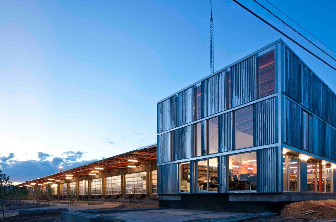
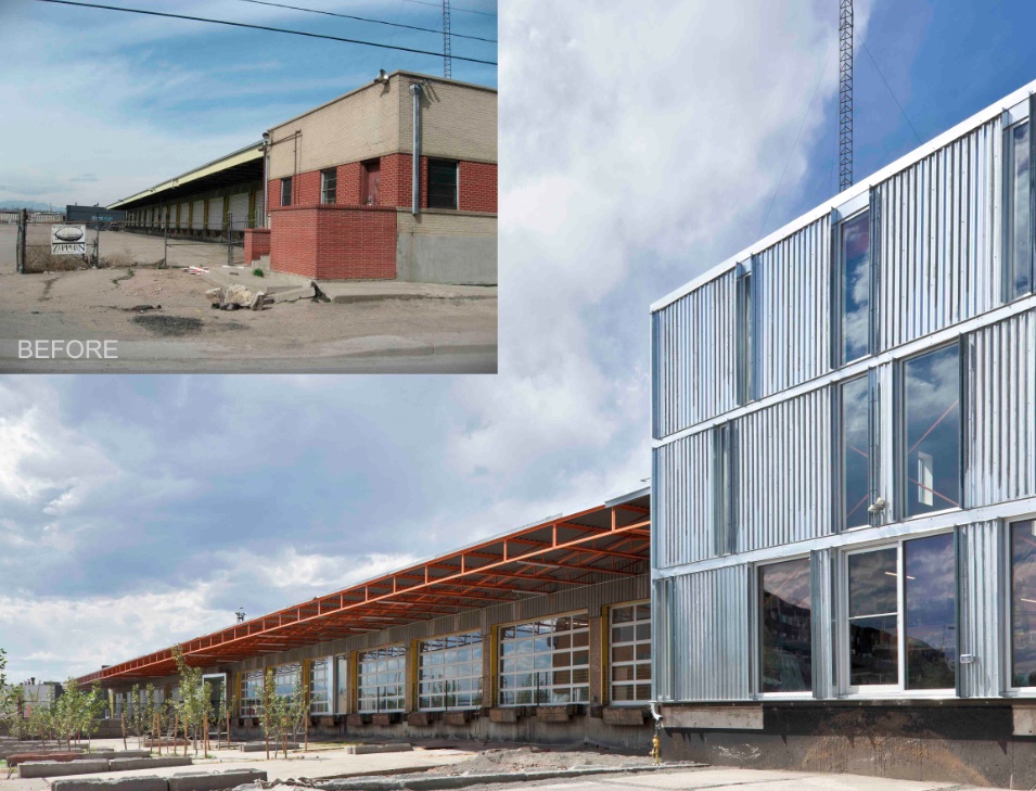
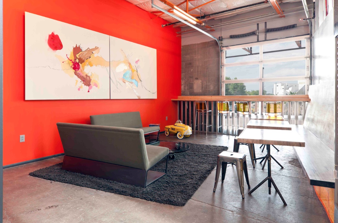
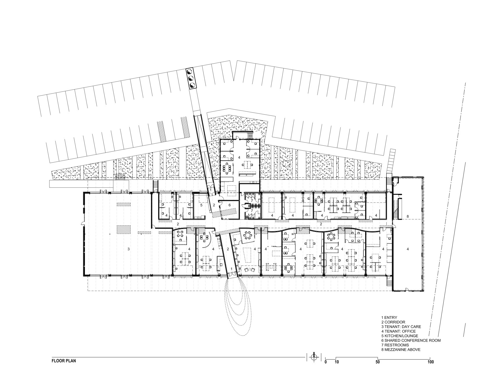
The new Freight development in Denver infuses a 29,000-sf, mid-century shipping terminal with the next evolution of TAXI creative work spaces. Flexible and filled with natural light, Freight is designed with unique and customizable spaces to suit the needs of modern businesses. Common spaces and amenities promote collaboration.
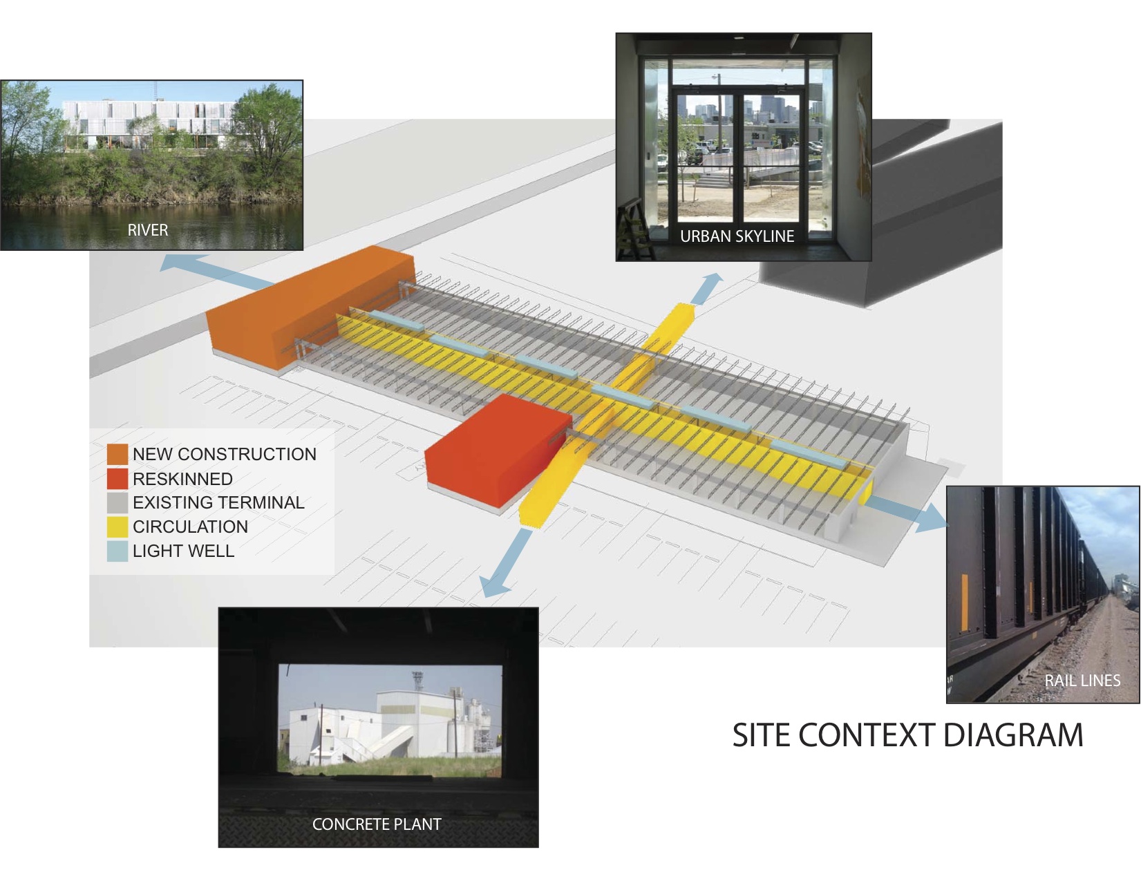
The goal of this transformation of a derelict freight terminal was to provide flexible tenant space with amenities such as common social spaces to lure “new economy” businesses to an abandoned industrial zone north of downtown Denver. The Denver warehouse redevelopment project, located between river and rail lines, is the most recent phase of a development that includes new and renovated structures that look to create a new workplace that uses architecture to foster interaction and create a culture of innovation.
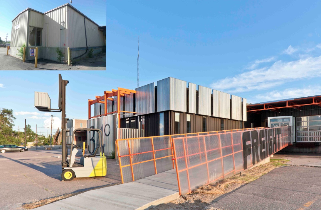
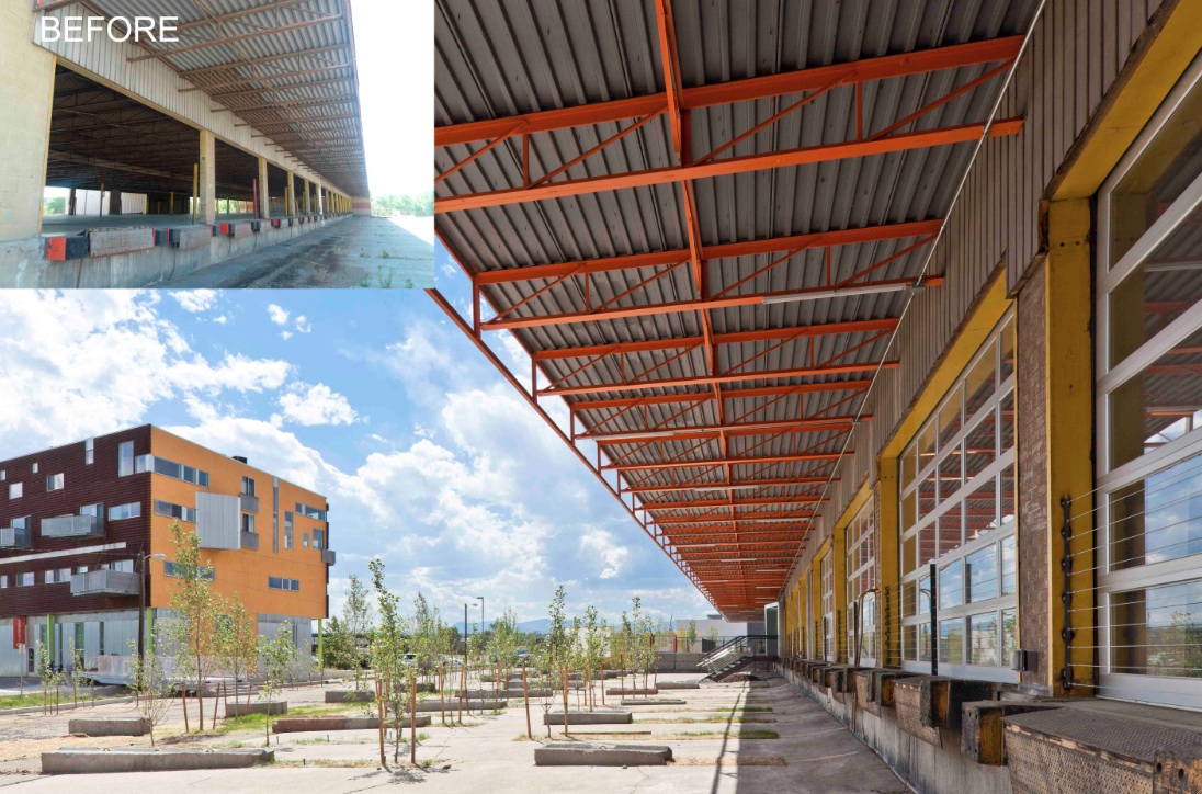
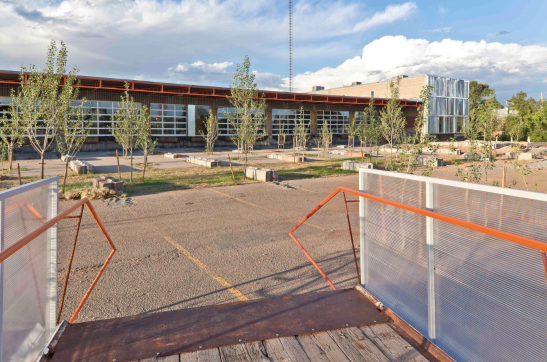
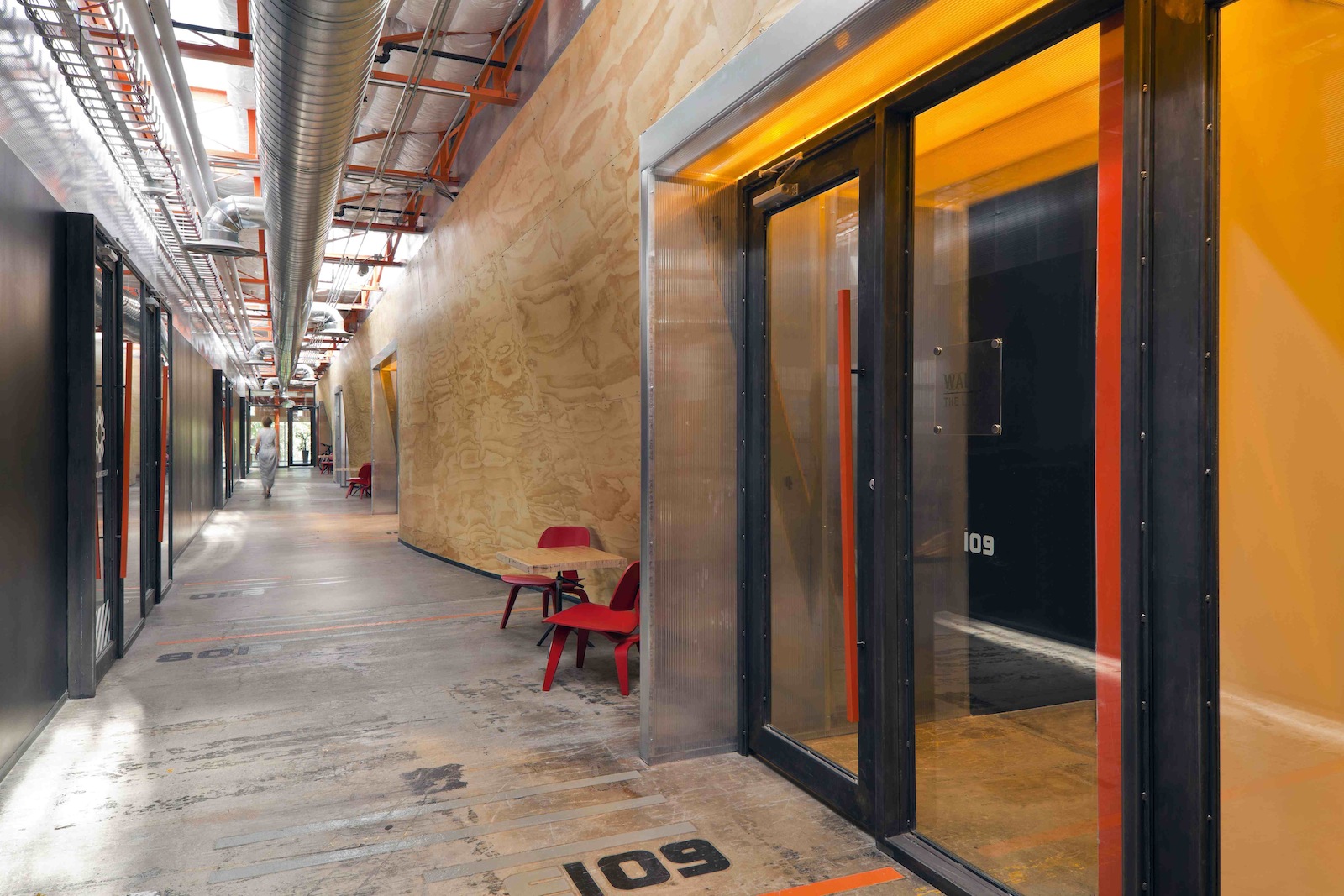
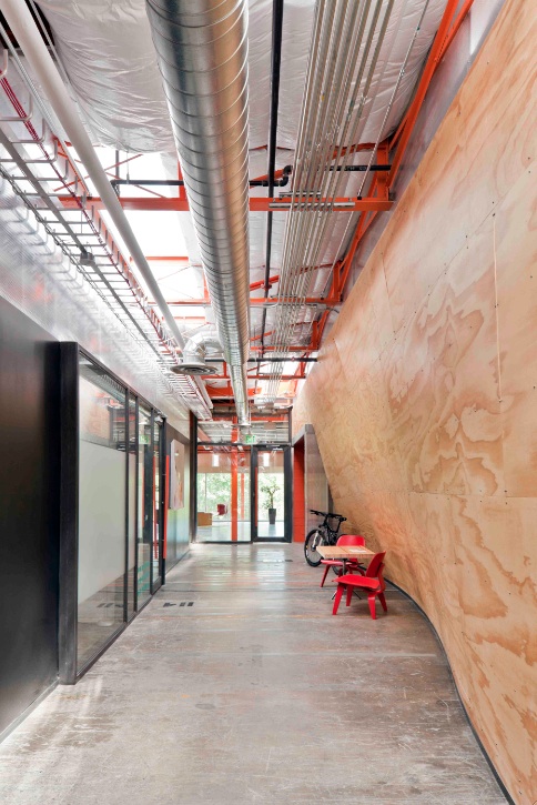
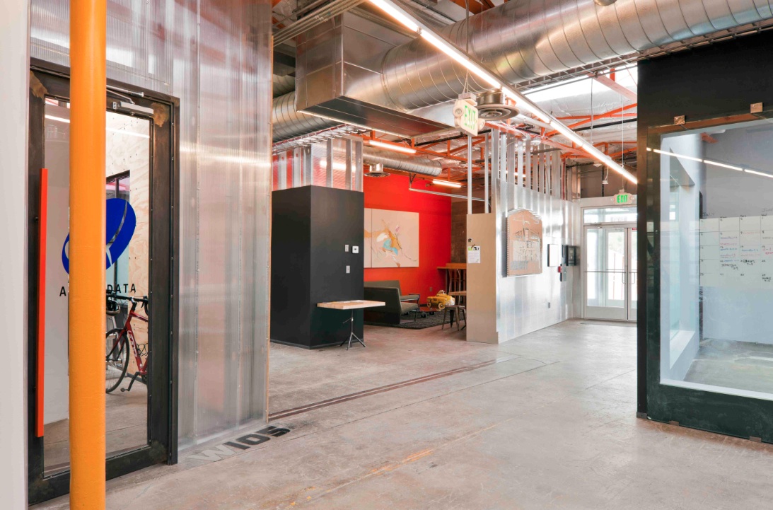
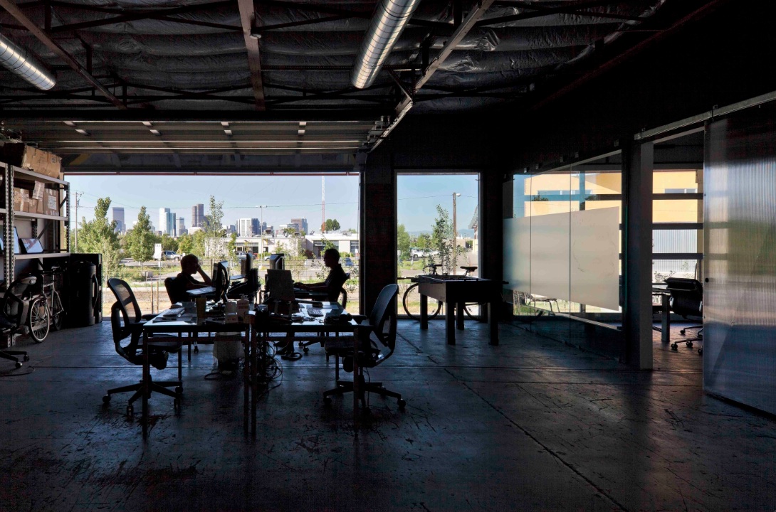
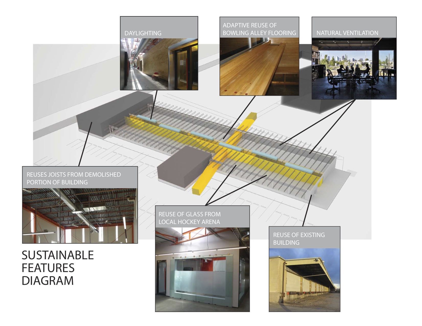
The reuse preserves the carcass of the freight terminal, with its deep overhangs and garage bay openings, and inserts new elements to contrast old. Original paint and markings are left intact with new glass overhead doors that allow offices to open to the landscape. An internal skylit “street” and sculptural plywood ribbon wall punctuated with luminous entries provides internal circulation. The main entrance slices through the building, axially connecting the entry experience to the larger site and the urban skyline beyond.
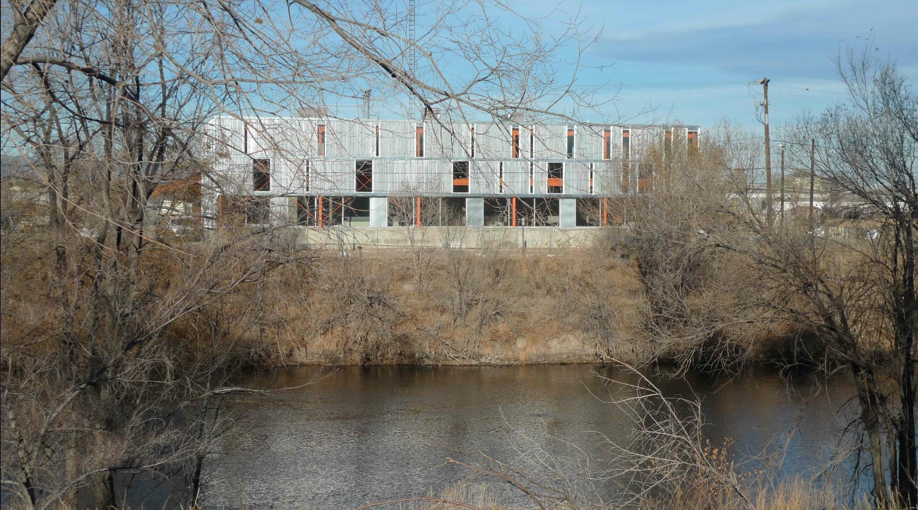
Outside, an existing metal shed projecting north was re-imaged. The new portion of the building along the river took inspiration from the movement of rail and containers, and uses trusses from the traditional administrative component at the head of the terminal that had been razed. A ghosting of the former truck dock pattern extends as adjacent landscape pattern.
Tenant spaces were arranged from a kit of industrial components and materials included reused glass panels from a hockey rink as internal partitions, salvaged bowling alley floors for benches, tables and counters, and industrial shelves in a variety of configurations to conform to a challenging budget. “International Orange” enlivens structural components throughout.
Client: Zeppelin Places
Architect: Stephen Dynia Architects
Site area: 4 acres
Gross Floor area: 29,000 sf
Location: Denver
Photos: Ron Johnson
Related Stories
Green | Apr 8, 2024
LEED v5 released for public comment
The U.S. Green Building Council (USGBC) has opened the first public comment period for the first draft of LEED v5. The new version of the LEED green building rating system will drive deep decarbonization, quality of life improvements, and ecological conservation and restoration, USGBC says.
Codes and Standards | Apr 8, 2024
Boston’s plans to hold back rising seawater stall amid real estate slowdown
Boston has placed significant aspects of its plan to protect the city from rising sea levels on the actions of private developers. Amid a post-Covid commercial development slump, though, efforts to build protective infrastructure have stalled.
Sustainability | Apr 8, 2024
3 sustainable design decisions to make early
In her experience as an architect, Megan Valentine AIA, LEED AP, NCARB, WELL AP, Fitwel, Director of Sustainability, KTGY has found three impactful sustainable design decisions: site selection, massing and orientation, and proper window-to-wall ratios.
Brick and Masonry | Apr 4, 2024
Best in brick buildings: 9 projects take top honors in the Brick in Architecture Awards
The Ace Hotel Toronto, designed by Shim-Sutcliffe Architects, and the TCU Music Center by Bora Architecture & Interiors are among nine "Best in Class" winners and 44 overall winners in the Brick Industry Association's 2023 Brick in Architecture Awards.
Retail Centers | Apr 4, 2024
Retail design trends: Consumers are looking for wellness in where they shop
Consumers are making lifestyle choices with wellness in mind, which ignites in them a feeling of purpose and a sense of motivation. That’s the conclusion that the architecture and design firm MG2 draws from a survey of 1,182 U.S. adult consumers the firm conducted last December about retail design and what consumers want in healthier shopping experiences.
Healthcare Facilities | Apr 3, 2024
Foster + Partners, CannonDesign unveil design for Mayo Clinic campus expansion
A redesign of the Mayo Clinic’s downtown campus in Rochester, Minn., centers around two new clinical high-rise buildings. The two nine-story structures will reach a height of 221 feet, with the potential to expand to 420 feet.
Sports and Recreational Facilities | Apr 2, 2024
How university rec centers are evolving to support wellbeing
In a LinkedIn Live, Recreation & Wellbeing’s Sadat Khan and Abby Diehl joined HOK architect Emily Ostertag to discuss the growing trend to design and program rec centers to support mental wellbeing and holistic health.
Architects | Apr 2, 2024
AE Works announces strategic acquisition of WTW Architects
AE Works, an award-winning building design and consulting firm is excited to announce that WTW Architects, a national leader in higher education design, has joined the firm.
Office Buildings | Apr 2, 2024
SOM designs pleated façade for Star River Headquarters for optimal daylighting and views
In Guangzhou, China, Skidmore, Owings & Merrill (SOM) has designed the recently completed Star River Headquarters to minimize embodied carbon, reduce energy consumption, and create a healthy work environment. The 48-story tower is located in the business district on Guangzhou’s Pazhou Island.
K-12 Schools | Apr 1, 2024
High school includes YMCA to share facilities and connect with the broader community
In Omaha, Neb., a public high school and a YMCA come together in one facility, connecting the school with the broader community. The 285,000-sf Westview High School, programmed and designed by the team of Perkins&Will and architect of record BCDM Architects, has its own athletic facilities but shares a pool, weight room, and more with the 30,000-sf YMCA.


