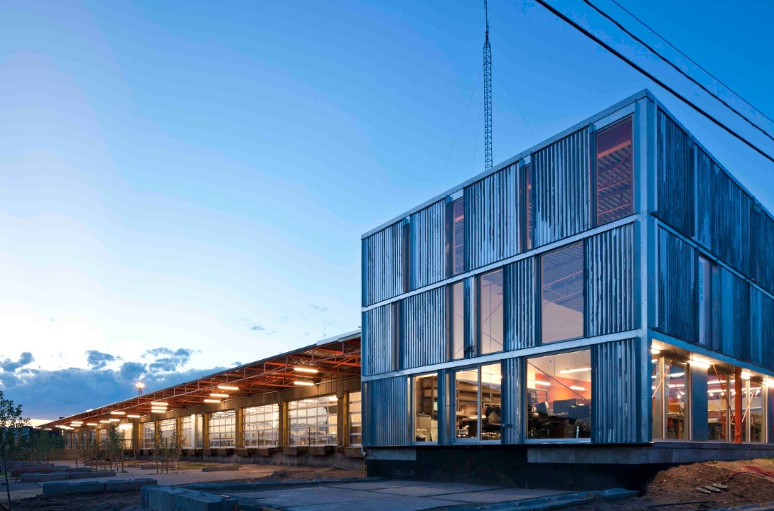
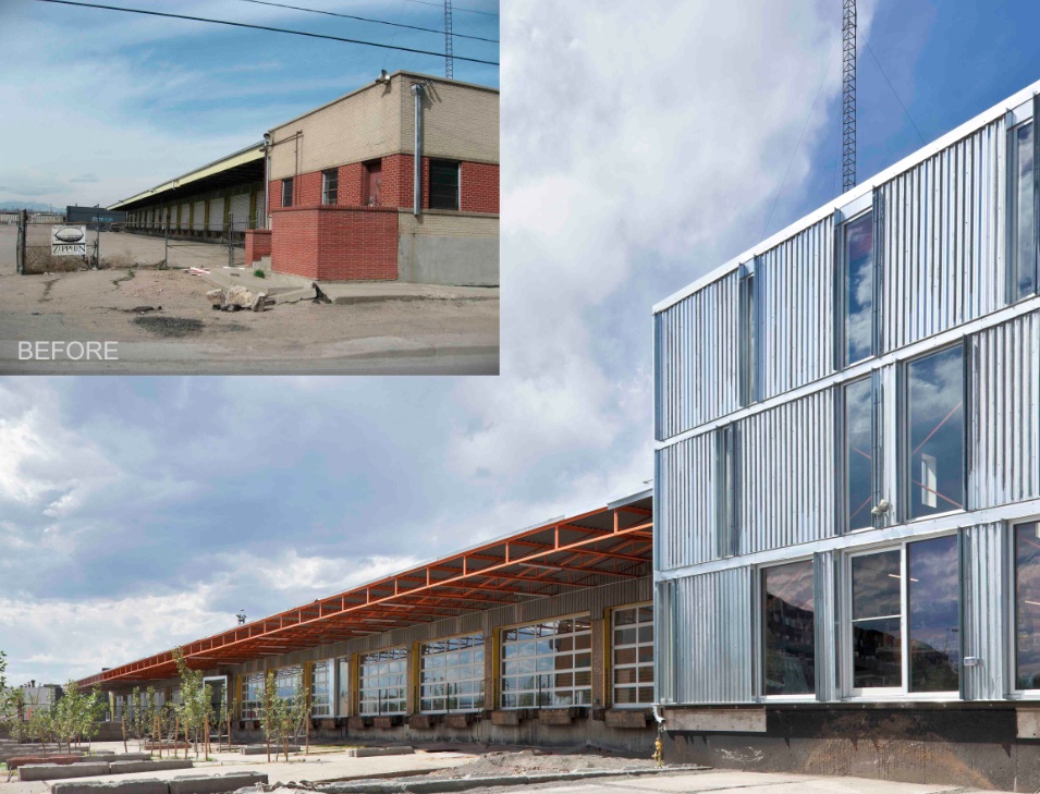
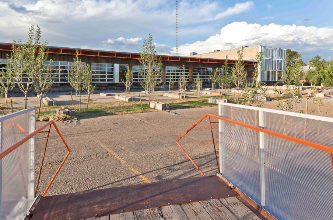
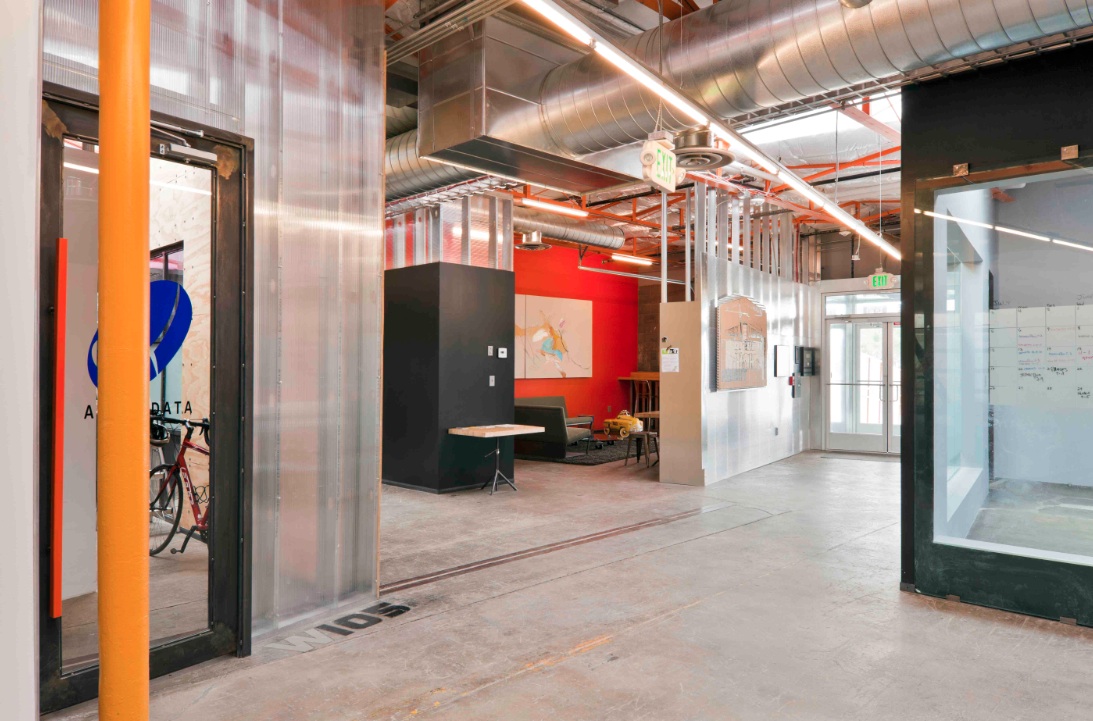
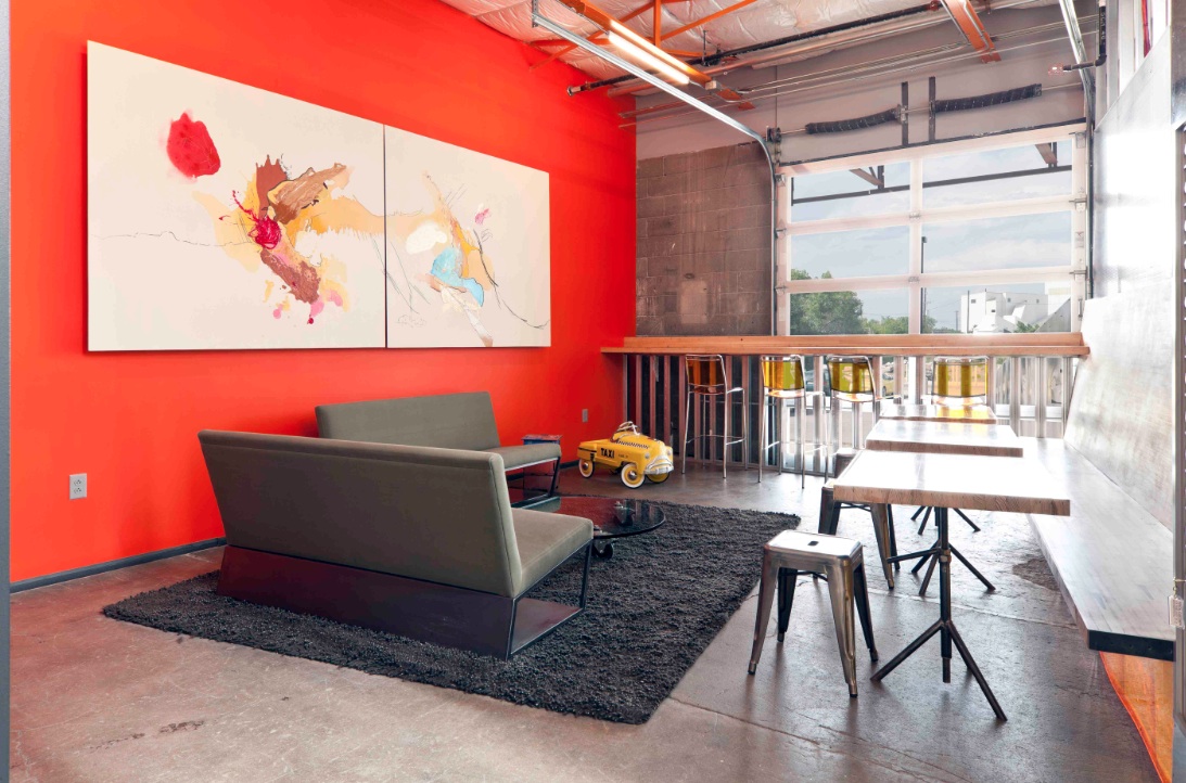
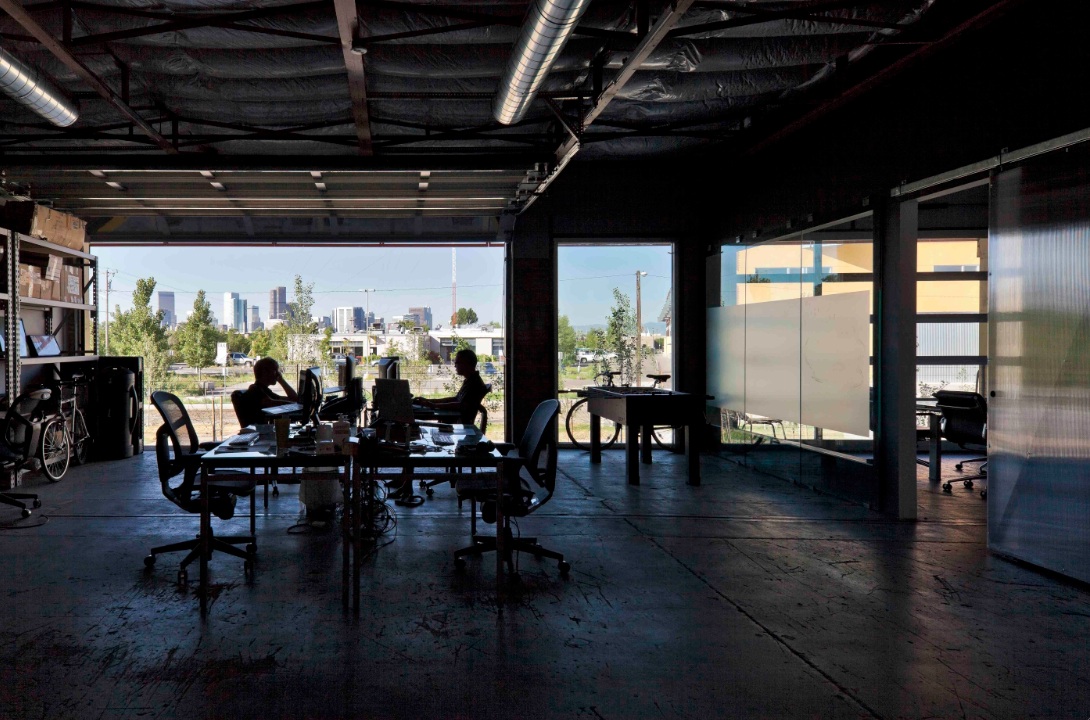
The new Freight development in Denver infuses a 29,000-sf, mid-century shipping terminal with the next evolution of TAXI creative work spaces. Flexible and filled with natural light, Freight is designed with unique and customizable spaces to suit the needs of modern businesses. Common spaces and amenities promote collaboration.
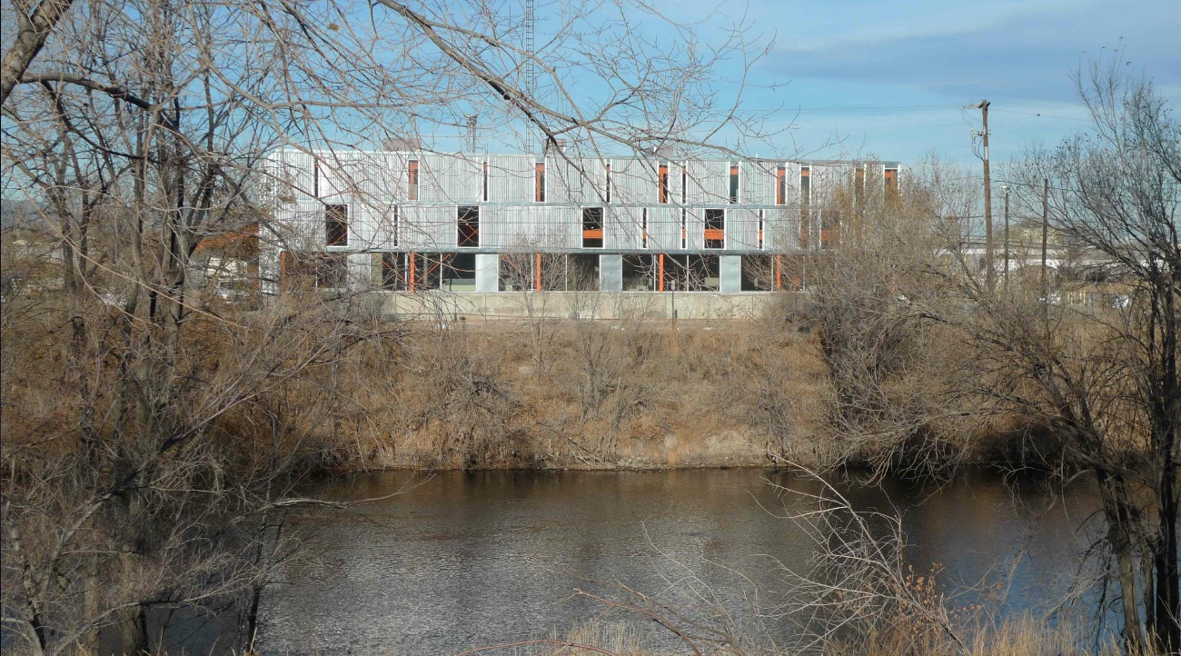
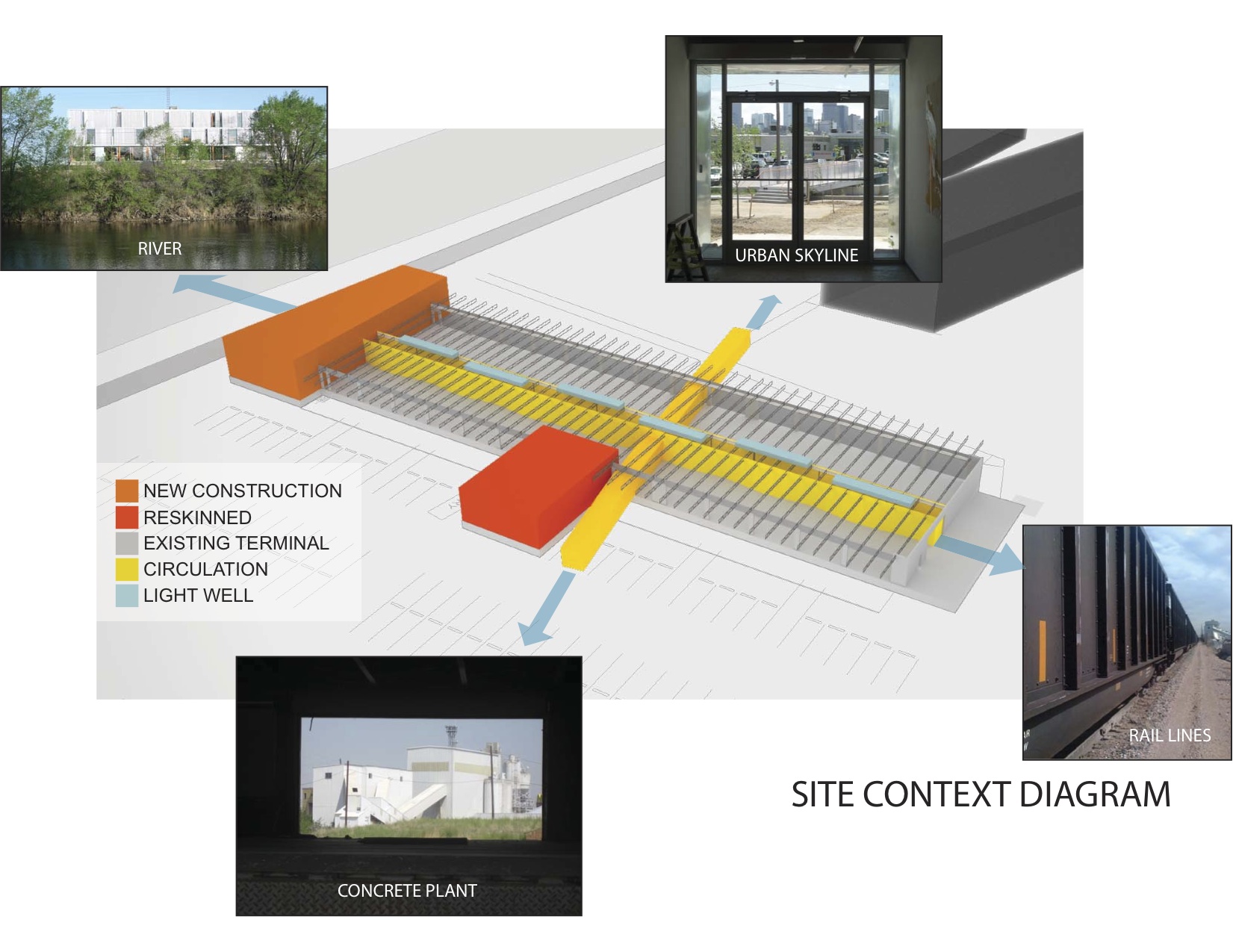
The goal of this transformation of a derelict freight terminal was to provide flexible tenant space with amenities such as common social spaces to lure “new economy” businesses to an abandoned industrial zone north of downtown Denver. The Denver warehouse redevelopment project, located between river and rail lines, is the most recent phase of a development that includes new and renovated structures that look to create a new workplace that uses architecture to foster interaction and create a culture of innovation.
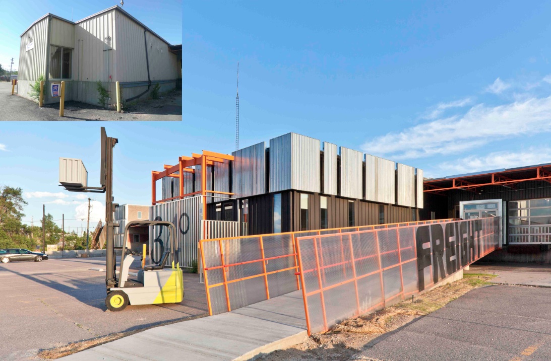
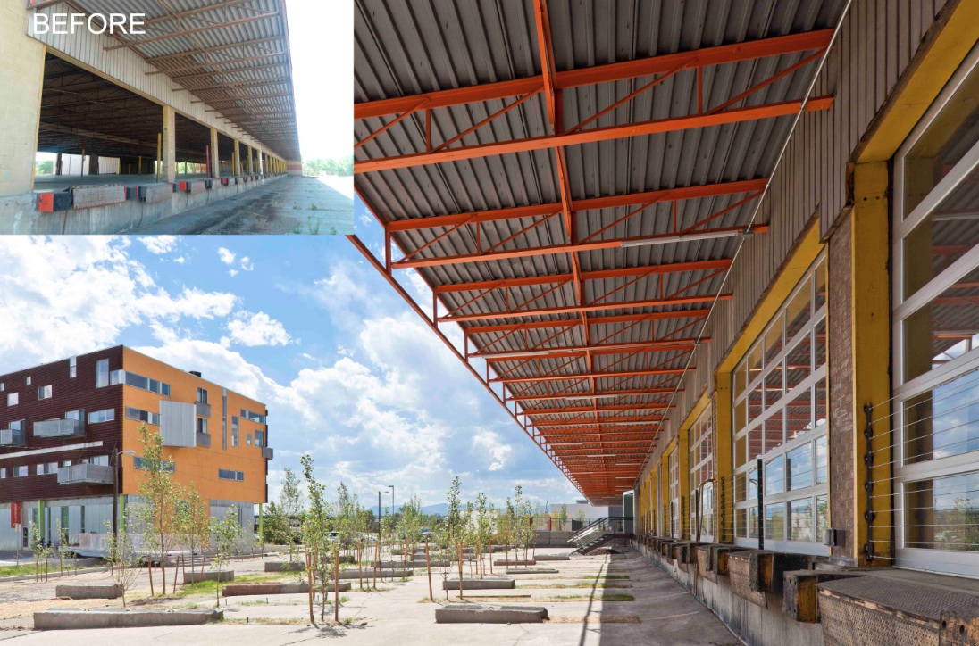
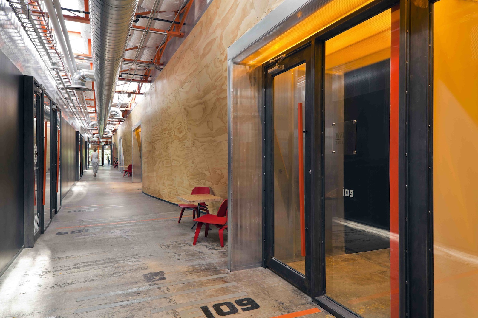
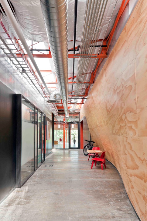
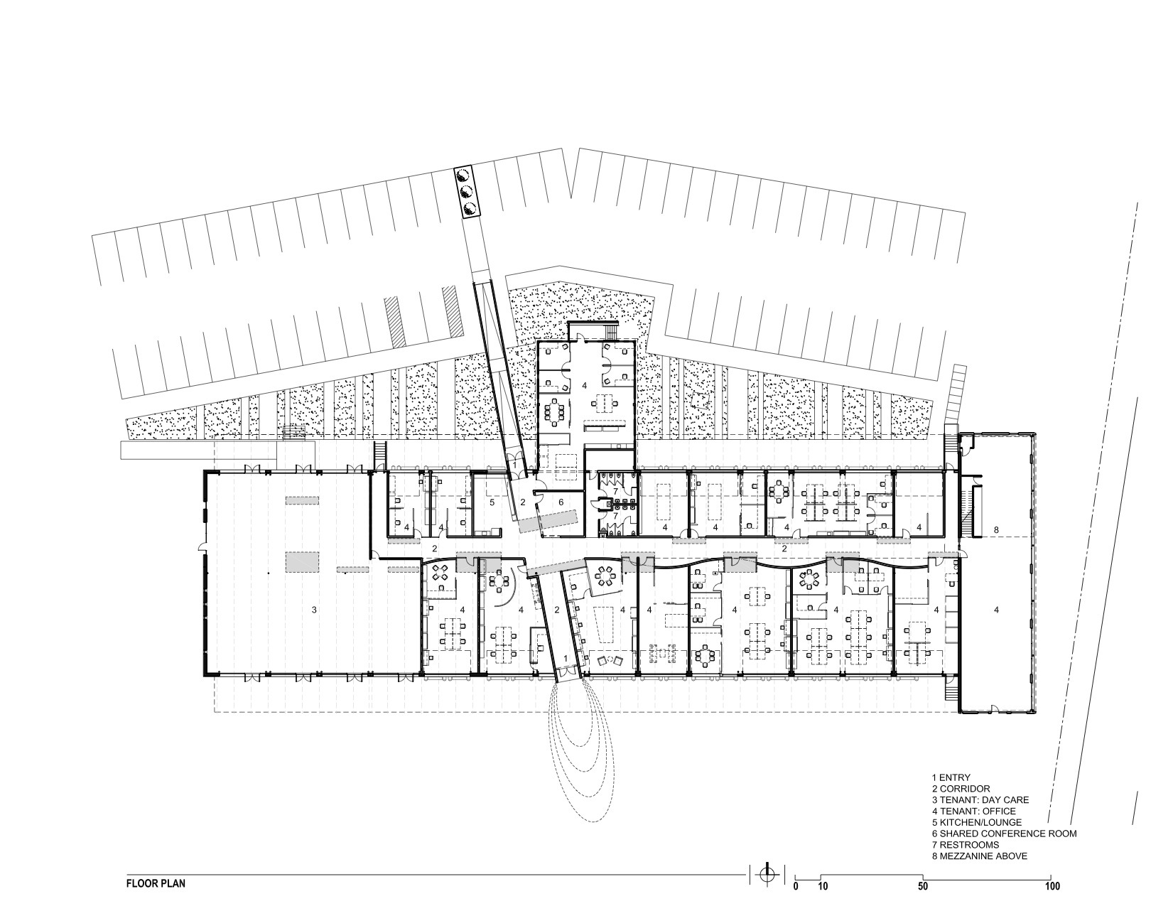
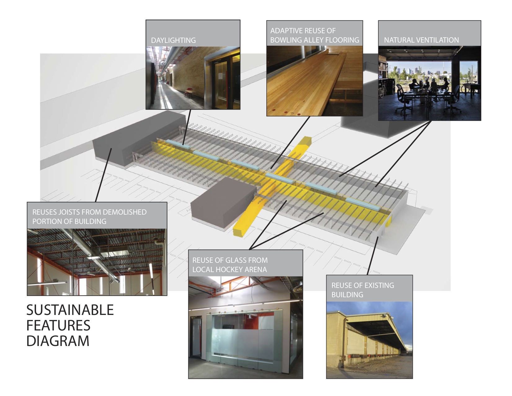
The reuse preserves the carcass of the freight terminal, with its deep overhangs and garage bay openings, and inserts new elements to contrast old. Original paint and markings are left intact with new glass overhead doors that allow offices to open to the landscape. An internal skylit “street” and sculptural plywood ribbon wall punctuated with luminous entries provides internal circulation. The main entrance slices through the building, axially connecting the entry experience to the larger site and the urban skyline beyond.
Outside, an existing metal shed projecting north was re-imaged. The new portion of the building along the river took inspiration from the movement of rail and containers, and uses trusses from the traditional administrative component at the head of the terminal that had been razed. A ghosting of the former truck dock pattern extends as adjacent landscape pattern.
Tenant spaces were arranged from a kit of industrial components and materials included reused glass panels from a hockey rink as internal partitions, salvaged bowling alley floors for benches, tables and counters, and industrial shelves in a variety of configurations to conform to a challenging budget. “International Orange” enlivens structural components throughout.
Client: Zeppelin Places
Architect: Stephen Dynia Architects
Site area: 4 acres
Gross Floor area: 29,000 sf
Location: Denver
Photos: Ron Johnson
Related Stories
| Dec 12, 2011
Mojo Stumer takes top honors at AIA Long Island Design Awards
Firm's TriBeCa Loft wins "Archi" for interior design.
| Dec 10, 2011
10 Great Solutions
The editors of Building Design+Construction present 10 “Great Solutions” that highlight innovative technology and products that can be used to address some of the many problems Building Teams face in their day-to-day work. Readers are encouraged to submit entries for Great Solutions; if we use yours, you’ll receive a $25 gift certificate. Look for more Great Solutions in 2012 at: www.bdcnetwork.com/greatsolutions/2012.
| Dec 10, 2011
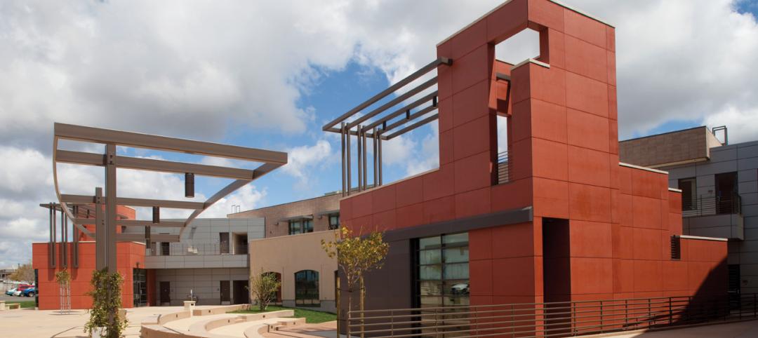
Energy performance starts at the building envelope
Rainscreen system installed at the west building expansion of the University of Arizona’s Meinel Optical Sciences Center in Tucson, with its folded glass wall and copper-paneled, breathable cladding over precast concrete.
| Dec 10, 2011
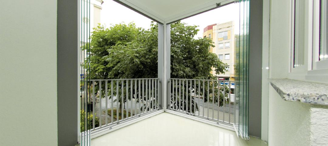
Turning Balconies Outside In
Operable glass balcony glazing systems provide solution to increase usable space in residential and commercial structures.
| Dec 10, 2011
BIM tools to make your project easier to manage
Two innovations—program manager Gafcon’s SharePoint360 project management platform and a new BIM “wall creator” add-on developed by ClarkDietrich Building Systems for use with the Revit BIM platform and construction consultant—show how fabricators and owner’s reps are stepping in to fill the gaps between construction and design that can typically be exposed by working with a 3D model.
| Dec 9, 2011
BEST AEC FIRM 2011: Chapman Construction/Design
Taking sustainable practices to heart.
| Dec 9, 2011
BEST AEC FIRMS 2011: EYP Architecture & Engineering
Expertise-Driven Design: At EYP Architecture & Engineering, growing the business goes hand in hand with growing the firm’s people.


