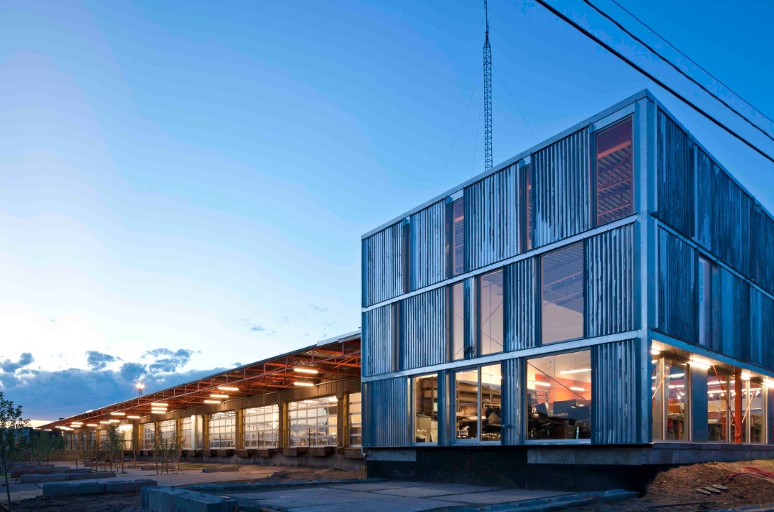
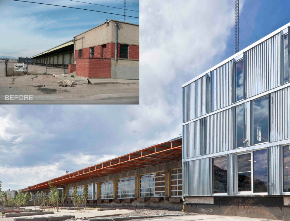
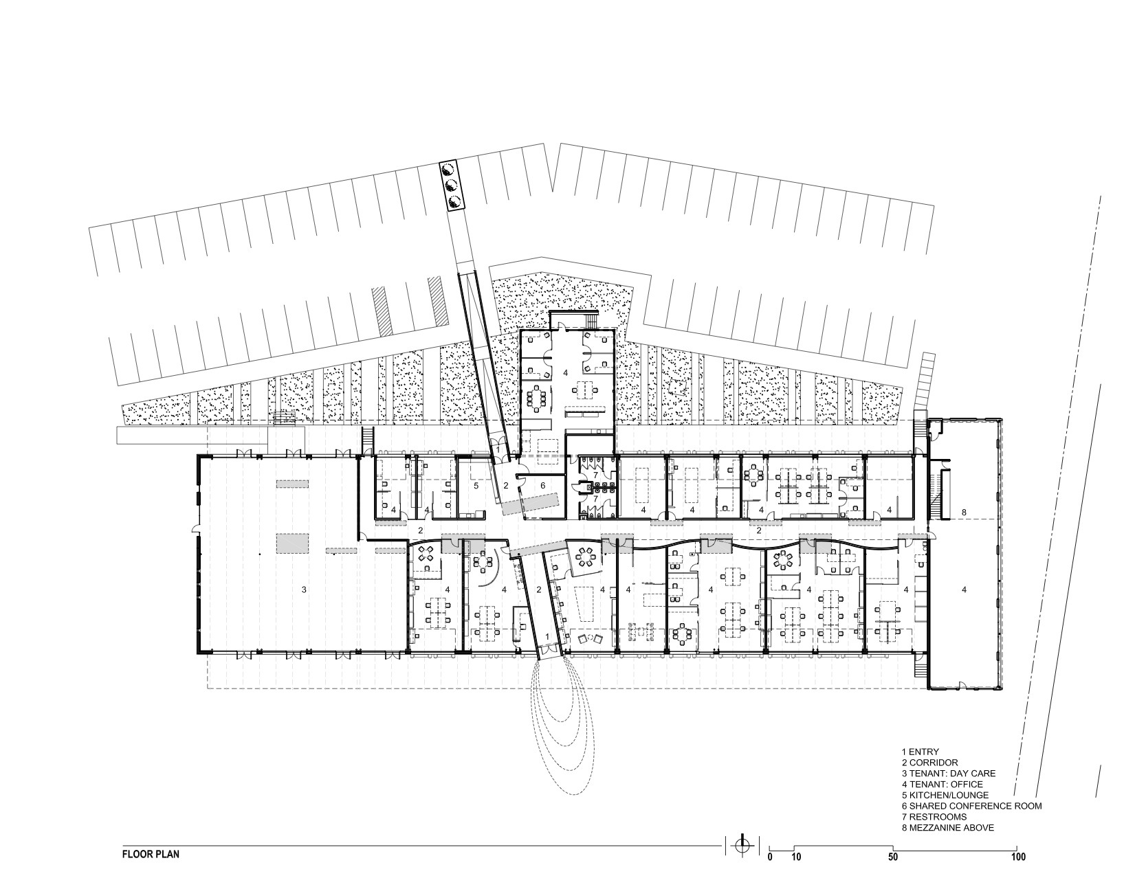
The new Freight development in Denver infuses a 29,000-sf, mid-century shipping terminal with the next evolution of TAXI creative work spaces. Flexible and filled with natural light, Freight is designed with unique and customizable spaces to suit the needs of modern businesses. Common spaces and amenities promote collaboration.
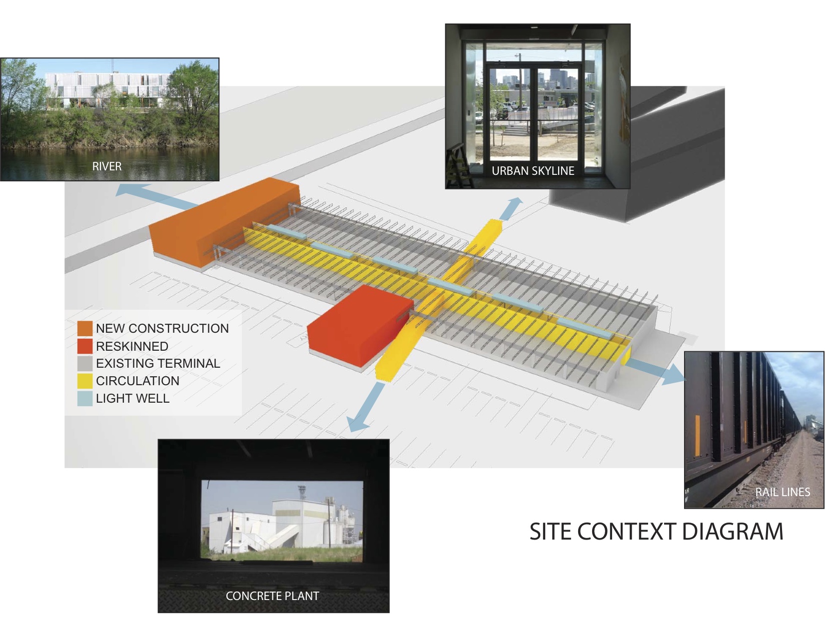
The goal of this transformation of a derelict freight terminal was to provide flexible tenant space with amenities such as common social spaces to lure “new economy” businesses to an abandoned industrial zone north of downtown Denver. The Denver warehouse redevelopment project, located between river and rail lines, is the most recent phase of a development that includes new and renovated structures that look to create a new workplace that uses architecture to foster interaction and create a culture of innovation.
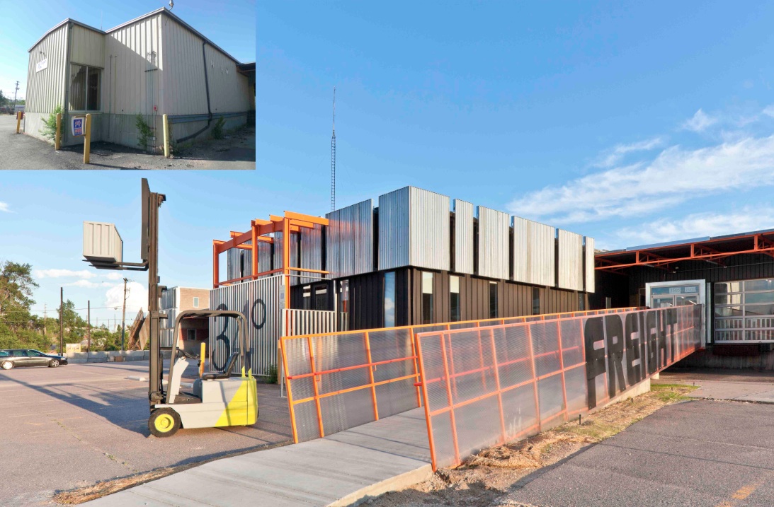
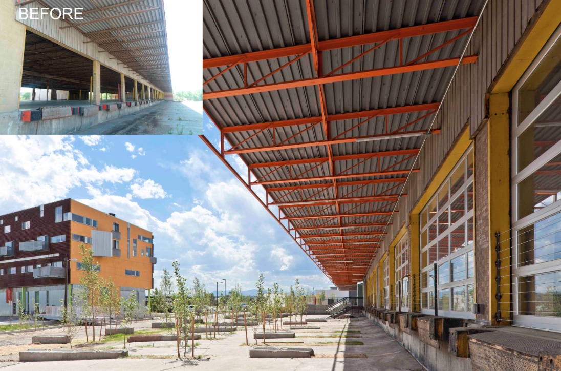
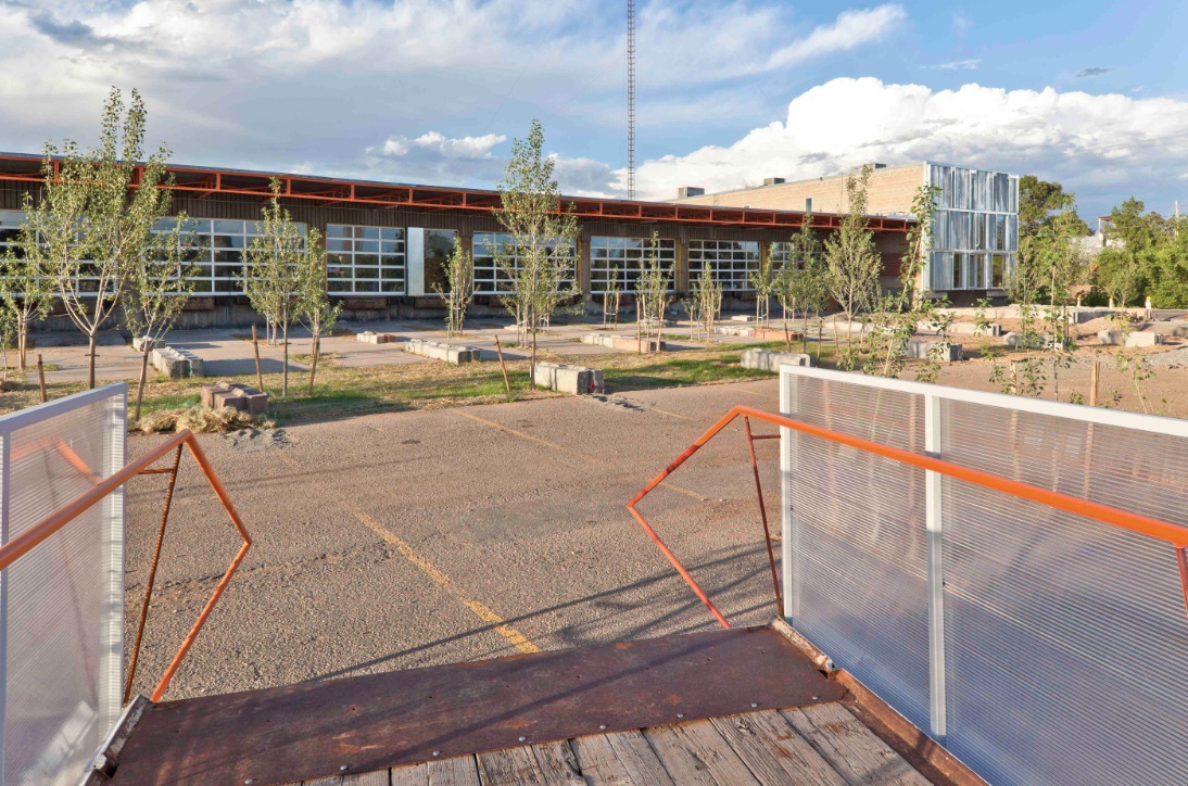
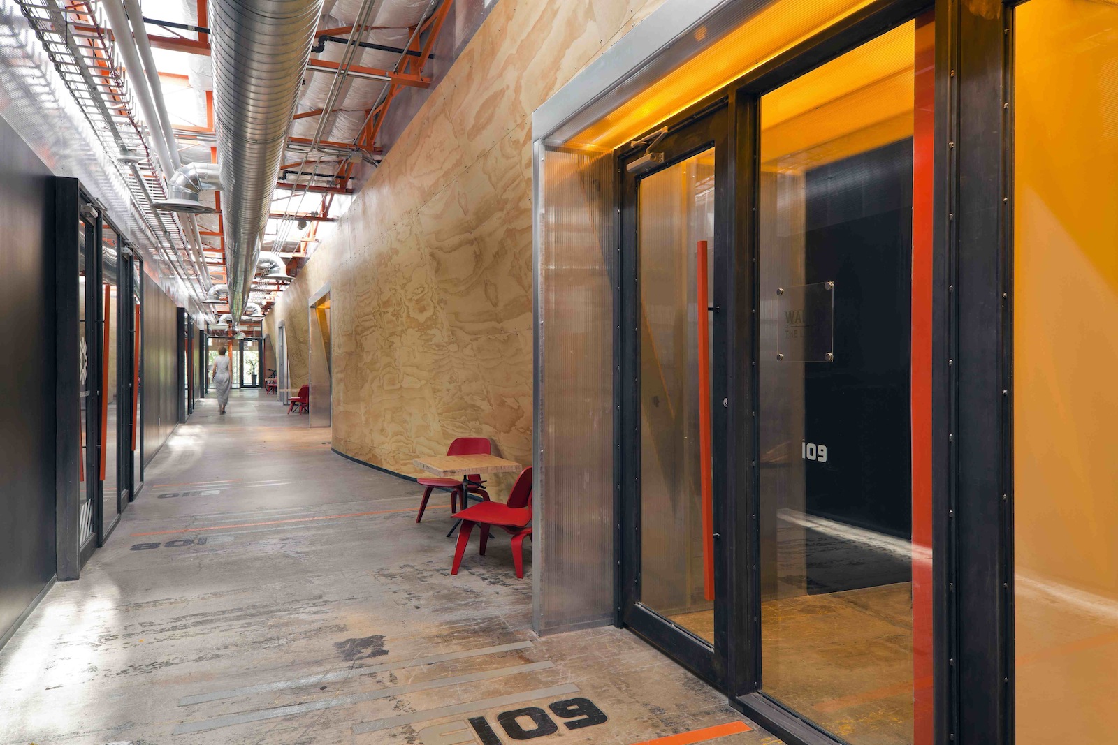
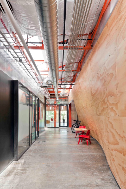
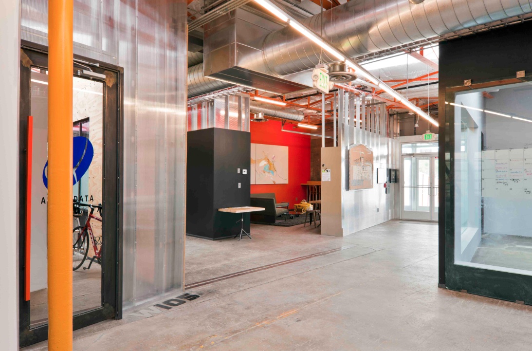
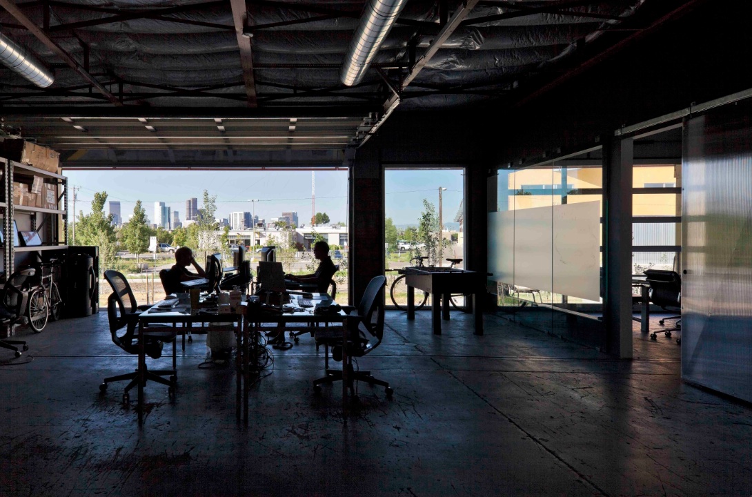
The reuse preserves the carcass of the freight terminal, with its deep overhangs and garage bay openings, and inserts new elements to contrast old. Original paint and markings are left intact with new glass overhead doors that allow offices to open to the landscape. An internal skylit “street” and sculptural plywood ribbon wall punctuated with luminous entries provides internal circulation. The main entrance slices through the building, axially connecting the entry experience to the larger site and the urban skyline beyond.
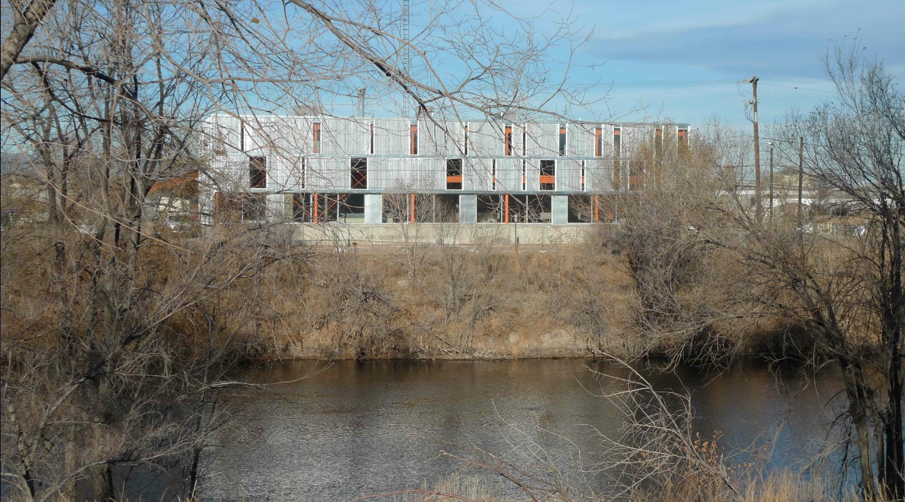
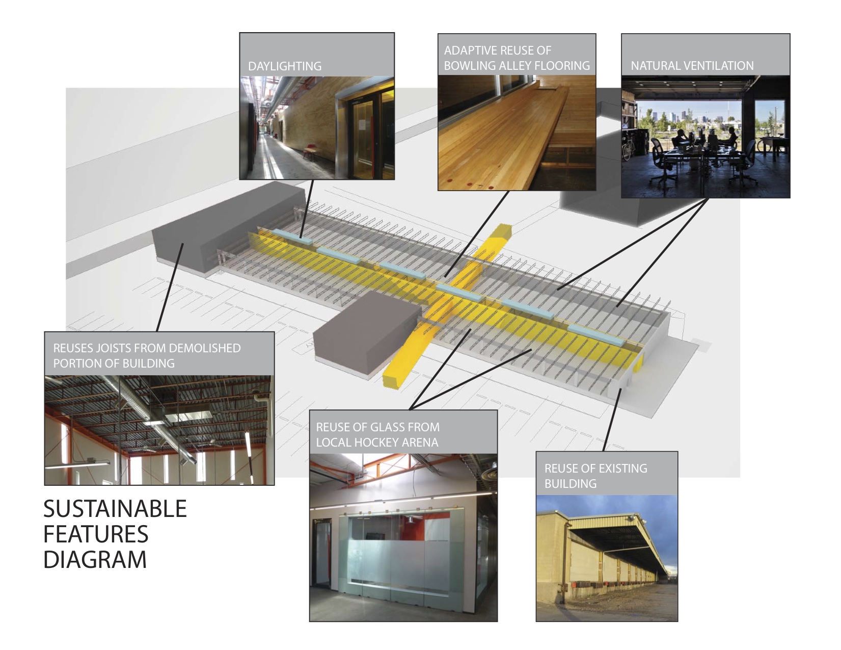
Outside, an existing metal shed projecting north was re-imaged. The new portion of the building along the river took inspiration from the movement of rail and containers, and uses trusses from the traditional administrative component at the head of the terminal that had been razed. A ghosting of the former truck dock pattern extends as adjacent landscape pattern.
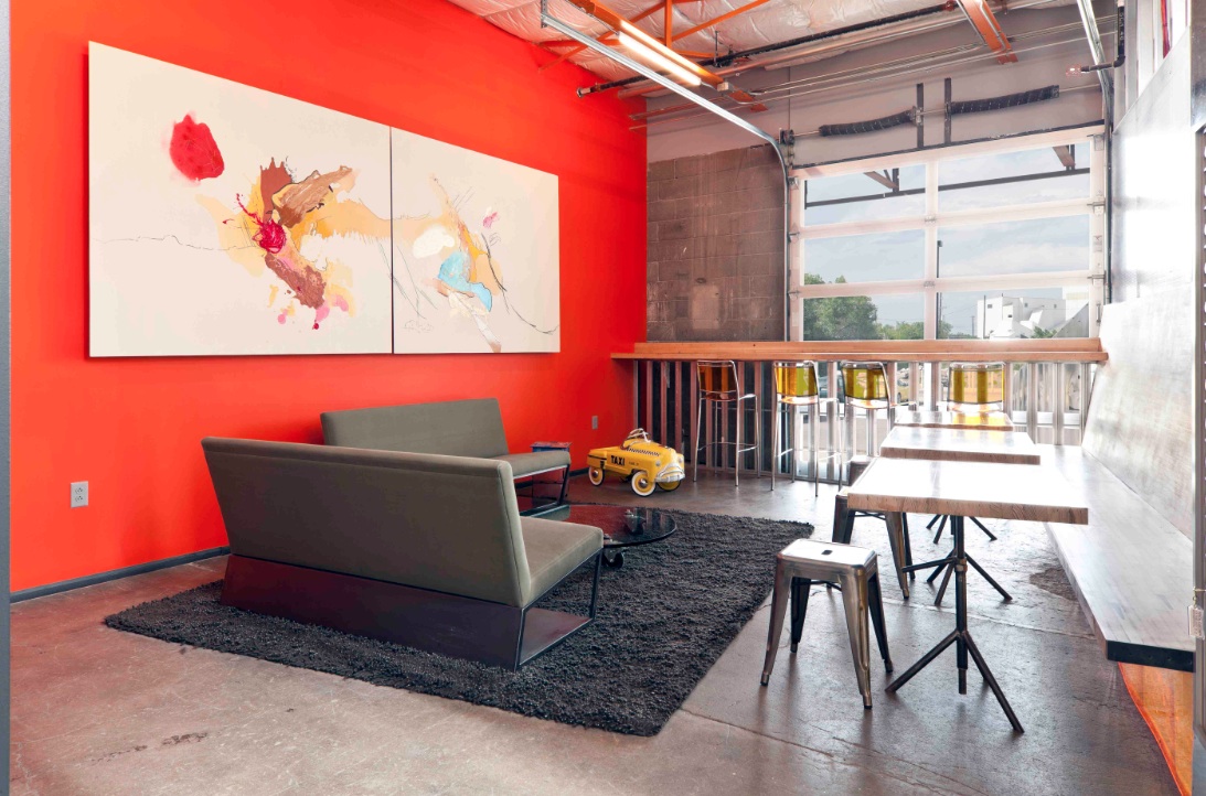
Tenant spaces were arranged from a kit of industrial components and materials included reused glass panels from a hockey rink as internal partitions, salvaged bowling alley floors for benches, tables and counters, and industrial shelves in a variety of configurations to conform to a challenging budget. “International Orange” enlivens structural components throughout.
Client: Zeppelin Places
Architect: Stephen Dynia Architects
Site area: 4 acres
Gross Floor area: 29,000 sf
Location: Denver
Photos: Ron Johnson
Related Stories
| Nov 9, 2010
Designing a library? Don’t focus on books
How do you design a library when print books are no longer its core business? Turn them into massive study halls. That’s what designers did at the University of Amsterdam, where they transformed the existing 27,000-sf library into a study center—without any visible books. About 2,000 students visit the facility daily and encounter workspaces instead of stacks.
| Nov 9, 2010
Turner Construction report: Green buildings still on the agenda
Green buildings continue to be on the agenda for real estate owners, developers, and corporate owner-occupants, according to the Turner 2010 Green Building Market Barometer. Key findings: Almost 90% of respondents said it was extremely or very likely they would incorporate energy-efficiency improvements in their new construction or renovation project, and 60% expected to incorporate improvements to water efficiency, indoor environmental quality, and green materials.
| Nov 5, 2010
New Millennium’s Gary Heasley on BIM, LEED, and the nonresidential market
Gary Heasley, president of New Millennium Building Systems, Fort Wayne, Ind., and EVP of its parent company, Steel Dynamics, Inc., tells BD+C’s Robert Cassidy about the Steel Joist Manufacturer’s westward expansion, its push to create BIM tools for its products, LEED, and the outlook for the nonresidential construction market.
| Nov 3, 2010
First of three green labs opens at Iowa State University
Designed by ZGF Architects, in association with OPN Architects, the Biorenewable Research Laboratory on the Ames campus of Iowa State University is the first of three projects completed as part of the school’s Biorenewables Complex. The 71,800-sf LEED Gold project is one of three wings that will make up the 210,000-sf complex.
| Nov 3, 2010
Park’s green education center a lesson in sustainability
The new Cantigny Outdoor Education Center, located within the 500-acre Cantigny Park in Wheaton, Ill., earned LEED Silver. Designed by DLA Architects, the 3,100-sf multipurpose center will serve patrons of the park’s golf courses, museums, and display garden, one of the largest such gardens in the Midwest.
| Nov 3, 2010
Public works complex gets eco-friendly addition
The renovation and expansion of the public works operations facility in Wilmette, Ill., including a 5,000-sf addition that houses administrative and engineering offices, locker rooms, and a lunch room/meeting room, is seeking LEED Gold certification.
| Nov 3, 2010
Sailing center sets course for energy efficiency, sustainability
The Milwaukee (Wis.) Community Sailing Center’s new facility on Lake Michigan counts a geothermal heating and cooling system among its sustainable features. The facility was designed for the nonprofit instructional sailing organization with energy efficiency and low operating costs in mind.
| Nov 3, 2010
Seattle University’s expanded library trying for LEED Gold
Pfeiffer Partners Architects, in collaboration with Mithun Architects, programmed, planned, and designed the $55 million renovation and expansion of Lemieux Library and McGoldrick Learning Commons at Seattle University. The LEED-Gold-designed facility’s green features include daylighting, sustainable and recycled materials, and a rain garden.
| Nov 3, 2010
Recreation center targets student health, earns LEED Platinum
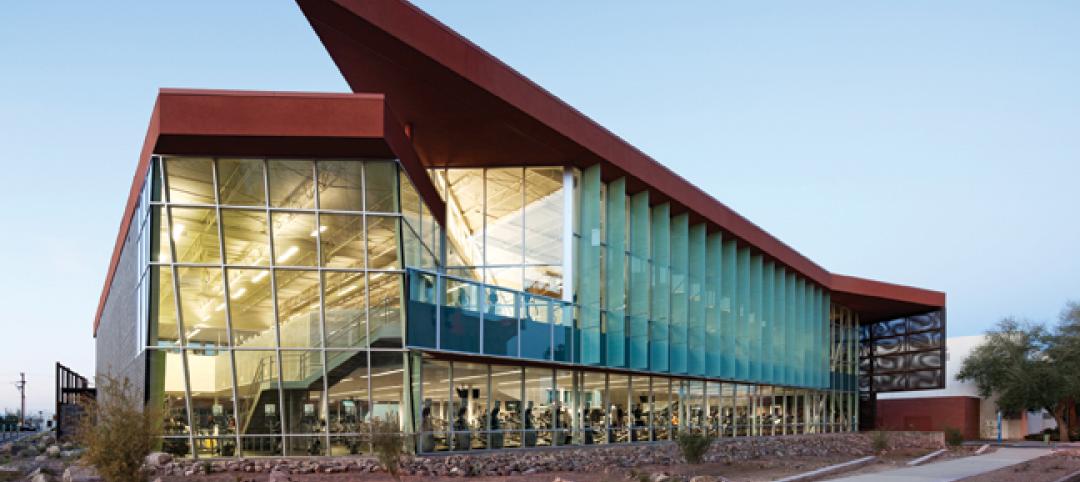
Not only is the student recreation center at the University of Arizona, Tucson, the hub of student life but its new 54,000-sf addition is also super-green, having recently attained LEED Platinum certification.
| Nov 3, 2010
New church in Connecticut will serve a growing congregation
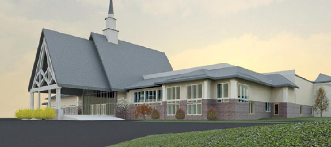
Tocci Building Companies will start digging next June for the Black Rock Congregational Church in Fairfield, Conn. Designed by Wiles Architects, the 103,000-sf multiuse facility will feature a 900-person worship center with tiered stadium seating, a children’s worship center, a chapel, an auditorium, a gymnasium, educational space, administrative offices, commercial kitchen, and a welcome center with library and lounge.


