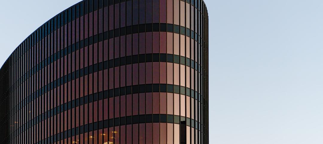
After a six-year hiatus, the U.S. General Services Administration late last year resumed its esteemed GSA Design Awards program. Founded in 1990 under the leadership of GSA’s first Chief Architect, Ed Feiner, the biennial awards program honors federal building projects—and the teams behind them—for their design excellence and service to the people who work in, visit, and live near the buildings. This year’s program evaluated projects completed between 2016 and 2022.
In all, 19 federal building projects nationwide were honored with 2022 GSA Design Awards, eight with Honor Awards and 11 with Citations.
The submissions were evaluated by a jury of 10 architecture, art, design, and construction professionals:
- JURY CHAIR: Curtis Moody, FAIA, NOMA, NCARB, LEED AP, Founder and Board Chairman of Moody Nolan, Columbus, Ohio
- Mark Cain, President and CEO, Smoot Construction, Washington, D.C.
- Ariel O’Connor, Conservator, Smithsonian National Museum of Asian Art, Washington, D.C.
- Jaspreet Pahwa, NCARB, LEED AP, Director of Capital Planning and Construction, DC Public Library, Washington, D.C.
- Kay Sargent, FASID, FIIDA, CID, LEED AP, MCR.w, WELL AP, Director of WorkPlace, Senior Principal, HOK, Washington, D.C.
- Peggy Van Eepoel, PE, Managing Principal, Thornton Tomasetti, Washington, D.C.
- Michael Vergason, FASLA, FAAR, Founder, Michael Vergason Landscape Architects, Alexandria, Va.
- Taryn Williams, President, Association for Preservation Technology International, Washington, D.C.
- Jejon Yeung, Co-founder, Worrell Yeung, Brooklyn, N.Y.
- Dolores Zinny, Program Director, Rinehart School of Sculpture, Maryland Institute College of Art, Baltimore, Md.
“If there is a thread that unites this jury’s choices for the 2022 awards cycle, it is our search for projects that put people first,” said Curtis Moody, FAIA, NOMA, NCARB, LEED AP, Founder and Board Chairman of Moody Nolan and the 2022 GSA Design Awards Jury Chair. “By selecting projects that center user comfort, nurtured professional collaboration, or maximize local community benefit, we look forward to a day when even the most monumental-seeming federal investment resonates with a GSA Design Awards jury for its empathy and human touch.”
Meet the 2022 GSA Design Awards winners:
(Note: project descriptions and team information courtesy GSA)
Columbus Land Port Of Entry
Columbus, New Mexico
HONOR AWARD FOR LANDSCAPE ARCHITECTURE
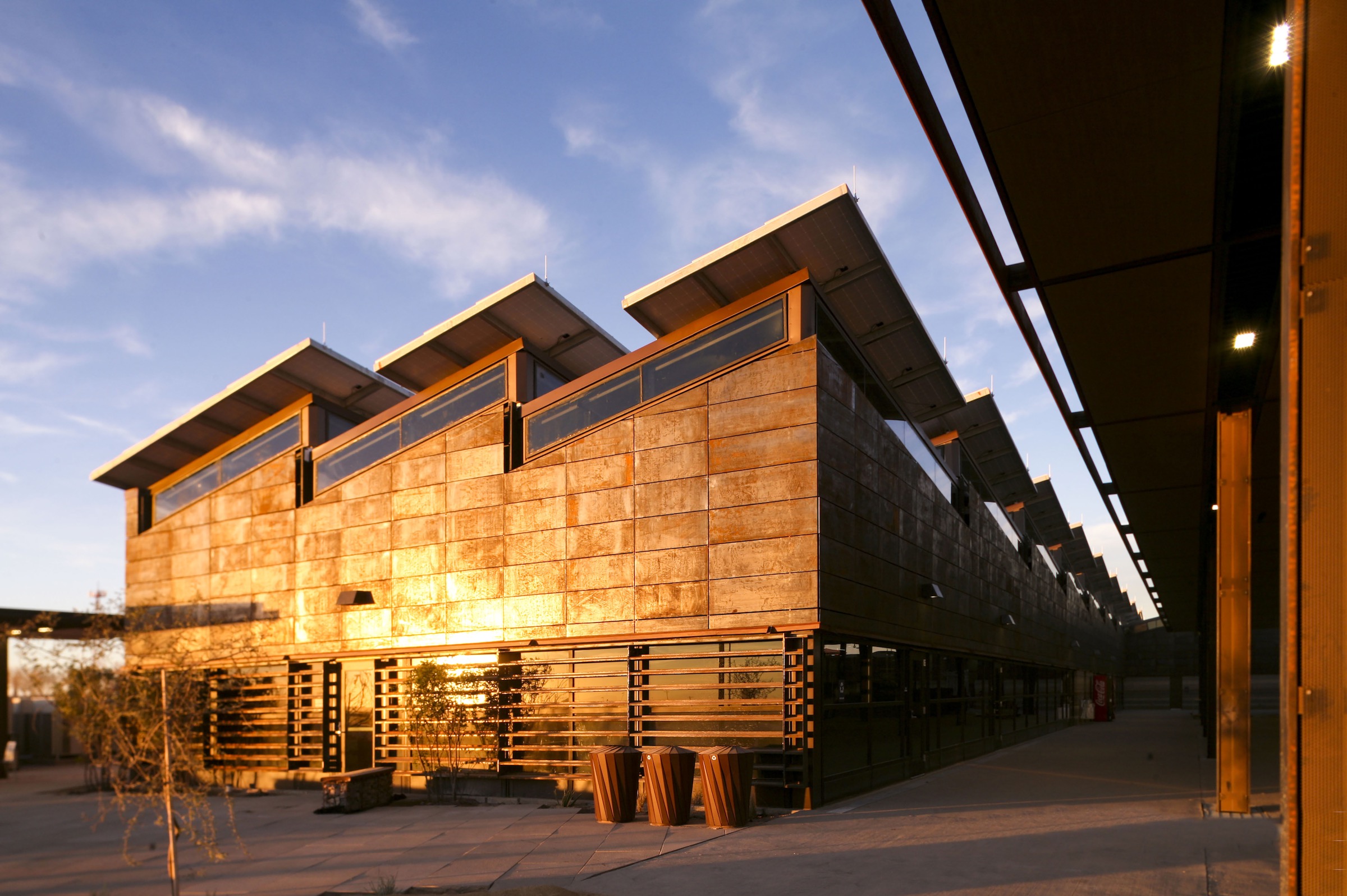
Located within New Mexico’s swath of the Chihuahuan Desert, the Columbus Land Port of Entry replaces an obsolete border facility to process vehicle traffic as well as pedestrian travelers—a group that includes more than 800 American schoolchildren who cross into Columbus from Puerto Palomas, Mexico, daily. The campus is located on a clayey site within the drainage path of a regional watershed, which has flooded periodically for decades.
The 2022 GSA Design Awards jury was impressed by the process efficiency, security, durability, and sustainable performance achieved by the Columbus Land Port of Entry. Yet they thrilled to the facility’s architectural expression. Noting that the act of border crossing can create anxiety in travelers, Kay Sargent praised the design as “official, but not intimidating.”
Of weathered steel cladding and exterior brick assembled in a strata pattern, Jaspreet Pahwa remarked, “Beautiful, simple gestures interpret topography, climate, and culture as a vernacular for building.”
Jurors further rallied around building elements representing practicality and sense of place in single moves: the main building’s photovoltaic-topped rooftop, for example, reinterprets a sawtooth profile to evoke a nearby mountain range and maximize PVs’ solar exposure.
The campus landscape integrates multiple purposes with similar legibility. A generously proportioned walkway leading from Mexico to the land port’s main building is lined in
shade trees in low planters, which also physically separate pedestrians from adjacent vehicle traffic. On that walkway’s other side, a series of gabion walls create water-harvesting terraces and encourage lush pockets of growth in the Chihuahuan Desert climate. Nearby basins are planted with native flora that are both drought-resistant and capable of boring through clay, making the tightly packed earth more absorptive of desert monsoon events.
In architecture and landscape architecture alike, the Columbus Land Port of Entry melds high functionality with regional culture and resource stewardship. As Pahwa reflected, the project’s “restorative feel” can be likened to the optimism a traveler might feel about crossing into the United States.
For the complete project team list and additional photos, download the GSA Design Awards booklet.
Department Of State Workspace Prototypes
Washington, D.C.
HONOR AWARD: ON THE BOARDS
Remote work has challenged long-held notions of where and how many Americans do their jobs, hastening mainstream acceptance of information security, mobility, and employee well-being strategies that have emerged relatively recently.
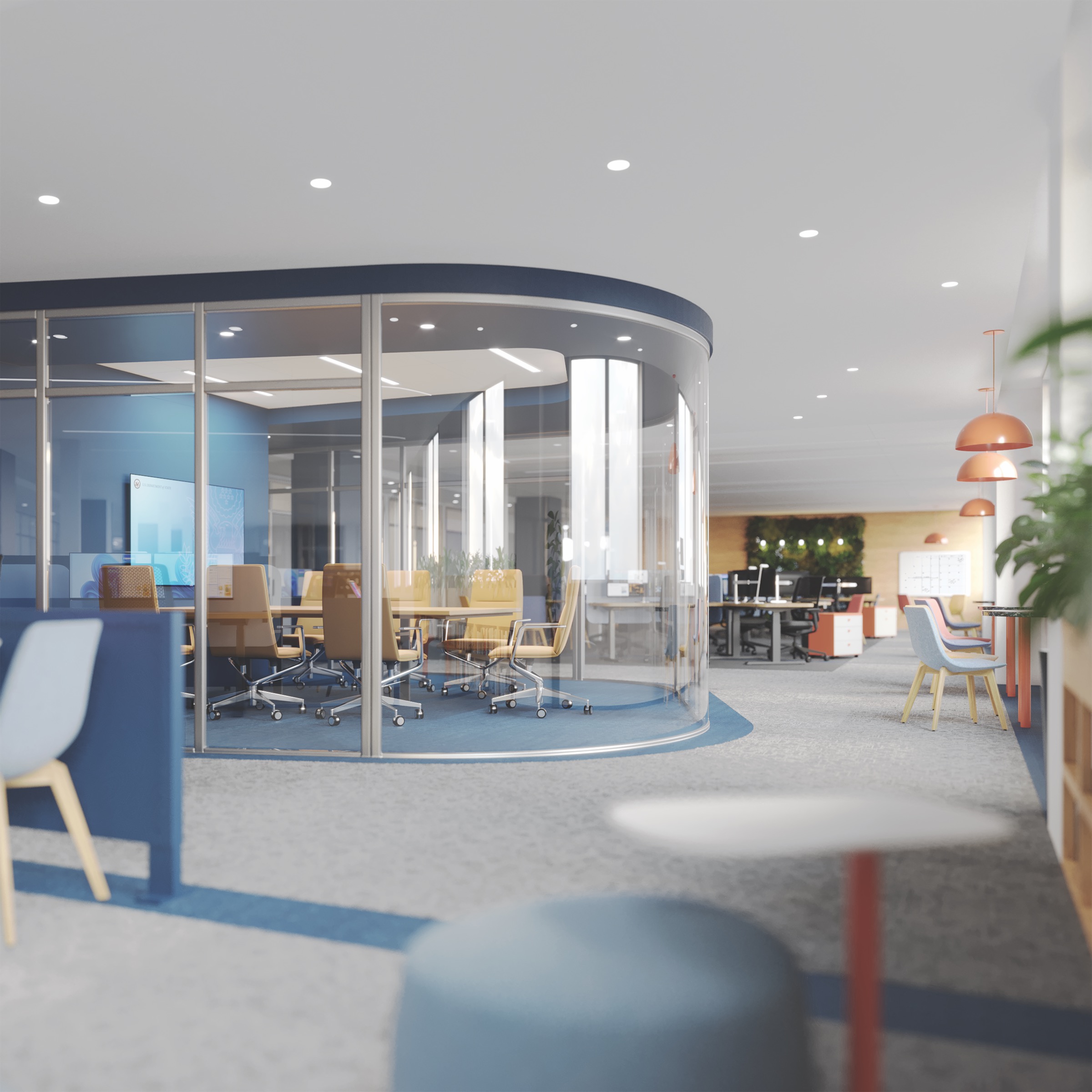
The U.S. Department of State is no exception to this national phenomenon and, one year into a COVID-19 response that involved widespread remote work, the department partnered with GSA on commissioning a set of workplace design guidelines that draw from the pandemic’s lessons. The Department of State envisioned applying this knowledge to interior projects such as the ongoing modernization of its Harry S. Truman Federal Building headquarters; the collaboration with GSA also included “Hoteling Plus” and “100% free address” prototype spaces conceived respectively for the Truman building and State Annex 5.
The effort’s result inspired a first in the history of the GSA Design Awards—the bestowing of an Honor Award to a conceptual scheme. As Jejon Yeung explained the decision, “If the Weaver building interior is an example of how to greatly improve long standing context, then this a model for how we should be moving forward. That the project takes on pandemic-related issues that the public and private sectors are grappling with, right now, underscores its merit.”
Kay Sargent enumerated the many ways the Department of State commission has elevated federal workplace design “to a whole other level,” such as the systematic approach to the Hoteling Plus layout—in which the interior was divided into zones according to type and frequency of use as well as access to daylight.
Sargent further noted how this planning was reconciled to preset utilities and modular construction to minimize the disruption of future change, while remaining considerate of human scale, personal preference, and other factors impacting morale. “This design team thought through the brief holistically,” Sargent enthused of the multifaceted concept, calling it applicable to an array of federal offices.
For the complete project team list and additional photos, download the GSA Design Awards booklet.
FBI Central Records Complex
Winchester, Va.
HONOR AWARD FOR CONSTRUCTION
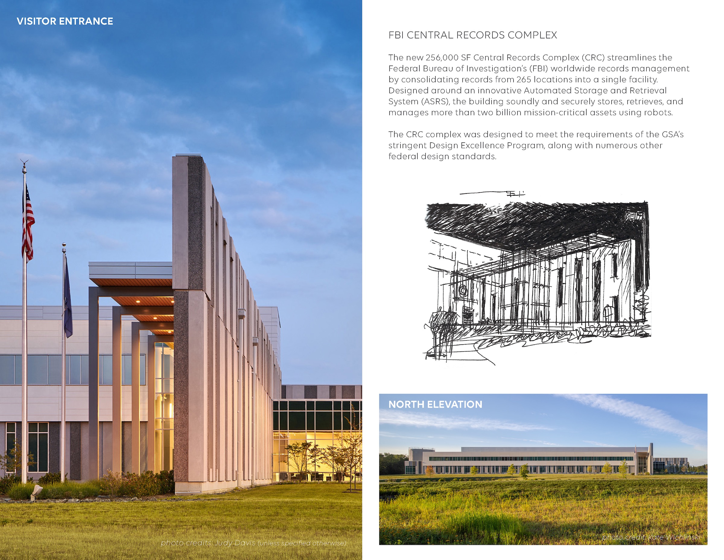
The recently completed FBI Central Records Complex in Winchester, Va., consolidates official records from 265 Federal Bureau of Investigation field offices into one facility dedicated to storage, retrieval, and management.
The complex houses one of the world’s largest automated storage and retrieval systems, as well as workspace for 450 employees, a visitor screening center, operation support, and secure service areas.
The automated document array stood out to jurors for its performance, as well as the process by which it was merged with the building. The system retrieves files using energy-efficient robots that, in June 2022 alone, retrieved 21,500 files with almost 100% accuracy. Yet at the time of project planning, its team was not aware of the technology or its output. In the project’s qualifications stage, the team partnered with the automation company to incorporate its array into the overall design, which reduced the facility’s footprint and freed FBI technical staff to perform more complex archival work.
The project team nimbly changed direction more than once. In one instance, new innovations in air-cooled chillers justified replacing a water-cooled chiller with the newer technology after project award. In another, redundancy-minded improvements to the electrical and mechanical systems were implemented after construction of the foundation, structural steel, and underground utilities were well under way.
Awards jurors took care to analyze this agility, determining that it could not be attributed solely to the project’s design-build delivery method. “The team sustained its partnering initiatives throughout the project, going well beyond contract requirements,” explained Mark Cain, who lauded the project team for its frequent partnering sessions, collegial atmosphere, and collective dedication to best-in- class solutions.
For the complete project team list and additional photos, download the GSA Design Awards booklet.
The Fruit Of The Spirit
Philadelphia
HONOR AWARD FOR ART
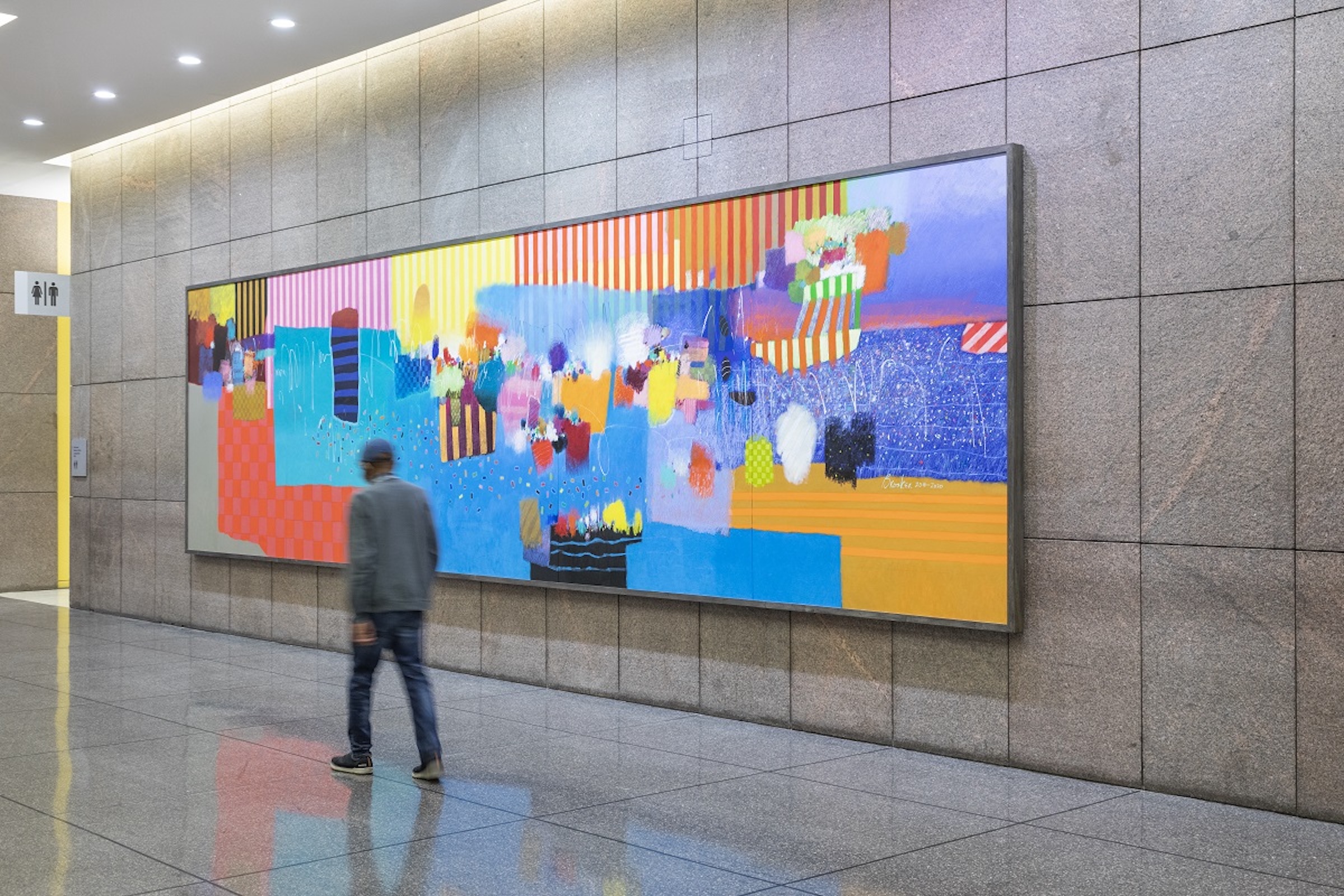
As part of the first substantial renovation of Philadelphia’s William J. Green, Jr. Federal Building since its 1973 opening, the GSA Art in Architecture Program tapped prominent local artist and educator Moe Brooker to create The Fruit of the Spirit. Measuring 8x30 feet, this largest work of Brooker’s career also emblematizes his exuberantly abstract, mixed- media compositions. “I want to make people smile, I want to make people laugh, and I want to introduce to people their own sense of spirituality, because that’s what keeps us going,” Brooker said of the commission.
Of several potential locations in the redesigned main lobby, Brooker selected a monolithic granite wall for the installation and called The Fruit of the Spirit an “invitation that celebrates the architectural space and adds warmth to it.” Dividing the canvas into five equally sized panels, Brooker layered loosely brushed areas of paint, chalky white lines and marks, and confetti-like patterns over larger fields of color. These dynamic forms are framed by several areas of checkerboard grids—a motif that “always represents options, possibilities, and what could happen,” in Brooker’s words—and stripes.
The scope of the green building renovation also permitted conserving and relocating an earlier Art in Architecture commission, the 1976 painting Celebration, from an inaccessible second-floor elevator lobby to the ground-floor lobby. Its creator, Charles Searles, was Brooker’s friend and fellow graduate of the Pennsylvania Academy of the Fine Arts. Envisioning the
two pieces engaging in visual exchange, Brooker studied Celebration repeatedly and made sure that his color palette complemented the predecessor work.
“Here is a message of hope, as well as a community dialogue that crosses generations,” Dolores Zinny said of The Fruit of the Spirit. The painting was installed in September 2021; Brooker passed away unexpectedly in January 2022.
For the complete project team list and additional photos, download the GSA Design Awards booklet.
Hedge Wedge
San Diego, Calif.
HONOR AWARD FOR ART
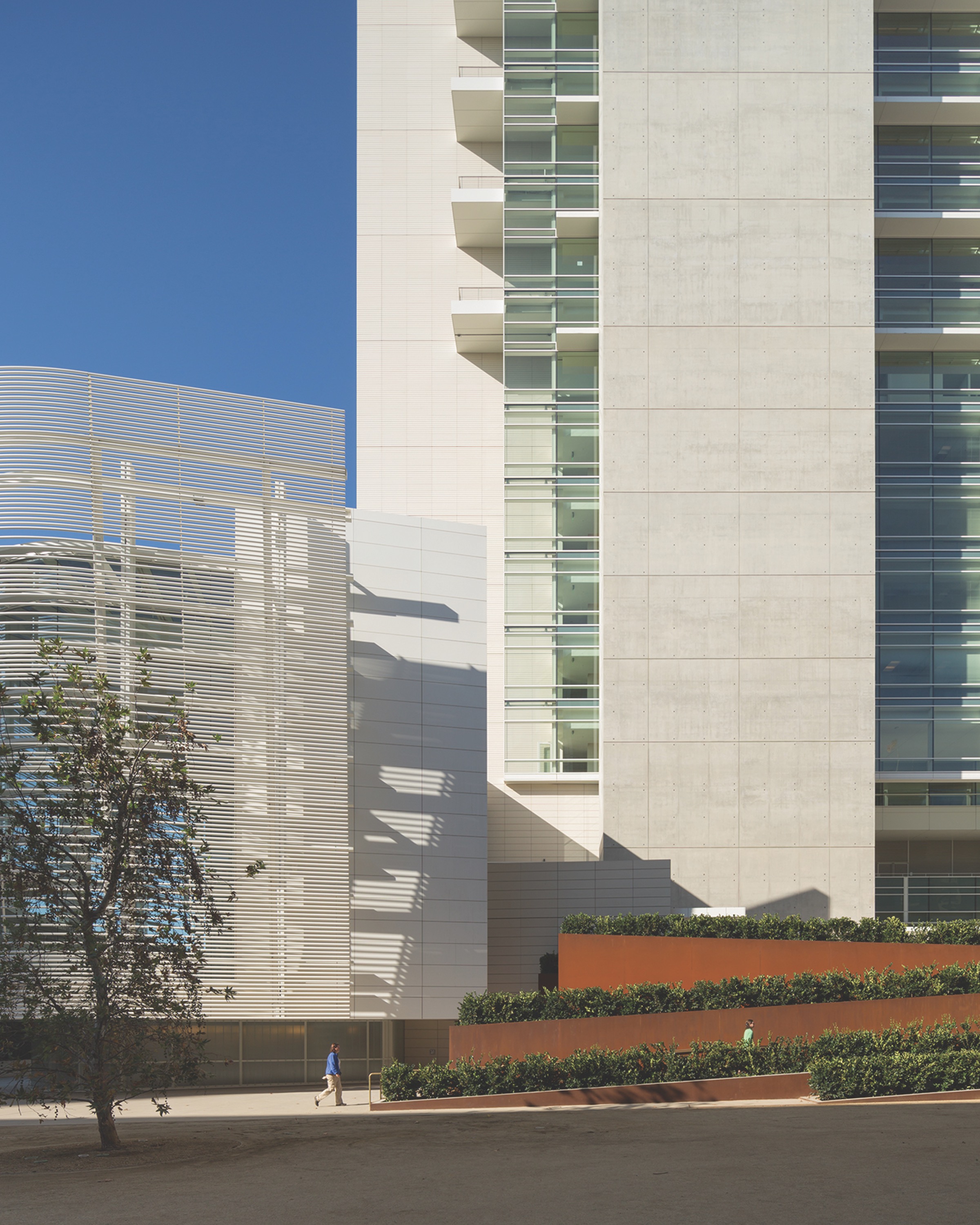
The James M. Carter and Judith N. Keep U.S. Courthouse is a 16-story tower recently erected in downtown San Diego whose siting and slender proportions allowed development of a public plaza along Broadway—the city’s primary east-west corridor.
Through the GSA Art in Architecture Program, the internationally renowned San Diego artist Robert Irwin was selected to collaborate with the design team on the plaza. That team transformed the outdoor space into the heart of a federal building complex that includes the older Edward J. Schwartz United States Courthouse directly to the east of the new courthouse. Today it is a place of both respite and drama, where gardens, a water feature, and pedestrian paths celebrate local landscape and climate.
The design team worked closely with Irwin, in particular, to create a transition from the plaza to the courthouse lobby entrance, which is elevated several feet above street level. In turn, Irwin conceived a zigzagging ramp as the artwork Hedge Wedge. Edged in Cor-ten steel and ensconced in more than 1,000 privet plants, Hedge Wedge serves as a provocative backdrop for the plaza and a focal point for passersby on Broadway. It is also a successful link between the plaza and the courthouse entry where, among other experiences, potential jurors waiting at the elevated Jury Assembly Terrace enjoy the view of pedestrians activating the built form.
“The perspectives that one can enjoy within this artwork show a keen understanding of circulation and human experience,” observed Dolores Zinny.
For the complete project team list and additional photos, download the GSA Design Awards booklet.
The Robes Of Justitia
Nashville, Tenn.|
HONOR AWARD FOR ART
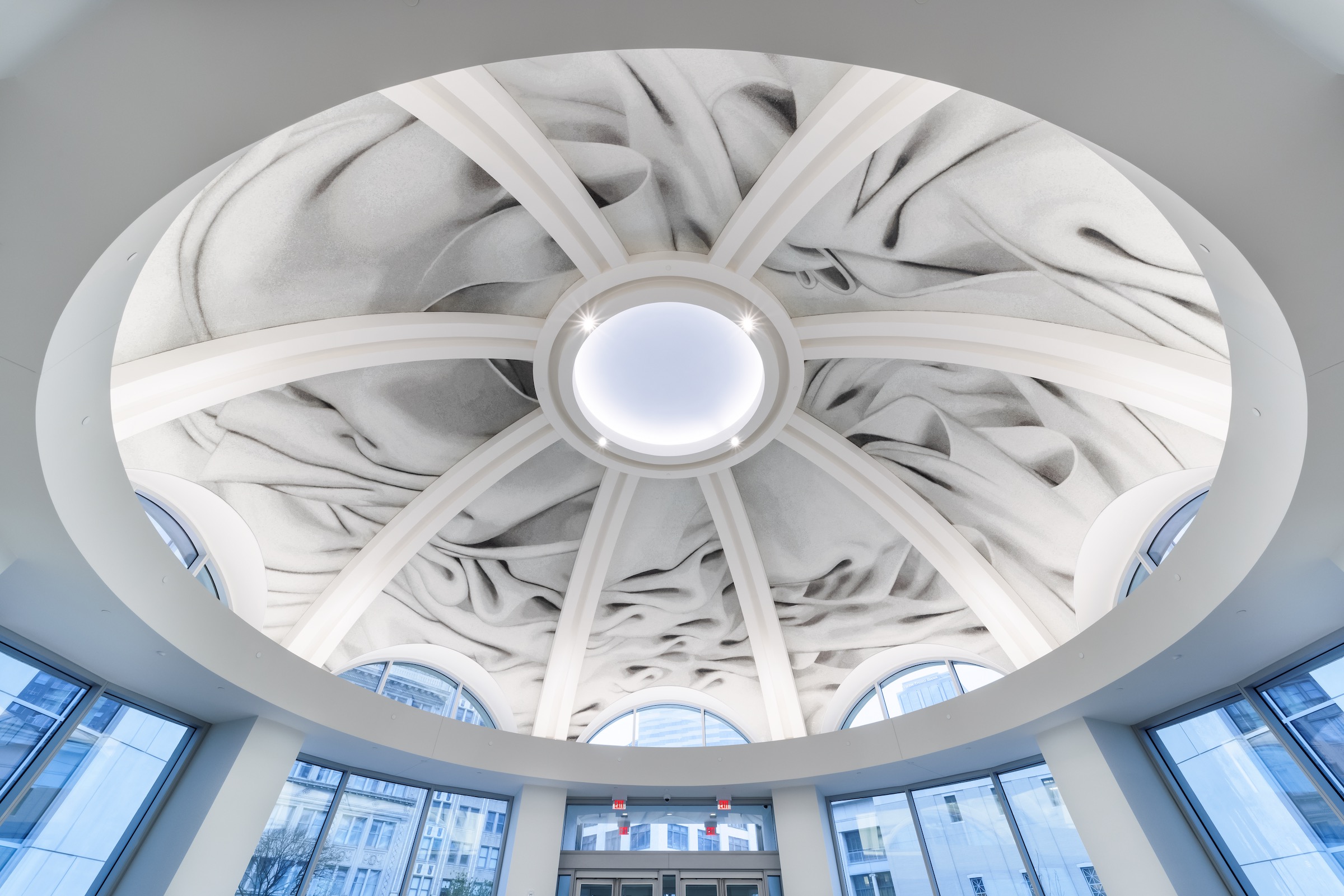
When GSA commissioned Alyson Shotz to realize a permanent artwork for the Fred D. Thompson U.S. Courthouse and Federal Building in Nashville, the Brooklyn-based artist visited the Tennessee capital in March 2019 to meet the courthouse project’s key team members. Among them was District Judge Aleta Trauger, who shared that Nashville has been called the Athens of the South since the 1820s and that the city’s Centennial Park includes a full-scale replica of the Parthenon.
Back in her studio, Shotz conceived a trompe l’oeil mosaic for the building rotunda’s domed ceiling called The Robes of Justitia. As Shotz explained in a statement, “Justitia was the personification of justice in ancient Roman art. In this mosaic installation, the folds of her robes appear to billow around the dome’s central oculus, as if blown by the wind, and are a metaphor for the protection of justice that surrounds us and the work of the law that shapes our society.”
Whereas classical drapery was contoured around representations of Victory, Liberty, or Justice, Shotz’s depiction of robes excludes allegorical figures to underscore that, in American democracy, the rotunda’s occupants serve justice.
Execution of Shotz’s vision can be further interpreted through the lens of civic responsibility. The formation of a singular image from millions of glass pieces embodies E Pluribus Unum, for example, and fabrication involved a herculean collective effort in which the mosaic was made in gridded sections that were then shipped to Nashville and installed into eight larger, wedge-shaped sections over six weeks.
“It is difficult to make a public artwork that appeals to everybody in terms of content. Even so, here you would still be fascinated by the technical accomplishment,” Kay Sargent concluded of The Robes of Justitia. “I could stare at this for hours.”
For the complete project team list and additional photos, download the GSA Design Awards booklet.
United States Courthouse
Los Angeles, Calif.
HONOR AWARD FOR ARCHITECTURE

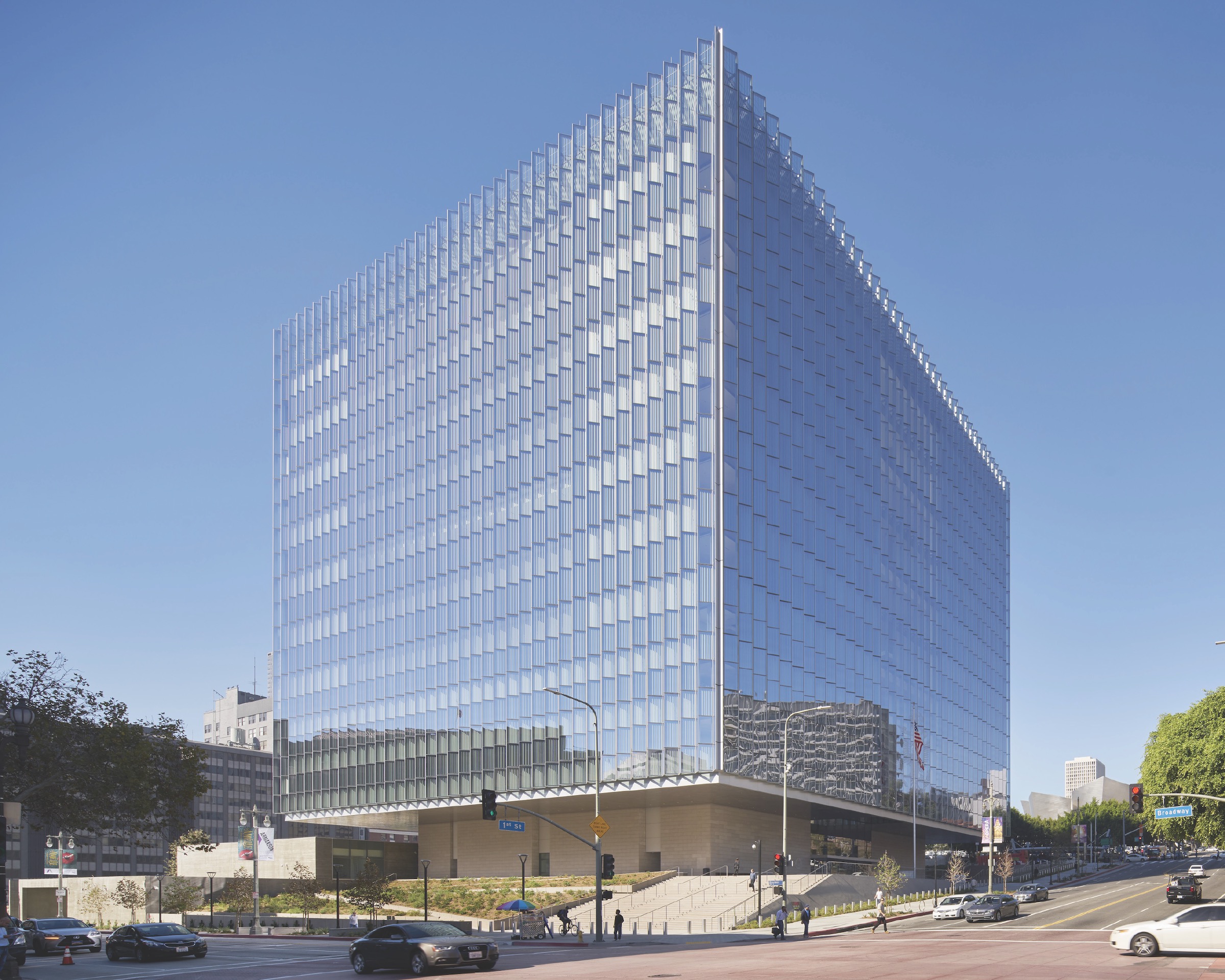
At first glance, the new United States Courthouse in Los Angeles is strikingly contemporary: a 10-story cube of pleated glass rises atop a base volume, cantilevering beyond it on
all four sides. While jurors felt that this first impression was highly compelling, they also lauded the courthouse design for its subtle embrace of tradition.
The building employs processional steps, grand public spaces, and enduring materials to achieve continuity with past judicial facilities. And although the glass cube appears to break from all precedent, floating above its surroundings, its elevation and vertical expression are in keeping with federal architecture generally. “It’s classical with a twist,” Dolores Zinny said approvingly.
Jury chair Curtis Moody and juror Michael Vergason further praised the glass envelope for reconciling the courthouse’s federal imagery with local conditions. The Los Angeles
street grid is rotated 38 degrees from a true north-south axis, meaning that buildings paralleling that grid are greatly exposed to solar heat gain and glare on their east- and west-facing elevations. The courthouse’s exterior pleats align with ideal solar orientation for daylighting, while keeping the building itself aligned to the street grid. In addition, the pleats’ alternation of transparency and opacity—glass panels facing north or south are clear, while those facing east or west are not—minimizes sunlight’s adverse thermal and visual impacts.
Inside the building, floors are organized around the so-called Light Court, and public circulation wraps around this atrium and crisscrosses it in the form of staggered bridges.
The courthouse’s exterior presence and interior configuration both dovetail with the project’s wider sustainability goals.
The cube is highly efficient in its ratio of building perimeter to floor area in terms of energy use; the pleated envelope reduces annual solar radiation load by 47%; and the Light Court delivers daylight into the heart of the building and provides a second source of natural illumination for the courtrooms. Measured in tandem with other techniques like rooftop photovoltaic production, the courthouse has achieved LEED Platinum certification.
For the complete project team list and additional photos, download the GSA Design Awards booklet.
Yosemite Falls
Los Angeles, Calif.
HONOR AWARD FOR ART
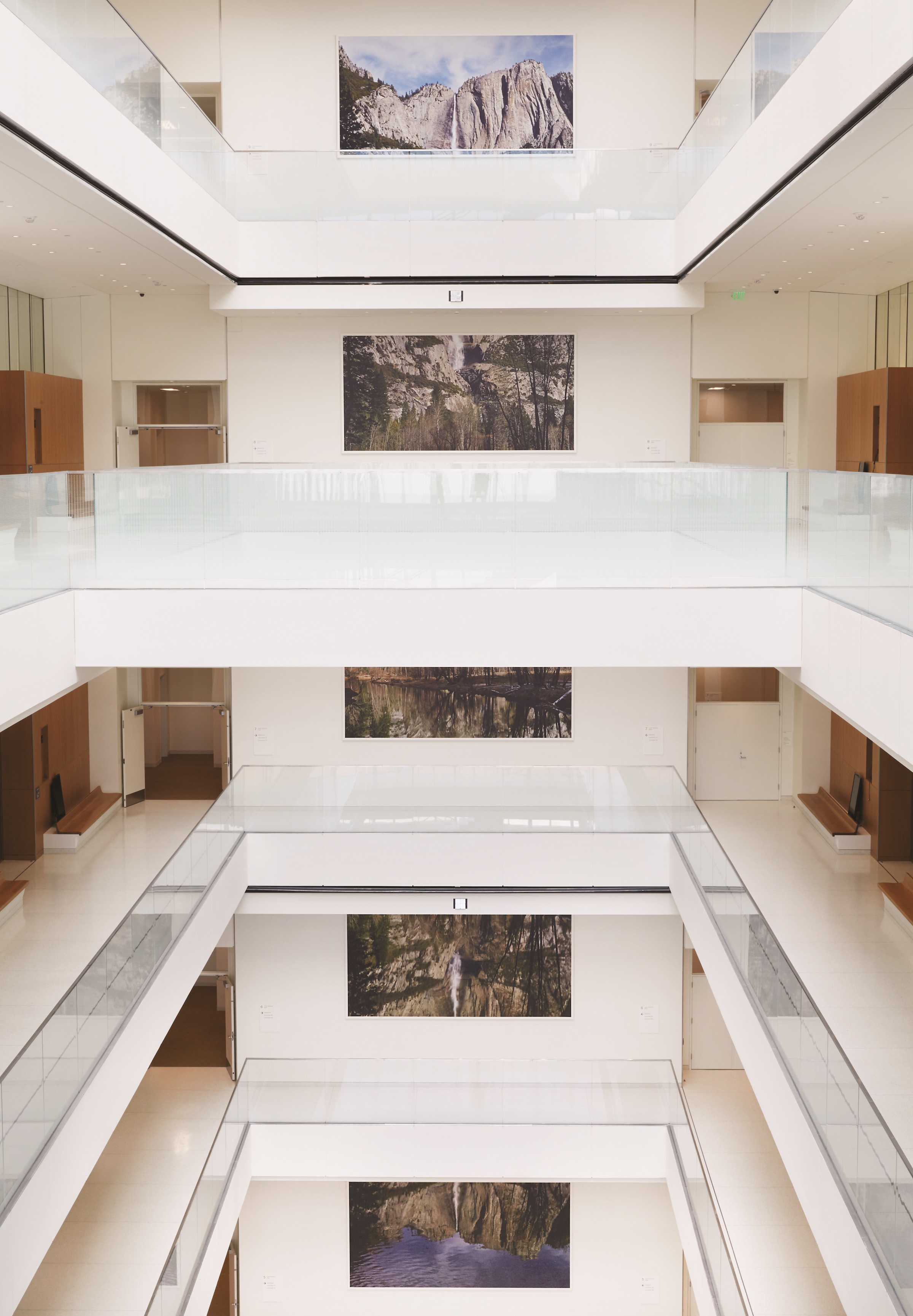
“Public art does not require a huge investment, yet it can tremendously impact how people perceive a difficult situation,” Dolores Zinny said as 2022 GSA Design Awards jurors conferred over Yosemite Falls, the Catherine Opie artwork commissioned by GSA’s Art in Architecture Program for the new United States Courthouse in Los Angeles.
In her depiction of the highest waterfall in Yosemite National Park, the Los Angeles artist invites viewers to reflect upon their immediate surroundings, the landscape of Los Angeles and
of California more widely, and American jurisprudence. The contemplation offers respite from, and lends dimension to, the day-to-day proceedings taking place inside the courthouse.
Opie divided a composite photograph of the iconic falls into six 8x16-foot panels, which she then individually installed on the southwest wall of the courthouse’s atrium (known
as the Light Court) on floors five through 10. In its portrayal of the waterfall’s ridge crowned in cloud-streaked azure, the uppermost panel seems to meld with sky that is visible through the atrium’s glass canopy, while the lowermost two show reflections of Yosemite Falls in the Merced River.
Functionally and symbolically, Yosemite Falls prompts multiple viewer responses. The installation offers a dose of biophilia in an urban environment, or it illustrates the passage of time. One journalist advanced Yosemite Falls “as a metaphor for the scales of justice: an image and its mirror, hanging in balance.”
Yet according to a statement by Opie, the artwork should be perceived first as an integrator of disciplines. “One of the most important elements of this piece is how it functions within the architecture of the building,” she writes. “The incredible Light Court already invites daylight into the building and onto the photographs. The height of the six floors conceptually holds the scale of the [majestic] view of Yosemite Falls. These various floors allow for different views of the falls...There is not one vantage point where you can see all six panels. You have to experience them by actually experiencing the architecture.”
For the complete project team list and additional photos, download the GSA Design Awards booklet.
Arthur J. Altmeyer Federal Building
Woodlawn, Md.
CITATION FOR ARCHITECTURE
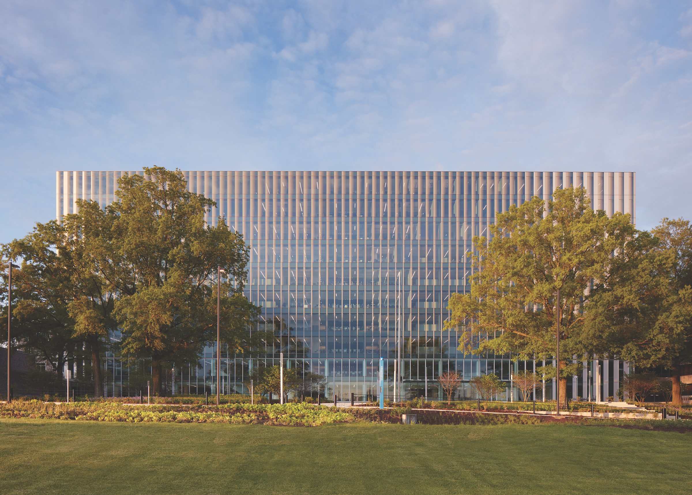
Housing executive offices as well as a spacious auditorium, the 10-story Arthur J. Altmeyer Federal Building is the figurative and practical heart of the Social Security Administration’s Woodlawn, Md., campus. Because the headquarters had not undergone significant alteration since its 1959 opening, contemporary occupants experienced temperature swings of 15 to 20 degrees within the slender building. Its original double-loaded interior, moreover, had failed to keep pace with evolving workplace culture.
In a modernization that struck the 2022 GSA Design Awards jury as exhaustive in scope and restrained in appearance, the Altmeyer building was stripped to its concrete frame and given all-new mechanical systems and elevator cores, an interior overhaul, and a complete recladding.
From the project’s outset, architecture and engineering strategies were developed jointly in service of overall building performance. Consider the unitized building envelope: confirmed by continual energy modeling, each elevation was designed to maximize daylighting and prevent heat gain and glare; the north and south facades largely comprise glass and anodized aluminum, respectively, and a gradient ceramic frit on the glass serves as a transition device between the two major materials.
Reflecting on the Altmeyer building’s transformed architectural image, judge Jaspreet Pahwa commented that the modernization “takes a community asset that was an eyesore and gives it monumentality.”
Jury chair Curtis Moody concurred, adding, “This project has transformed an opaque building into a symbol of public service.” Pahwa and Moody’s fellow jurors also praised the project for breathing new life into an existing environmental investment. To that end, the orientation-specific facades work in tandem with a sophisticated mechanical design and other solutions to improve operational emissions.
Where the Altmeyer building had once performed significantly below modern energy code standards, it now beats ASHRAE baselines by 14.8%. The modernization was conducted without interruption to a basement-level boiler plant that supports the wider Woodlawn campus.
For the complete project team list and additional photos, download the GSA Design Awards booklet.
Captain John Foster Williams U.S. Coast Guard Building And Seawall
Boston, Mass.
CITATIONS FOR ENGINEERING AND CONSTRUCTION
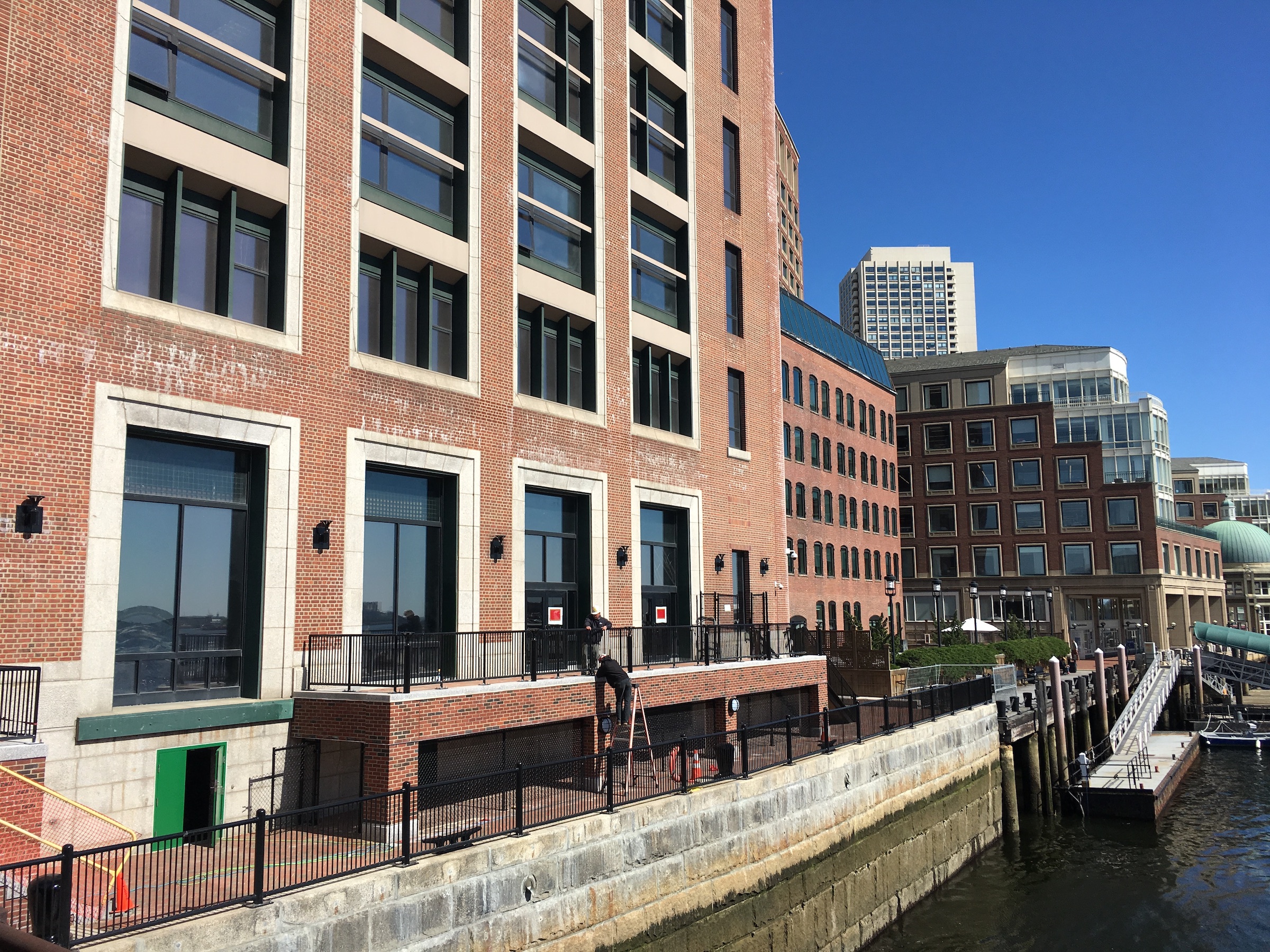
Overlooking Fort Point Channel in downtown Boston, the Captain John Foster Williams Coast Guard Building originated in 1918 as a storage facility for the Boston Custom House. A granite-and-concrete seawall was simultaneously constructed next to the warehouse’s east elevation, and that structure has since been incorporated into the Boston Harborwalk. The Williams building itself was converted into offices for the United States Coast Guard and other agencies in the early 1990s.
Thanks in part to deterioration of the seawall, the multilevel basement that houses the Williams building’s utility systems had experienced fooding during tidal and storm events despite multiple repairs to its concrete-and-steel structure. For a recently completed project dedicated to both repairing the basement and restoring the seawall, a team of experts examined existing infrastructure to grasp the persistent food threat.
Researchers analyzed the seawall using above-water and underwater scanning technologies and conducted detailed inspections of water infiltration within the basement under various conditions. Soil borings and wellpoint installations helped determine the site’s groundwater elevation and soil properties, while destructive material testing of building elements and seawall concrete allowed the team to understand the mode and extent of failure.
This due diligence, which jurors praised for its interdisciplinary collaboration and thoroughness, yielded solutions emphasizing material reuse and minimal disruption to office operations. The project team employed dry dock repair technologies to repair water infiltration within the Williams building and eliminate demand for extensive pumping.
For the seawall, it restored the barrier’s structural stability without compromising historic integrity while also decoupling it from the Harborwalk. That pedestrian route, as well as emergency egress from the Williams building, now occupy an elevated concrete platform with a prefabricated steel platform on micropiles.
For the complete project team list and additional photos, download the GSA Design Awards booklet.
Convent Avenue And Juarez-Lincoln Land Ports Of Entry
Laredo, Texas
CITATION FOR CONSTRUCTION
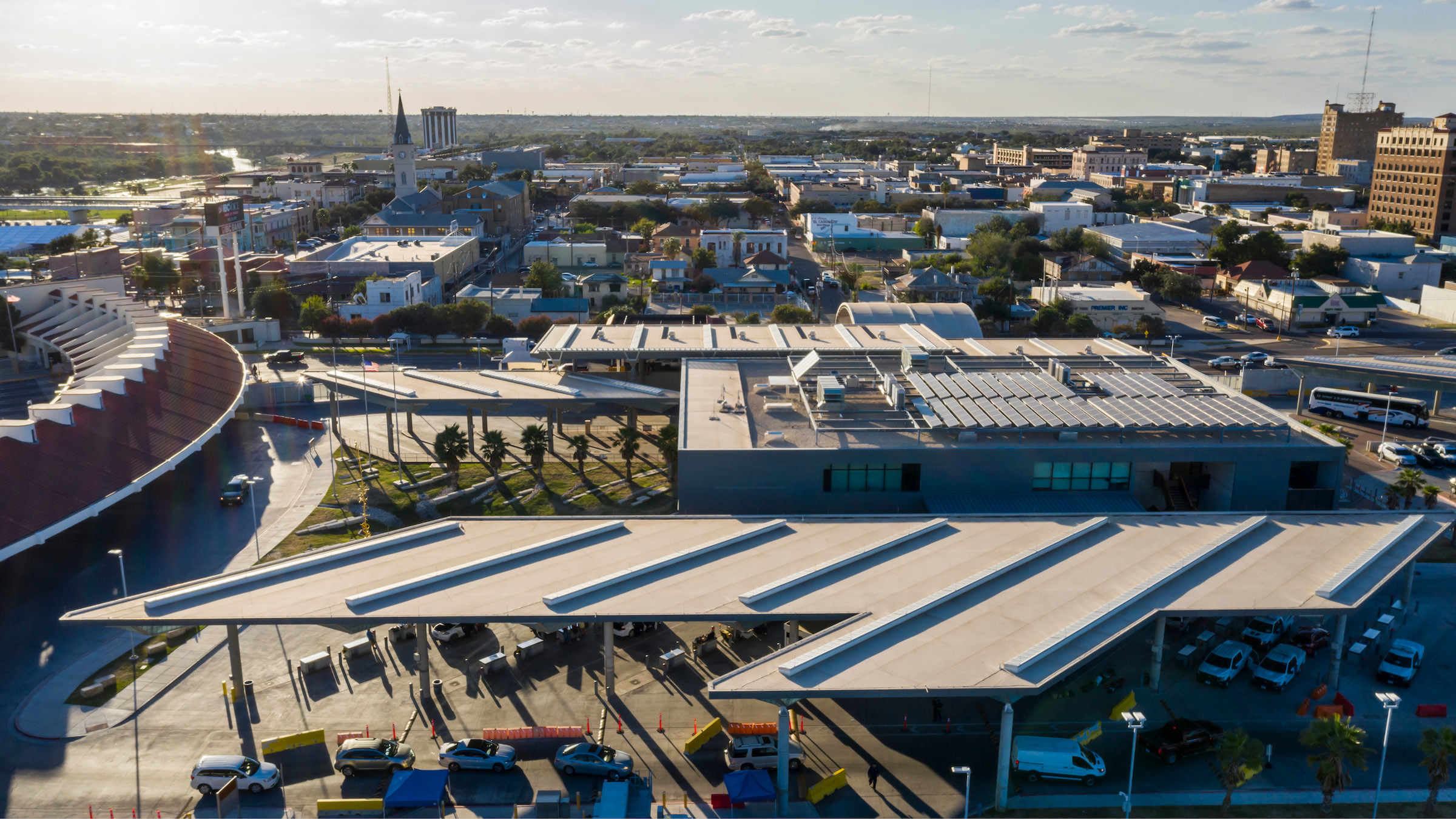
Laredo, Texas, was America’s busiest border crossing in 2020, with a total of 15 million people entering the United States from Mexico via five separate land ports of entry. Confronting dense urban fabric, highly variable weather, and geopolitical and security events, a complex renovation of two of those facilities—the Convent Avenue Land Port of Entry and Juarez-Lincoln Land Port of Entry—was completed on time and budget without interruption to port service. Sophisticated planning and coordination even made it possible to increase traveler throughput while construction was under way.
The Convent Avenue Land Port of Entry is a historic inspection building, and its modernization focused on increasing the in-processing of pedestrian travelers and included substantial interior work as well as new windows, systems, and sustainability upgrades. The Juarez-Lincoln Land Port of Entry was completely replaced in a phased process that encompassed new buildings for processing and inspecting privately owned vehicles and buses. The design of each project was led by a different architect.
“There was not only significant coordination to keep both facilities operating, but also sensitivity to historic fabric and community involvement,” Mark Cain said of the pair of efforts.
Accomplishing this intricate work leveraged planning and visualization technologies ranging from BIM models to VR headsets that allowed U.S. Customs and Border Protection stakeholders to interact in a virtual environment prior to groundbreaking. In a similar vein, the contractor made use of a proprietary app in lieu of safety reports, while also committing to traditional safety training for craft employees who had to navigate trying conditions like heavy traffic and summertime heat indexes surpassing 115 degrees. The consideration given to worker safety evidences the project team’s commitment to serving the Laredo community overall, which, among other efforts, manifested in regular communications with citizens about port operations as well as job-training outreach to local high schools and vocational schools.
For the complete project team list and additional photos, download the GSA Design Awards booklet.
Dwight D. Eisenhower National Memorial
Washington, D.C.
CITATION FOR LANDSCAPE ARCHITECTURE
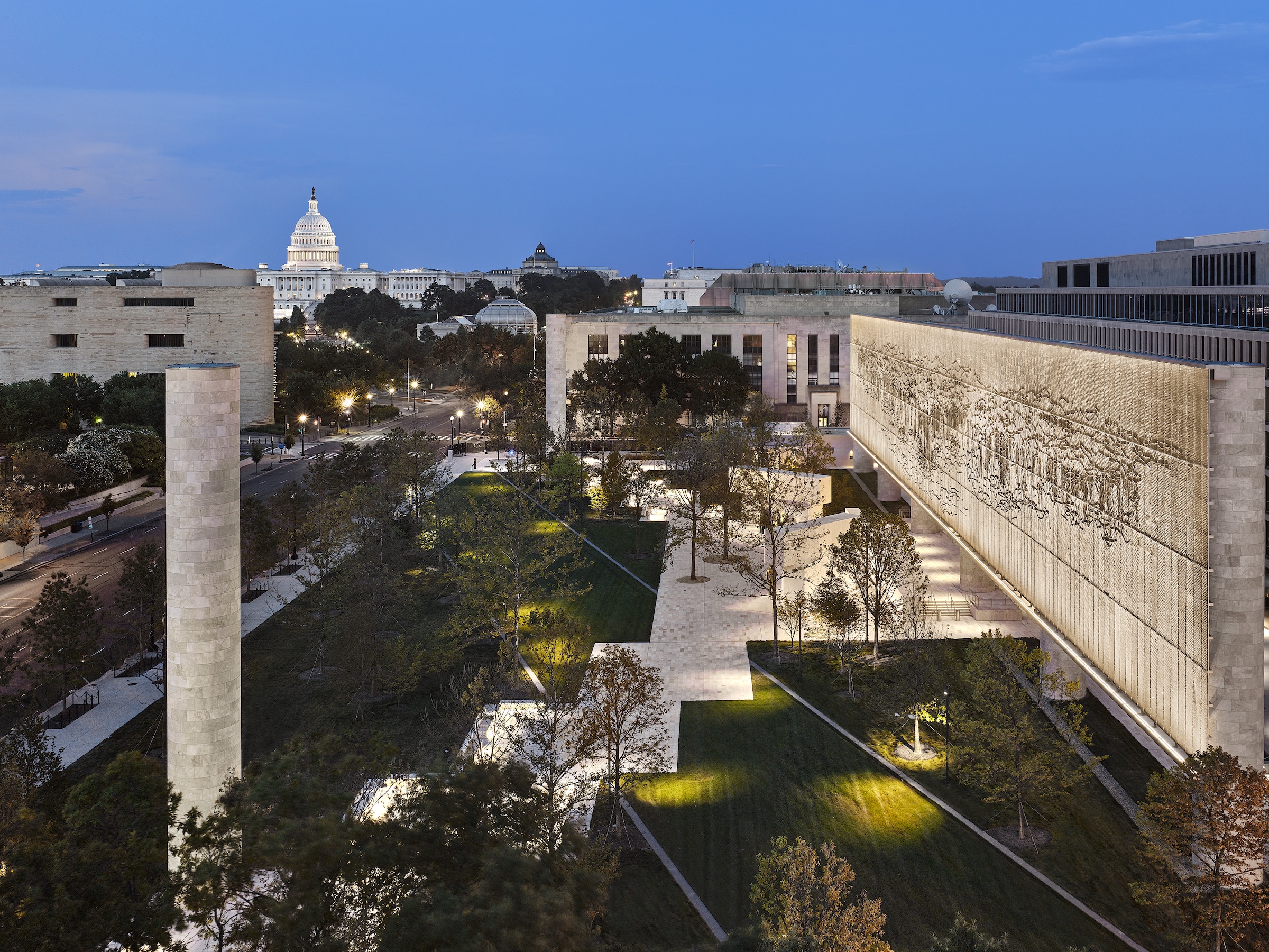
Hemmed between the National Mall to its north and the Lyndon B. Johnson Department of Education Building to the south, the Dwight D. Eisenhower National Memorial represents a uniquely urban environment among national memorials in Washington, D.C. Its landscape architecture responds to this setting by functioning as a pedestrian conduit, city park, and place of commemoration all at once, about which jury member Jejon Yeung remarked, “the ambiguity between public and memorial space is both interesting and inclusive.”
Encompassing four acres in total, the landscape is designed to guide visitors through key view corridors. Mature trees were sourced to provide ample shade as well as definition to street edges and open spaces immediately upon the memorial’s opening.
Because developing the memorial required annexation of Maryland Avenue, plants and hardscaping also demarcate that route’s diagonal axis. Maryland Avenue is an important historical corridor whose viewshed includes the U.S. Capitol, and multiple jurors pointed to the landscape’s acknowledgment of the avenue as an inspired feature.
In the southern half of the site, a stainless-steel tapestry depicting the Pointe du Hoc promontory of France’s Normandy coastline stands on large columns to create an outdoor room and memorial experience within the park.
Directly beneath the tapestry, freestanding sculpture, bas reliefs, and architectural elements invite visitors to explore President Eisenhower’s legacy in an intimate setting; to the tapestry’s south, the Lyndon B. Johnson Promenade serves as a distinct forecourt to the Department of Education Building.
Overall, Michael Vergason concluded, “The design and construction of a national memorial in Washington, D.C., is a significant achievement by any standard, but particularly so with a project of this scale and prominence. It contributes to everyday life and enriches the ensemble of landscapes that make up the city’s monumental core.”
For the complete project team list and additional photos, download the GSA Design Awards booklet.
John A. Volpe National Transportation Systems Center
Cambridge, Mass.
CITATION: ON THE BOARDS
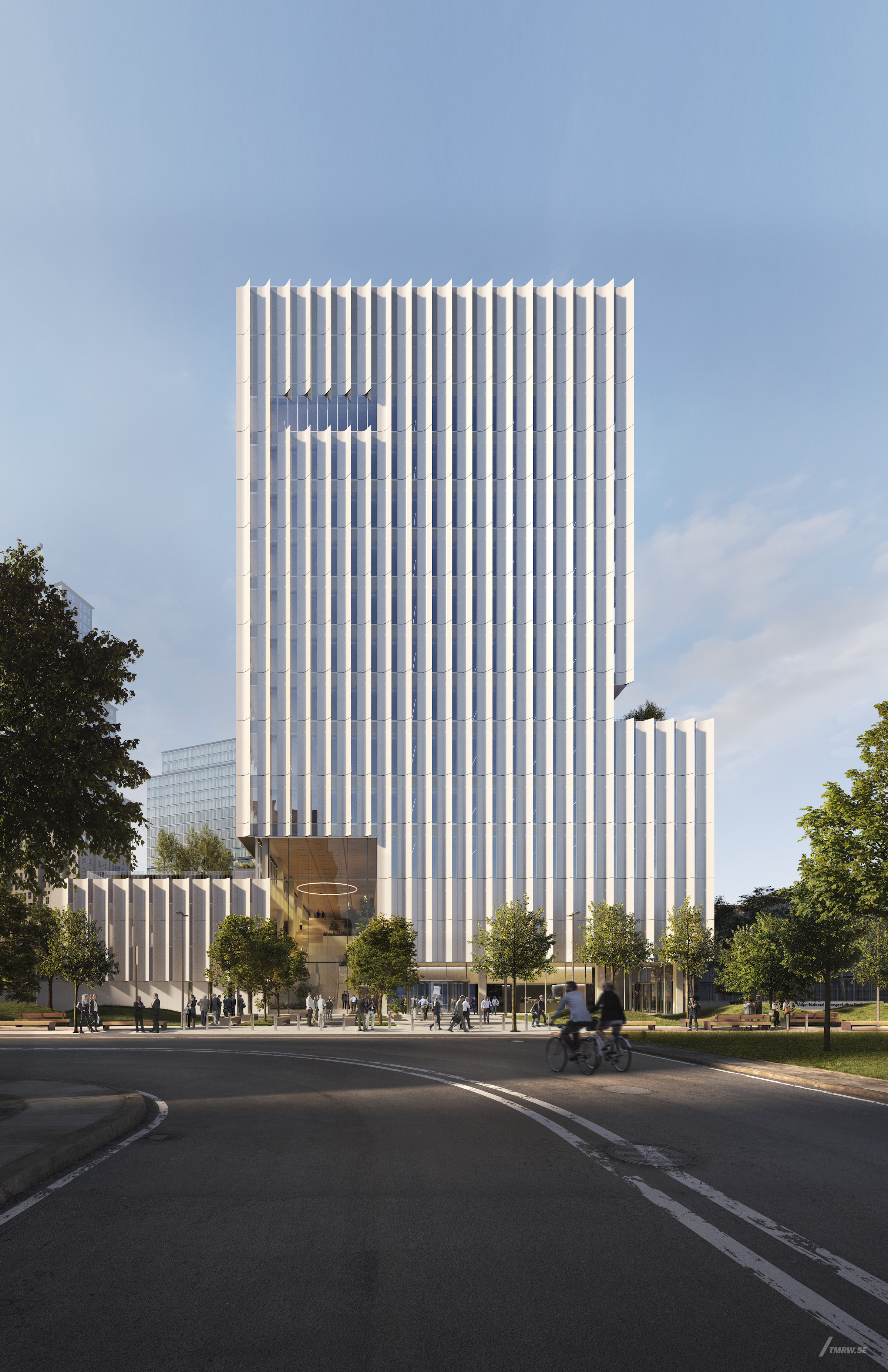
Established in 1970 and today employing 1,300 staff, the Cambridge, Mass.–based John A. Volpe Transportation Systems Center is a shared resource for federal agencies pursuing improvements to the nation’s transportation systems.
The Massachusetts Institute of Technology, U.S. Department of Transportation, and GSA are now nearing completion of a vertical research campus whose state-of-the-art laboratories and collaborative offices will replace six workplaces situated throughout Cambridge’s Kendall Square neighborhood.
The 13-story, 410,000-sf building includes a two- story volume that contains multipurpose labs, public spaces, and amenities. Noting how human factors labs are displayed so passersby may see how vehicles are tested and prototyped for public safety, Peggy Van Eepoel enthused, “This project responds well to the evolution of the neighborhood—even engaging with the public at ground level.” Also within this podium, an extensively glazed entrance provides views into a triple-height lobby whose open stairway connects to shared spaces such as a second-floor conference center and the third-floor cafeteria and its adjacent terrace.
The tower comprises office floors into which smaller labs are integrated, and setbacks on the north and south elevations infuse the structure with a human scale while still conveying, according to Curtis Moody, “a lot of strength.”
Whereas the north- and south-facing walls are characterized by glass mounted with horizontal sunshades, the east and west elevations are finished in vertical louvers crafted in white metal plates, the angles of which harvest daylight while shielding interiors from direct sun.
The facade shading enables workspaces to be arranged along the building perimeter, and it is poised to work alongside triple glazing and other techniques to contribute to exceptional energy performance. A third of the building’s energy and hot-water demand will be generated renewably on site.
For the complete project team list and additional photos, download the GSA Design Awards booklet.
John F. Kennedy Federal Building
Boston, Mass.
CITATION FOR PRESERVATION
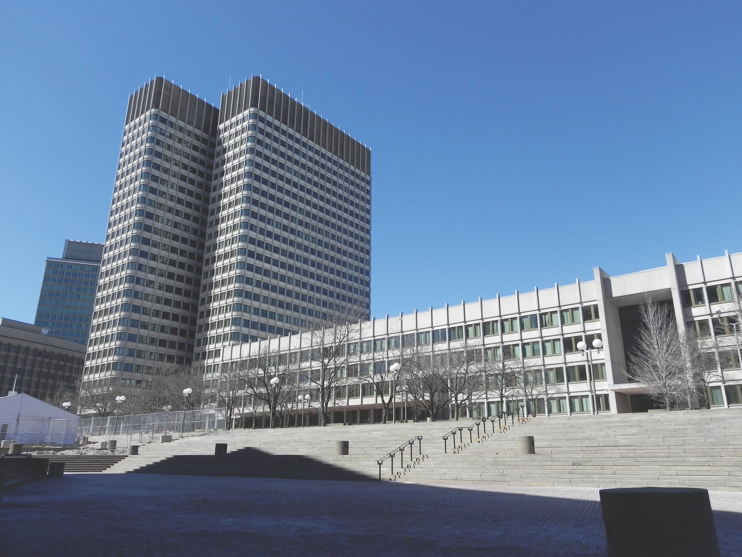
Designed by Walter Gropius and The Architects Collaborative, the John F. Kennedy Federal Building in Boston is one of the federal government’s most distinguished examples of midcentury modernism.
The recent operational efficiency of the twin 26-story towers on a four-story base, however, did not match its architectural reputation. According to an investigation performed in the early 2000s, the U-Factor of single-pane windows punched into the Kennedy building’s precast concrete exterior scored a heat-losing 1.17. Aged and degraded glazing contributed to air leakage and water infiltration while failing to provide meaningful glass shard retention.
The windows’ bronze-anodized aluminum frames did not incorporate thermal breaking, and a red-hued film that was once layered onto the glass to improve performance had also deteriorated and failed.
When replacement of the Kennedy building’s glazing systems began in earnest in 2009, GSA’s project criteria included increased thermal performance to meet modern energy code requirements, better airtightness, a higher level of condensation resistance, and a specified level of glass shard retention under blast. Equally important, while the building was not listed on the National Register of Historic Places at the time of the project’s execution, its team approached the historic appearance with reverence—making sure, for example, that any changes to the building’s character-defining details were submitted to the Massachusetts Historical Commission for review.
The newly designed and constructed glazing comprises thermally broken window frames with a clear double-pane insulating glass unit that incorporates low-emissivity coating in lieu of film. The final system enjoys a dramatically improved U-Factor of approximately 0.50 with an annual projected energy savings of $375,000, as well as a nearly identical appearance to the original glazing.
“The new glazing systems adhered so closely to the original appearance that the building was listed on the National Register of Historic Places after recladding,” observed judge Taryn Williams of the Kennedy building’s November 2021 elevation to the register. “That’s rare.”
For the complete project team list and additional photos, download the GSA Design Awards booklet.
Red Neon Circle Fragments On A Blue Wall
Dayton, Ohio
CITATION FOR CONSERVATION
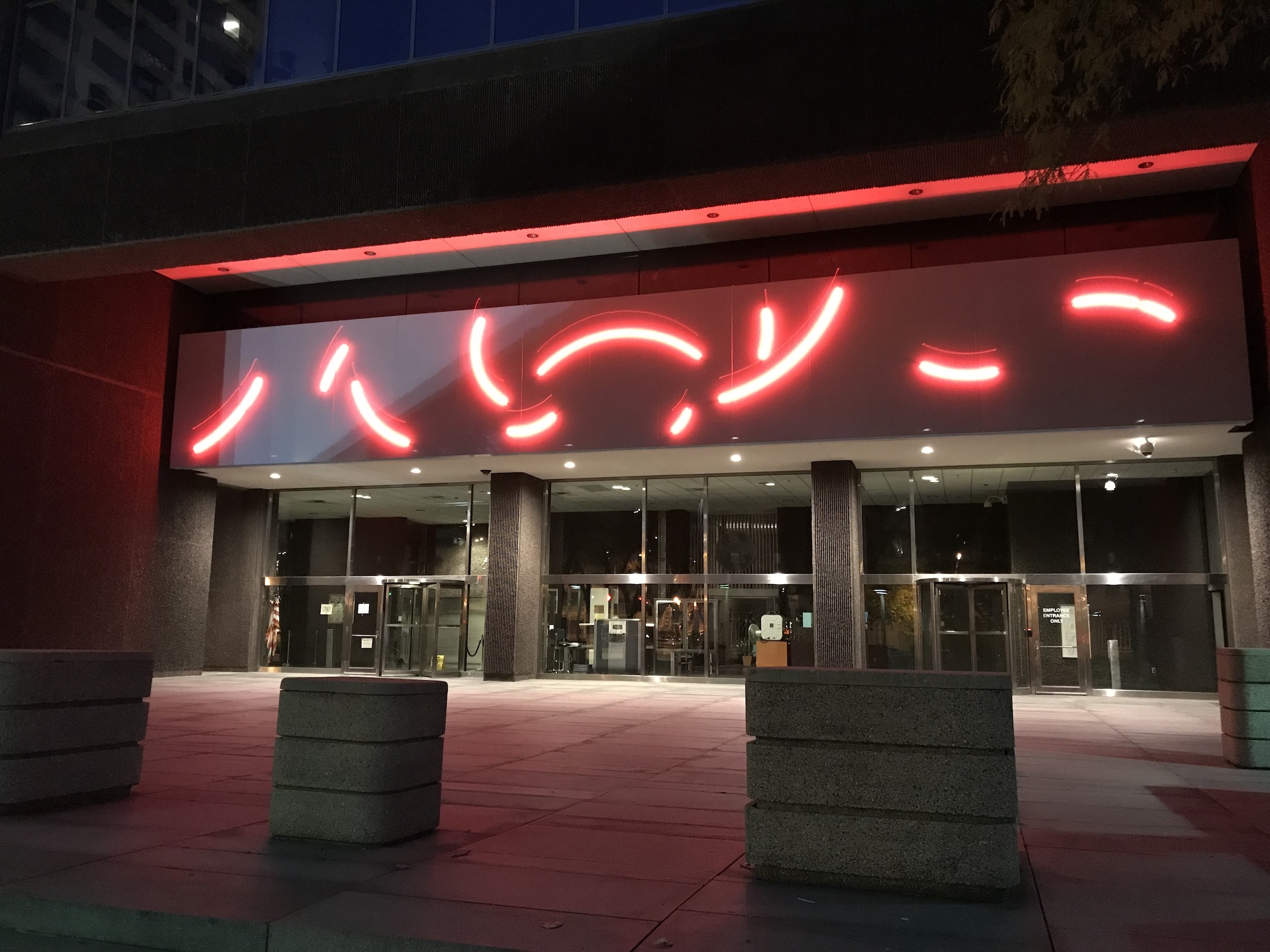
At the Walter H. Rice Federal Building and U.S. Courthouse in Dayton, Ohio, the revitalization of Red Neon Circle Fragments on a Blue Wall proves the value of orchestration. The project fully rehabilitated the 1978 installation by artist Stephen Antonakos in conjunction with exterior insulation improvement, which both upgraded the electrical infrastructure for the public art and improved the federal building’s energy efficiency.
When examination of Red Neon Circle Fragments on a Blue Wall revealed an outdated electrical supply, as well as missing and failing insulation behind the artwork panels, the arcing neon shapes were immediately deactivated for safety purposes.
In the subsequent modernization, the artwork was detached from the facade so the building envelope could be closed and insulated: the piece was removed by crane from its location over the north entrance of the Rice building, separated into its individual sections, and shipped off site. Electrical and cosmetic rehabilitation then took place in the conservation workshop.
Replacement neon tubing featuring more robust glass sockets was designed and produced to match the original tubes in both appearance and design. In parallel, the neon’s complementary sky-blue panels were stripped and recoated in epoxy primer and polyurethane architectural color coating, and original mild steel fasteners were replaced with stainless-steel hardware.
Building envelope work proceeded separately, with original non-compliant wiring entirely replaced and updated transformers hidden within drop-down panels that can be accessed from outside the building.
Upon completion of conservation efforts, Red Neon Circle Fragments on a Blue Wall was test-assembled and illuminated prior to its return to Dayton. The artwork was reinstalled by crane over new foam envelope insulation, which had been completed only recently beforehand to minimize the stand-in time for temporary filler panels.
For the complete project team list and additional photos, download the GSA Design Awards booklet.
Robert C. Weaver Federal Building
Washington, D.C.
CITATION FOR WORKPLACE
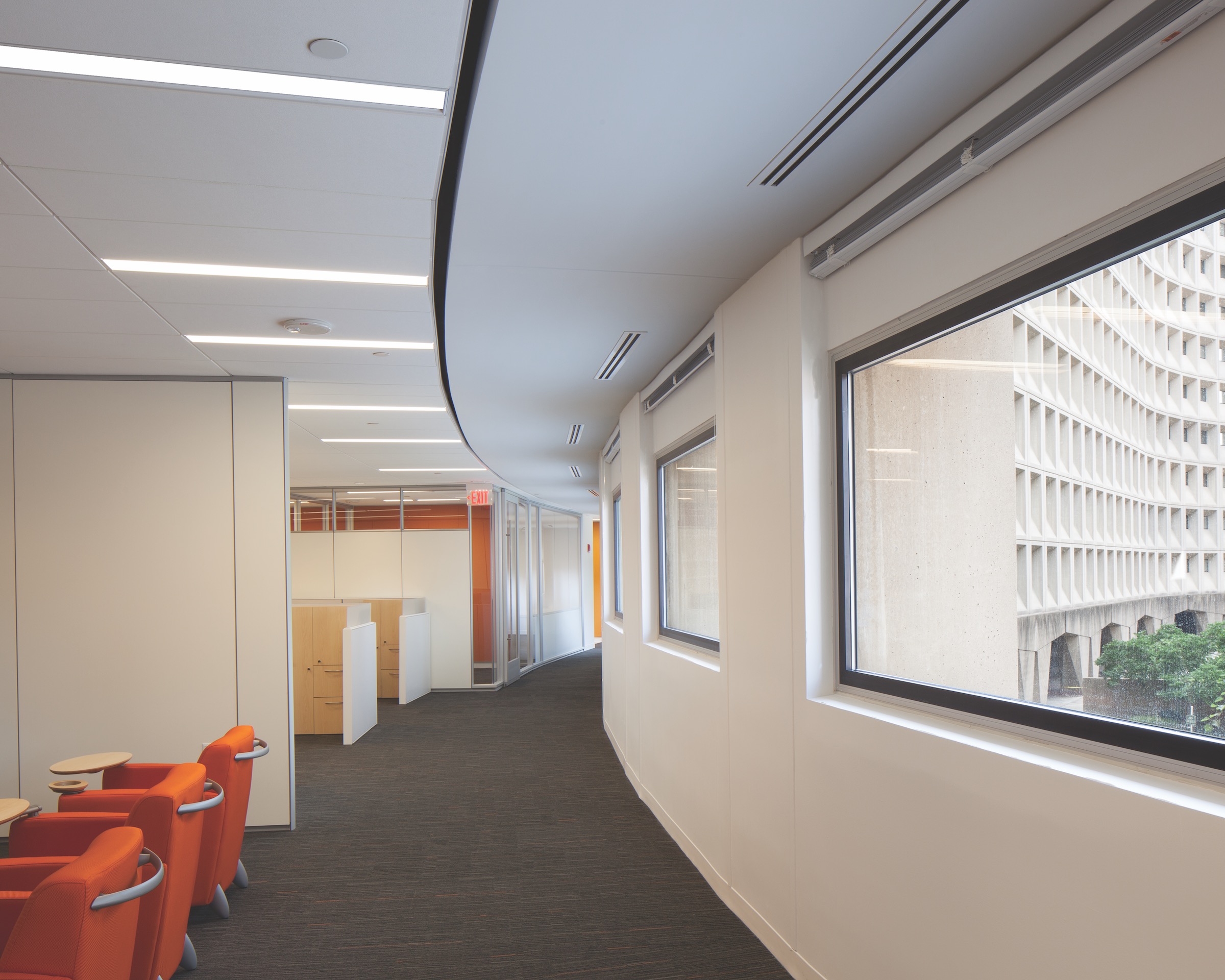
The Robert C. Weaver Federal Building is the 1.2 million-sf headquarters of the U.S. Department of Housing and Urban Development (HUD), originally designed by Marcel Breuer and completed in 1968. While Breuer’s composition is regarded as iconic, the building interior has been described by HUD employees as “eight floors of basement.”
In this half-foor demonstration project, workplace interiors are both dramatically updated and respectful of architectural and historic precedent.
Handling of daylight was key to the transformation. Countering relatively small, punched windows that might otherwise hinder sunshine from penetrating the interior, the design team removed enclosed spaces from the building perimeter and sheathed offices, conference rooms, and similar destinations in glass. For workstations placed within the newly open space, low partitions diminish interruptions to daylighting, while throughout the project a palette of light-colored finishes diffuse that light.
Workspaces are laid out on a rigorous module without feeling placeless. Noting how “it is difficult to think critically about the quality and comfort of interior spaces at the magnitude of government buildings,” Jejon Yeung praised the project’s organization around an interior thoroughfare: dotted with informal meeting spots, this “street” infuses the demonstration space with a human scale and enlivens it with activity.
Meanwhile, ceiling systems coordinate with Breuer’s architecture by following its curved footprint, which, according to Taryn Williams, “exemplifies building reuse at a high level.” In a similar vein, collaboration and training rooms’ orange and yellow accent walls evoke the Weaver building’s historic wayfinding scheme.
All occupants of the realized pilot space have access to daylight. The pilot also proved that it could accommodate projected staff growth of 15% or more. If rolled out completely, HUD would be able to consolidate its Washington, D.C., leases into the Weaver building.
For the complete project team list and additional photos, download the GSA Design Awards booklet.
Tomochichi Federal Building and U.S. Courthouse Annex
Savannah, Ga.
CITATION FOR URBAN DESIGN AND PLANNING
In the 1733 document now considered an ingenious stroke of urban planning, James Oglethorpe arranged Savannah, Ga., into six wards. In each, so-called trustee lots flank the east and west sides of a public square, and tything lots line the streets to that square’s north and south. Trustee lots were conceived as sites of civic buildings, whereas tything lots were distributed among colonists for housing.
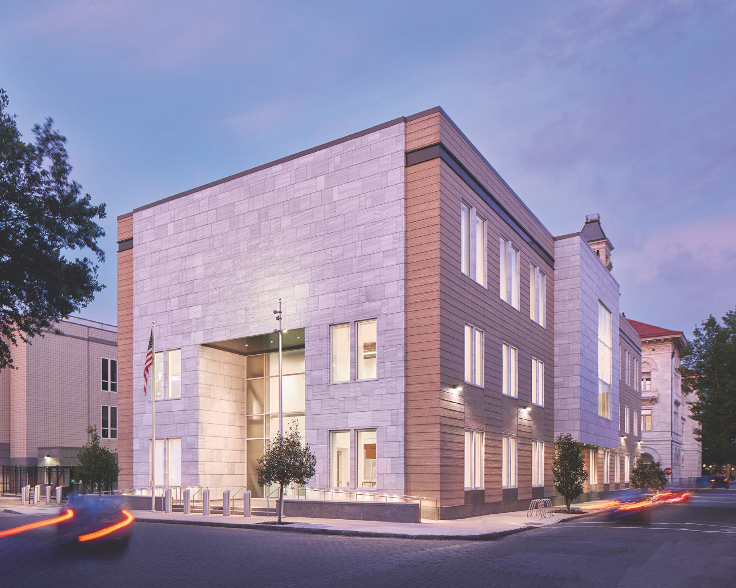
The Tomochichi Federal Building and U.S. Courthouse Annex stands directly within Oglethorpe’s purview, occupying the eastern trustee block of Telfair Square. The annex’s 1894 namesake, located directly to its east, occupies the western trustee block of Wright Square.
The new annex represents “exactly what we should be aspiring to when designing a building for an urban grid, because it interprets its context for the community,” Curtis Moody shared with jurors.
The masonry volume’s dimensions complement Telfair Square as well as the proportions of trust-block buildings found elsewhere in the Savannah Historic District (which today encompasses wards centered on 22 squares). Exterior tan brick blends with the surrounding streetscape, while brick coursing and white marble unify the annex to the original, Second Renaissance Revival–style Tomochichi facility. The annex’s largely marble west elevation expresses the symmetry common to the public faces of trust-block buildings, and the articulation of its north, east, and south elevations was informed by adjacent buildings.
Taryn Williams was equally impressed by the process by which the project team “connected this building to the grid and scale of Savannah.” The design appears embedded in the community fabric in part because occupants and residents advocated for that integration, and input from local citizens impacted site utilization and program organization and even resulted in some cost savings.
As Williams concluded, “There was a process that focused on stakeholder engagement and public input, which deeply informed the design.”
For the complete project team list and additional photos, download the GSA Design Awards booklet.
United States Custom House
San Ysidro, Calif.
CITATION FOR PRESERVATION
The United States Custom House in San Ysidro, Calif., was erected in 1933 to serve motor vehicle travel between Tijuana, Mexico, and San Diego. For two decades thereafter, border agents enforced America’s customs and immigration laws solely from the Custom House.
But, culminating a series of construction projects, in 2009 the historic building faced possible demolition to make room for a major port expansion. A Section 106 consultation spared the Custom House, by prompting a redesign of traffic lanes around its site.
Since then, too, emergence of new inspection protocols for southbound pedestrians created a viable new use for the building, allowing it to continue its service at the San Ysidro Land Port of Entry.
“The building was treated as an afterthought for several decades, so it’s pretty amazing that it was saved at all,” said Taryn Williams, as she and the other 2022 GSA Design Awards jurors cheered the rehabilitation of the Custom House.
The Custom House was previously used as a pedestrian processing facility, and its interior had been extensively altered while uneven maintenance of the exterior had led to deterioration of surfaces.
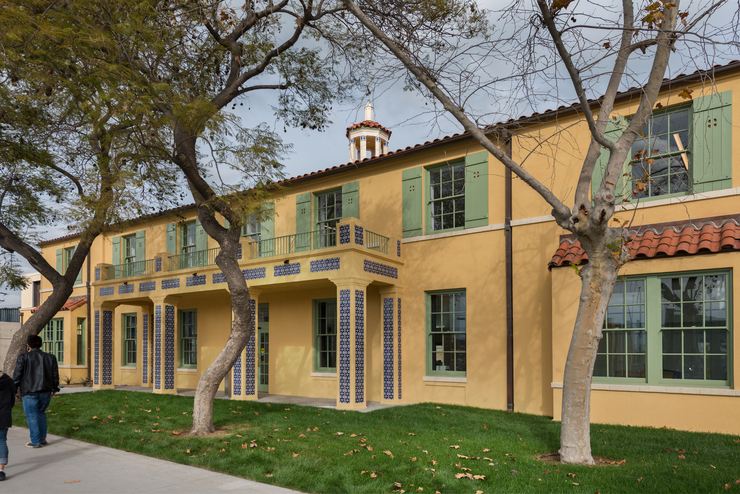
In response, rehabilitation efforts restored the stucco and eliminated an inappropriate elastomeric coating. Original windows and doors were removed, restored, and reinstalled, as were terracotta sills, wood shutters, and other decorative elements.
The signature cupola was also faithfully reconstructed and accented with original cobalt blue highlights, while a legibly modern addition was placed over the north wing.
Performance upgrades included a full seismic retrofit, the introduction of new and sustainable systems, and improved gunfire resistance.
Today, the Custom House plays a vital role for the thousands of pedestrians who use the San Ysidro Land Port of Entry daily, and it provides a welcoming, human-scale presence to all travelers who cross through the sprawling complex.
For the complete project team list and additional photos, download the GSA Design Awards booklet.
USC Consolidation - Conrad B. Duberstein U.S. Post Office And Courthouse
Brooklyn, N.Y.
CITATION FOR WORKPLACE
Located in downtown Brooklyn, the Conrad B. Duberstein U.S. Post Office and Courthouse was initially completed in 1892 and expanded to the north in 1933. The U.S. Courts (USC) Bankruptcy and Probation Consolidation project is a phased initiative whose goals include reactivating the original Romanesque Revival–style building’s south-facing entrance, relocating Probation staff from an adjacent federal facility, and upgrading the workplace interiors with an emphasis on energy efficiency and smart building technologies.
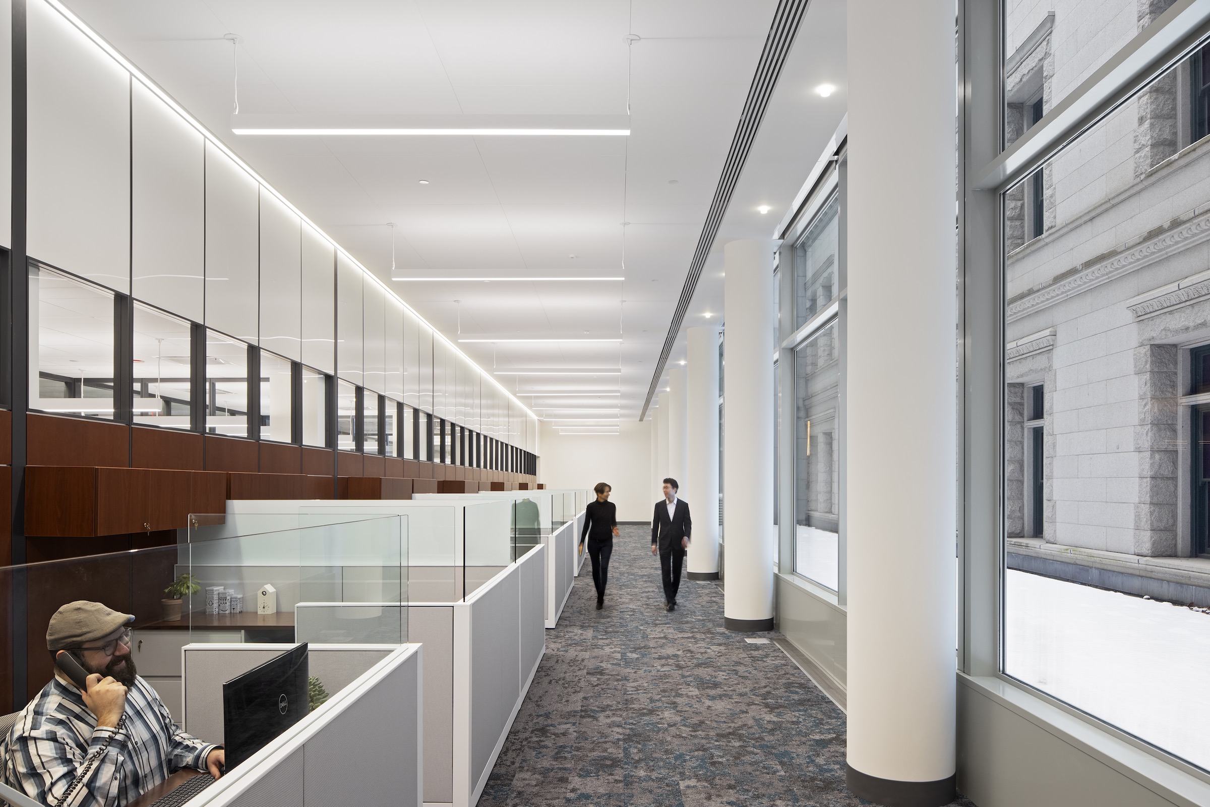
Jurors lauded the interior renovations completed to date, citing the balance struck between existing architectural elements, state-of-the-art office needs, and contemporary aesthetics. The design team configured open office areas at the building perimeter, so all occupants would have access to daylight entering the interior through soaring perimeter windows, for example.
The team also employed demountable partitions to divide the interior into offices and other rooms, about which Jejon Yeung said, “The contrast between the panels and the historic context works well without being overbearing.”
The Bankruptcy program comprises offices, training spaces, and storage, and the Probation program includes a screening area, interview rooms, offices, tactical and interactive training areas, conference rooms, and a laboratory.
In addition to delicately bridging past and present, the demountable partitions achieved practical benefits—namely, condensing the construction schedule, minimizing tenant disruption, and customizing office solutions. Moreover, the solution was just one of several cost-effective approaches to the interior redesign, which also included sound masking and the addition of batt insulation within the ceiling cavity to provide acoustical dampening where existing building infrastructure conflicted with partition locations.
Of this suite of budget-conscious design decisions, Kay Sargent called the consolidation, “one of the most fiscally responsible projects submitted to the 2022 GSA Design Awards.”
For the complete project team list and additional photos, download the GSA Design Awards booklet.
Related Stories
Sustainable Design and Construction | Oct 10, 2024
Northglenn, a Denver suburb, opens a net zero, all-electric city hall with a mass timber structure
Northglenn, Colo., a Denver suburb, has opened the new Northglenn City Hall—a net zero, fully electric building with a mass timber structure. The 32,600-sf, $33.7 million building houses 60 city staffers. Designed by Anderson Mason Dale Architects, Northglenn City Hall is set to become the first municipal building in Colorado, and one of the first in the country, to achieve the Core certification: a green building rating system overseen by the International Living Future Institute.
Government Buildings | Sep 17, 2024
OSHA’s proposed heat standard published in Federal Register
The Occupational Safety and Health Administration (OSHA) has published a proposed standard addressing heat illness in outdoor and indoor settings in the Federal Register. The proposed rule would require employers to evaluate workplaces and implement controls to mitigate exposure to heat through engineering and administrative controls, training, effective communication, and other measures.
Government Buildings | Aug 19, 2024
GSA posts new RFI for enabling energy efficiency, decarbonization in commercial buildings
The U.S. General Services Administration (GSA), in collaboration with the U.S. Department of Energy, recently released a new Request For Information (RFI) focused on enabling energy efficiency and decarbonization in commercial buildings. GSA wants to test innovative technologies through GSA’s Center for Emerging Building Technologies.
Curtain Wall | Aug 15, 2024
7 steps to investigating curtain wall leaks
It is common for significant curtain wall leakage to involve multiple variables. Therefore, a comprehensive multi-faceted investigation is required to determine the origin of leakage, according to building enclosure consultants Richard Aeck and John A. Rudisill with Rimkus.
Government Buildings | Aug 14, 2024
GSA releases updated standards to move federal buildings toward zero emissions
The U.S. General Services Administration (GSA) recently released updated building efficiency standards for federal buildings. The mandatory design and construction standards and performance criteria apply to 300,000 federal buildings.
Sustainability | Aug 14, 2024
World’s first TRUE Zero Waste for Construction-certified public project delivered in Calif.
The Contra Costa County Administration Building in Martinez, Calif., is the world’s first public project to achieve the zero-waste-focused TRUE Gold certification for construction. The TRUE Certification for Construction program, administered by Green Business Certification Inc. (GBCI), recognizes projects that achieve exceptional levels of waste reduction, reuse, and recycling.
Government Buildings | Aug 1, 2024
One of the country’s first all-electric fire stations will use no outside energy sources
Charlotte, N.C.’s new Fire Station #30 will be one of the country’s first all-electric fire stations, using no outside energy sources other than diesel fuel for one or two of the fire trucks. Multiple energy sources will power the station, including solar roof panels and geothermal wells. The two-story building features three truck bays, two fire poles, dispatch area, contamination room, and gear storage.
Smart Buildings | Jul 25, 2024
A Swiss startup devises an intelligent photovoltaic façade that tracks and moves with the sun
Zurich Soft Robotics says Solskin can reduce building energy consumption by up to 80% while producing up to 40% more electricity than comparable façade systems.
Government Buildings | Jul 8, 2024
GSA adopts new accessibility guidelines for federal properties
The U.S. General Services Administration (GSA) adopted a new rule with new accessibility guidelines for federal buildings. The rule establishes that pedestrian facilities in the public right-of-way are readily accessible to and usable by people with disabilities.
Smart Buildings | Jul 1, 2024
GSA to invest $80 million on smart building technologies at federal properties
The U.S. General Services Administration (GSA) will invest $80 million from the Inflation Reduction Act (IRA) into smart building technologies within 560 federal buildings. GSA intends to enhance operations through granular controls, expand available reporting with more advanced metering sources, and optimize the operator experience.


