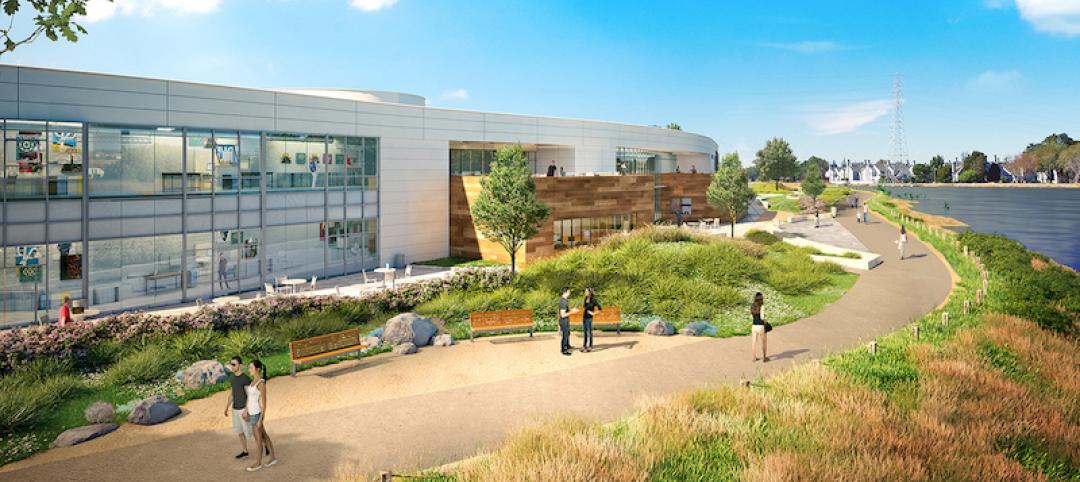
Built in 1963, the 32,000-sf 200 Fillmore building in Denver housed office and retail in a drab, outdated, and energy-splurging shell—a “style” made doubly disastrous by 200 Fillmore's function as the backdrop for a popular public plaza and outdoor café called “The Beach.”
In 2005, the owner, Western Development Group, determined to pluck 200 Fillmore out from its Class C office space doldrums. To do that, a Building Team headed by the Denver office of Chicago firm 4240 Architecture came up with three goals: maximize the leasable area, improve the building's energy usage, and enhance the appearance of The Beach.
The team ran head-on into problems. First, they discovered the building already exceeded zoning limits on area, so any expansion had to stay within the building's original footprint. Their best option for expansion, then, lay in the cantilevered concrete slab that extended around the outside as part of the original façade. Field tests showed the slab could support a new exterior wall, but only one weighing less than 10 pounds per face square foot. The solution: A terra cotta rainscreen system that gave the building an inviting appearance at a low weight.
This part of the project required better-than-average organizational skills. The terra cotta tiles were not flat, nor did they have clean, straight edges. To make sure the rainscreen was installed with a 3/16-in. joint throughout, the team experimented with a full-size mockup. All this was going on even as ground-floor retail was open and the upper three floors were gutted.
Bumping up the building's energy efficiency led the Building Team to, of all places, the restrooms, which had claustrophobically low seven-foot ceilings that were constrained by undersized air handler units stored in the space above. The team junked those floor-based units in favor of one large roof unit that served the whole building. The result was not only a more efficient HVAC system, but also a person-friendly restroom design—with ceiling heights raised to eight feet.
Improvements to The Beach include tall grasses and seasonal flower landscaping that wrap around the retail and plaza edge. A new wood and steel entry canopy complements the terra cotta rainscreen and steel window treatments, while simultaneously connecting the lobby and outdoors and reducing the building's scale.
All these changes resulted in a radically different building—both inside and out. Gone is the '60s-era façade with its set-back windows framed by a mesh grille and crossed by vertical support bars. In its place are new flush windows on the second and third floors, and a balcony on the fourth floor, which is now residential space for the building's owner. Horizontal trim at the tops of the windows mimic the balcony's railing system.
The Building Team was able to accomplish this complete overhaul—from original design to completed construction—in 12 months. Although the project went $300,000 (7.5%) over the original $4 million budget, the overrun was negated by the fact that the new 200 Fillmore was fully leased on opening day.
Related Stories
Office Buildings | Sep 27, 2017
Gensler designs New Jersey law firm’s new headquarters space
The HQ occupies 75,000 sf in a 400,000-sf suburban office building.
Mixed-Use | Sep 26, 2017
Perkins+Will designs new international business community in Cali, Colombia
The new free trade zone is designed to resemble a small village.
Office Buildings | Sep 20, 2017
Five Stantec offices move into one Fifth Avenue location
The new location provides the firm with 40,000 sf of space.
Industrial Facilities | Aug 29, 2017
Clayco completes construction on Georgia-Pacific Distribution Center
The new facility expands on the company’s old distribution facility by over 300,000 sf.
Green | Aug 24, 2017
Business case for WELL still developing after first generation office fitouts completed
The costs ranged from 50 cents to $4 per sf, according to a ULI report.
Market Data | Aug 20, 2017
Some suburban office markets are holding their own against corporate exodus to cities
An analysis of mortgage-backed loans suggests that demand remains relatively steady.
Office Buildings | Aug 17, 2017
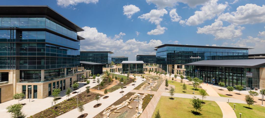
Toyota’s new North American HQ opens in Plano
Toyota invested $1 billion in the project, which was designed by Corgan.
Lighting | Aug 2, 2017
Dynamic white lighting mimics daylighting
By varying an LED luminaire’s color temperature, it is possible to mimic daylighting, to some extent, and the natural circadian rhythms that accompany it, writes DLR Group’s Sean Avery.
Office Buildings | Aug 1, 2017
Corporate values as workplace drivers
Connecting personal values to company values is important to millennial workers.
K-12 Schools | Aug 1, 2017
This new high school is the first to be built on a tech company’s campus
Design Tech High School, located on Oracle Corporation’s Headquarters campus, will span 64,000 sf across two stories and have a capacity of 550 students.


