Built in 1963, the 32,000-sf 200 Fillmore building in Denver housed office and retail in a drab, outdated, and energy-splurging shell—a “style” made doubly disastrous by 200 Fillmore's function as the backdrop for a popular public plaza and outdoor café called “The Beach.”
In 2005, the owner, Western Development Group, determined to pluck 200 Fillmore out from its Class C office space doldrums. To do that, a Building Team headed by the Denver office of Chicago firm 4240 Architecture came up with three goals: maximize the leasable area, improve the building's energy usage, and enhance the appearance of The Beach.
The team ran head-on into problems. First, they discovered the building already exceeded zoning limits on area, so any expansion had to stay within the building's original footprint. Their best option for expansion, then, lay in the cantilevered concrete slab that extended around the outside as part of the original façade. Field tests showed the slab could support a new exterior wall, but only one weighing less than 10 pounds per face square foot. The solution: A terra cotta rainscreen system that gave the building an inviting appearance at a low weight.
This part of the project required better-than-average organizational skills. The terra cotta tiles were not flat, nor did they have clean, straight edges. To make sure the rainscreen was installed with a 3/16-in. joint throughout, the team experimented with a full-size mockup. All this was going on even as ground-floor retail was open and the upper three floors were gutted.
Bumping up the building's energy efficiency led the Building Team to, of all places, the restrooms, which had claustrophobically low seven-foot ceilings that were constrained by undersized air handler units stored in the space above. The team junked those floor-based units in favor of one large roof unit that served the whole building. The result was not only a more efficient HVAC system, but also a person-friendly restroom design—with ceiling heights raised to eight feet.
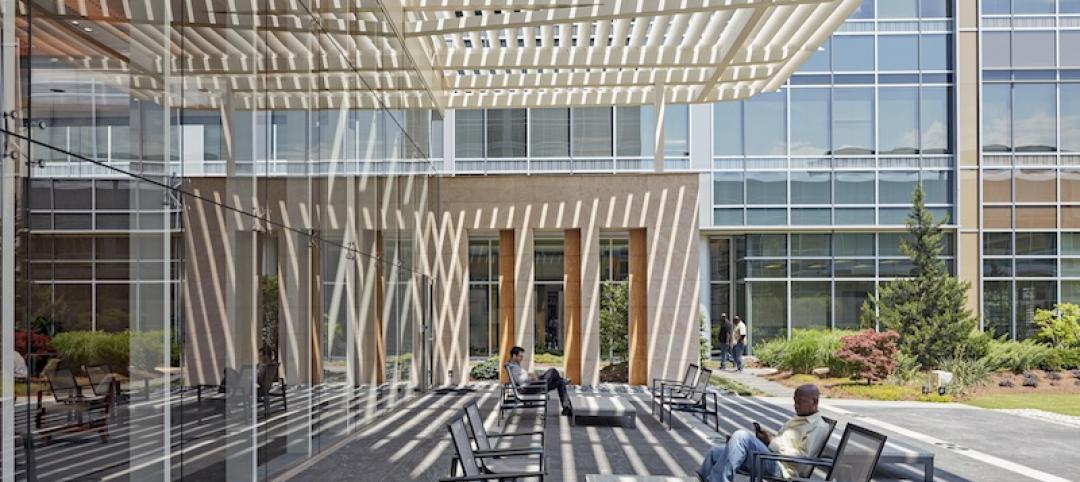
Improvements to The Beach include tall grasses and seasonal flower landscaping that wrap around the retail and plaza edge. A new wood and steel entry canopy complements the terra cotta rainscreen and steel window treatments, while simultaneously connecting the lobby and outdoors and reducing the building's scale.
All these changes resulted in a radically different building—both inside and out. Gone is the '60s-era façade with its set-back windows framed by a mesh grille and crossed by vertical support bars. In its place are new flush windows on the second and third floors, and a balcony on the fourth floor, which is now residential space for the building's owner. Horizontal trim at the tops of the windows mimic the balcony's railing system.
The Building Team was able to accomplish this complete overhaul—from original design to completed construction—in 12 months. Although the project went $300,000 (7.5%) over the original $4 million budget, the overrun was negated by the fact that the new 200 Fillmore was fully leased on opening day.
Related Stories
BIM and Information Technology | Mar 28, 2017
Digital tools accelerated the design and renovation of one contractor’s new office building
One shortcut: sending shop drawings created from laser scans directly to a wood panel fabricator.
Office Buildings | Mar 27, 2017
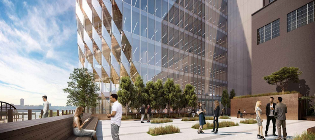
New York warehouse to become an office mixing industrial and modern aesthetics
The building is located in West Chelsea between the High Line and West Street.
Office Buildings | Mar 24, 2017
Brookfield expands its ‘office of the future’ brand to Houston
The developer engaged four design firms to come up with unique suites it will market under its DesignHive label.
Office Buildings | Mar 21, 2017
Fruit company’s HQ acts as an oasis among surrounding industrial processing yards
Graham Baba Architects designed the project around a central, landscaped courtyard.
Office Buildings | Mar 20, 2017
The new workplace: More than a generational issue
Today’s workplace requires designers and employers to look holistically at the organization’s culture, its criteria for success, and its place in the world.
Office Buildings | Mar 7, 2017
Large creative office projects generate staggering returns for property investors
A new Transwestern report examines the adaptive reuse trend across the U.S.
Office Buildings | Mar 2, 2017
White paper from Perkins Eastman and Three H examines how design can inform employee productivity and wellbeing
This paper is the first in a planned three-part series of studies on the evolution of diverse office environments and how the contemporary activity-based workplace (ABW) can be uniquely tailored to support a range of employee personalities, tasks and work modes.
Office Buildings | Mar 2, 2017
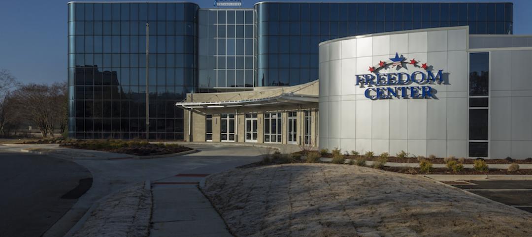
Office renovation and addition give new life to a section of Huntsville, Ala.
The newly opened Freedom Center, near Redstone Arsenal, includes a 10,000-sf conference center.
Office Buildings | Feb 24, 2017
The sun’s rays helped shape this Studio Gang-designed NYC tower
Solar Carve Tower advances Studio Gang’s ‘solar carving’ design strategy.
Office Buildings | Feb 16, 2017
Bjarke Ingels Group wins competition to design S.Pellegrino Flagship Factory
The factory will immerse employees and visitors in nature from all sides.


