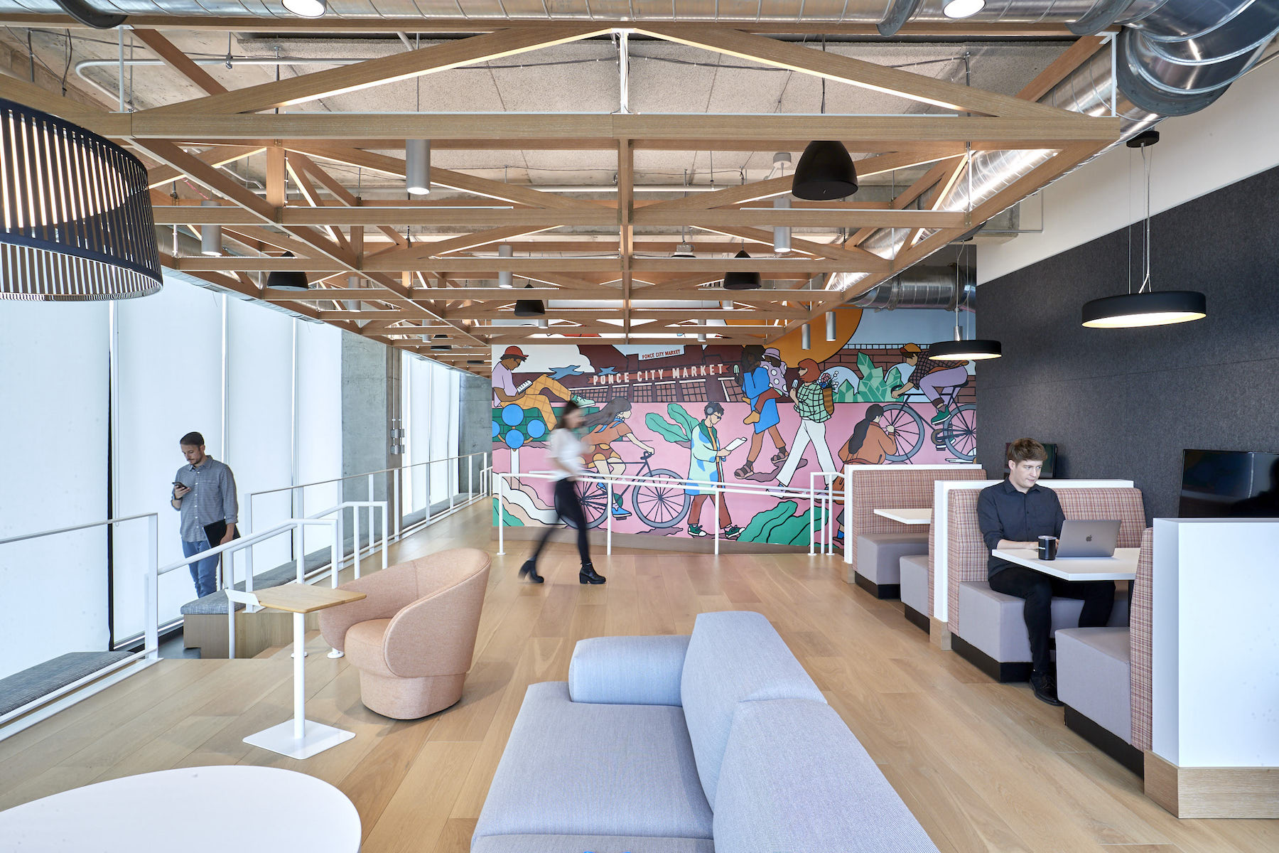
The asset management giant BlackRock has released images of the interior design for its 120,000-sf Innovation Hub in Atlanta, which BlackRock moved into two years ago. That design, a collaboration with Perkins&Will’s studios in Atlanta and New York, is the first project in North America to follow BlackRock’s global design guidelines, which the design firm authored. P&W’s Branded Environments team also provided BlackRock’s Global Signage and Brand guidelines for environmental applications.
The office is located in midtown’s 725 Ponce development along the Atlanta BeltLine and across from the Ponce City Market. Brent Capron, interior design director at P&W’s New York office, calls this space “a testament to [BlackRock’s] long-term commitment in the city and its workforce.” BlackRock revealed its plans to expand into Atlanta with a new Innovation Hub in October 2018. At the time, it had 15 employees in the state, and its plans called for hiring up to 1,000 workers by 2024, according to various news reports at the time. The Wall Street Journal reported then that BlackRock would use $25 million in public tax breaks in support of its Southern expansion.
DESIGN ENCOURAGES COLLABORATION
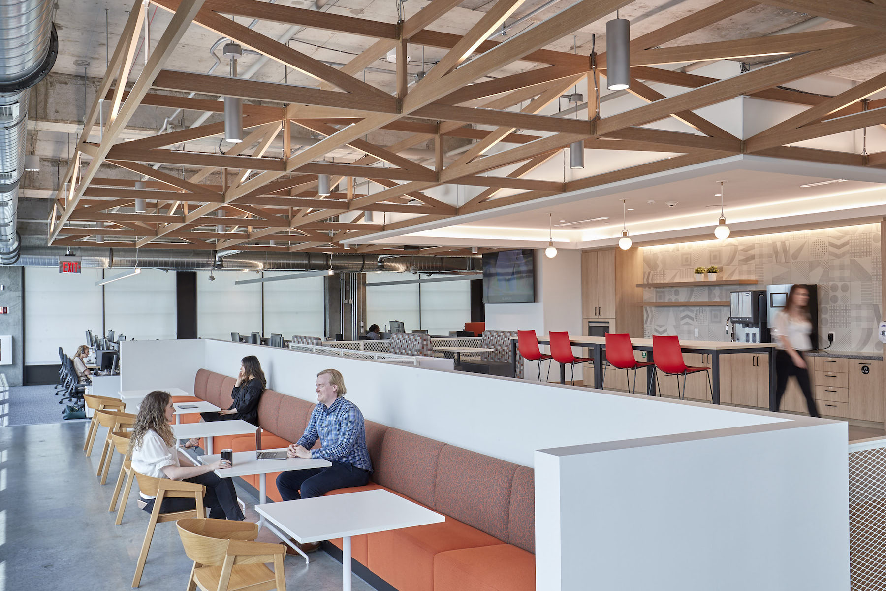
The two-floor Atlanta iHub will eventually expand to four floors to accommodate BlackRock’s intended recruitment. Three core themes—the porch, the festival, and the crossroads—drive iHub’s design concept:
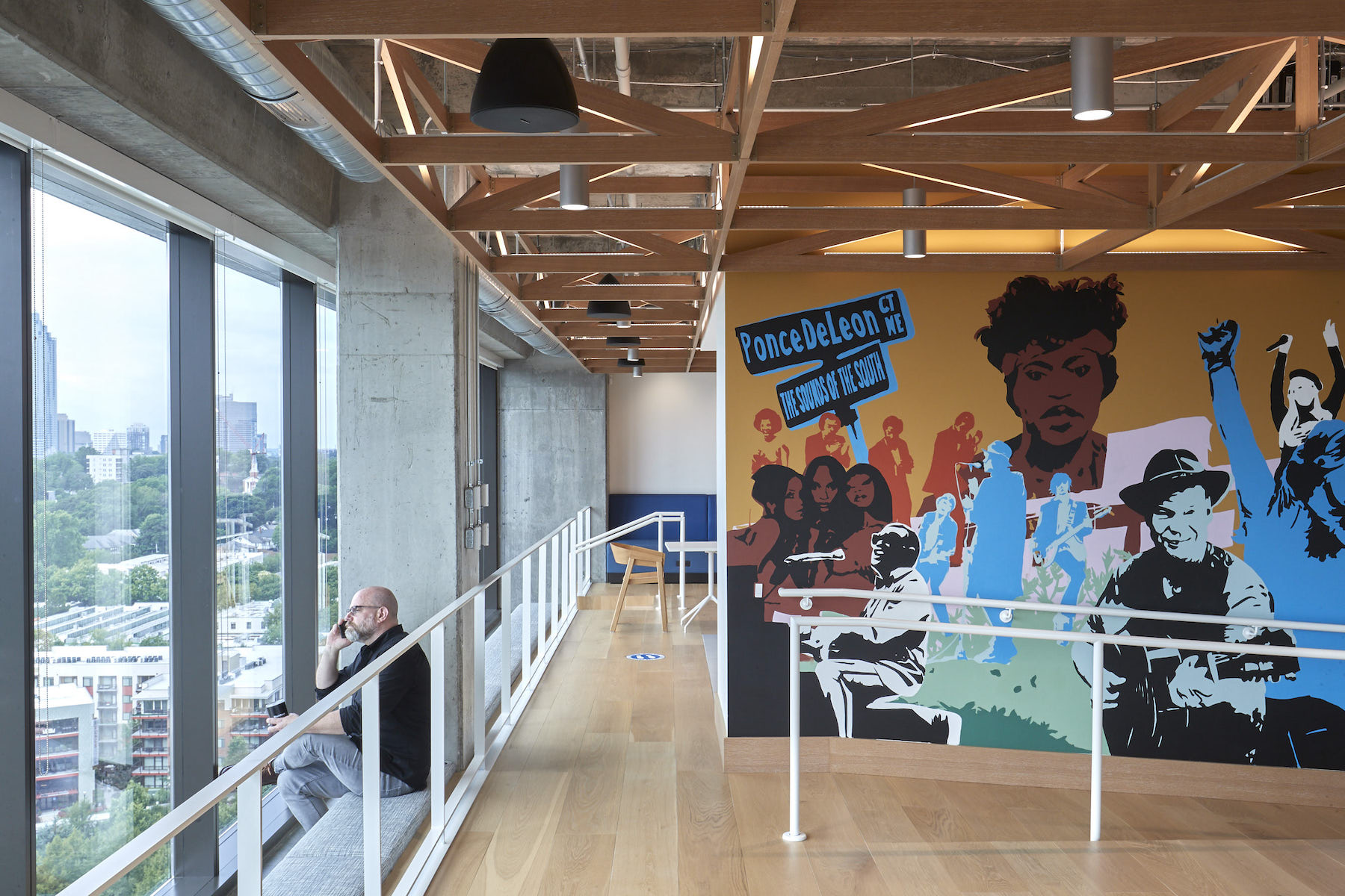
• The end of each floor has its own dedicated “porch,” with individualized murals and design expressions. The porch is meant to be where employees from both floors can congregate, as well as host clients and guests;
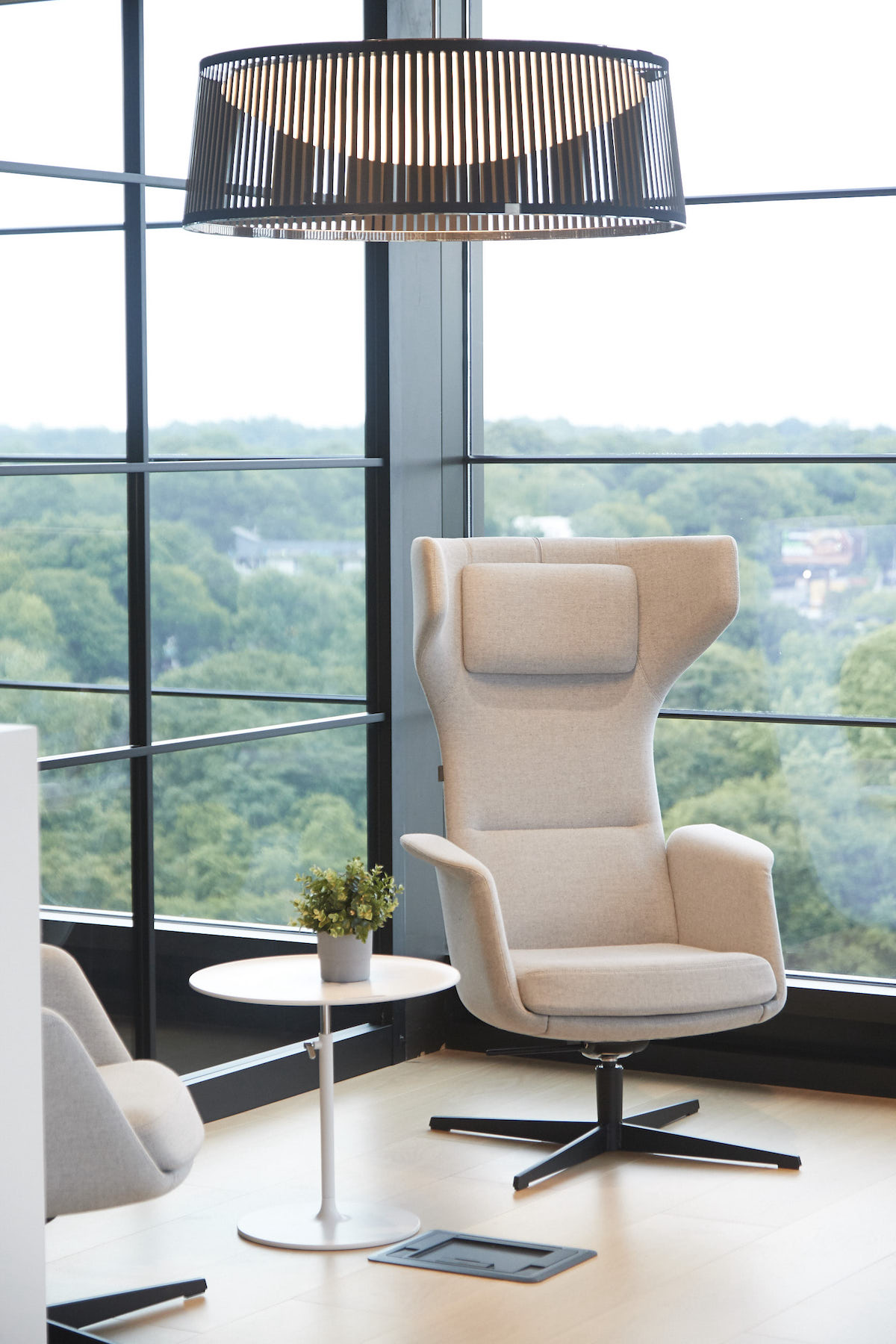
• P&W has positioned iHub as a place that fosters idea exchanges. These “crossroads” also are meant to reflect (or at least suggest) Atlanta’s role as a transportation nexus that includes America’s busiest airport;
• Spaces that encourage impromptu meetings and collaborations also capture the “festival” design theme that echoes Atlanta’s culture and past. These areas are distinguished by flexible spaces, furniture, and lighting.
ART EXPRESSES A LOCAL POV
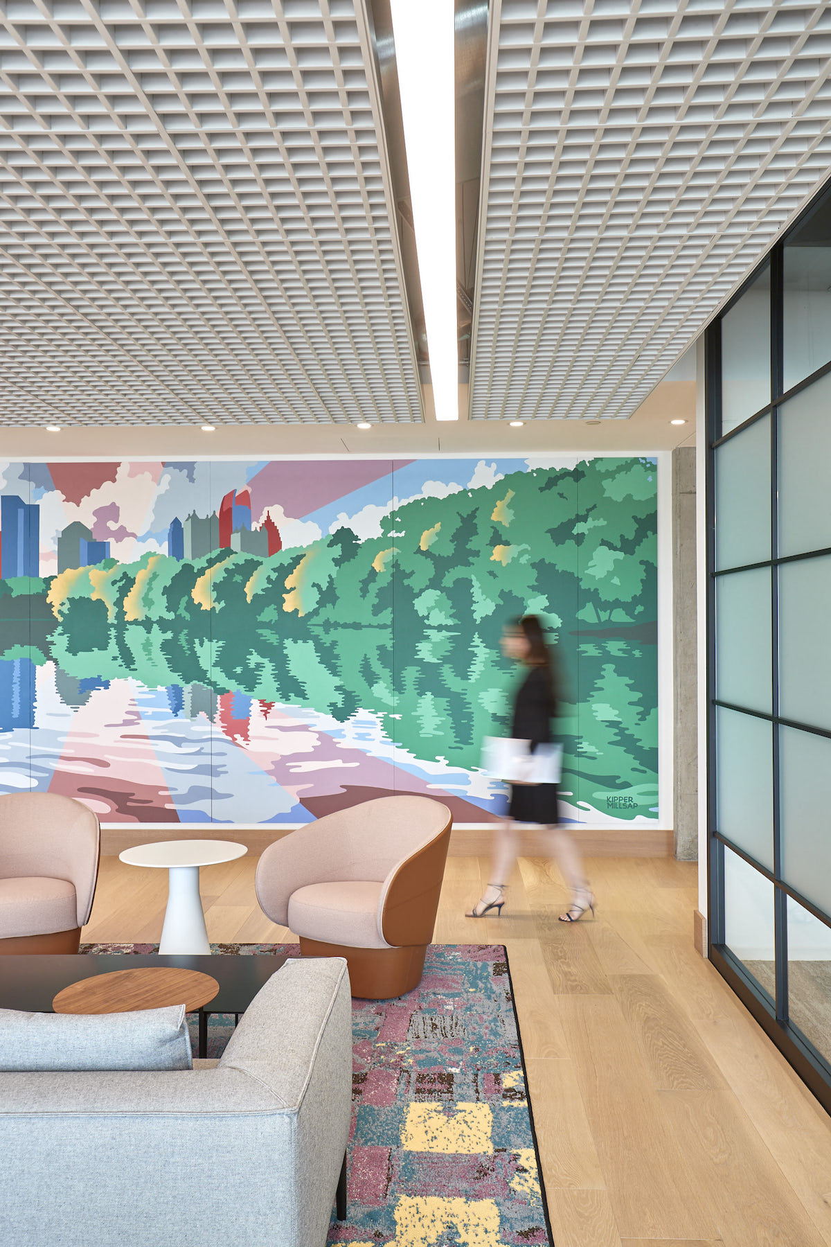
Perkins&Will and BlackRock’s art curator Susan Frei Nathan engaged local organizations and artists to introduce an urban perspective into iHub. Artwork, in particular murals, tell unique stories about the city’s history and culture. Local artist Peter Ferrari created a frame and outline with employees invited to paint a small section each, further reinforcing a sense of communal ownership over the new office.
Rugs with their own origin stories specific to Atlanta adorn the office’s reception areas. The design team explored ways to celebrate the city’s long history of quilters, engaging local guild, the Brown Sugar Stitchers, whose chosen quilt design was used as the pattern generation and manufactured locally for the throw rugs in reception. “It was crucial that outreach to local creators and artists be not only proactive but extremely thoughtful and representative of Atlanta's identity,” says Jeanette Kim, senior project designer at Perkins&Will’s New York studio.
iHub is targeting LEED Gold certification.
Related Stories
| Aug 11, 2010
U.S. firm designing massive Taiwan project
MulvannyG2 Architecture is designing one of Taipei, Taiwan's largest urban redevelopment projects. The Bellevue, Wash., firm is working with developer The Global Team Group to create Aquapearl, a mixed-use complex that's part of the Taipei government's "Good Looking Taipei 2010" initiative to spur redevelopment of the city's Songjian District.
| Aug 11, 2010
High-Performance Workplaces
Building Teams around the world are finding that the workplace is changing radically, leading owners and tenants to reinvent corporate office buildings to compete more effectively on a global scale. The good news is that this means more renovation and reconstruction work at a time when new construction has stalled to a dribble.
| Aug 11, 2010
Idea Center at Playhouse Square: A better idea
Through a unique partnership between a public media organization and a performing arts/education entity, a historic building in the heart of downtown Cleveland has been renovated as a model of sustainability and architectural innovation. Playhouse Square, which had been working for more than 30 years to revitalize the city's arts district, teamed up with ideastream, a newly formed media group t...
| Aug 11, 2010
200 East Brady
Until July 2004, 200 East Brady, a 40,000-sf, 1920s-era warehouse, had been an abandoned eyesore in Tulsa, Okla.'s Brady district. The building, which was once home to a grocery supplier, then a steel casting company, and finally a casket storage facility, was purchased by Tom Wallace, president and founder of Wallace Engineering, to be his firm's new headquarters.
| Aug 11, 2010
Two Rivers Marketing: Industrial connection
It was supposed to be the perfect new office. In July 2003, Two Rivers Marketing Group of Des Moines, Iowa, began working with Shiffler Associates Architects on a 14,000-sf building to house their rapidly growing marketing firm. Over the next six months they put together an innovative program that drew on unprecedented amounts of employee feedback.
| Aug 11, 2010
AIA Course: Enclosure strategies for better buildings
Sustainability and energy efficiency depend not only on the overall design but also on the building's enclosure system. Whether it's via better air-infiltration control, thermal insulation, and moisture control, or more advanced strategies such as active façades with automated shading and venting or novel enclosure types such as double walls, Building Teams are delivering more efficient, better performing, and healthier building enclosures.
| Aug 11, 2010
Glass Wall Systems Open Up Closed Spaces
Sectioning off large open spaces without making everything feel closed off was the challenge faced by two very different projects—one an upscale food market in Napa Valley, the other a corporate office in Southern California. Movable glass wall systems proved to be the solution in both projects.
| Aug 11, 2010
Silver Award: Pere Marquette Depot Bay City, Mich.
For 38 years, the Pere Marquette Depot sat boarded up, broken down, and fire damaged. The Prairie-style building, with its distinctive orange iron-brick walls, was once the elegant Bay City, Mich., train station. The facility, which opened in 1904, served the Flint and Pere Marquette Railroad Company when the area was the epicenter of lumber processing for the shipbuilding and kit homebuilding ...
| Aug 11, 2010
Special Recognition: Durrant Group Headquarters, Dubuque, Iowa
Architecture firm Durrant Group used the redesign of its $3.7 million headquarters building as a way to showcase the firm's creativity, design talent, and technical expertise as well as to create a laboratory for experimentation and education. The Dubuque, Iowa, firm's stated desire was to set a high sustainability standard for both itself and its clients by recycling a 22,890-sf downtown buil...
| Aug 11, 2010
Thrown For a Loop in China
While the Bird's Nest and Water Cube captured all the TV coverage during the Beijing Olympics in August, the Rem Koolhaas-designed CCTV Headquarters in Beijing—known as the “Drunken Towers” or “Big Shorts,” for its unusual shape—is certain to steal the show when it opens next year.


