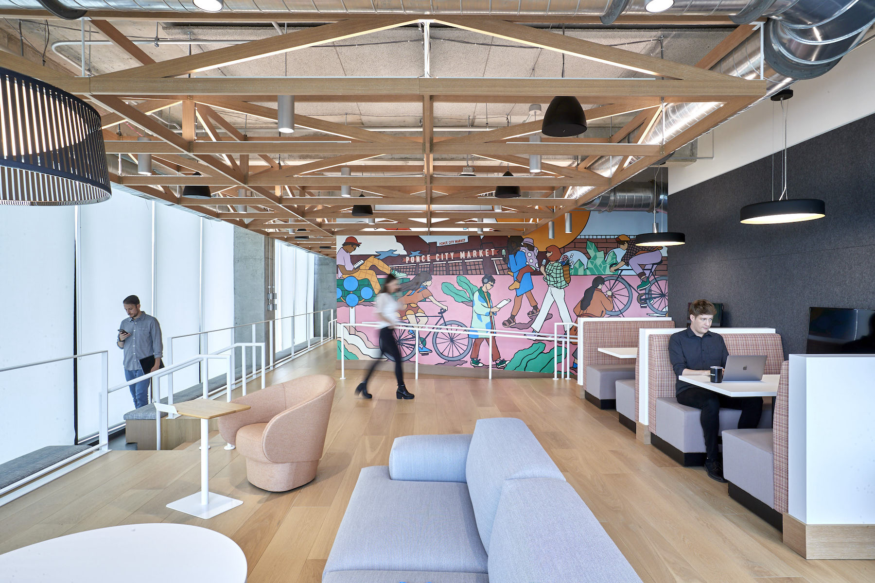
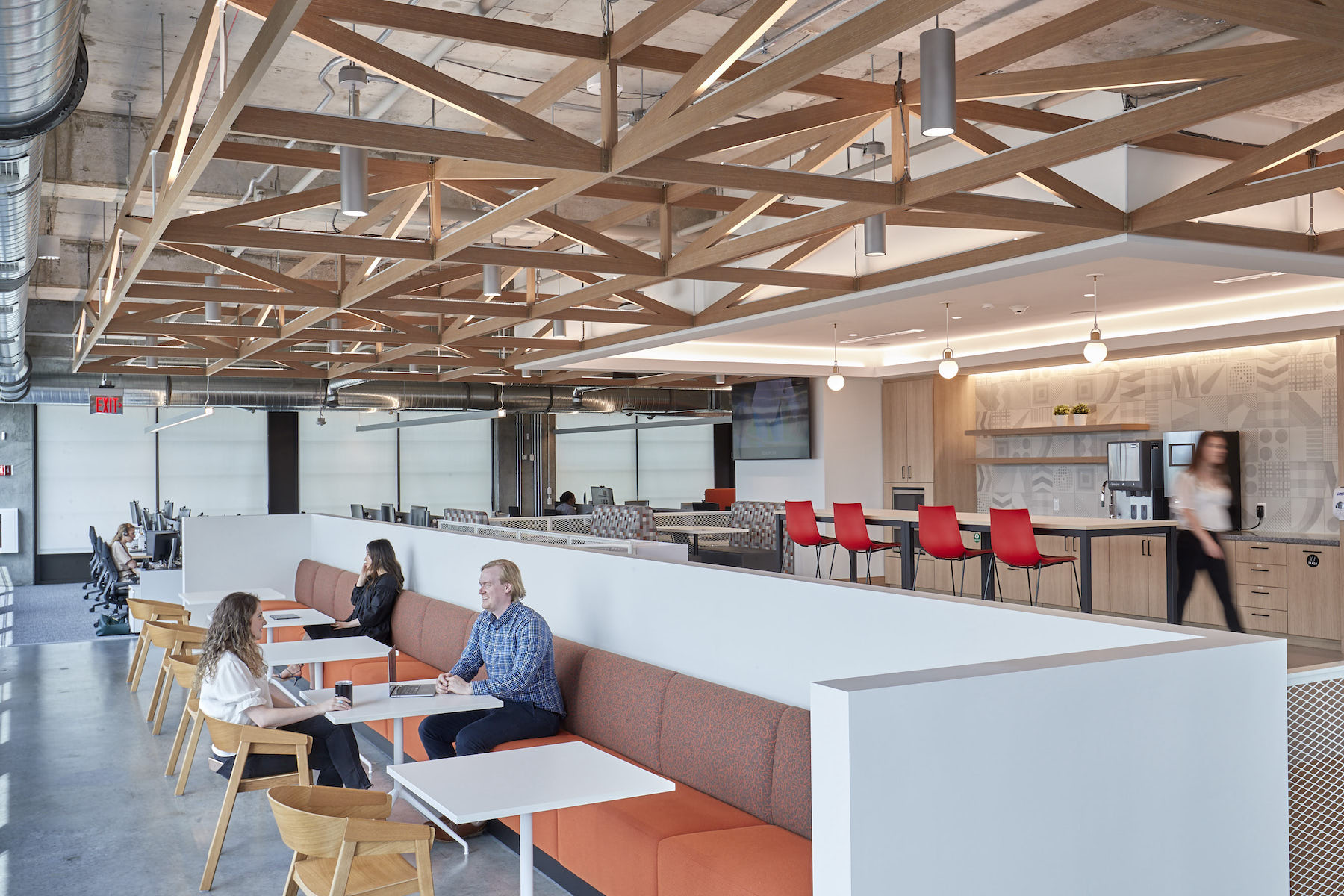
The asset management giant BlackRock has released images of the interior design for its 120,000-sf Innovation Hub in Atlanta, which BlackRock moved into two years ago. That design, a collaboration with Perkins&Will’s studios in Atlanta and New York, is the first project in North America to follow BlackRock’s global design guidelines, which the design firm authored. P&W’s Branded Environments team also provided BlackRock’s Global Signage and Brand guidelines for environmental applications.
The office is located in midtown’s 725 Ponce development along the Atlanta BeltLine and across from the Ponce City Market. Brent Capron, interior design director at P&W’s New York office, calls this space “a testament to [BlackRock’s] long-term commitment in the city and its workforce.” BlackRock revealed its plans to expand into Atlanta with a new Innovation Hub in October 2018. At the time, it had 15 employees in the state, and its plans called for hiring up to 1,000 workers by 2024, according to various news reports at the time. The Wall Street Journal reported then that BlackRock would use $25 million in public tax breaks in support of its Southern expansion.
DESIGN ENCOURAGES COLLABORATION
The two-floor Atlanta iHub will eventually expand to four floors to accommodate BlackRock’s intended recruitment. Three core themes—the porch, the festival, and the crossroads—drive iHub’s design concept:
• The end of each floor has its own dedicated “porch,” with individualized murals and design expressions. The porch is meant to be where employees from both floors can congregate, as well as host clients and guests;
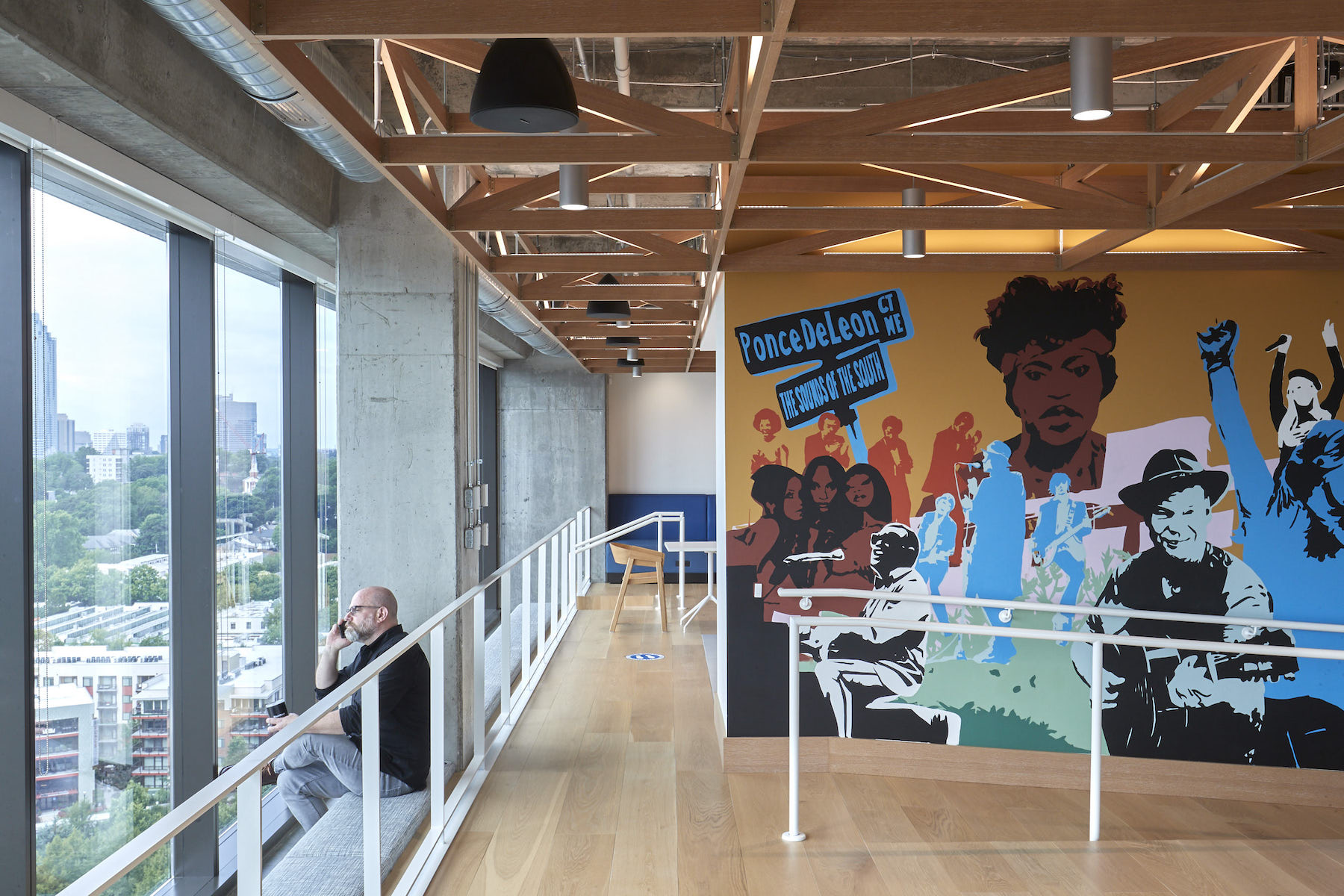
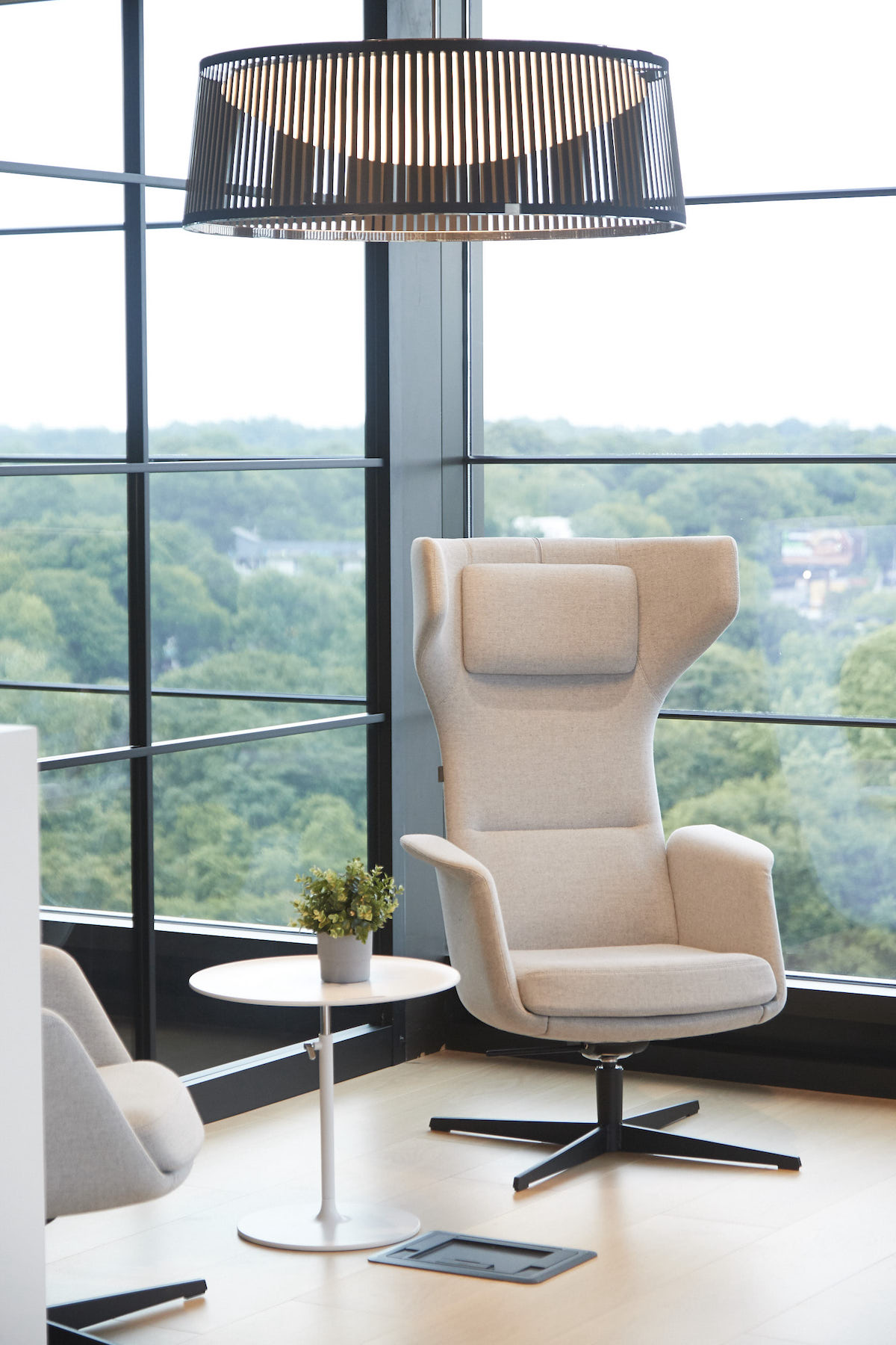
• P&W has positioned iHub as a place that fosters idea exchanges. These “crossroads” also are meant to reflect (or at least suggest) Atlanta’s role as a transportation nexus that includes America’s busiest airport;
• Spaces that encourage impromptu meetings and collaborations also capture the “festival” design theme that echoes Atlanta’s culture and past. These areas are distinguished by flexible spaces, furniture, and lighting.
ART EXPRESSES A LOCAL POV
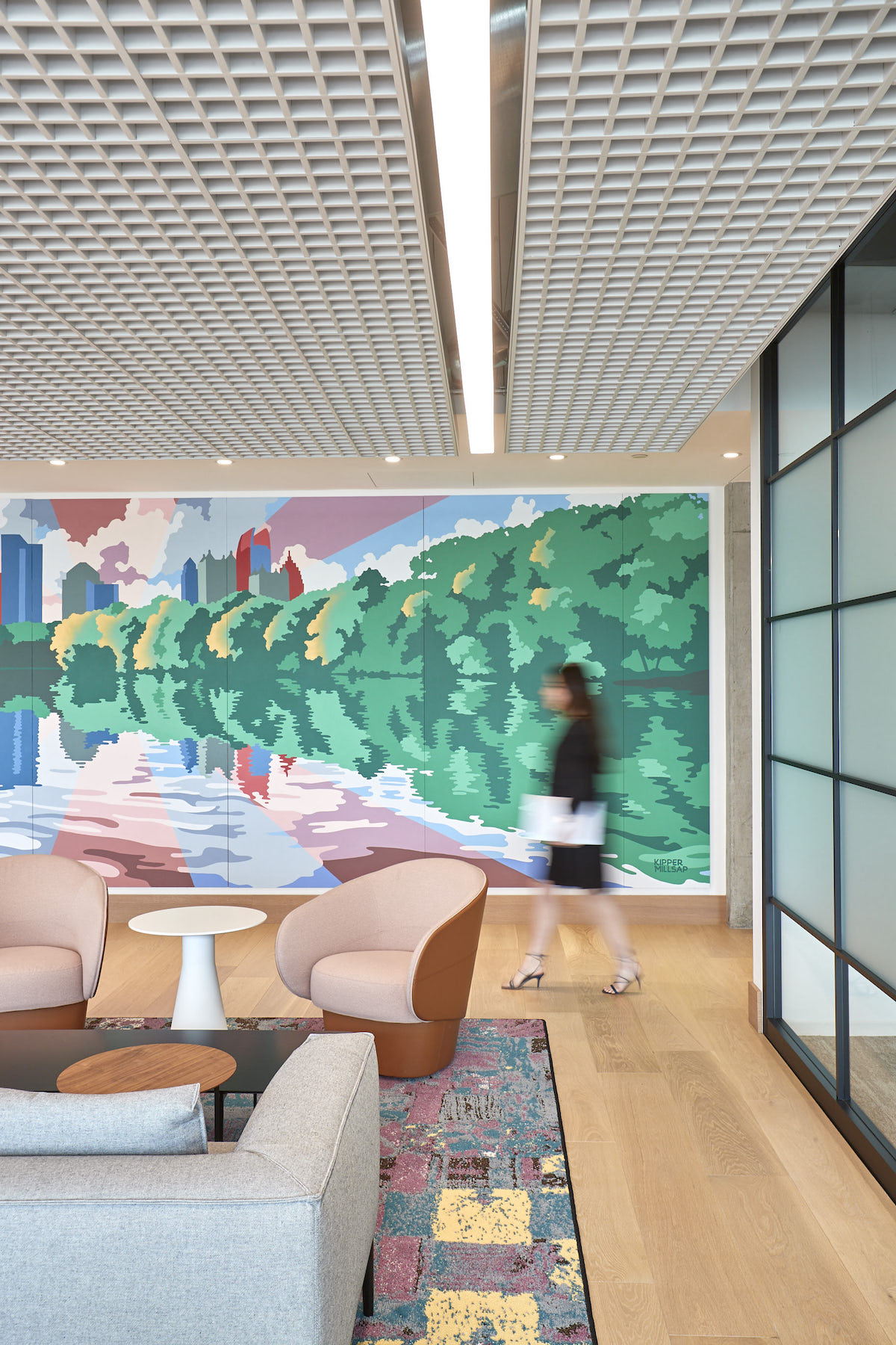
Perkins&Will and BlackRock’s art curator Susan Frei Nathan engaged local organizations and artists to introduce an urban perspective into iHub. Artwork, in particular murals, tell unique stories about the city’s history and culture. Local artist Peter Ferrari created a frame and outline with employees invited to paint a small section each, further reinforcing a sense of communal ownership over the new office.
Rugs with their own origin stories specific to Atlanta adorn the office’s reception areas. The design team explored ways to celebrate the city’s long history of quilters, engaging local guild, the Brown Sugar Stitchers, whose chosen quilt design was used as the pattern generation and manufactured locally for the throw rugs in reception. “It was crucial that outreach to local creators and artists be not only proactive but extremely thoughtful and representative of Atlanta's identity,” says Jeanette Kim, senior project designer at Perkins&Will’s New York studio.
iHub is targeting LEED Gold certification.
Related Stories
| Aug 11, 2010
Top of the rock—Observation deck at Rockefeller Center
Opened in 1933, the observation deck at Rockefeller Center was designed to evoke the elegant promenades found on the period's luxury transatlantic liners—only with views of the city's skyline instead of the ocean. In 1986 this cultural landmark was closed to the public and sat unused for almost two decades.
| Aug 11, 2010
200 Fillmore
Built in 1963, the 32,000-sf 200 Fillmore building in Denver housed office and retail in a drab, outdated, and energy-splurging shell—a “style” made doubly disastrous by 200 Fillmore's function as the backdrop for a popular public plaza and outdoor café called “The Beach.
| Aug 11, 2010
Integrated Project Delivery builds a brave, new BIM world
Three-dimensional information, such as that provided by building information modeling, allows all members of the Building Team to visualize the many components of a project and how they work together. BIM and other 3D tools convey the idea and intent of the designer to the entire Building Team and lay the groundwork for integrated project delivery.
| Aug 11, 2010
Inspiring Offices: Office Design That Drives Creativity
Office design has always been linked to productivity—how many workers can be reasonably squeezed into a given space—but why isn’t it more frequently linked to creativity? “In general, I don’t think enough people link the design of space to business outcome,” says Janice Linster, partner with the Minneapolis design firm Studio Hive.
| Aug 11, 2010
Great Solutions: Products
14. Mod Pod A Nod to Flex Biz Designed by the British firm Tate + Hindle, the OfficePOD is a flexible office space that can be installed, well, just about anywhere, indoors or out. The self-contained modular units measure about seven feet square and are designed to serve as dedicated space for employees who work from home or other remote locations.


