As the world becomes smaller with the globalization of ideas, trends, and style, the divide between traditionally institutional interiors and the corporate workplace is shrinking. Today’s students no longer accept the facilities their parents once considered acceptable. Similarly, the office worker’s Dilbert-like cubicle is a thing of days gone by. Today’s learning, social, and creative environments are about mobility, choice, and comfort. These environments have less, but more efficient, personal space with more shared and amenity space.
CONGREGATING OVER COFFEE
In modern history, the break room—either a coffee nook or a cafeteria—played an important role in the workplace. It was the place where employees could connect away from their office or cubicle. They could share stories, gossip, and have a cup of coffee before returning to their individual work. In the last two decades, however, the walk to the break room evolved into a trip down the street to the local coffee shop or restaurant. To provide employees the same kind of collaborative, creative, laid-back atmosphere of an off-site coffee shop while reducing the amount of time they spend out of the workplace, larger corporate offices began offering coffee shop-like atmospheres on site, complete with a barista, as an amenity. Today, we see the importance of that same coffee shop environment for students today. The coffee shop becomes a meeting, social, and study place.
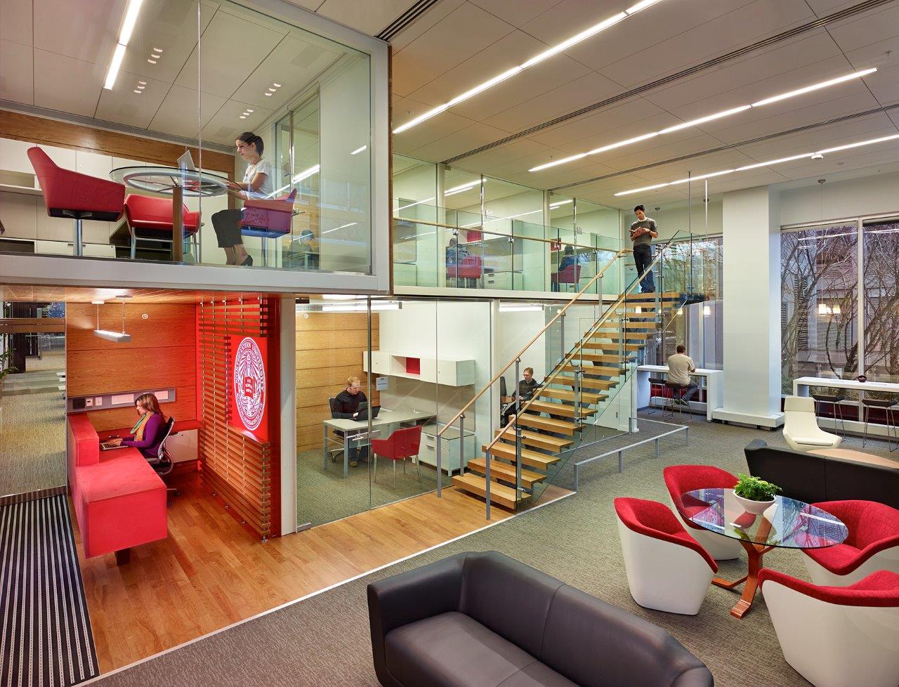
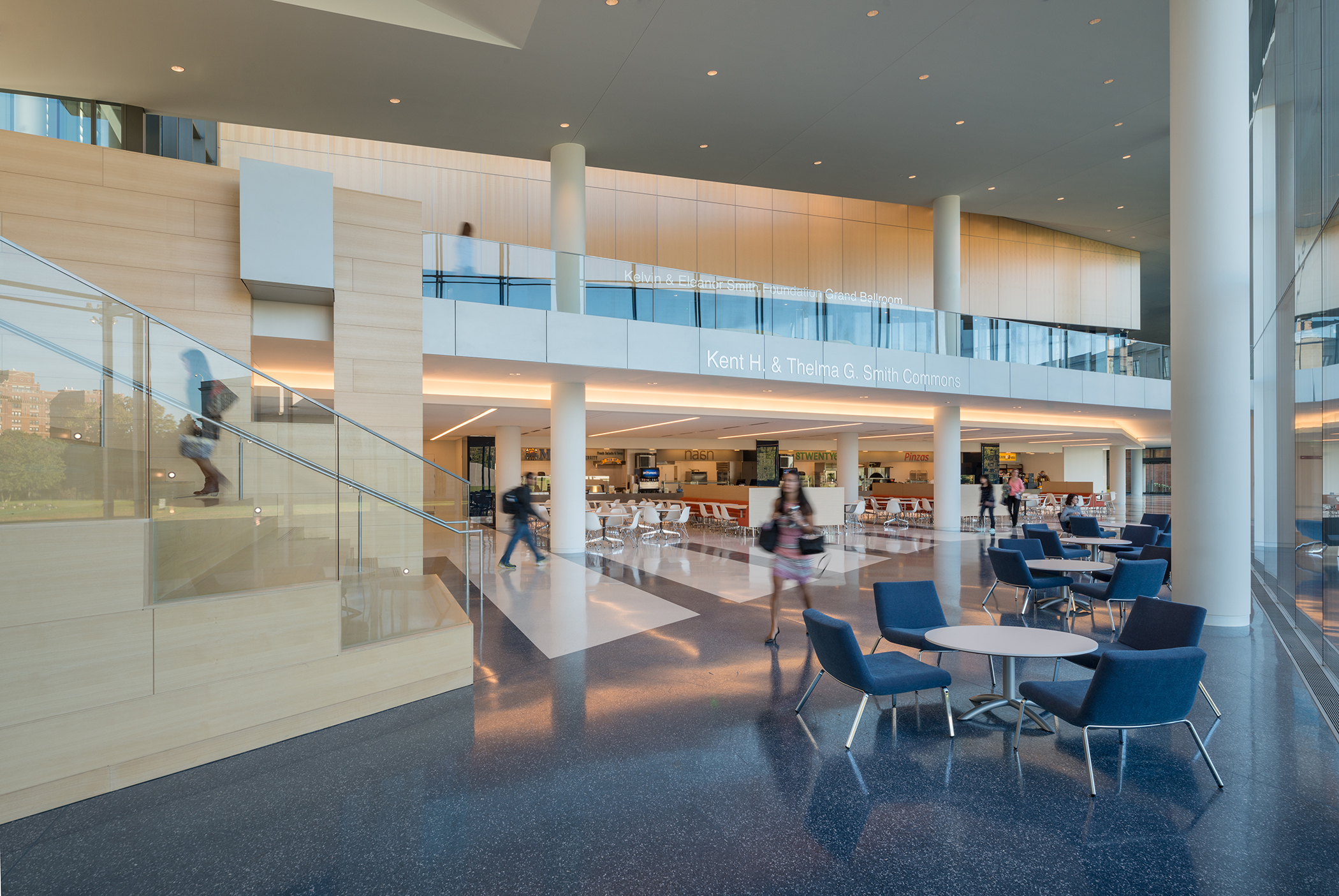 At Case Western Reserve University’s Tinkham Veale University Center, varied seating options for dining and lounging provide a related setting.
Similarly, the office cafeteria was a place to eat one’s meal of the day quickly and return to one’s desk in 30 minutes. But for today’s workers and students, food is important throughout the day, not only at prescribed meal times. Variety in choice of cuisine and speed of service are paramount. Dining places need to double as work and study places. The sea of same tables and chairs meant for efficiency has been replaced by a variety of seating options. Traditional seating is augmented with bar height counters for sitting or standing, booths and banquets for a more intimate setting, long tables for a shared experience, and lounge furniture providing a more relaxed setting. These spaces are used around the clock.
REDEFINING MEETING AREAS
For years we’ve designed meeting spaces in higher education facilities with flexibility and multifunction in mind. Conversely, the corporate conference room was formal and structured, not easily adaptable. This is now changing, as corporate interiors are taking their cue from the higher education market. Meeting spaces are often designed to be easily re-arranged by the users. Flip-top and mobile tables with stackable chairs are the norm for easy changes. Often these spaces include writable surfaces, which remain vital regardless of user type, as do magnetic or tackable surfaces. Technology also remains important but simple, relying on web-based applications.
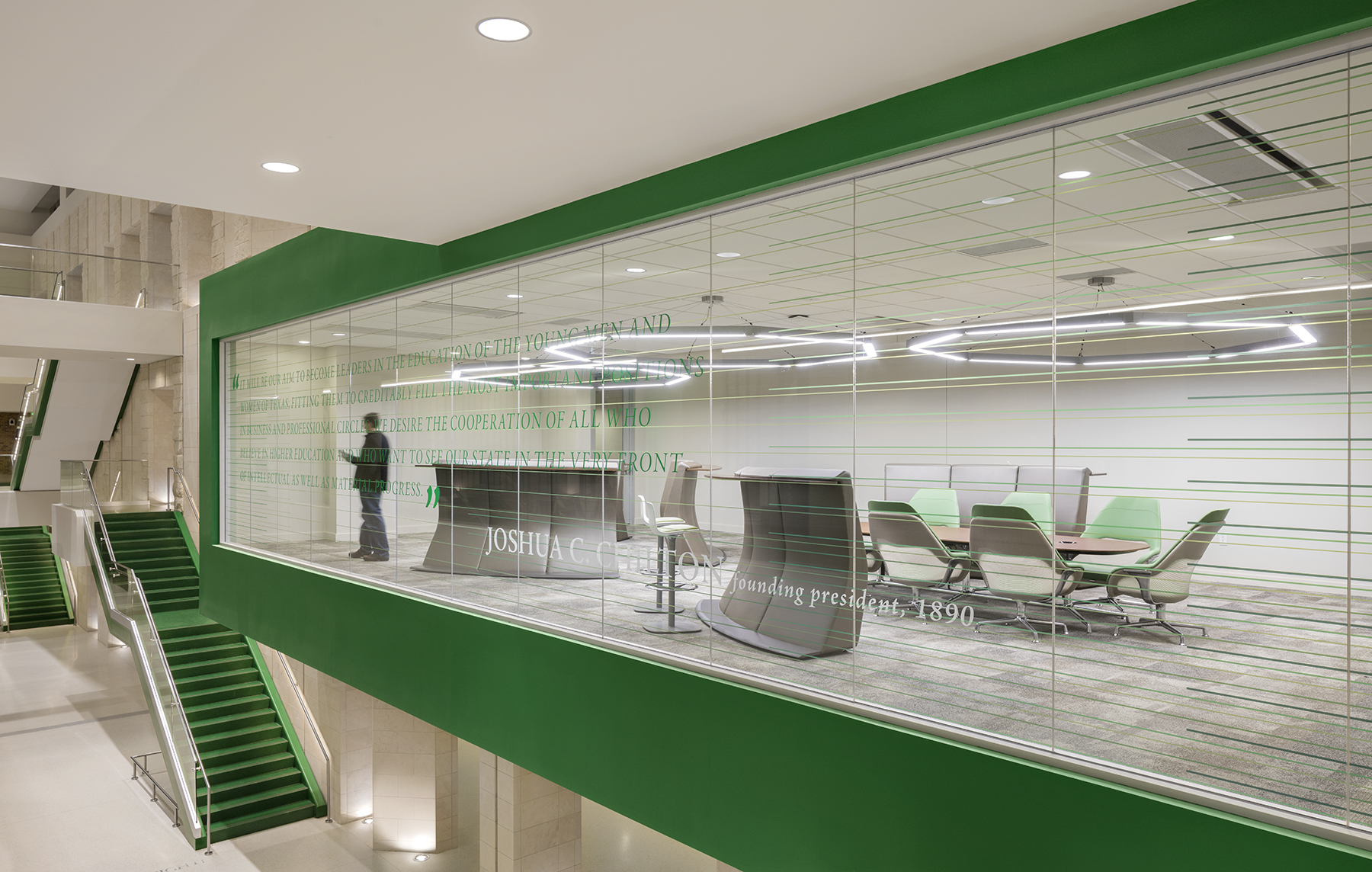 At the University of North Texas’ University Union, mobile room dividers allow users to easily rearrange the meeting room.
RETHINKING WORK AREAS
It’s the spaces for student and staff offices that provide some of the greatest similarities and contrasts between the higher education and corporate interiors markets. Today’s corporate offices are open and airy with energy and personality. More and more corporations are limiting personal space to a footprint of as much as half of what it was 10 years ago. This is possible for a couple of reasons. First, technology is much smaller and therefore the space it once occupied is no longer needed. But the more important reason is that by reducing the personal/owned space, each employee gets so much more. There is space for that coffee shop, for example, as well as space to work as a group in open collaboration or in a team/project room with technology and writeable walls. There are places to lounge and discuss strategy or endure the conference call. The café, with its multiple seating options, becomes a change of venue to refresh.
While not true for all, another step much of the corporate world has adopted is the elimination or great reduction of private offices. Most employees—management and staff — sit equally and when privacy or a special need arises, conference rooms and private telephone or one-on-one huddle rooms are available. The openness provides for greater collaboration and understanding as well as a more relaxed work environment. Many corporations go a step further to provide only a place to store one’s personal work with no assigned desks; employees can work anywhere.
 At Northeastern University’s Seattle Satellite Campus, huddle rooms provide quiet and privacy for staff within a flexible and open workplace.
In working with student groups, such as student government and other student-led organizations, on several projects in the last decade, the design ideas described above have proven successful. By providing storage, but not assigned space to an entity, everyone gets more. Often, when we meet with student groups to review their current spaces, we’ll see only room for the few most active groups, each with an assigned desk or workstation area. By lining the walls with storage cabinets and closets, the open space can be used to provide large meeting tables, lounge areas, meeting rooms, and “plug-in” technology for sharing ideas. These shared resources provide both variety of work style, but also access to many more students.
Part of the appeal for the more open shared learning and workspace environments are the wellness and sustainability aspects. The variety of work settings allows for mobility throughout the day. Multiple height and posture choices allow for sit/stand alternatives. By not hiding the window wall with private offices, daylight and view are available to all. And often in more modern facilities, open stairs are featured to encourage exercise and social interaction.
DESIGNING FOR FACULTY AND STAFF
While the collaborative and open workspaces of the corporate world translate well for student group work and study, the transition is more challenging for faculty and staff. The private office has been so institutionalized, and for many faculty and staff the office represents status. In working with faculty and staff at many institutions and discussing open collaborative workspace, the responses unanimously highlight a need for privacy in talking with students or dealing with sensitive matters, as well as seclusion from students.
Taking into account the actual hours faculty members spend in their assigned offices, perhaps it makes more sense to work in a shared space, furnish the necessary rooms for privacy and meetings, and give the square footage back to the student and learning places.
There are multiple methods to provide quiet and privacy within a flexible and open workspace. In fact, these places are necessary for the concept to succeed. For instance, the above mentioned telephone and huddle rooms provide the needed audible privacy. And a small huddle room provides a more comfortable and neutral setting for sensitive conversations. Further, these small meeting rooms could be located throughout the campus allowing faculty and students to meet where most convenient for both parties. This flexibility of workplace is the hallmark of the modern office.
THE ROLE OF FURNITURE
Furniture goes a long way in supporting modern workspaces, allowing for flexibility and easy mobility. One of the most practical furniture pieces for open spaces is mobile room dividers. These pieces bring personality, function, and a sculptural element to open spaces. Functionally the pieces often have soft surfaces to reduce noise, writable surfaces for team work, and can incorporate technology for easy sharing of information.
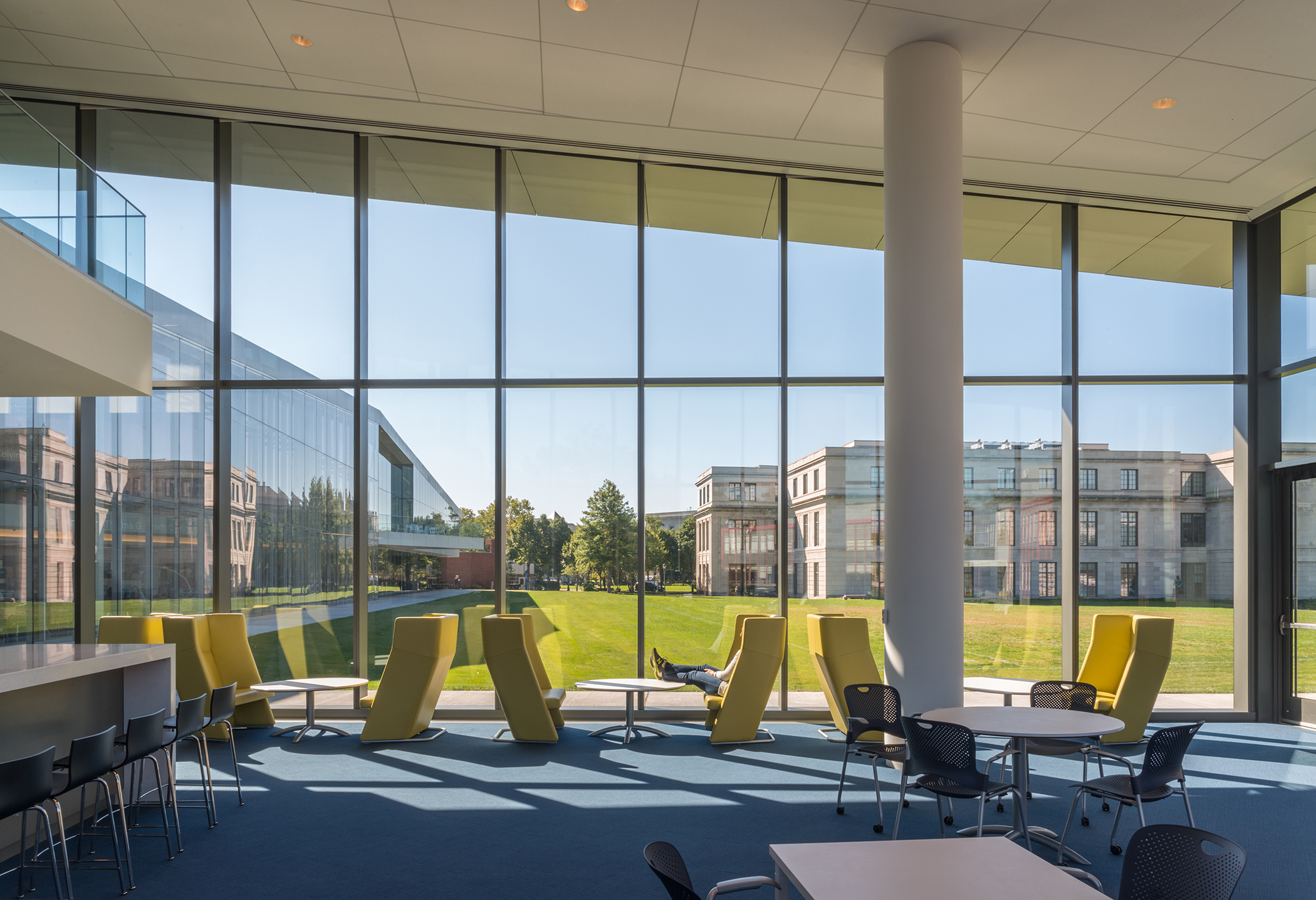 At Case Western, furniture affords a personal harbor in an otherwise open space, creating privacy and quiet when needed.
While it’s great to have open spaces for group work and collaboration, furniture can also provide needed privacy and quiet. One way to describe these places is a personal harbor. These places are not meant to belong to any one person, but rather be available when needed. Often these places are as simple as a lounge chair or settee with high upholstered walls surrounding to provide limited visual and acoustical privacy. As these pieces have continued to evolve over time, they now often contain work tables, power, and lighting, creating a cocoon-like environment for heads-down work. And this small personal space has taken yet another step forward with freestanding enclosed telephone rooms and small meeting spaces complete with lighting, power, and ventilation.
THE VALUE OF BRANDING
A final commonality often seen in today’s corporate and learning environments is a strong sense of place and brand. These environments are unique unto themselves and represent those who use them. They embody a pride of place sharing common stories and history. These work and learning places instill unity with a view to a common goal.
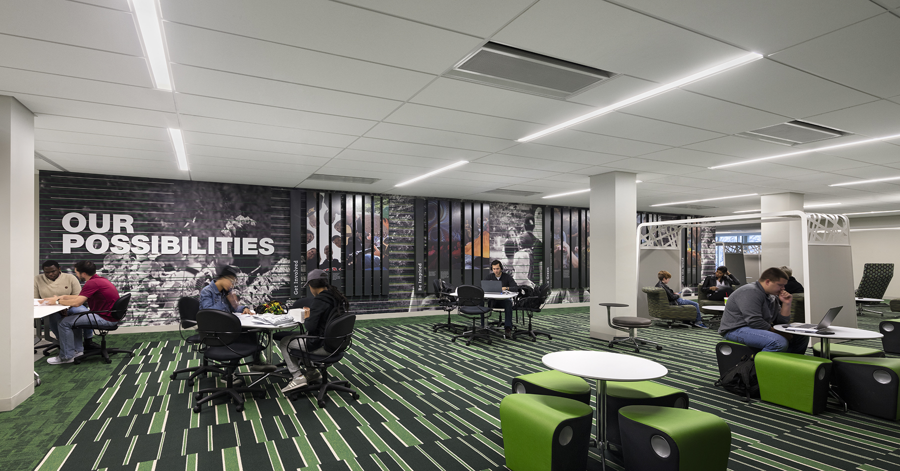 Mobile room dividers bring personality, function, and a sculptural element to this open space. The brand elements provide a strong sense of place for the students of UNT.
More from Author
Perkins and Will | Sep 19, 2023
Transforming shopping malls into 21st century neighborhoods
As we reimagine the antiquated shopping mall, Marc Asnis, AICP, Associate, Perkins&Will, details four first steps to consider.
Perkins and Will | Jul 20, 2023
The co-worker as the new office amenity
Incentivizing, rather than mandating the return to the office, is the key to bringing back happy employees that want to work from the office. Spaces that are designed and curated for human-centric experiences will attract employees back into the workplace, and in turn, make office buildings thrive once again. Perkins&Will’s Wyatt Frantom offers a macro to micro view of the office market and the impact of employees on the future of work.
Perkins and Will | May 30, 2023
How design supports a more holistic approach to training
For today’s college athletes, training is no longer about cramming team practices and weight lifting sessions in between classes.
Perkins and Will | Dec 20, 2022
4 triage design innovations for shorter wait times
Perkins and Will shares a nurse's insights on triage design, and how to help emergency departments make the most of their resources.
Perkins and Will | Aug 30, 2021
The great re-shuffle & re-think
In this new hybrid environment in which we cater to how our employees work best, how will we manage new hybrid work practices and etiquette?
Perkins and Will | May 18, 2020
Global design firms collaborate on new COVID-19 mobile testing lab to bring testing to vulnerable communities worldwide
Perkins and Will, Schmidt Hammer Lassen Architects, and Arup Group develop scalable solutions for increased testing capacity within high-density and under-served neighborhoods.
Perkins and Will | Jun 7, 2019
Workplace wellness: Top 3 tips for Fitwel certification
How can thoughtful design encourage healthier choices, lifestyles, and work environments?
Perkins and Will | Feb 27, 2019
ResilientSEE: A framework to achieve resilience across scales
Conceived in the Boston studio of Perkins+Will, the ResilientSEE team developed a resilient planning framework that can be applied to other neighborhoods, cities, and countries.
Perkins and Will | Nov 28, 2018
Amazon HQ2 and the new geography of work
The big HQ2 takeaway is how geography and mobility are becoming major workplace drivers.
Perkins and Will | Sep 4, 2018
It takes more than money to fund resilience
Resilient design, much like all projects in the built environment, requires funding.

