On three floors of Cambridge Tower A at The University of Kansas Health System in Kansas City, patients being treated for blood cancers have a dedicated space that not only keeps them safe during immune system comprising treatments, but also provide feelings of comfort and compassion.
The 100-bed unit was designed with the safety of these vulnerable patients in mind, as well as their families and loved ones. All portions of the unit, whether a patient, staff or public area, was designed with thoughtfulness and empathy, keeping in mind that those who stay and work on this cancer unit are not able to venture beyond it for some time.
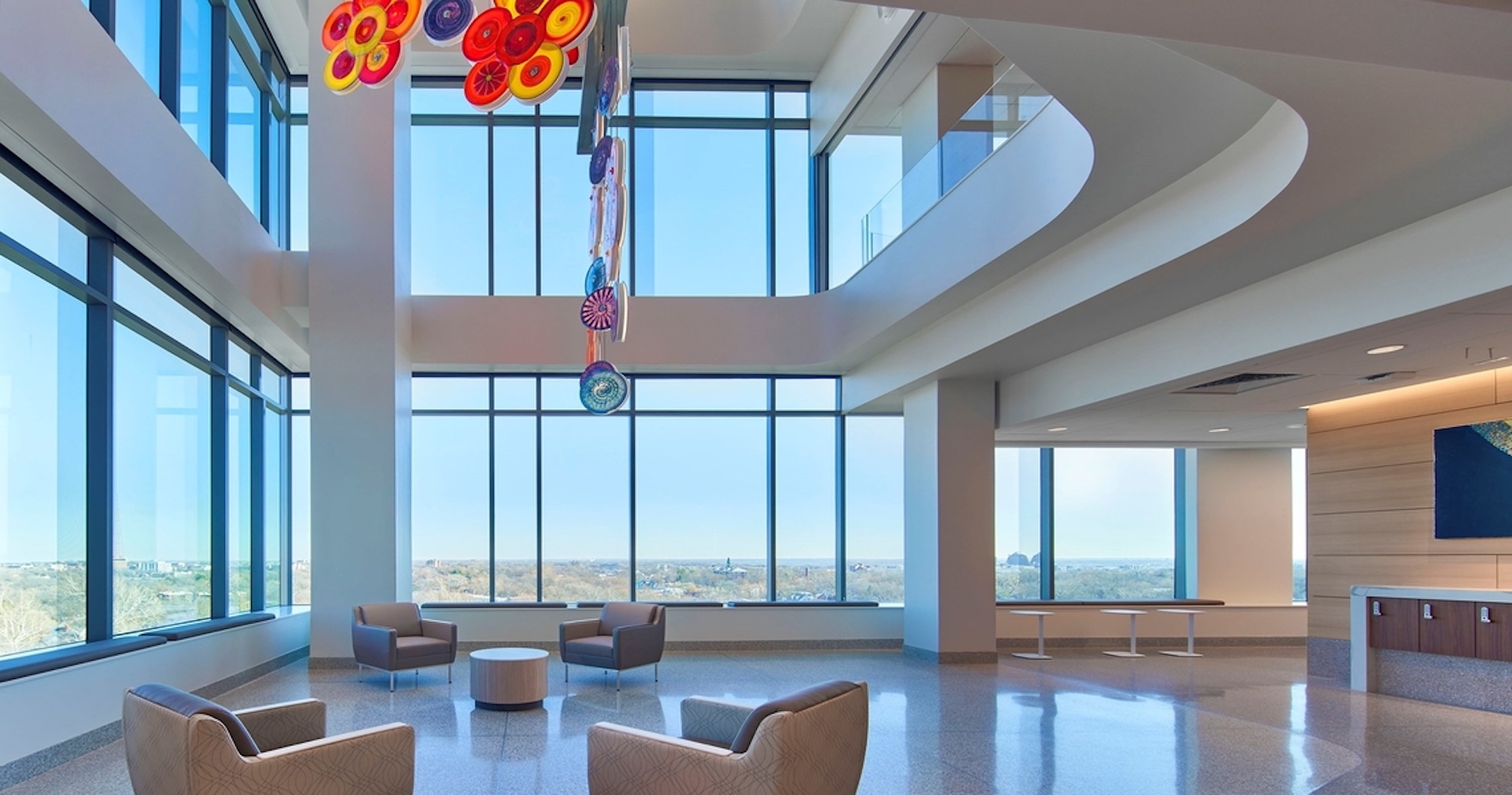
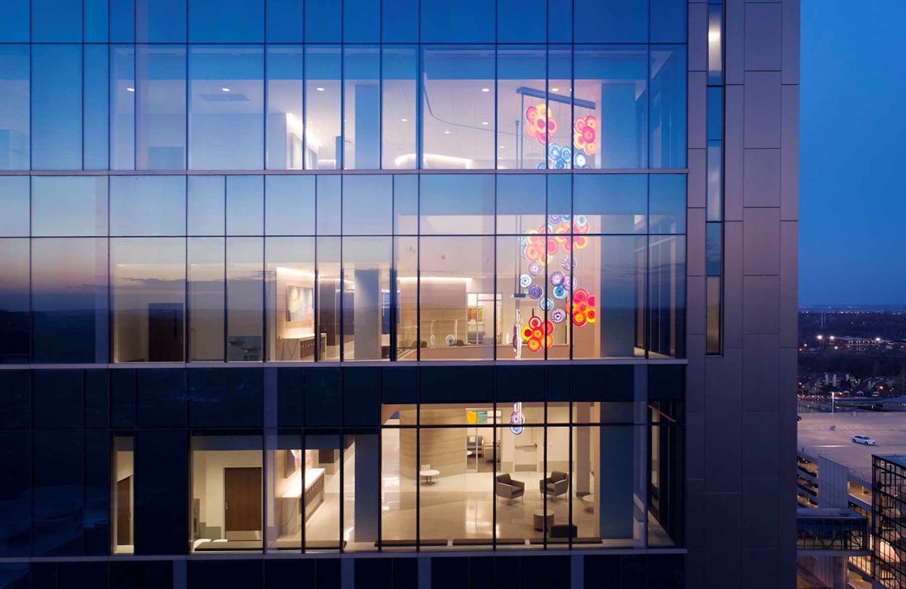
A wide-open, three-story vertical public space greets all who step off the elevator, with comfortable areas to sit with stunning views of the Kansas City skyline. Sculptural artwork hangs from the lobby ceiling and is visible from outside the building, giving the unit its own identity within the larger inpatient tower.
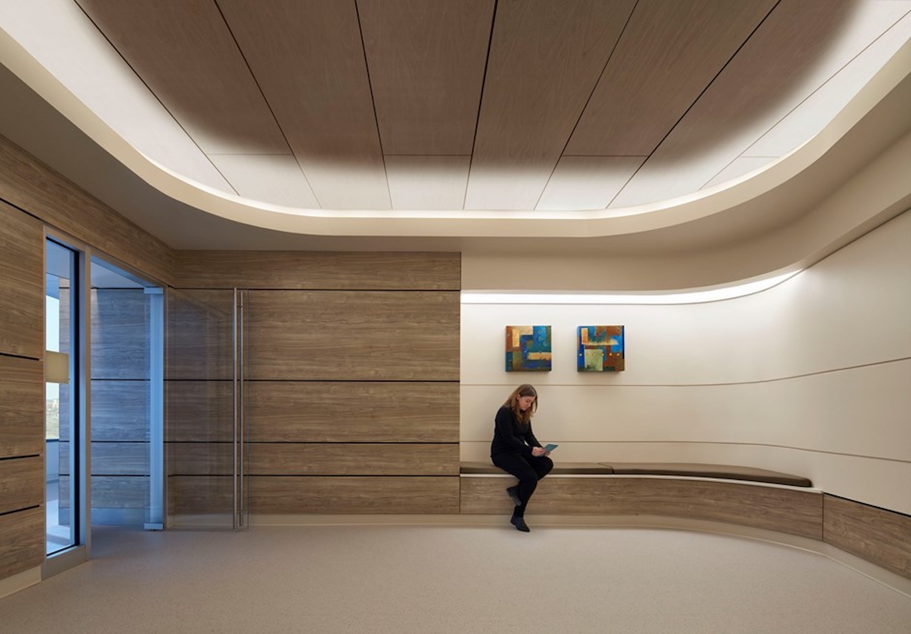
A main feature is a walking trail, which loops around the perimeter of the unit and goes by all communal places on the floor. A lighted wall guides patients walking down the hallway, with the lights changing and moving alongside them. The lights can be changed with the seasons or time of day (or to mark a Chiefs gameday) and give a sense of newness for patients who are receiving care for weeks.
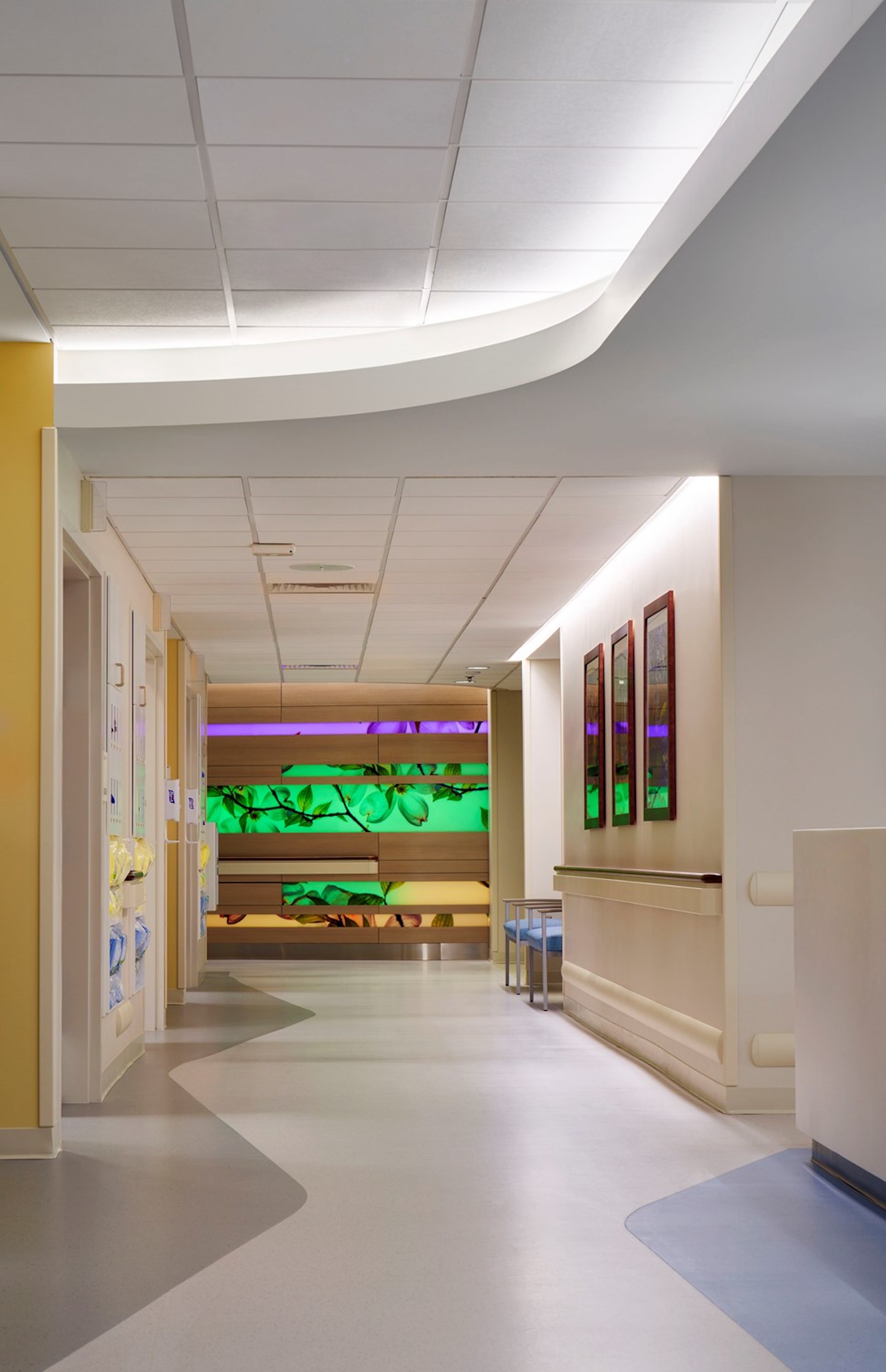
The curves and linearity of the walking trail wall and light feature mimic those of Cambridge Tower’s exterior (also a CannonDesign project), and the materials used for it can be found throughout all floors of the tower. Lead designer Allison Mendez noted that the wall started out as one huge screen and evolved as the team took in sunlight considerations and patent needs.

“We wanted it to be an engaging art feature, and the way the wood materials and lights come together help guide patients towards a destination,” said Allison. “We also designed the floor pattern to indicate patient spaces and clinician spaces and developed a pattern along the walking trail that could be used for measuring walking distances for therapy.” Desk spaces and benches also line the path for walking breaks or alternate areas for loved ones to work or decompress.
The design team consulted with our in-house Lighting Studio on the shaping and logistics of the lighting bands and worked with the contractor to use a 3D scanner to make precisely formed pieces of wood to form the curvilinear wall. This new process eliminated field cuts based on drawings and instead used precise scans that could be referenced to pre-cut and pre-curve the panels.
At the “end” of the trail is a meditation room, which functions as more than a quiet place for reflection. It will be used for group therapy as well as discussions about palliative care. The soft lighting, comfortable seating and tucked away sense of privacy make it a soothing space for difficult conversations.
“This has been a vision for many people, but most importantly our patients and their families for years now,” said Joseph McGuirk, DO, division director of Hematologic Malignancies and Cellular Therapeutics and medical director of blood and marrow transplant at the University of Kansas Cancer Center. “We traveled around the nation looking at some of the best, most competitive transplant program inpatient units in the nation, and we built a stem cell and cell therapy transplant unit that is second to none in this nation.”
Previous patients were consulted for this project, and majority of feedback centered around the importance of views to the outdoors. With most blood cancer patients staying on the unit for treatment for at least a month, even a brief walk outside is not available to them.
The design team ensured that those views to nature were not compromised, and the walking trail has the lighted wall feature on one side and expansive floor-to-ceiling views of the tree canopy on the other. “We wanted the lighted art piece to be secondary to views of nature, it can’t compete with the outdoors,” said Allison. “But it is a reflection of the outdoors, through its use of artwork photography and wood-look finishes, and in how the lighting can be adjusted to change daily or seasonally.”
There are also patient amenities designed for maximum comfort and for long-term stays of family members and loved ones, some of whom travel from rural areas hundreds of miles away. Available services include fold out sofas in patient rooms that enable overnight stays, laundry services on-unit, shower spaces and separate areas for eating or remote work.
Patient safety was also paramount, as cancer patients are extremely immunocompromised and can become very sick if they encounter any virus or bacteria. All three floors have a positive pressure airflow ventilation system, which keeps harmful particles out. Everyone who enters the unit, walks through an airlock system with handwashing sinks to further reduce the risk of contamination.
Clinician workflow was also a priority for the cancer care team. Collaboration among doctors, nurses, therapists and more is integral for the best possible care, and different work areas within the nurses’ station allow for team meetings or heads-down time. The nurse stations and staff workspaces are very open and utilize glass walls which provides great lines of sight though the unit. This not only allows the staff to easily see the patient spaces, but also allows patients and families to see and have more connection to their caregivers.
While the original tower was designed around a universal patient room model for maximum flexibility, the building’s mechanical systems were not sized for multiple levels of positive pressure environment. Through creative problem solving, the design team alongside BR+A Engineering, developed a plan to rotate the existing air handlers in the penthouse mechanical space to make room for additional units. This allowed for two additional patient rooms, including an isolation room and heavily shielded radiation treatment room.
The design of the exterior curtainwall utilized shadow boxes rather than spandrel panes for the solid areas. This not only looks more uniform from the exterior, but also allowed for the flexibility to add and remove shadow boxes as needed for the interior fit-out without replacing any glass. By removing the shadow boxes in the multi-story lobby and patient amenity spaces, like the walking trail, we were able to open the spaces to much more natural light, views of the city skyline, and connection to nature.
More from Author
CannonDesign | Sep 20, 2024
The growing moral responsibility of designing for shade
Elliot Glassman, AIA, NCARB, LEED AP BD+C, CPHD, Building Performance Leader, CannonDesign, makes the argument for architects to consider better shade solutions through these four strategies.
CannonDesign | Jan 3, 2024
Designing better built environments for a neurodiverse world
For most of human history, design has mostly considered “typical users” who are fully able-bodied without clinical or emotional disabilities. The problem with this approach is that it offers a limited perspective on how space can positively or negatively influence someone based on their physical, mental, and sensory abilities.
CannonDesign | Oct 23, 2023
Former munitions plant reimagined as net-zero federal workplace
The General Services Administration (GSA) has embraced adaptive reuse with Building 48, an exciting workplace project that sets new precedents for how the federal government will approach sustainable design.
CannonDesign | Aug 22, 2023
How boldly uniting divergent disciplines boosts students’ career viability
CannonDesign's Charles Smith and Patricia Bou argue that spaces designed for interdisciplinary learning will help fuel a strong, resilient generation of students in an ever-changing economy.
CannonDesign | Jul 10, 2023
The latest pediatric design solutions for our tiniest patients
Pediatric design leaders Julia Jude and Kristie Alexander share several of CannonDesign's latest pediatric projects.
CannonDesign | May 11, 2023
Let's build toward a circular economy
Eric Corey Freed, Director of Sustainability, CannonDesign, discusses the values of well-designed, regenerative buildings.
CannonDesign | Apr 10, 2023
4 ways designers can help chief heat officers reduce climate change risks
Eric Corey Freed, Director of Sustainability, CannonDesign, shares how established designers and recently-emerged chief heat officers (CHO) can collaborate on solutions for alleviating climate change risks.
CannonDesign | Mar 9, 2023
5 laboratory design choices that accelerate scientific discovery
Stephen Blair, director of CannonDesign's Science & Technology Practice, identifies five important design strategies to make the most out of our research laboratories.
CannonDesign | Feb 9, 2023
3 ways building design can elevate bold thinking and entrepreneurial cultures
Mehrdad Yazdani of CannonDesign shares how the visionary design of a University of Utah building can be applied to other building types.
CannonDesign | Jan 9, 2023
How modular solutions can help address skyrocketing construction costs
Modular builder Joshua Mensinger details three ways modular solutions aid in lowering construction costs.

