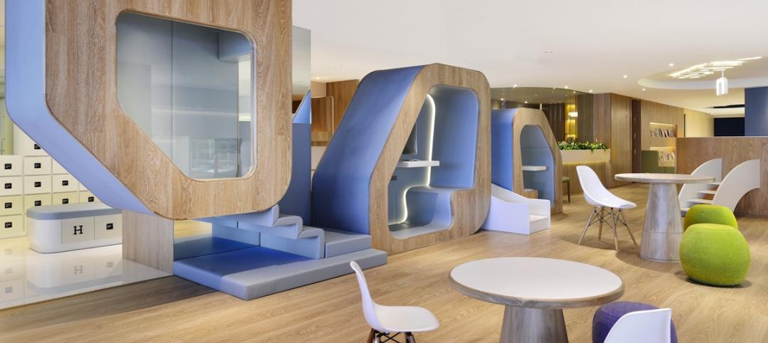
On the 37th floor of the 51-story 1600 Smith building in Houston, four design firms have each developed spec office suites that are being positioned as showcases for next-generation work environments.
Brookfield Property Partners, the real estate developer, gave these firms—Gensler, Rottet Studio, Ziegler Cooper Architects, and Inventure Design—pretty much carte blanche to come up with their vision for the office of the future. When construction is completed next month, Brookfield intends to market these suites under the brand DesignHive by Brookfield Houston.
O’Donnell/Snider Construction is doing the renovation work on all four suites.
The design firms have enjoyed unusual freedom on this project, within a building that hadn’t been renovated since it opened in 1984. Other than a budget, “there were no real set parameters, and no client,” said Laura Nagala, Ziegler Cooper’s project designer for DesignHive Houston. Dean Strombom, AIA, LEED BD+C, a principal at Gensler, noted that DesignHive gives his firm “the opportunity to take a look at how are people going to work in the future, [and] what are the things that are important.”
Yishio Kuo, NCIDQ, LEED AP ID+C, Gensler’s design director on this project, said that the suite design acknowledges that “people work anywhere, anyplace, any time.”
In a written response to questions from BD+C, Brookfield stated that the overall goal of DesignHive is “innovation.” And in videotaped interviews, its design partners talked about “collaboration” and “creating exciting spaces” as abiding guidelines for their suites.
“We saw this as a great opportunity for the firms to bring a completely fresh vision to 1600 Smith,” says Paul Frazier, EVP and Head of Brookfield’s Houston Region. “The tower’s rich history will remain ever-present, but through new eyes, DesignHive will reimagine each space’s design potential, and attract tenants who may not have considered the iconic tower previously.”
Brookfield and its design partners in Houston are keeping the specifics about the design of each suite—whose sizes range from 2,815 sf to 4,193 sf —close to the vest until next month’s opening. Brookfield also hasn’t said yet whether it intends to expand the DesignHive brand into other markets, except to note that it hopes the brand “resonate[s] across all tenant categories, broadening the spectrum of potential tenants and accelerating leasing velocity.”

DesignHive is the brand under which Brookfield is promoting new office designs in Houston and Los Angeles. The developer hasn't said yet whether it will bring that brand to other metros. Image: Brookfield Property Partners.
Two years ago, Brookfield launched DesignHive when it conducted a competition involving six architecture firms—Wolcott, Unispace, Rottet Studio, Schlemmer Algaze Associates, Interior Architects, and Gensler—for which each designed a spec suite in one of two buildings in Los Angeles: the 52-story Gas Company Tower, and the Wells Fargo Center.
“What we are doing with DesignHive in downtown Los Angeles is demonstrating that high-rise buildings—with great architecture and design, amenities, common areas, infrastructure, connectivity, parking and access to public transit—can be the preferred option for many creative uses as well as for traditional service firms,” Bert Dezzutti, EVP of Brookfield’s western region, told Interior Design magazine at the time.
When the L.A. DesignHive opened in May 2015, the website L.A. Downtown reported the only parameters that Brookfield imposed on its six designers was a budget and the type of tenant. The six L.A. suites ranged from 3,792 sf to 4,535 sf.
•Gensler’s “law firm of the future” in the Wells Fargo Center has a concierge-style reception desk, and open and private workstations to spark collaboration.
•SAA’s 4,320-sf suite for a boutique trading and investment firm has a purple-and-gold color scheme that’s supposed to signify wealth and power, Italianate wall coverings, and a chandelier over a bar.
•Interior Architects’ suite, for the technology consulting sector, features lightweight furniture that can be moved around easily. There are practically no walls in this suite.
•Rottet’s design, for a fashion media tenant, includes custom wall art and Ikea furniture.
•Unispace’s 4,378-sf suite, for a cloud-based computing company, includes hanging ceiling raindrop sculptures and a mural of the earth’s atmosphere and clouds. The space opened with a break area with Nintendo Wii and a glass booth to make private phone calls.
•Wolcott designed its suite for a law firm, too, albeit one targeting younger clients. The space includes hangout areas with oversized pillows and two pod structures that look like teepees.
Related Stories
| Feb 6, 2014
End of the open workplace?
If you’ve been following news about workplace design in the popular media, you might believe that the open workplace has run its course. While there’s no shortage of bad open-plan workplaces, there are two big flaws with the now common claim that openness is bad.
| Feb 5, 2014
Extreme conversion: Atlanta turns high-rise office building into high school
Formerly occupied by IBM, the 11-story Lakeside building is the new home for North Atlanta High School.
| Feb 5, 2014
7 towers that define the 'skinny skyscraper' boom [slideshow]
Recent advancements in structural design, combined with the loosening of density and zoning requirements, has opened the door for the so-called "superslim skyscraper."
| Jan 30, 2014
See how architects at NBBJ are using computational design to calculate the best views on projects [video]
In an ideal world, every office employee would have a beautiful view from his or her desk. While no one can make that happen in real life, computational design can help architects maximize views from every angle.
| Jan 30, 2014
The evolving workplace: One designer's inspiration board
"Open office" has been a major buzzword for decades, and like any buzzword, some of the novelty has worn off. I don't believe we will abandon the open office, but I do think we need to focus on providing a dynamic mix of open and closed spaces.
| Jan 29, 2014
Richard Meier unveils 'urban courtyard' scheme for Mexico City towers
A grand atrium, reaching some 30 stories, highlights the contemporary, bright-white design scheme unveiled this week by Richard Meier & Partners for a new mixed-use development in Mexico City.
| Jan 28, 2014
2014 predictions for skyscraper construction: More twisting towers, mega-tall projects, and 'superslim' designs
Experts from the Council on Tall Buildings and Urban Habitat release their 2014 construction forecast for the worldwide high-rise industry.
| Jan 28, 2014
16 awe-inspiring interior designs from around the world [slideshow]
The International Interior Design Association released the winners of its 4th Annual Global Excellence Awards. Here's a recap of the winning projects.
| Jan 28, 2014
Big Ten Conference opens swanky HQ and museum [slideshow]
The new mixed-use headquarters includes a museum, broadcast studios, conference facilities, office spaces, and, oh yeah, a Brazilian steakhouse.
| Jan 23, 2014
Adrian Smith + Gordon Gill-designed Federation of Korean Industries tower opens in Seoul [slideshow]
The 50-story tower features a unique, angled building-integrated photovoltaic (BIPV) exterior designed to maximize the amount of energy collected.


