Emojis tend to elicit fairly strong reactions from people. Many people love to use the small ideograms while texting and emailing like modern day hieroglyphics. Others experience a visceral hatred any time they see one of the little buggers.
This dichotomy is best exemplified via a teaser trailer for The Emoji Movie. On one hand, the movie studio felt secure enough in the general public’s love of emojis to invest money in a feature film. But on the other hand, the trailer has received over 78,000 dislikes (compared to just 8,000 likes) on YouTube since its release.
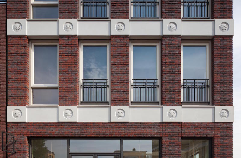
Regardless of what the prevailing opinion of the general public may be, one architecture firm decided to take emojis out of the digital world and incorporate 22 of them into the design of one of its building’s façades.
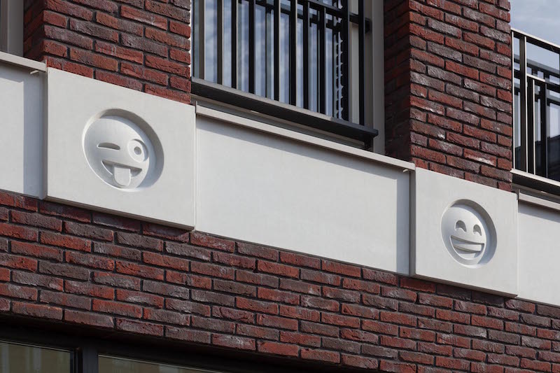 Photo courtesy Bart van Hoek, Attika Architekten.
The red brick structure, which resides in the Dutch city of Amersfoort, has horizontal bands of white concrete acting as floor demarcations. At each intersection where the brick and the concrete meet a small decorative circle is stamped in the concrete. On the side of the building that faces the town square, these concrete circles become emojis.
The building is a mix of ground floor retail and residential units and is part of the second phase of a larger mixed-use development. The second phase creates a more fully-fledged mall and adds more shops, restaurants, and apartments to connect to the shopping center that already exists.
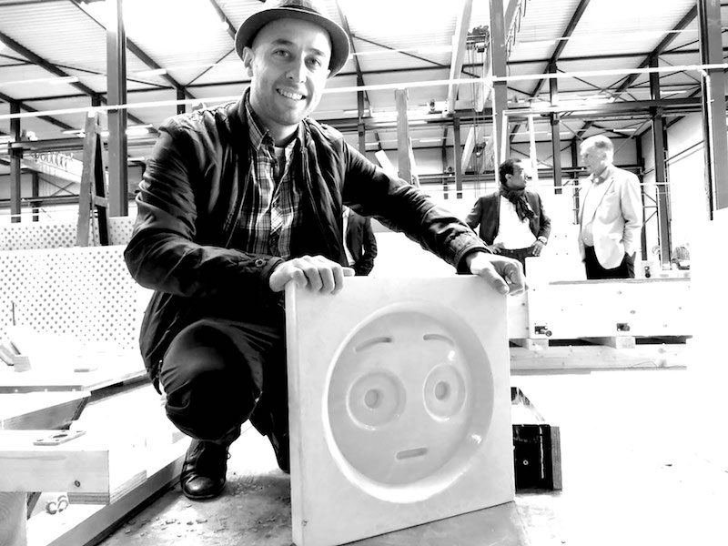 Photo courtesy Bart van Hoek, Attika Architekten.
A 150-year-old oak tree acts as the development’s centerpiece and gives it its name: “Plein Rond De Eik,” which translates to Place Around the Oak. A car-free town square helps to keep the public space as pedestrian friendly as possible. A 21,500-sf grocery store, a library, and a school are included in the development.
While the emojis may cause some passersby to groan and shake their heads, the emojis will also act as a visual timestamp; the architects hope the feature will be a unique reminder of the time period the structure was built in.
For more images and information, click here.
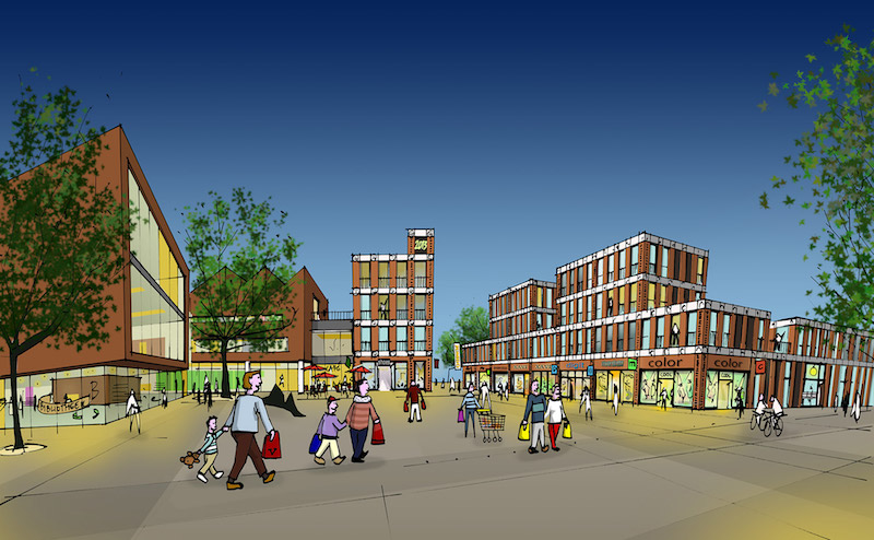 Image courtesy Bart van Hoek, Attika Architekten.
Related Stories
| Oct 15, 2014
Final touches make 432 Park Avenue tower second tallest in New York City
Concrete has been poured for the final floors of the residential high-rise at 432 Park Avenue in New York City, making it the city’s second-tallest building and the tallest residential tower in the Western Hemisphere.
| Oct 6, 2014
Moshe Safdie: Skyscrapers lead to erosion of urban connectivity
The 76-year-old architect sees skyscrapers and the privatization of public space to be the most problematic parts of modern city design.
| Sep 23, 2014
Cloud-shaped skyscraper complex wins Shenzhen Bay Super City design competition
Forget the cubist, clinical, glass and concrete jungle of today's financial districts. Shenzhen's new plan features a complex of cloud-shaped skyscrapers connected to one another with sloping bridges.
| Sep 15, 2014
Argentina reveals plans for Latin America’s tallest structure
Argentine President Cristina Fernández de Kirchner announces the winning design by MRA+A Álvarez | Bernabó | Sabatini for the capital's new miexed use tower.
| Sep 5, 2014
First Look: Zaha Hadid's Grace on Coronation towers in Australia
Zaha Hadid's latest project in Australia is a complex of three, tapered residential high-rises that have expansive grounds to provide the surrounding community unobstructed views and access to the town's waterfront.
| Aug 19, 2014
Goettsch Partners unveils design for mega mixed-use development in Shenzhen [slideshow]
The overall design concept is of a complex of textured buildings that would differentiate from the surrounding blue-glass buildings of Shenzhen.
| Aug 18, 2014
SPARK’s newly unveiled mixed-use development references China's flowing hillscape
Architecture firm SPARK recently finished a design for a new development in Shenzhen. The 770,700 square-foot mixed-use structure's design mimics the hilly landscape of the site's locale.
| Jul 17, 2014
A new, vibrant waterfront for the capital
Plans to improve Washington D.C.'s Potomac River waterfront by Maine Ave. have been discussed for years. Finally, The Wharf has started its first phase of construction.
| Jul 17, 2014
A high-rise with outdoor, vertical community space? It's possible! [slideshow]
Danish design firm C.F. Møller has developed a novel way to increase community space without compromising privacy or indoor space.
| Jun 30, 2014
OMA's The Interlace honored as one of the world's most 'community-friendly' high-rises
The 1,040-unit apartment complex in Singapore has won the inaugural Urban Habitat award from the Council on Tall Buildings and Urban Habitat, which highlights projects that demonstrate a positive contribution to the surrounding environment.


