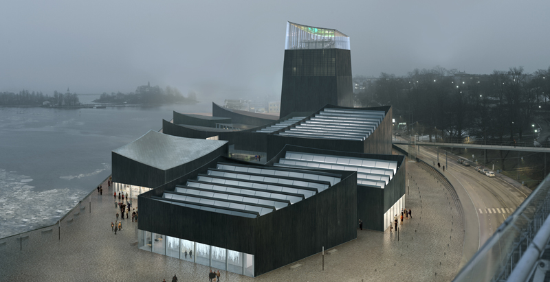
The second-stage designs by finalists in the Guggenheim Helsinki design competition have been unveiled, Architectureau reports.
The designs were not released alongside the firm that created them. The renderings below are from the finalists: AGPS Architecture, Asif Khan Ltd., Haas Cook Zemmrich Studio2050, Moreau Kusunoki Architectes, SMAR Architecture Studio, and Fake Industries Architectural Agonism.
The team behind each design will remain anonymous until judging is complete. Designs are currently on exhibit at the Kunsthalle Helsinki. Additionally, exhibition visitors can play a Matchmaker Game, developed by American data scientist and taste researcher Hugo Liu, to pair visitors with one of the six final designs based on an assessment of their personality.
Following the exhibition, the jury will meet in Helsinki to select a winner, which will be announced on June 23, 2015.
Read more at Architectureau, and see all the renderings for each submission at Guggenheim Helsinki.
FINALIST #1
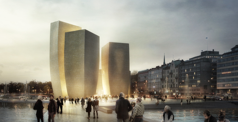
From the architects:
Five timber towers huddle together at the edge of the Baltic Sea, forming a shimmering beacon on the shoreline.
Multiple forms produce an interplay of light and shadow that create an inspiring, enticing atmosphere, while glimpses of in-between spaces beckon visitors from near and far. The warmth and familiarity of the wood shingle façade creates a sense of belonging with the landscape, while an ethereal quality is expressed through its subtle oscillation, ruffling, as though brushed by the winds of the sea. Helsinki Five seeks to engage a sense of discovery that is deeply informed by art, instigating close encounters between artwork and viewer, between art-maker and art-making.
It is a play of hide and seek, light and dark, wide and close, in and out.
FINALIST #2
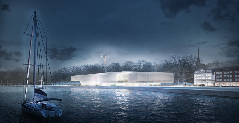
From the architects:
The use of Street Space forms the basis for basic social discourse, from political gatherings to Art creation or community expressions.
While an increasing “unofficial” art was blooming in the streets from the second half of the XX Century, Museums have been historically focused in Gallery Art, excluding Public Space production.
Future is “bottom up”. Museums have to change from institutions where information was directed in only one way: towards the viewer into institutions that are increasingly creating conversations with the citizen, prioritizing the human scale of a space over its merely sculptural value.
Due to its particular climatic conditions. There are 2 cities in Helsinki. Summer Helsinki and Winter Helsinki. We propose a Strategy that could offer back to the City an Interior Street, Public Space at no additional cost to be used also the 6 cold months of the year. The combination of 2 programs -The Museum -Gallery Art- and The Extra Space -Street Art- in a single building allows us to explore the relationship between 2 complementary worlds. Using both factors, we had the chance to add, subtract, divide… We decided to multiply.
FINALIST #3
From the architects:
Helsinki is a city of interiors. Due to its extreme climatic conditions, Helsinki’s civic society blossoms indoors. Our proposal for the Guggenheim Helsinki, 47 Rooms, extends this network using the architectural technologies that construct Helsinki’s interior citizenry: i.e. walls, doors, windows, and the machinery that defines atmospheric conditions.
47 Rooms contains nine rooms of 20x20m, twenty-seven of 6.5x6.5m six of 10x10m, two of 120x4m and one of 32x120m and three outdoor rooms. A multiplicity of chambers and climatic conditions will allow various museums to live together in the same building. The museum is ready to welcome individual visitors, families, local art scene, high school visits, young audiences, international tourists, groups of friends… 47 Rooms is a machine to provide singular and ever-changing experiences by opening and closing doors to different climates.
47 Rooms extends the logic through which Helsinki’s population already tempers their more intimate public spaces. Imitating the logic of the Sauna, each room’s final climatic conditions include certain degree of negotiation between the institution and its visitors.
47 Rooms means a strategic shift on Guggenheim’s identity: it embraces Helsinki focusing on interior climate rather than external appearance.
FINALIST #4
From the architects:
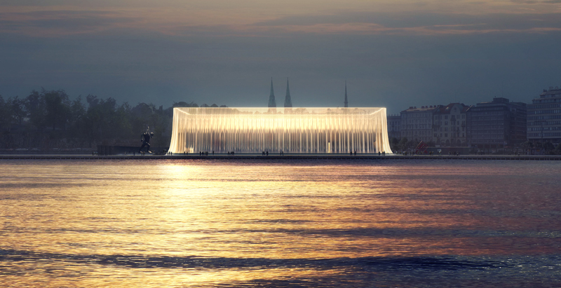
Our proposal takes the form of a Helsinki city block rotated to the harbourfront.
Seven timber-clad galleries are stacked over a basement and three levels flanked by administration and open-format halls. Public spaces are formed between these and an intelligent textured glass skin wrapping the entirety to precisely diffuse light, translucent below, and transparent above. The lower galleries join as needed, while the third floor is one super-space. The variety enables a wide range of curatorial approaches.
The museum’s three entrances are arrived at by new cobble and gravel walking routes. Centrally a wide, convivial staircase helps visitors wayfind intuitively. “Art Kioski” annex for young Nordic art twins the historic Kauppahalli while a sculpture garden is enclosed to the south.
In 1800s Helsinki city blocks were named after wild animals. The proposed new block will have the tactile familiarity of a pet’s fur. So we call this proposal “quiet animal."
FINALIST #5
From the architects:
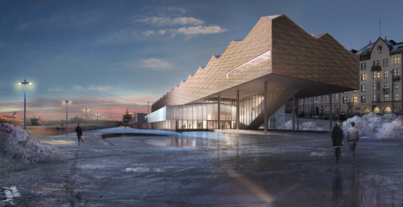
The museum is composed of two spaces - one for exhibitions, the other a public forum - that come together in a dance involving art and the city, gradually engaging in multiple movements, from a pas de deux, to a pas de trois, etcetera.
One space of the museum is on the dock level of the port facility, acknowledging the site’s industrial function as a vital memory for the new ensemble. Part gathering place, part community center, part incubator for innovation, it is conceived as a social commons within the city.
The other space of the museum houses art exhibitions. Hovering in the air, it offers a place for contemplation, with large open galleries, complementing its companion space below.
Greater than the sum of its parts, the museum generates multiple relations among people, architecture, and the arts. With this, the Guggenheim Helsinki can engage a broad constituency of stakeholders, benefiting not only the arts, but the public at large.
FINALIST #6

From the architects:
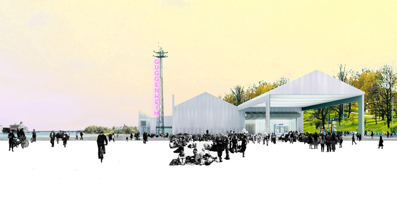
The design of the Guggenheim Helsinki and its woven landscape are based upon a sensitive and sympathetic approach to the context and nature of Helsinki. The design encourages people to flow within a new cultural core that is linked to the rest of the city, through the port promenade and the pedestrian footbridge to the Observatory Park. This flexible access welcomes not only the visitors but also serves as a key cultural destination for the community.
The museum skyline is composed by independent volumes, highlighted by a landmark tower. These fragmented art exhibition spaces allow strong integration with outdoor display and events, while the lighthouse offers a new perspective over the city. This new museum concept together with the charred timber façade echoes the process of regeneration that occurs when forests burn and then grow back stronger.
Related Stories
Architects | Jun 7, 2017
Build your very own version of Frank Lloyd Wright’s Guggenheim Museum with this new LEGO set
744 LEGO bricks are used to recreate the famous Wright design, including the 1992 addition.
Museums | May 25, 2017
The museum as workspace
Many museum staff are resistant to the idea of open offices.
Architects | May 23, 2017
Queens Museum exhibit shows New York City as it could have been
The installation will showcase 200 years worth of unrealized Big Apple projects via original drawings, renderings, newly commissioned models, and 3D visualizations.
Museums | May 18, 2017
American Writers Museum opens on Chicago’s Michigan Avenue
Amaze Design designed the 10,000-sf space.
Cultural Facilities | May 4, 2017
Obama Foundation reveals first look at the Obama Presidential Center
The design comprises three buildings set in the public space of Jackson Park on Chicago’s South Side.
Art Galleries | Apr 21, 2017
The Odunpazari Modern Art Museum pays homage to Ottoman Empire era architecture
The wooden façade is a link to the history of the area as a wood market.
Art Galleries | Apr 14, 2017
Activating exteriors as gallery space
Owners would like to get more value from their exterior spaces. One architecture firm details how it made that happen for the new Whitney Museum.
Museums | Jan 19, 2017
Turning museums inside out: White paper addresses the value of exterior gallery space
Many contemporary museum designs are beginning to utilize the exterior wall space to display art that can help attract new audiences.
Museums | Dec 15, 2016
The design of the Shanghai Planetarium draws inspiration from astronomical principles
Housed within the 400,000-sf building will be the world’s largest planetarium theater.
Museums | Dec 15, 2016
The Grand Louvre - Phase I honored with AIA Twenty-five Year Award
The award recognizes an architectural design that has stood the test of time for 25 years.


