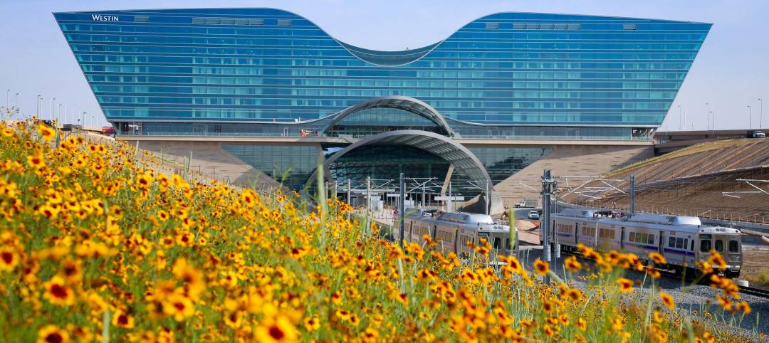
The design by Miami-based firm Oppenheim Architecture was selected by Crescent Heights, one of the nation’s largest developers, for the 40,000-sf Whole Foods Market to be constructed on Alton Road and 19th Street in Miami Beach. The project recently received Planning and Design Review Board approval by the City of Miami Beach.
Helping satiate the city’s appetite for elevated architecture expression set forth by projects created by Herzog & de Meuron, Frank Gehry, Zaha Hadid, Norman Foster and Rem Koolhaas, the new Whole Foods Market designed by Chad Oppenheim attempts to blur the boundaries between traditional and contemporary notions of place.
The design for the Whole Food Market features a grid of white concrete representing a pure expression of structure and space, establishing a pedestrian loggia at the ground level, and a floating garden above that screens the parking.
Veiled behind a dimensional and diaphanous mesh supported within the super structure, the flora, selected by Urban Robot, becomes a ghosted memory of the native landscape that was Miami Beach, some of which can actually be foraged.
The structure, while striking in its purity and innovation, is also somehow comfortable and familiar. The harmonious rhythm of columns and beams, distorts the perception of scale, making the large building friendlier to the neighborhood.

Oppenheim Architecture worked closely with Whole Foods to activate the majority of the public facing glass façades by inverting and celebrating the typical back of house operations such as baking, other food preparation and stores within stores. A large, landscaped plaza at the corner of the site is sure to serve as a major public gathering space of the city.
“Every great city needs a great market, and Miami Beach, while having many super markets is in need a market that is super," said Chad Oppenheim, Principal and Lead Designer of Oppenheim Architecture. "So we began by looking at the markets of ancient civilizations—Greece, Rome, those of the Islamic world, and even the Aztec capital of Tenochtitlán—when markets served as the center of communal life. We were inspired by their effortless elegance, logical practicality and ability to support public life.”
Related Stories
Market Data | Feb 26, 2016
JLL upbeat about construction through 2016
Its latest report cautions about ongoing cost increases related to finding skilled laborers.
Industry Research | Feb 22, 2016
8 of the most interesting trends from Gensler’s Design Forecast 2016
Technology is running wild in Gensler’s 2016 forecast, as things like virtual reality, "smart" buildings and products, and fully connected online and offline worlds are making their presence felt throughout many of the future's top trends.
Market Data | Feb 10, 2016
Nonresidential building starts and spending should see solid gains in 2016: Gilbane report
But finding skilled workers continues to be a problem and could inflate a project's costs.
Market Data | Feb 9, 2016
Cushman & Wakefield is bullish on U.S. economy and its property markets
Sees positive signs for construction and investment growth in warehouses, offices, and retail
Market Data | Jan 20, 2016
Nonresidential building starts sag in 2015
CDM Research finds only a few positive signs among the leading sectors.
| Jan 14, 2016
How to succeed with EIFS: exterior insulation and finish systems
This AIA CES Discovery course discusses the six elements of an EIFS wall assembly; common EIFS failures and how to prevent them; and EIFS and sustainability.
Retail Centers | Dec 13, 2015
Aged chimney in Baku sees new life as shopping center totem
For the Twin Towers of Port Baku, the restoration requires an elaborate anchoring and stabilization process.
Retail Centers | Nov 18, 2015
Foster + Partners unveils design for Apple Store on Chicago River
The 20,000-sf store draws inspiration from the Prairie School architectural style.
Shopping Centers | Nov 12, 2015
Dallas Cowboys owner Jerry Jones breaks ground on $1 billion mixed-use development
The plan calls for retail space, including a Walmart, along with offices, apartments, and homes.
Retail Centers | Oct 12, 2015
Rotterdam’s ‘ugliest building’ turned into sleek McDonald’s branch
Since the 1960s, residents of the Dutch city of Rotterdam have been bugged by an unsightly cigar shop on Coolsingel, one of its busiest streets. It received a much needed facelift earlier this year, designed by Mei Architects.


