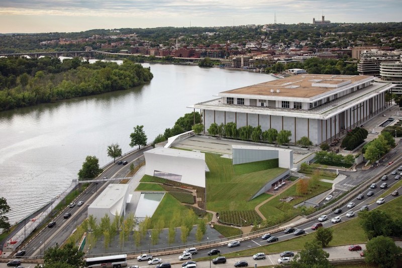
The John F. Kennedy Center for the Performing Arts in Washington D.C. opened its first-ever expansion on September 7, and is celebrating that opening with 16 days of free programming.
Designed by Steven Holl Architects, The REACH, as the addition is known, is anchored by three pavilions—called Welcome, Skylight, and River—located on more than 130,000 sf of sweeping lawn that overlooks the Potomac River. The buildings are linked below ground to create an expanded facility that includes classrooms, three rehearsal studios, and multiuse public spaces.
The project incorporates engineering features that include a void slab design, a technique rarely used in the U.S., which allowed for the expansion’s dramatic sculptural forms and spacious interiors. Plastic balls are embedded in the concrete to reduce the overall deadweight and allow for longer spans. Arup coordinated closely with the design team to ensure that each component of the building’s systems was effectively woven into the slab system on schedule.
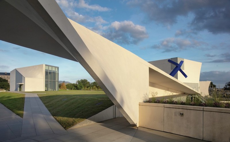 The Link walkway connects the Kennedy Center's main building to the REACH.
To support the architectural vision and ambitious sustainability targets, Arup's team of engineers and consultants collaborated to develop a building systems strategy that optimizes energy performance while remaining largely unseen. For example, an under-floor concrete trench system enables the building services to be distributed out of sightline, thereby preserving the integrity of the architectural vision.
The strategy also incorporates a range of performance-enhancing technologies, from a closed-loop, ground source heat rejection system, to advanced temperature controls and radiant floor heating. Using Arup’s in-house software suite, Oasys Building Environmental Analysis (BEANS), the team demonstrated that the addition of radiant floors would counteract the thermal effects of one of the pavilion’s massive curved wall, providing both heating and cooling and significantly boosting comfort throughout the year while keeping energy demands within acceptable levels.
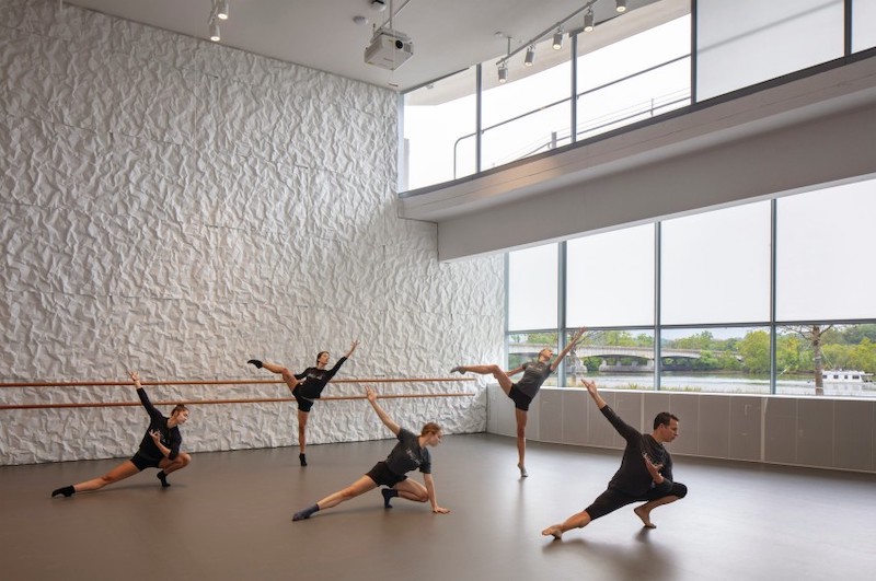 One of three rehearsal studios at The REACH.
The REACH could be viewed as a counterpoint to the monolithic Kennedy Center, which one architectural critic once disparaged as a “superbunker” with over-the-top interior design elements and few windows. In contrast, the REACH’s 72,000 sf interior space—which include a living theater, immersive learning center, and public arts incubator—present more-open, inviting spaces to visitors and patrons. The addition increases the Kennedy Center’s public-facing areas by 20%, Deborah Rutter, the Center’s president, told Bizjournals.com.
The Whiting-Turner Contracting Company was the construction manager on the project.
The REACH cost an estimated $175 million, 75% over its original construction buddget, and took two more years than planned to complete. Its supporters say that a portion of the extra cost will pay for operations. The Kennedy Center is in the process of raising $250 million in individual and corporate donations for the new facility, which is targeting LEED Gold certification.
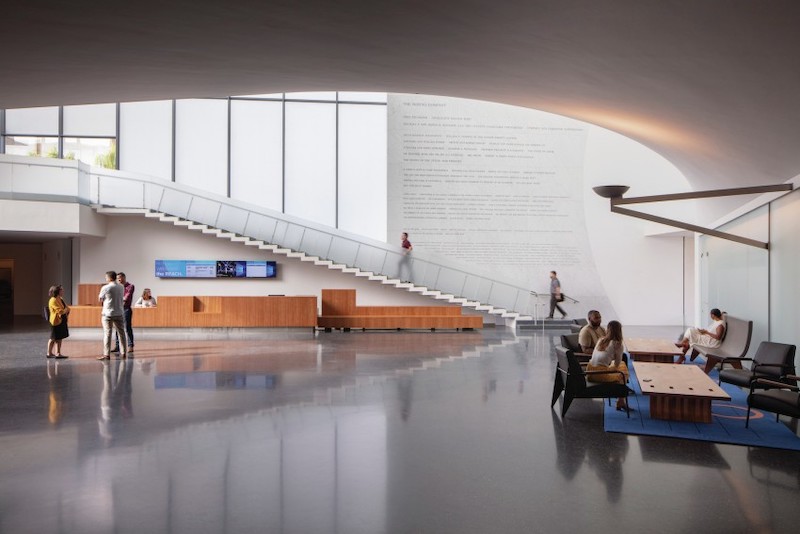 The lobby for the Welcome Pavilion, one of three buildings that comprise The REACH.
Related Stories
| Mar 26, 2014
Zaha Hadid's glimmering 'cultural hub of Seoul' opens with fashion, flair [slideshow]
The new space, the Dongdaemun Design Plaza, is a blend of park and cultural spaces meant for the public to enjoy.
| Mar 25, 2014
Sydney breaks ground on its version of the High Line elevated park [slideshow]
The 500-meter-long park will feature bike paths, study pods, and outdoor workspaces.
Sponsored | | Mar 21, 2014
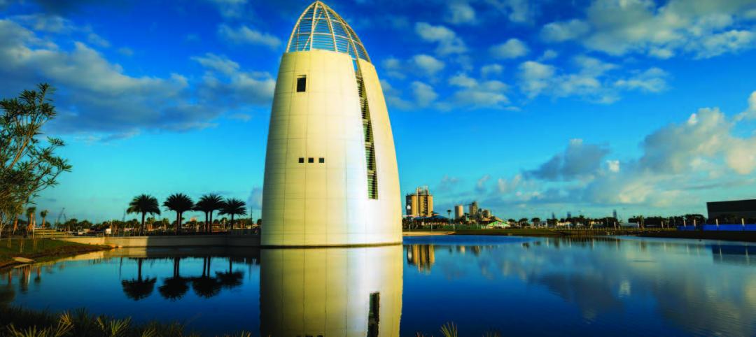
Kameleon Color paint creates color-changing, iridescent exterior for Exploration Tower at Port Canaveral
Linetec finishes Firestone’s UNA-CLAD panels, achieving a one-of-a-kind, dynamic appearance with the first use of Valspar’s new Kameleon Color
| Mar 20, 2014
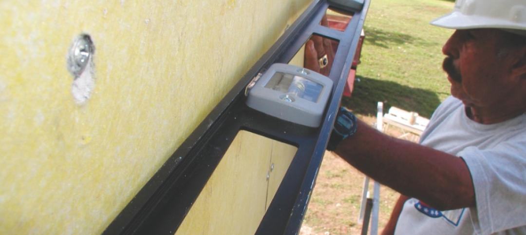
Common EIFS failures, and how to prevent them
Poor workmanship, impact damage, building movement, and incompatible or unsound substrate are among the major culprits of EIFS problems.
| Mar 13, 2014
Do you really 'always turn right'?
The first visitor center we designed was the Ernest F. Coe Visitor Center for the Everglades National Park in 1993. I remember it well for a variety of reasons, not the least of which was the ongoing dialogue we had with our retail consultant. He insisted that the gift shop be located on the right as one exited the visitor center because people “always turn right.”
| Mar 12, 2014
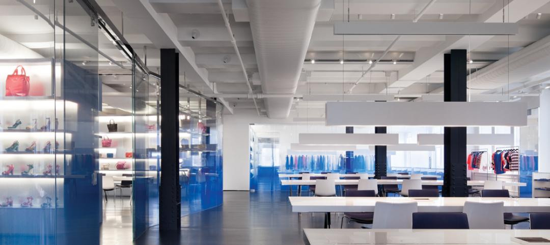
14 new ideas for doors and door hardware
From a high-tech classroom lockdown system to an impact-resistant wide-stile door line, BD+C editors present a collection of door and door hardware innovations.
| Mar 7, 2014
Chicago's 7 most threatened buildings: Guyon Hotel, Jeffrey Theater make the list
The 2014 edition of Preservation Chicago's annual Chicago's 7 list includes an L station house, public school, theater, manufacturing district, power house, and hotel.
| Mar 5, 2014
5 tile design trends for 2014
Beveled, geometric, and high-tech patterns are among the hot ceramic tile trends, say tile design experts.
| Mar 4, 2014
First look: Historic grain silo to become soaring art gallery
British architect Thomas Heatherwick has proposed to repurpose a grain silo into an art gallery in Cape Town, South Africa. The silo is made up of 42-concrete tubes, which Heatherwick plans to make into gallery spaces.
| Feb 28, 2014
Six finalists selected in design competition for Canadian Holocaust monument
David Adjaye and Daniel Libeskind are among the finalists for the National Holocaust Monument, planned near the Canadian War Museum in Ottawa.


