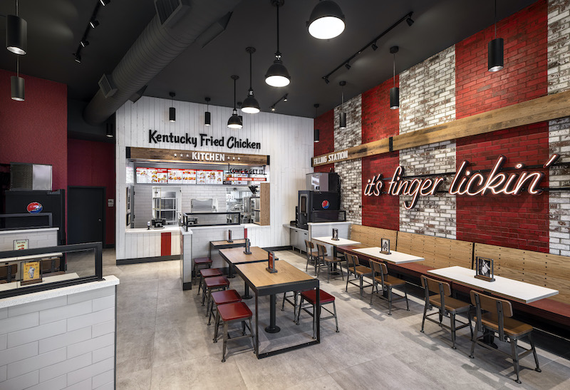
Located in the Bronx, KFC’s new urban inline restaurant design reflects the borough’s fast-paced, eclecticism with bolder accents and unique features evolved from the brand’s traditional American Showman restaurant design.
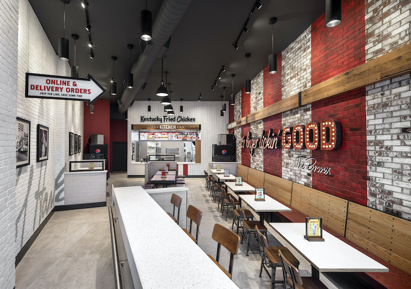
The project’s overall aesthetic reflects a juxtaposition between Colonel Sanders-inspired hospitality and the hustle and bustle of the Bronx. Upon entering the building, guests are greeted by a large Colonel Sanders wood focal wall and signage that features the brand’s “it’s finger lickin’ good” tagline. A brick accent wall serves as the backdrop for KFC’s signature red stripes to create a beacon visible from both the inside and the outside.
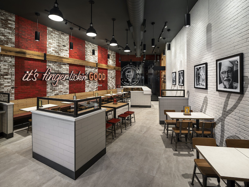
“Working with a brand historically known for its southern hospitality, we created a design that maintained the iconic experience, but also looked to fold in a distinctly edgier attitude to deliver on the feistiness of what guests see from KFC in commercials and on social media.”
See Also: World’s first drive-thru only restaurant in Australia
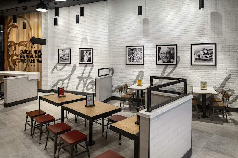
The seating arrangements and ordering options were designed for the on-the-go mentality of New Yorkers. The restaurant has bar seating for solo diners and a designated pick-up area for mobile and to-go orders.
The design gives the brand a modern look that captures the Colonel’s vintage flavor and marks a continued strategy to create more alternate and non-traditional formats that connect KFC with its consumers in differentiated markets.
Related Stories
Retail Centers | Mar 19, 2019
Porsche’s next-gen showroom prototype opens in Palm Springs, Ca.
The dealership is the first to showcase Porsche’s new design philosophy, ‘Destination Porsche.’
Retail Centers | Dec 3, 2018
Biotrack your shop
Sabrina Hilfer, a specialty retail designer, talks about the integration of biometrics in the retailscape.
Retail Centers | Nov 8, 2018
The Container Store moves into the next generation courtesy FRCH Design Worldwide
The next-gen prototype is located in Dallas, Texas.
Retail Centers | Oct 22, 2018
Stuck in the middle: What can save the average American mall?
Erich Dohrer doesn’t want to talk about the “dead mall” or the great mall success story—he wants to talk about design solutions for the ones that are just getting by.
Retail Centers | Oct 9, 2018
Kengo Kuma designs Taipei Starbucks from 29 shipping containers
The store will be part of a new shopping mall.
Retail Centers | Sep 27, 2018
Turkish bazaar takes the shape of the surrounding mountains
The project is designed by PDG Architects and ANTEPE.
Retail Centers | Sep 26, 2018
The future of travel retail
Kevin Horn and Shirley Cheng explore how a new generation of travelers is disrupting airport retail.
Retail Centers | Sep 20, 2018
BIG designs ‘restaurant village’ just outside of Copenhagen
The restaurant comprises 11 spaces, each with their own unique function.
Retail Centers | Sep 17, 2018
Iteration vs disruption: Designing for a great customer experience
One way to solve for the future is to disrupt the expected.
Mixed-Use | Sep 14, 2018
Six-story structure combines a parking garage with street-level retail
Eskew+Dumez+Ripple designed the structure.


