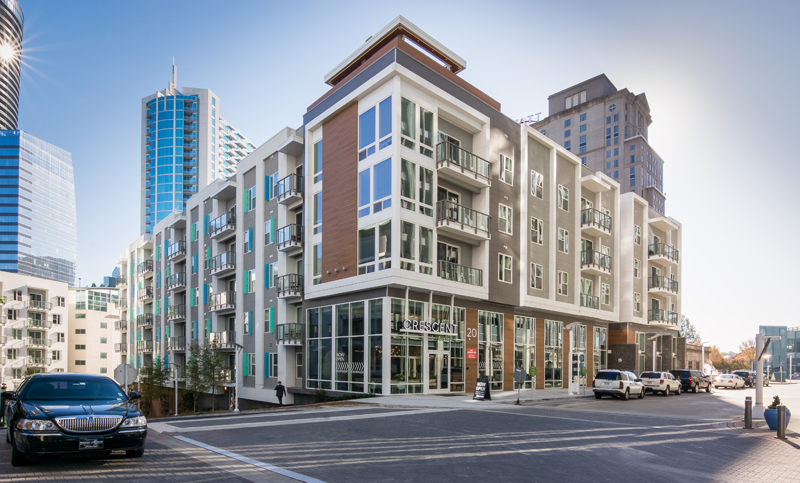
When the time came to develop the 355-unit, five-story Berkshire Terminus upscale apartment building in the Buckhead section of Atlanta, the design team had one goal: complement the neighboring institutional and corporate office spaces while still offering something distinctive.
“We wanted to be a good neighbor,” says Ben Hudgins, project manager and architect of Lord Aeck Sargent in Atlanta. “We wanted to conform to the design standard set by the existing campus while creating something unique.”
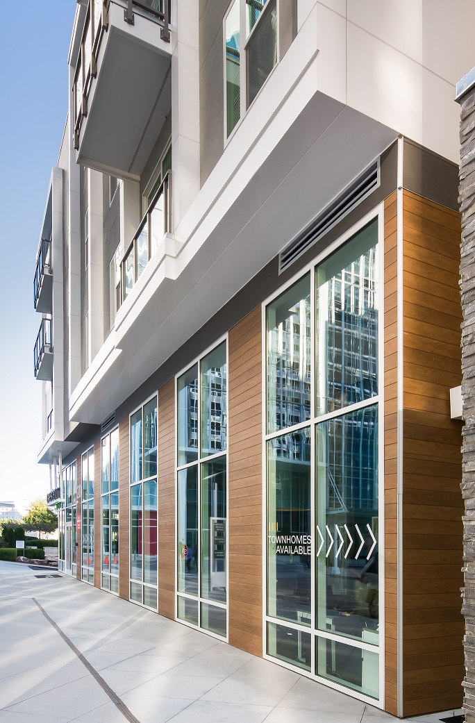
This also required they follow zoning and code requirements already set for the area, such as the amount of glass the building had at the street level. They met the intense street-level fenestration requirement by incorporating a two-story leasing/lobby space and two-story townhome-style walk-up units.
Choice of exterior materials was one way the team successfully differentiated this building from those nearby. The team specified Nichiha VintageWood fiber cement panels for the corners and the most prominent façade of the building to create texture and warmth next to the glass.
“The building is primarily gray and white, so the eye is immediately drawn to the cedar wood color and texture of the VintageWood product. This gives the building an artistic flair that adds life to an almost homogenous contemporary design,” says installer Bryce Dryden, vice president and director of operations for Living Stone Construction in Kennesaw, Ga.
The use of aluminum composite material panels makes direct reference to the existing buildings which are made entirely of glass and metal. Nichiha’s Illumination product was also used on this project as a budget friendly option.
As is the case with most urban infill projects, one of the biggest challenges was keeping roads and walkways open and accessible. In addition, the team needed to be sensitive to the neighboring businesses that still had to operate while the building was under construction.
Along with its aesthetics and streetscape, the property further embraces its location with amenities such as a roof terrace that provides an outdoor space complete with TV, fireplace lounge seating, and Buckhead skyline views.
Dryden’s team also benefitted from the ease of installing Nichiha products on a previous project. Given the additional experience our team gained, this installation was both smooth and efficient, Dryden adds.
The team was happy with the project and how the materials were used. “The Nichiha panels and VintageWood matched the sophisticated look the owner wanted to achieve for this affluent, uptown district,” Dryden says. “The building is a high-profile one, and other building owners and architects from around Atlanta regularly inquire about the design, and more specifically the Nichiha VintageWood panels on it.”

Project Overview
Challenge
The building had to complement neighboring structures—but still stand on its own. Mixing façade materials was an ideal solution, but required careful thought into transitioning from one look to another.
Solution
The use of gray and white colors enhance the warmth of the Nichiha wood-look panels and the building’s contemporary design.
Results
The apartment building features a contemporary high-end design that meshes well with neighboring buildings and the community as a whole. At the same time, its unique approach sets it apart while capturing the attention of other building owners and architects in the Atlanta area.
Project Details
Architect: Lord Aeck Sargent
Installer: Living Stone Construction
Location: Atlanta
Product: VintageWood & Illumination
Related Stories
| Aug 11, 2010
AAMA leads development of BIM standard for fenestration products
The American Architectural Manufacturers Association’s newly formed BIM Task Group met during the AAMA National Fall Conference to discuss the need for an BIM standard for nonresidential fenestration products.
| Aug 11, 2010
Embassy's dual façades add security and beauty
The British government's new 46,285-sf embassy building in Warsaw, Poland's diplomatic quarter houses the ambassador's offices, the consulate, and visa services on three floors. The $20 million Modernist design by London-based Tony Fretton Architects features a double façade—an inner concrete super structure and an outer curtain wall.
| Aug 11, 2010
Precast All the Way
For years, precast concrete has been viewed as a mass-produced product with no personality or visual appeal—the vanilla of building materials. Thanks to recent technological innovations in precast molds and thin veneers, however, that image is changing. As precast—concrete building components that are poured and molded offsite—continues to develop a vibrant personality all it...
| Aug 11, 2010
Seven tips for specifying and designing with insulated metal wall panels
Insulated metal panels, or IMPs, have been a popular exterior wall cladding choice for more than 30 years. These sandwich panels are composed of liquid insulating foam, such as polyurethane, injected between two aluminum or steel metal face panels to form a solid, monolithic unit. The result is a lightweight, highly insulated (R-14 to R-30, depending on the thickness of the panel) exterior clad...
| Aug 11, 2010
Nurturing the Community
The best seat in the house at the new Seahawks Stadium in Seattle isn't on the 50-yard line. It's in the southeast corner, at the very top of the upper bowl. "From there you have a corner-to-corner view of the field and an inspiring grasp of the surrounding city," says Kelly Kerns, project leader with architect/engineer Ellerbe Becket, Kansas City, Mo.
| Aug 11, 2010
AIA Course: Enclosure strategies for better buildings
Sustainability and energy efficiency depend not only on the overall design but also on the building's enclosure system. Whether it's via better air-infiltration control, thermal insulation, and moisture control, or more advanced strategies such as active façades with automated shading and venting or novel enclosure types such as double walls, Building Teams are delivering more efficient, better performing, and healthier building enclosures.
| Aug 11, 2010
Glass Wall Systems Open Up Closed Spaces
Sectioning off large open spaces without making everything feel closed off was the challenge faced by two very different projects—one an upscale food market in Napa Valley, the other a corporate office in Southern California. Movable glass wall systems proved to be the solution in both projects.


