Sherwin-Williams has released four new color palettes.
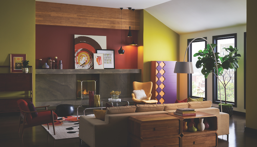
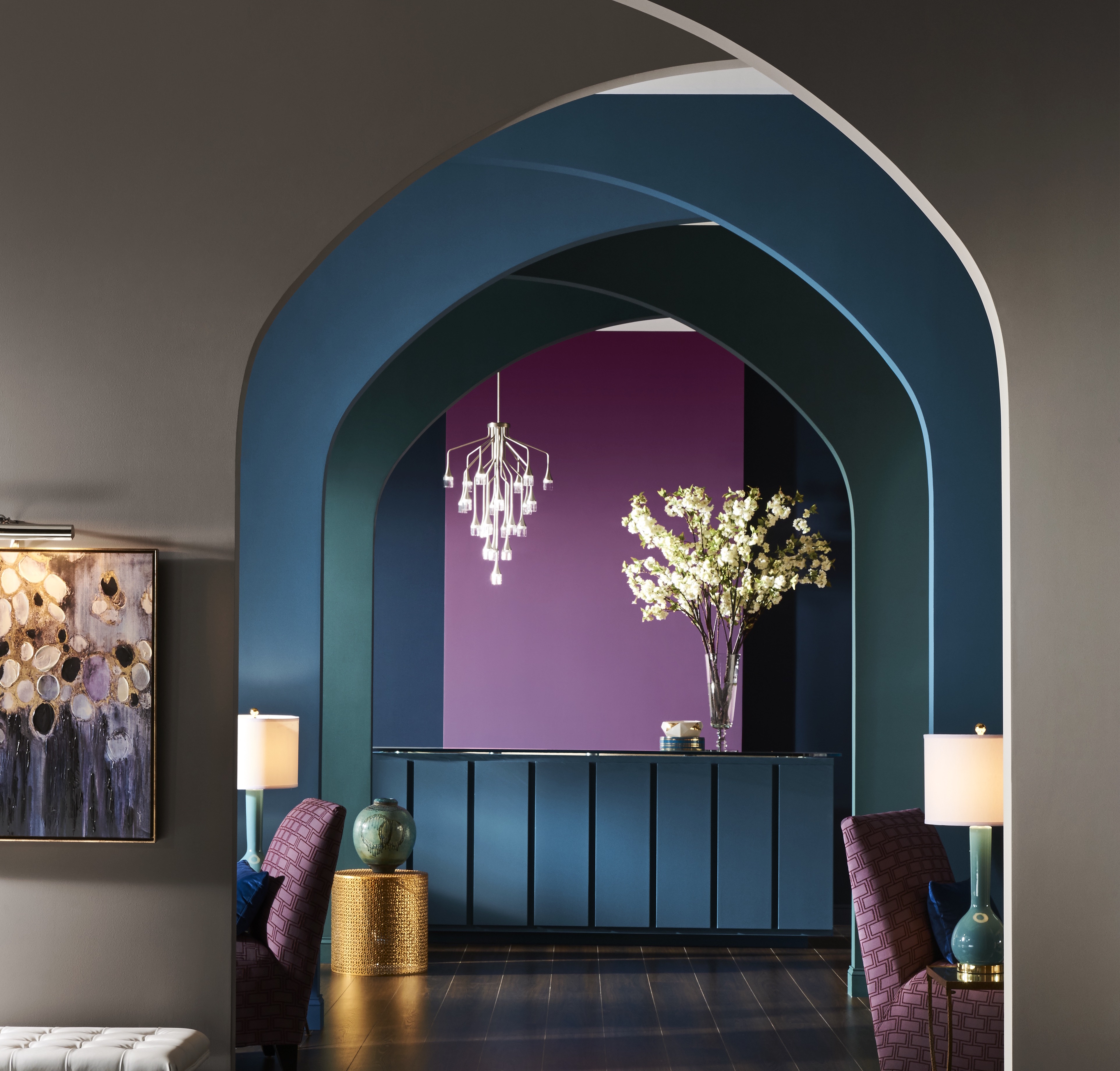
A team of design and color experts developed colormix 2017: The Sherwin-Williams Color Forecast based on extensive research and insights into global trends. The four palettes — Noir, Holistic, Intrepid and Unbounded — each consist of 10 colors.
Noir: Driven by baroque and romanticism trends, the Noir palette is rich with colors that evoke vine-ripe fruits, Nordic blues, moody neutrals, and golden yellow. This stark style looks modern in residences or commercial properties.
Holistic: Sustainable design and transparency are the new standards. The colors of this holistic palette include arctic neutrals, blush rose, wild browns and forest floor green, and they are suitable for healing retreats and eco-travel settings.
Intrepid: Youth culture and global collaboration lead to a feisty energy, which influenced this retro palette, including fiery oranges, vibrant kimono colors and the simplicity of black, white and gray.
Unbounded: Global immigration is redefining national identities, and design is adapting to more diverse populations. Global consciousness is captured in this palette’s earthy mustards and browns as well as ocean blues and corals.
“Our forecast this year is an exploration of the trends and influences that are emerging to drive design towards a state of restless energy,” said Sue Wadden, director of color marketing for Sherwin-Williams. “Each of our four palettes tell a distinct color story, offering opportunities for homeowners and professionals alike to explore color in new and exciting ways.”
colormix 2017: The Sherwin-Williams Color Forecast
|
Noir |
Holistic |
Intrepid |
Unbounded |
|
|
Related Stories
Coatings | Feb 18, 2015
Wet-applied coatings and finishes for commercial and institutional projects [AIA course]
The rapid pace of development of improved liquid-applied materials and finishes has given Building Teams new options. These sprayable, paintable, or “gunnable” products can add performance and sustainability benefits and reach new levels of resiliency and durability.
Sponsored | | Dec 16, 2014
Kameleon colors expand the palette
Advanced technologies are creating new possibilities with Valspar’s Fluropon Kameleon. A rich look is created with a unique blend of ceramic and inorganic pigments. SPONSORED CONTENT
Sponsored | | Nov 26, 2014
What’s in a coating?
A beautiful coating on metal products can make a strong statement, whether used on a high-end commercial project or an industrial building. SPONSORED CONTENT
Sponsored | | Nov 12, 2014
Eye-popping façade highlights renovation, addition at Chaffin Junior High School
The new distinctive main entrance accentuates the public face of the school with an aluminum tube “baguette” system.
Sponsored | | Nov 6, 2014
Paint pigment and performance
Paints are used both to add color and protect surfaces. The pigments in the paint not only impact the color but also its performance properties. SPONSORED CONTENT
Sponsored | Coatings | Nov 6, 2014
Spanning the Spectrum
Chameleons are known for changing their skin colors to suit the observer, but what if a building can too?
Sponsored | | Oct 29, 2014
What’s the difference between your building’s coating chalking and fading?
While the reasons for chalk and fade are different, both occurrences are something to watch for. SPONSORED CONTENT
Sponsored | | Oct 19, 2014
The Exploration Tower in Port Canaveral dazzles visitors
With a mission to provide the experience of a lifetime, the Exploration Tower at Port Canaveral, Fla., is designed to inspire, as visitors learn about the history and nature of the port and beyond. SPONSORED CONTENT
Sponsored | | Sep 2, 2014
Judson University’s Harm A. Weber Academic Center resembles copper, but its sustainability efforts are pure gold
The building’s custom-fabricated wall panels look like copper, but are actually flat metal sheets coated with Valspar’s signature Fluropon Copper Penny coating.


![Wet-applied coatings and finishes for commercial and institutional projects [AIA course] Wet-applied coatings and finishes for commercial and institutional projects [AIA course]](/sites/default/files/styles/list_big/public/aiacourse.jpg?itok=bxS08zQL)

