Great design should celebrate a project’s connection to its place and provide an aesthetic that unifies the entire space. For Ascent Apartments, a luxury apartment complex in the epicenter of California’s Silicon Valley, the architecture firm responsible for the design was inspired by the site’s unique role in the history of the Information Age.
The team at Architects Orange, based in Orange, Calif., formed an immediate connection with the 10.8-acre site in San Jose. The 332-acre parcel on which it is located is where IBM manufactured the world’s first hard disc drives in 1956. The design for the 650-unit complex was inspired by the information technology manufacturing facilities and mid-century office buildings that once covered the campus.
Hitachi Global Storage Technologies acquired the entire property when it merged with IBM in 2002. The current owner of the Ascent site, Shea Properties, and Canadian investment partner Ivanhoé Cambridge have made the apartment complex an integral part of the 172-acre Cottle Transit Village, a transit-oriented development that encompasses two retail/commercial centers, green space and recreation areas, and more than 3,000 homes in adjacent neighborhoods. Last year, Ascent won a Gold award in the National Association of Home Builders’ Best in American Living Awards.
ASCENT APARTMENTS
PROJECT TEAM
Client: Shea Properties
Architect: Architects Orange
Interior designer: Style Interiors
Structural engineer: Van Dorpe Chou
Civil engineer: Carlson, Barbee & Gibson Inc.
Mechanical engineer: LDI Mechanical
Electrical engineer: IDS Group
Plumbing engineer: Parks Mechanical
Landscape architect: BrightView Design Group
General contractor: Brown Construction
“It has a clean architectural vocabulary that pays homage to the mid-century office buildings on the campus,” says RC Alley, Lead Partner of the multifamily and mixed-use practice at Architects Orange.
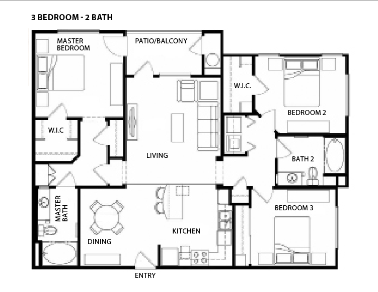
The apartments, which range in size from 704 to 1,575 sf, are contemporary and upscale in design. Units feature nine-foot ceilings with abundant natural light and private patios or balconies. Wood-plank flooring flows throughout the units.
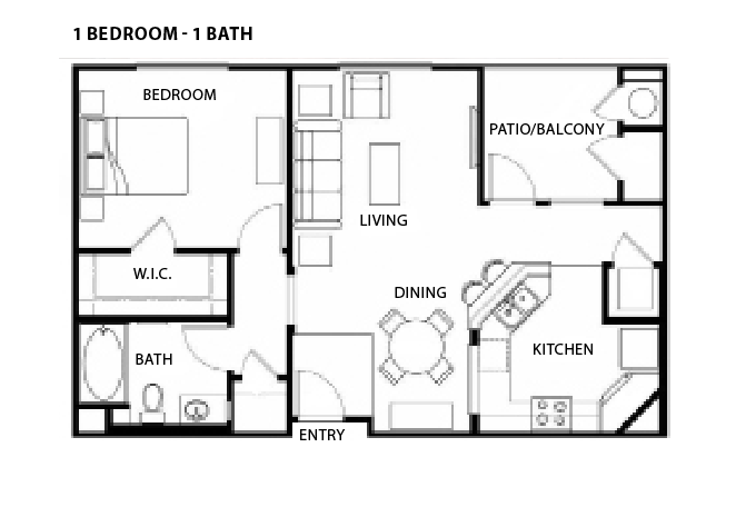
The Architects Orange team was shooting for a European feel, particularly for the kitchens. “We designed a kitchen that’s more compact,” says Alley. “A lot of people who live in these units don’t do a lot of cooking, so why have a big, separate space?”
Beyond the kitchen, the designers specified several elements that reimagine mid-century modern industrial style, notably metal mesh railings and the use of a recurring L-shape configuration that starts in the entryway and continues through various elements of the interior and exterior and act as a visual offset. Another mid-century touch: the illuminated vertical blades on the exterior, which serve as a unifying element and wayfinding tool, says Alley. The blades heighten the visibility of the complex from the adjacent freeway off-ramp.
Yet another feature that evokes the high-tech legacy of the site is a dramatic two-story reinforced fiber cement panel that dominates the leasing office lobby. The Architects Orange team took its inspiration for this feature from the iconic IBM punch (or “punched”) cards that early programmers used to encode data. The visual effect, says Alley, speaks to prospective tenants, many of whom work in high-tech jobs.
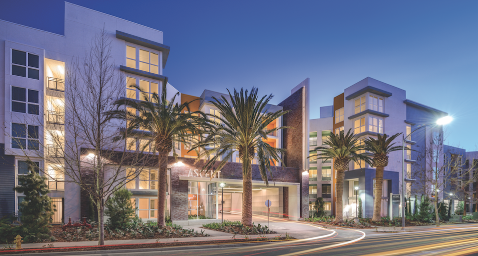
Ascent’s elevations benefit from a combination of materials: a smooth-finish exterior plaster, fiber siding, prefinished steel awnings that provide a horizontal element above the windows, and brick. “We added the brick because it has a warm and textural feeling, but we tried to use it in a more contemporary manner,” says Ed Cadavona, a Partner at Architects Orange.
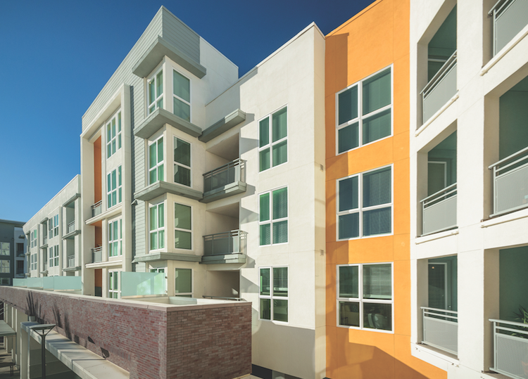 Architects Orange used a variety of materials in the elevation, including stucco, brick, metal, and horizontal siding. Pops of color evoke the feel of a California resort. Note the “eyebrows” above the corner windows and stairwells, which add texture to the space. The offset panes in the windows pay tribute to the punch cards that were used at the dawn of the Information Age. Translucent, sand-blasted panels enhance privacy on the patios of this high-density project.
The use of wide composite windows and the incorporation of top-level loft apartments help vary the roof line to differentiate Ascent from nearby residential developments.
The architects found an innovative way to achieve the corner windows that help define the mid-century modern style of the buildings.
“Vinyl windows can get very expensive if you don’t buy standard ones,” says Alley. “We had the manufacturer put them together so they read as one piece. It has a nice rhythm. It has the punch card look without making the windowpanes look too small. We used an asymmetrical approach so it doesn’t look too plain.” The designers used vinyl windows throughout, except in the leasing area, where they specified a storefront system.
CREATING A TRANSIT-ORIENTED RESORT
Ascent Apartments is one of five projects designed by Architects Orange in Cottle Transit Village, Silicon Valley’s largest mixed-use, transit-oriented infill project. Kaiser Hospital and IBM Research are nearby. The Blossom Hill stop provides Caltrain rush-hour service to Diridon Station in downtown San Jose, with links to Amtrak and San Jose International Airport. Cottle Light Rail offers service to downtown San Jose, with connections to Santa Clara, Mill Valley, and other Silicon Valley locales.
But this is still automobile-crazy California, and the site hugs a busy freeway off-ramp. To buffer the complex from the roadway, Architects Orange and landscape architect BrightView Design Group incorporated lush landscaping along the walled perimeter, created an extensive walking path, and used plant materials to dampen the noise. Smaller park areas provide quiet enclaves throughout the site. The designers created a sense of visual distancing with pops of vibrant color in everything from the outdoor seating to exterior wall panels.
The five-story mid-rise project is structured in two buildings that wrap around parking in the center, as opposed to the more standard podium design with residential components atop a parking structure. This design compressed the footprint and allowed the project to achieve a density of just over 60 units/acre.
The wrap form also provided the framework for Ascent’s two most dominant features. The first is the entryway, an opulent porte cochère with vehicular lobby that features an atrium that lets light come through as you proceed. Cadavona describes the effect: “It transforms an ordinary parking structure into a grand sense of arrival for a resort feel.”
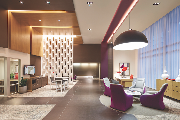 The designers’ L-shape architectural motif is evident in both the overhead wood panels and the violet stripe that runs the length of the leasing office lobby. The dramatic two-story perforated white panel, made of reinforced fiber cement, is another homage to the 1960s-era IBM punch card.
That sense of opulence is consistent with the vision Shea Properties and Ivanhoé Cambridge had for the project. “They wanted the look and feel of a high-end resort with a large amenity space,” Alley says. “It had to be unlike anything else in the area.”
The second dominant component is a half-acre park dominated by a large, resort-style saltwater pool and spa. The park features an outdoor gaming area, a tot lot, a bark park, and fireplaces. The community offers study pods, workspaces, a bicycle “kitchen” where you can fix your bike, a fitness center, a residence café, and a high-tech gaming room. “All those amenities are clustered around this green space,” says Cadavona.
“We wanted a walking trail that would create a sense of community in a high-density project,” Cadavona says. “You come out of your unit and the grand open space is prevalent throughout.”
A major gathering place of the central open space is the outdoor kitchen, which is supplied with grills, a pizza oven, and a fireplace, all located under a tensile structure with a large dining table and flat-screen TVs.
“We wanted to tie in this resort feel,” says Cadavona. “The buildings are very modern, with hard edges, and then there’s this soft tensile structure. Your eye kind of wanders around and goes to that structure.”
Every element of the buildings’ design comes into play to give the project a distinctive look and feel, Cadavona says. “All the textures—the brick, the metal awnings, the landscaping—all come into play to give it a unique character. The very horizontal building, lined up with palm trees, gives it that California casual but high-end feel.”
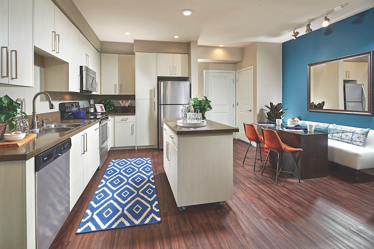 Sophisticated architectural cabinetry and quartz countertops accent the kitchens. Recessed lighting fixtures in the kitchen are complemented by simple pendants above the islands and track lighting over the dining area. “We wanted it to be consistent with the mid-century modern look and feel,” says Architect Orange’s RC Alley. “It’s a more subtle approach, and the recessed lights emphasize the openness of the floor plan.”
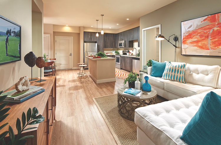 Apartments at Ascent have a contemporary, European look and feel. Design elements include open floor plans with wood plank flooring throughout and simple light fixtures. Note how the refrigerator is framed by the wall, soffit, and cabinetry. Here, the kitchen cabinetry contrasts in color and style with the floating island.
Related Stories
BAS and Security | Oct 19, 2022
The biggest cybersecurity threats in commercial real estate, and how to mitigate them
Coleman Wolf, Senior Security Systems Consultant with global engineering firm ESD, outlines the top-three cybersecurity threats to commercial and institutional building owners and property managers, and offers advice on how to deter and defend against hackers.
Codes and Standards | Oct 17, 2022
Ambitious state EV adoption goals put pressure on multifamily owners to provide chargers
California’s recently announced ban on the sale of new gas-powered vehicles starting in 2035—and New York’s recent decision to follow suit—are putting pressure on multifamily property owners to install charging stations for tenants.
Multifamily Housing | Oct 7, 2022
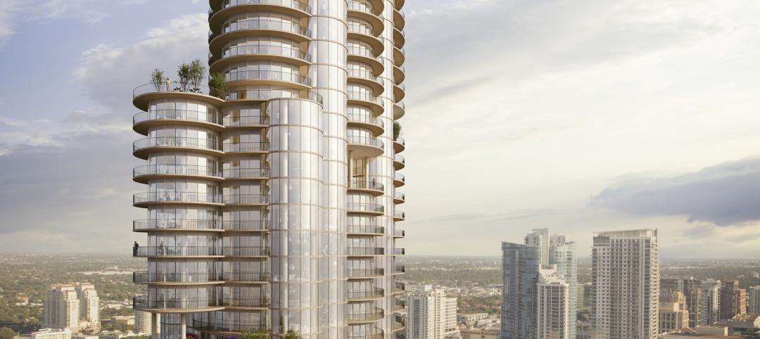
Design for new Ft. Lauderdale mixed-use tower features sequence of stepped rounded volumes
The newly revealed design for 633 SE 3rd Ave., a 47-story, mixed-use tower in Ft. Lauderdale, features a sequence of stepped rounded volumes that ease the massing of the tower as it rises.
Multifamily Housing | Oct 5, 2022
Co-living spaces, wellness-minded designs among innovations in multifamily housing
The booming multifamily sector shows no signs of a significant slowdown heading into 2023. Here is a round up of Giants 400 firms that are driving innovation in this sector.
Fire and Life Safety | Oct 4, 2022
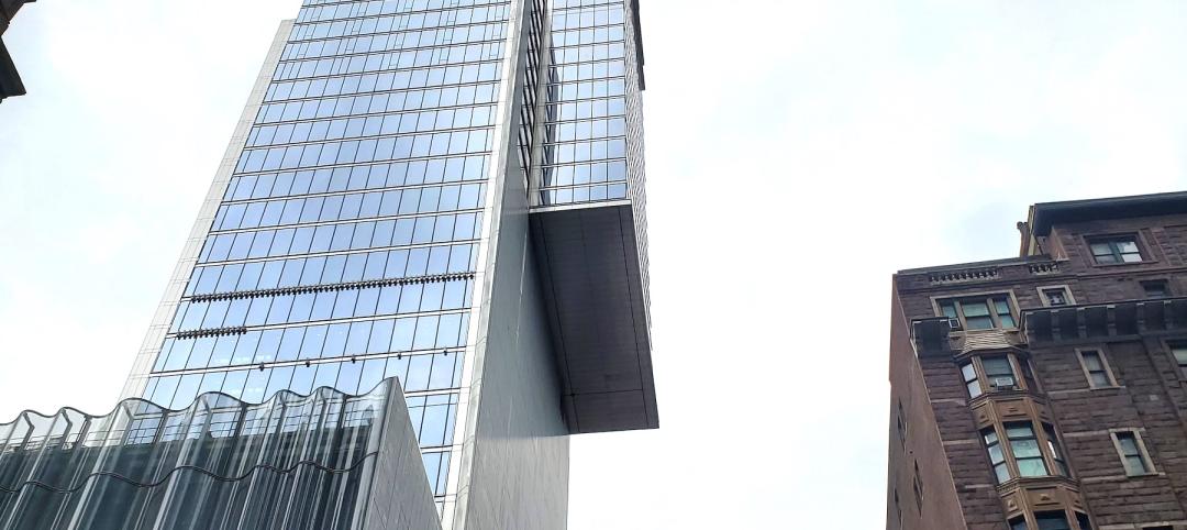
Fire safety considerations for cantilevered buildings
Bold cantilevered designs are prevalent today, as developers and architects strive to maximize space, views, and natural light in buildings. Cantilevered structures, however, present a host of challenges for building teams, according to José R. Rivera, PE, Associate Principal and Director of Plumbing and Fire Protection with Lilker.
| Oct 4, 2022
Rental property owners want access to utility usage data for whole properties
As pressure from investors for ESG reporting mounts, owners of multifamily properties increasingly look to collect whole-building utility usage data.
Resiliency | Sep 30, 2022
Designing buildings for wildfire defensibility
Wold Architects and Engineers' Senior Planner Ryan Downs, AIA, talks about how to make structures and communities more fire-resistant.
Sponsored | Multifamily Housing | Sep 16, 2022
In-Stock Sheathing System Saves Multifamily Project Timeline
Multifamily Housing | Sep 15, 2022
Toronto’s B-Line Condominiums completed using prefabricated panels
B-Line Condos, Toronto, completed using Sto Panel Technology.


