Building Teams for apartments, senior living, and other multifamily residential projects may be seeing gray this year, at least in kitchens and bathrooms. Gray color schemes for both types of spaces have grown dramatically in popularity, according to a new National Kitchen & Bath Association Top 10 trends report. Used currently in 55% of kitchens and 56% of bathrooms, gray conveys a sense of chic sophistication, according to the NKBA. White, off-white, beige, and bone also remain very popular, and sepia tones are on the rise.
Transitional-style kitchens and baths—defined as a "seamless blend of traditional and contemporary"—have surpassed traditional styles, which reigned until 2012. Quartz finishes are another "clear trendsetter" for 2013, according to NKBA survey respondents, consisting of ~300 member designers in the U.S. and Canada. Though quartz saw a slight popularity decline in 2012, it is now a close second to perennial favorite granite.
Additional top trends for kitchens include white-painted cabinetry, glass backsplashes, LED lighting, touch-activated faucets, and satin-nickel finishes. Bathroom trends include an increased use of ceramic/porcelain tiles and undermount sinks.
Here's a recap of the top 10 kitchen and bath design trends for 2013 (download the full report at http://www.nkba.org/PressRelease/2013_NKBA_Kitchen_and_Bath_Style_Report.pdf):
KITCHENS & BATHROOMS
1. Shades of Gray
In kitchens, shades of gray have noticeably jumped in use over the past three years. There was a significant increase from 9% of kitchens in 2010 to a remarkable 55% in the final three months of 2012. Similar to kitchens, grays in bathroom remodels have risen from 12% to 56% since 2010.
Whites and off-whites remain the top color schemes of both kitchens and bathrooms, used in 73% and 71%, respectively, an increase of 6 percentage points in both categories over the past year. Beiges and bones remain the second most popular color scheme in both rooms, followed by grays and then browns. Browns are slightly in decline in bathrooms, falling from 39% in 2012 to 35% this year, but sepia tones rose from 11% to 17% in kitchens and 11% to 18% in bathrooms.
2. Rise of Quartz
Quartz was the second most popular counter-surface material used in kitchens and baths last year. This year, it has significantly narrowed the gap with granite, increasing from 69% to 80% in kitchens and from 53% to 65% in bathrooms. Meanwhile, granite held steady in 2013, with 87% usage in kitchens and 71% in bathrooms.
Identified as the key trend for 2012, the popularity of solid surfaces in kitchens continues to rise, growing from 11% in 2010 to 35% in 2013. Marble still remains a popular bathroom vanity-top material, only moderately dipping in popularity from 46% in 2010 to 39% this year.
3. Trending Transitional Styles
In 2012, the popularity of transitional style — a seamless blend of traditional and contemporary — exceeded that of its traditional counterpart, which had been the clear topper in 2010 and 2011. In our latest survey, transition expanded its lead in the kitchen, with usage growing from 59% to 69%, Likewise, transitional styles in the bathroom are still positioned #1, currently used by 61% of NKBA-member designers.
As a consequence, traditional styles sit in second place in both rooms, their popularity holding steady at 60% in kitchens and 58% in bathrooms. Contemporary designs secured a close third in the most recent poll, maintaining a steady 52% usage in kitchens and increasing slightly from 53% to 57% in bathrooms.
KITCHENS ONLY
4. White Painted Cabinetry
Among painted cabinetry, white has stayed on top of the chart since last year. Given its remarkable, upward climb over the past three years, it’s clearly no fad. The popularity of white-painted cabinetry jumped from 47% to 59% in 2012 and further increased to 67% this year.
Use of light, medium and natural finishes has remained more or less consistent over the past year. Light finishes are currently used by 30% of respondents, medium finishes by 54%, and dark finishes by 55%. Use of glazed finishes, which held at 44% in 2011 and 2012, increased by four percentage points this year.
5. Glass Backsplash
The preference for glass splashes has grown dramatically over the past three years: from 42% in 2010 to 64% this year. At the same time, while natural stone tile showed consistent growth during 2011 and 2012, usage dropped from 60% to 55% in the latest survey. Ceramic or porcelain tiles held its top position for the third consecutive year, but overall usage fell by 11 percentage points between 2010 (88%) and now (77%).
6. LED Lighting
Energy-efficient lighting is widely used by member designers in both the United States and Canada. As consumer awareness of energy efficiency has risen, it comes as no surprise that light-emitting diode, or LED, lighting is being specified by a higher percentage of designers, increasing from 70% to 77% over the past year. The significant uptick from 50% in 2010 indicates that this trend has serious staying power.
Meanwhile, there has been no significant change in the use of compact fluorescent lighting (CFL) and incandescent bulbs, with current usage at 26% and 41%, respectively.
7. Touch-activated Faucets
Growing in popularity are touch-activated faucets, specified by 32% of member designers, versus only 20% of designers in 2011 and 2012. Pull-out faucets are still in the top position, as they have been since 2010, with usage rising from 88% in 2010 to 94% this year. Pot filler faucets grab the second spot this year, gaining five percentage points over the past year to 33%.
8. Satin Nickel on the Rise
When it comes to faucet finishes in kitchens, satin nickel has been on the top since 2011, its usage increasing from 42% in 2010 to 60% this year. Bronze or oil-rubbed bronze finishes are also being specified more often, growing from 41% to 50% in the past year. The increased popularity of these three finishes most likely comes at the expense of polished nickel and polished chrome. The latter, which had seen a rise in usage in 2012, dipped from 52% to 47% in the latest survey; polished nickel dropped from 25% to 20%.
BATHROOMS ONLY
9. Ceramic/Porcelain Tiles
Ceramic or porcelain tile flooring has been in slight decline over the past two years, but it remains the most popular of all materials, specified by 83% of the survey participants this year — down from 93% in 2011. Natural stone tiles have also declined since 2011 dropping from 77% to 59% in 2012, and to 57% this year. However, they have been the second most popular type of flooring used since 2011.
10. Undermount sink
Undermounts are in slight decline this year, dropping from 94% in 2012 to 87%. But here again, they remain the most specified type of lavoratory sink — not just in the latest poll, but over the past 3 years. Integrated sink/tops have seen modest growth, increasing from 35% in 2012 to 41% currently.
For the full report, visit: http://www.nkba.org/PressRelease/2013_NKBA_Kitchen_and_Bath_Style_Report.pdf.
Related Stories
| Feb 11, 2011
RS Means Cost Comparison Chart: Office Buildings
This month's RS Means Cost Comparison Chart focuses on office building construction.
| Feb 11, 2011
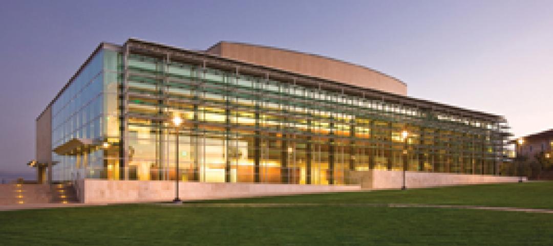
Sustainable features on the bill for dual-building performing arts center at Soka University of America
The $73 million Soka University of America’s new performing arts center and academic complex recently opened on the school’s Aliso Viejo, Calif., campus. McCarthy Building Companies and Zimmer Gunsul Frasca Architects collaborated on the two-building project. One is a three-story, 47,836-sf facility with a grand reception lobby, a 1,200-seat auditorium, and supports spaces. The other is a four-story, 48,974-sf facility with 11 classrooms, 29 faculty offices, a 150-seat black box theater, rehearsal/dance studio, and support spaces. The project, which has a green roof, solar panels, operable windows, and sun-shading devices, is going for LEED Silver.
| Feb 11, 2011
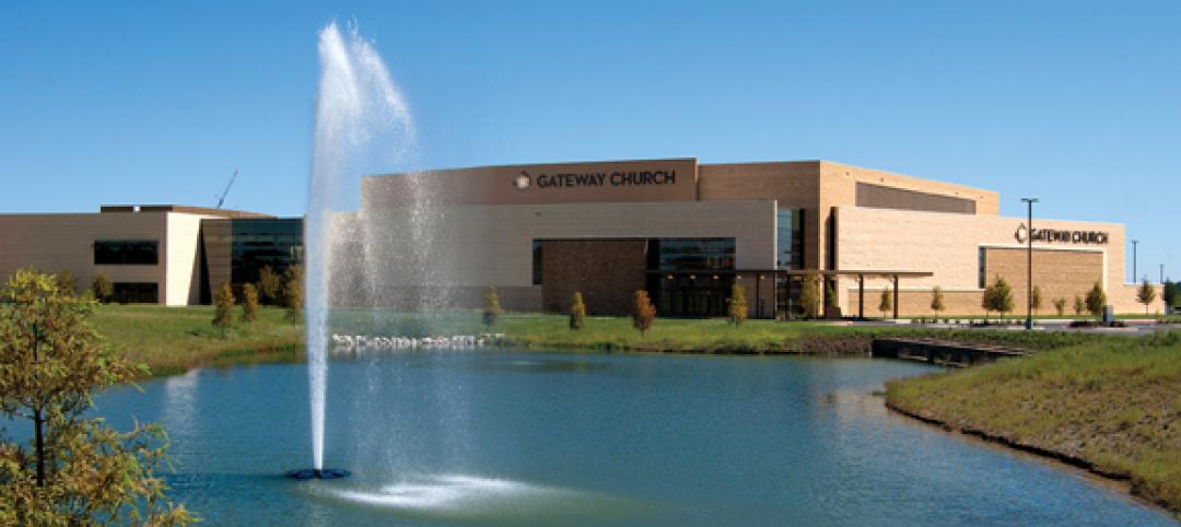
BIM-enabled Texas church complex can broadcast services in high-def
After two years of design and construction, members of the Gateway Church in Southland, Texas, were able to attend services in their new 4,000-seat facility in late 2010. Located on a 180-acre site, the 205,000-sf complex has six auditoriums, including a massive 200,000-sf Worship Center, complete with catwalks, top-end audio and video system, and high-definition broadcast capabilities. BIM played a significant role in the building’s design and construction. Balfour Beatty Construction and Beck Architecture formed the nucleus of the Building Team.
| Feb 11, 2011
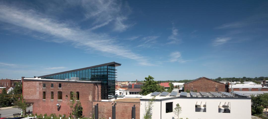
Kentucky’s first green adaptive reuse project earns Platinum
(FER) studio, Inglewood, Calif., converted a 115-year-old former dry goods store in Louisville, Ky., into a 10,175-sf mixed-use commercial building earned LEED Platinum and holds the distinction of being the state’s first adaptive reuse project to earn any LEED rating. The facility, located in the East Market District, houses a gallery, event space, offices, conference space, and a restaurant. Sustainable elements that helped the building reach its top LEED rating include xeriscaping, a green roof, rainwater collection and reuse, 12 geothermal wells, 81 solar panels, a 1,100-gallon ice storage system (off-grid energy efficiency is 68%) and the reuse and recycling of construction materials. Local firm Peters Construction served as GC.
| Feb 11, 2011
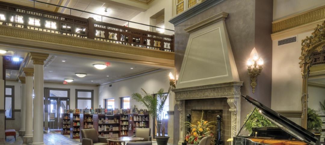
Former Richardson Romanesque hotel now houses books, not beds
The Piqua (Ohio) Public Library was once a late 19th-century hotel that sat vacant and deteriorating for years before a $12.3 million adaptive reuse project revitalized the 1891 building. The design team of PSA-Dewberry, MKC Associates, and historic preservation specialist Jeff Wray Associates collaborated on the restoration of the 80,000-sf Richardson Romanesque building, once known as the Fort Piqua Hotel. The team restored a mezzanine above the lobby and repaired historic windows, skylight, massive fireplace, and other historic details. The basement, with its low ceiling and stacked stone walls, was turned into a castle-like children’s center. The Piqua Historical Museum is also located within the building.
| Feb 11, 2011
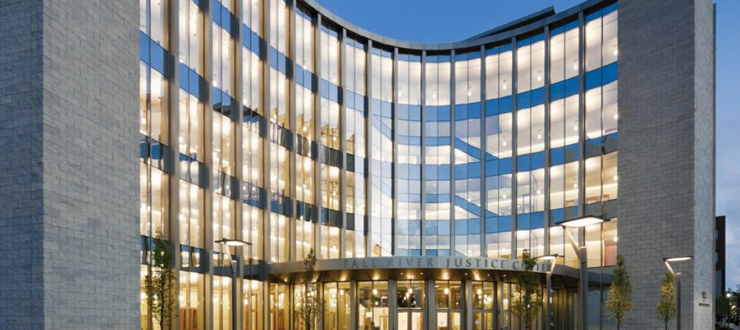
Justice center on Fall River harbor serves up daylight, sustainable elements, including eucalyptus millwork
Located on historic South Main Street in Fall River, Mass., the Fall River Justice Center opened last fall to serve as the city’s Superior and District Courts building. The $85 million facility was designed by Boston-based Finegold Alexander + Associates Inc., with Dimeo Construction as CM and Arup as MEP. The 154,000-sf courthouse contains nine courtrooms, a law library, and a detention area. Most of the floors have the same ceiling height, which will makes them easier to reconfigure in the future as space needs change. Designed to achieve LEED Silver, the facility’s elliptical design offers abundant natural daylight and views of the harbor. Renewable eucalyptus millwork is one of the sustainable features.
| Feb 11, 2011
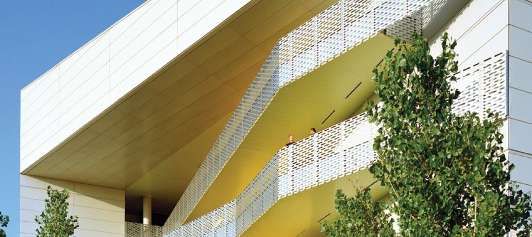
Research facility separates but also connects lab spaces
California State University, Northridge, consolidated its graduate and undergraduate biology and mathematics programs into one 90,000-sf research facility. Architect of record Cannon Design worked on the new Chaparral Hall, creating a four-story facility with two distinct spaces that separate research and teaching areas; these are linked by faculty offices to create collaborative spaces. The building houses wet research, teaching, and computational research labs, a 5,000-sf vivarium, classrooms, and administrative offices. A four-story outdoor lobby and plaza and an outdoor staircase provide orientation. A covered walkway links the new facility with the existing science complex. Saiful/Bouquet served as structural engineer, Bard, Rao + Athanas Consulting Engineers served as MEP, and Research Facilities Design was laboratory consultant.
| Feb 11, 2011
A feast of dining options at University of Colorado community center, but hold the buffalo stew
The University of Colorado, Boulder, cooked up something different with its new $84.4 million Center for Community building, whose 900-seat foodservice area consists of 12 micro-restaurants, each with its own food options and décor. Centerbrook Architects of Connecticut collaborated with Denver’s Davis Partnership Architects and foodservice designer Baker Group of Grand Rapids, Mich., on the 323,000-sf facility, which also includes space for a career center, international education, and counseling and psychological services. Exterior walls of rough-hewn, variegated sandstone and a terra cotta roof help the new facility blend with existing campus buildings. Target: LEED Gold.
| Feb 11, 2011
Chicago high-rise mixes condos with classrooms for Art Institute students
The Legacy at Millennium Park is a 72-story, mixed-use complex that rises high above Chicago’s Michigan Avenue. The glass tower, designed by Solomon Cordwell Buenz, is mostly residential, but also includes 41,000 sf of classroom space for the School of the Art Institute of Chicago and another 7,400 sf of retail space. The building’s 355 one-, two-, three-, and four-bedroom condominiums range from 875 sf to 9,300 sf, and there are seven levels of parking. Sky patios on the 15th, 42nd, and 60th floors give owners outdoor access and views of Lake Michigan.
| Feb 11, 2011
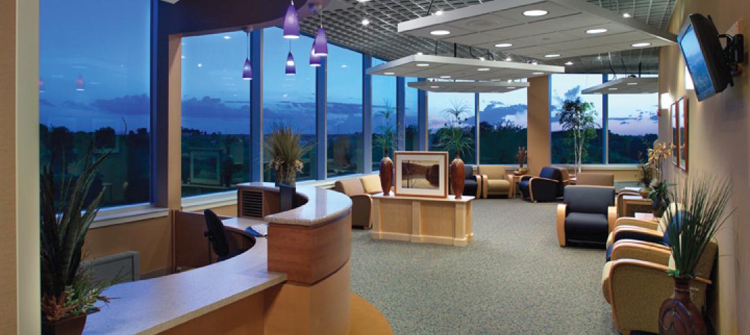
Iowa surgery center addresses both inpatient and outpatient care
The 12,000-person community of Carroll, Iowa, has a new $28 million surgery center to provide both inpatient and outpatient care. Minneapolis-based healthcare design firm Horty Elving headed up the four-story, 120,000-sf project for St. Anthony’s Regional Hospital. The center’s layout is based on a circular process flow, and includes four 800-sf operating rooms with poured rubber floors to reduce leg fatigue for surgeons and support staff, two substerile rooms between each pair of operating rooms, and two endoscopy rooms adjacent to the outpatient prep and recovery rooms. Recovery rooms are clustered in groups of four. The large family lounge (left) has expansive windows with views of the countryside, and television monitors that display coded information on patient status so loved ones can follow a patient’s progress.


