Building Teams for apartments, senior living, and other multifamily residential projects may be seeing gray this year, at least in kitchens and bathrooms. Gray color schemes for both types of spaces have grown dramatically in popularity, according to a new National Kitchen & Bath Association Top 10 trends report. Used currently in 55% of kitchens and 56% of bathrooms, gray conveys a sense of chic sophistication, according to the NKBA. White, off-white, beige, and bone also remain very popular, and sepia tones are on the rise.
Transitional-style kitchens and baths—defined as a "seamless blend of traditional and contemporary"—have surpassed traditional styles, which reigned until 2012. Quartz finishes are another "clear trendsetter" for 2013, according to NKBA survey respondents, consisting of ~300 member designers in the U.S. and Canada. Though quartz saw a slight popularity decline in 2012, it is now a close second to perennial favorite granite.
Additional top trends for kitchens include white-painted cabinetry, glass backsplashes, LED lighting, touch-activated faucets, and satin-nickel finishes. Bathroom trends include an increased use of ceramic/porcelain tiles and undermount sinks.
Here's a recap of the top 10 kitchen and bath design trends for 2013 (download the full report at http://www.nkba.org/PressRelease/2013_NKBA_Kitchen_and_Bath_Style_Report.pdf):
KITCHENS & BATHROOMS
1. Shades of Gray
In kitchens, shades of gray have noticeably jumped in use over the past three years. There was a significant increase from 9% of kitchens in 2010 to a remarkable 55% in the final three months of 2012. Similar to kitchens, grays in bathroom remodels have risen from 12% to 56% since 2010.
Whites and off-whites remain the top color schemes of both kitchens and bathrooms, used in 73% and 71%, respectively, an increase of 6 percentage points in both categories over the past year. Beiges and bones remain the second most popular color scheme in both rooms, followed by grays and then browns. Browns are slightly in decline in bathrooms, falling from 39% in 2012 to 35% this year, but sepia tones rose from 11% to 17% in kitchens and 11% to 18% in bathrooms.
2. Rise of Quartz
Quartz was the second most popular counter-surface material used in kitchens and baths last year. This year, it has significantly narrowed the gap with granite, increasing from 69% to 80% in kitchens and from 53% to 65% in bathrooms. Meanwhile, granite held steady in 2013, with 87% usage in kitchens and 71% in bathrooms.
Identified as the key trend for 2012, the popularity of solid surfaces in kitchens continues to rise, growing from 11% in 2010 to 35% in 2013. Marble still remains a popular bathroom vanity-top material, only moderately dipping in popularity from 46% in 2010 to 39% this year.
3. Trending Transitional Styles
In 2012, the popularity of transitional style — a seamless blend of traditional and contemporary — exceeded that of its traditional counterpart, which had been the clear topper in 2010 and 2011. In our latest survey, transition expanded its lead in the kitchen, with usage growing from 59% to 69%, Likewise, transitional styles in the bathroom are still positioned #1, currently used by 61% of NKBA-member designers.
As a consequence, traditional styles sit in second place in both rooms, their popularity holding steady at 60% in kitchens and 58% in bathrooms. Contemporary designs secured a close third in the most recent poll, maintaining a steady 52% usage in kitchens and increasing slightly from 53% to 57% in bathrooms.
KITCHENS ONLY
4. White Painted Cabinetry
Among painted cabinetry, white has stayed on top of the chart since last year. Given its remarkable, upward climb over the past three years, it’s clearly no fad. The popularity of white-painted cabinetry jumped from 47% to 59% in 2012 and further increased to 67% this year.
Use of light, medium and natural finishes has remained more or less consistent over the past year. Light finishes are currently used by 30% of respondents, medium finishes by 54%, and dark finishes by 55%. Use of glazed finishes, which held at 44% in 2011 and 2012, increased by four percentage points this year.
5. Glass Backsplash
The preference for glass splashes has grown dramatically over the past three years: from 42% in 2010 to 64% this year. At the same time, while natural stone tile showed consistent growth during 2011 and 2012, usage dropped from 60% to 55% in the latest survey. Ceramic or porcelain tiles held its top position for the third consecutive year, but overall usage fell by 11 percentage points between 2010 (88%) and now (77%).
6. LED Lighting
Energy-efficient lighting is widely used by member designers in both the United States and Canada. As consumer awareness of energy efficiency has risen, it comes as no surprise that light-emitting diode, or LED, lighting is being specified by a higher percentage of designers, increasing from 70% to 77% over the past year. The significant uptick from 50% in 2010 indicates that this trend has serious staying power.
Meanwhile, there has been no significant change in the use of compact fluorescent lighting (CFL) and incandescent bulbs, with current usage at 26% and 41%, respectively.
7. Touch-activated Faucets
Growing in popularity are touch-activated faucets, specified by 32% of member designers, versus only 20% of designers in 2011 and 2012. Pull-out faucets are still in the top position, as they have been since 2010, with usage rising from 88% in 2010 to 94% this year. Pot filler faucets grab the second spot this year, gaining five percentage points over the past year to 33%.
8. Satin Nickel on the Rise
When it comes to faucet finishes in kitchens, satin nickel has been on the top since 2011, its usage increasing from 42% in 2010 to 60% this year. Bronze or oil-rubbed bronze finishes are also being specified more often, growing from 41% to 50% in the past year. The increased popularity of these three finishes most likely comes at the expense of polished nickel and polished chrome. The latter, which had seen a rise in usage in 2012, dipped from 52% to 47% in the latest survey; polished nickel dropped from 25% to 20%.
BATHROOMS ONLY
9. Ceramic/Porcelain Tiles
Ceramic or porcelain tile flooring has been in slight decline over the past two years, but it remains the most popular of all materials, specified by 83% of the survey participants this year — down from 93% in 2011. Natural stone tiles have also declined since 2011 dropping from 77% to 59% in 2012, and to 57% this year. However, they have been the second most popular type of flooring used since 2011.
10. Undermount sink
Undermounts are in slight decline this year, dropping from 94% in 2012 to 87%. But here again, they remain the most specified type of lavoratory sink — not just in the latest poll, but over the past 3 years. Integrated sink/tops have seen modest growth, increasing from 35% in 2012 to 41% currently.
For the full report, visit: http://www.nkba.org/PressRelease/2013_NKBA_Kitchen_and_Bath_Style_Report.pdf.
Related Stories
| Feb 11, 2011
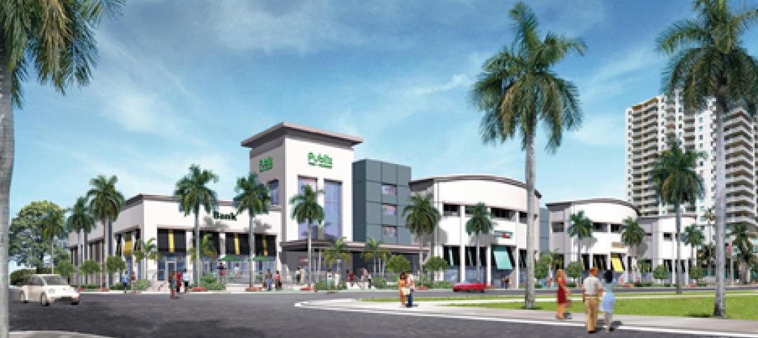
Grocery store anchors shopping center in Miami arts/entertainment district
18Biscayne is a 57,200-sf urban retail center being developed in downtown Miami by commercial real estate firm Stiles. Construction on the three-story center is being fast-tracked for completion in early 2012. The project is anchored by a 49,200-sf Publix market with bakery, pharmacy, and café with outdoor seating. An additional 8,000 sf of retail space will front Biscayne Boulevard. The complex is in close proximity to the Adrienne Arsht Center for the Performing Arts, the downtown Miami entertainment district, and the Omni neighborhood, one of the city’s fast-growing residential areas.
| Feb 11, 2011
Chicago architecture firm planning one of China’s tallest towers
Chicago-based Goettsch Partners was commissioned by developer Guangzhou R&F Properties Co. Ltd. to design a new 294,570-sm mixed-use tower in Tianjin, China. The Tianjin R&F Guangdong Tower will be located within the city’s newly planned business district, and at 439 meters it will be one of China’s tallest buildings. The massive complex will feature 134,900 sm of Class A office space, a 400-key, five-star hotel, 55 condominiums, and 8,550 sm of retail space. The architects are designing the tower with multi-story atriums and a high-performance curtain wall to bring daylight deep into the building, thereby creating deeper lease spans. The project is currently finishing design.
| Feb 11, 2011
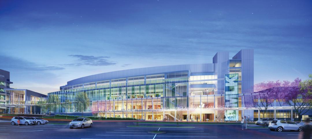
Two projects seek to reinvigorate Los Angeles County medical center
HMC Architects designed two new buildings for the Los Angeles County Martin Luther King, Jr., Medical Center as part of a $360 million plan to reinvigorate the campus. The buildings include a 120-bed hospital, which involves renovation of an existing tower and several support buildings, and the construction of a new multi-service ambulatory care center. The new facilities will have large expanses of glass at all waiting and public areas for unobstructed views of downtown Los Angeles. A curved glass entrance canopy will unite the two buildings. When both projects are completed—the hospital in 2012 and the ambulatory care center in 2013—the campus will have added more than 460,000 sf of space. The hospital will seek LEED certification, while the ambulatory care center is targeting LEED Silver.
| Feb 11, 2011
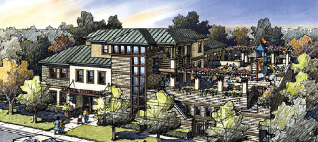
Sustainable community center to serve Angelinos in need
Harbor Interfaith Services, a nonprofit serving the homeless and working poor in the Harbor Area and South Bay communities of Los Angeles, engaged Withee Malcolm Architects to design a new 15,000-sf family resource center. The architects, who are working pro bono for the initial phase, created a family-centered design that consolidates all programs into a single building. The new three-story space will house a resource center, food pantry, nursery and pre-school, and administrative offices, plus indoor and outdoor play spaces and underground parking. The building’s scale and setbacks will help it blend with its residential neighbors, while its low-flow fixtures, low-VOC and recycled materials, and energy-efficient mechanical equipment and appliances will help it earn LEED certification.
| Feb 11, 2011
Texas megachurch inspired by yesteryear’s materials, today’s design vocabulary
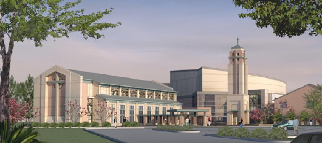
The third phase of The First Baptist Church of Pasadena, Texas, involves construction of a new 115,000-sf worship center addition. Currently in design by Zeigler Cooper, the project will include a 2,500-seat worship center (with circular layout and space for a 50-person orchestra and 200-person choir), a 500-seat chapel (for weddings, funerals, and special events), and a prayer room. The addition will connect to the existing church and create a Christian Commons for education, administration, music, and fellowship. The church asked for a modern design that uses traditional materials, such as stone, brick, and stained glass. Construction is scheduled to begin this summer.
| Feb 11, 2011
Apartment complex caters to University of Minnesota students
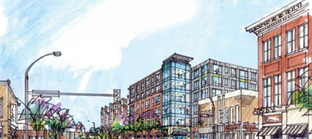
Twin Cities firm Elness Swenson Graham Architects designed the new Stadium Village Flats, in the University of Minnesota’s East Bank Campus, with students in mind. The $30 million, six-story residential/retail complex will include 120 furnished apartments with fitness rooms and lounges on each floor. More than 5,000 sf of first-floor retail space and two levels of below-ground parking will complete the complex. Opus AE Group Inc., based in Minneapolis, will provide structural engineering services.
| Feb 11, 2011
Four-story library at Salem State will hold half a million—get this—books!
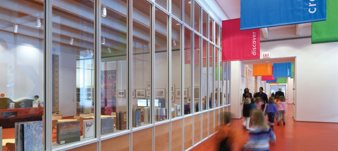
Salem State University in Massachusetts broke ground on a new library and learning center in December. The new four-story library will include instructional labs, group study rooms, and a testing center. The modern, 124,000-sf design by Boston-based Shepley Bulfinch includes space for 500,000 books and study space for up to a thousand students. Sustainable features include geothermal heating and cooling, rainwater harvesting, and low-flow plumbing fixtures.
| Feb 11, 2011
Green design, white snow at Egyptian desert retail complex
The Mall of Egypt will be a 135,000-sm retail and entertainment complex in Cairo’s modern 6th of October district. The two-story center is divided into three themed zones—The City, which is arranged as a series of streets lined with retail and public spaces; The Desert Valley, which contains upscale department stores, international retailers, and a central courtyard for music and other cultural events; and The Crystal, which will include leisure and entertainment venues, including a cinema and indoor snow park. RTKL is designing the massive complex to LEED Silver standards.
| Feb 10, 2011
7 Things to Know About Impact Glazing and Fire-rated Glass
Back-to-basics answers to seven common questions about impact glazing and fire-rated glass.
| Feb 10, 2011
Medical Data Center Sets High Bar for BIM Design Team
The construction of a new data center becomes a test case for BIM’s ability to enhance project delivery across an entire medical campus.


