Space is at a premium when it comes to museums. Only the best of the best of a museum’s collection gets the prime real estate that is displayed to the public. In fact, it is estimated that only 2% to 4% of a museum’s collection is actually shown to guests.
As museums try to show more of their collections to visitors, many contemporary designs are beginning to incorporate the exterior of the building as a gallery. Now, you aren’t going to see the Louvre plastering the Mona Lisa onto the side of the building like a wanted poster anytime soon, but museums are starting to realize art installations specifically designed for the exterior of a building can prove to be quite valuable.
Buildings have made use of their exterior walls as a display in the past. Chicago’s Tribune Tower is covered with over 150 historically significant artifacts from around the world that are built into the structure’s limestone wall.
Col. Robert McCormick brought back the first piece from a church that was shelled in Belgium during World War I. Upon returning to Chicago, he then told his correspondents around the world to obtain pieces of famous buildings and bring them back.
Embedded in Tribune Tower’s limestone walls are pieces of the Greek Parthenon, the Roman Colosseum, London’s Houses of Parliament, and dozens more, all permanently on display for passersby.
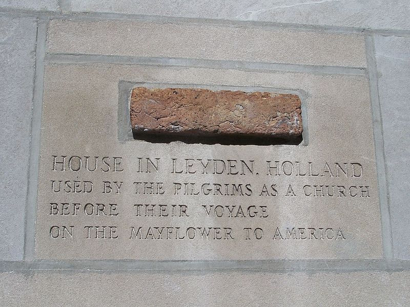
While these artifacts aren’t necessarily art installations, the exterior walls have still been transformed into a display.
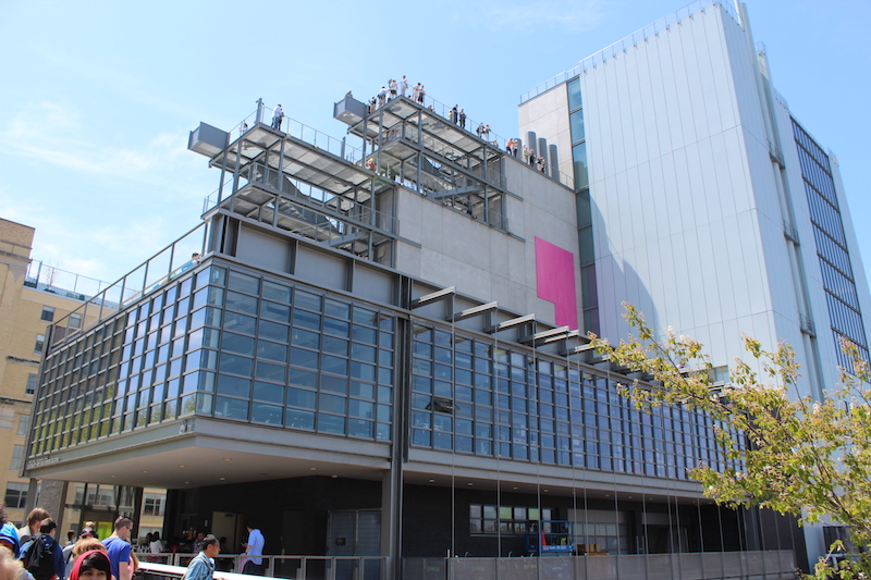
The Whitney Museum of American Art, however, took this idea one step further by actually designing the building with specific solutions to best utilize exterior wall space as a gallery.
As a new white paper, Exterior as Gallery, from the New York-based Cooper Robertson outlines, the new Whitney Museum of American has facades that face Manhattan’s popular High Line park and the Hudson River, making them ideal viewing galleries.
Works of art can be anchored to the building’s terraces or suspended from the facades. A combination of vertical anchor points on the façade and a grid of horizontal points on the terraces allows for the installation of two- and three-dimensional artwork that can be viewed from multiple angles and levels. In total, there are four art terraces connected by an exterior stair leading from one to the other.
For displaying pieces from the façade, the design team used a standard system of bolts that can be tethered to or removed and replaced with eye hooks or other hardware to enable the museum to attach a screen, stretch a canvas, or suspend a super-scale object from the side of the building, according to the white paper. The façade was also reinforced to accommodate the addition of a 600-pound pull load.
The terraces required a different solution in order to display art and to keep it secured, especially in instances of high winds. A cylinder is bolted to a base plate that is then fastened to the structure below. Each cylinder is filled with foamed-in-place insulation. These cylindrical anchors align with the beams of the building’s rigorous structural grid in order not to exceed weight limitations. The terraces also have technology consolidation points for displays that require electricity and other AV needs.
If these additions prove successful, odds are, the Whitney Museum of American Art won’t be the last museum to apply these strategies.
Read the entire Cooper Robertson Exterior as Gallery white paper, here.
Related Stories
| Mar 13, 2014
Do you really 'always turn right'?
The first visitor center we designed was the Ernest F. Coe Visitor Center for the Everglades National Park in 1993. I remember it well for a variety of reasons, not the least of which was the ongoing dialogue we had with our retail consultant. He insisted that the gift shop be located on the right as one exited the visitor center because people “always turn right.”
| Mar 12, 2014
14 new ideas for doors and door hardware
From a high-tech classroom lockdown system to an impact-resistant wide-stile door line, BD+C editors present a collection of door and door hardware innovations.
| Mar 5, 2014
5 tile design trends for 2014
Beveled, geometric, and high-tech patterns are among the hot ceramic tile trends, say tile design experts.
| Feb 24, 2014
New Menil Drawing Institute will fit in with leafy surroundings
In Houston, plans are being finalized for the first freestanding American building built to house and conserve modern and contemporary drawings.
| Feb 18, 2014
Robert A.M. Stern sent back to drawing board for Revolutionary War museum in Philadelphia
The Philadelphia Art Commission has suggested some significant changes to the design by Robert A.M. Stern Architects, namely the elimination of a cupola and the addition of eye-level windows on the ground floor.
| Feb 14, 2014
Giant interactive pinwheel adds fun to museum exterior
The proposed design for the Santa Cruz Museum of Art and History features a 10-foot pinwheel that can be activated by passersby.
| Feb 14, 2014
Crowdsourced Placemaking: How people will help shape architecture
The rise of mobile devices and social media, coupled with the use of advanced survey tools and interactive mapping apps, has created a powerful conduit through which Building Teams can capture real-time data on the public. For the first time, the masses can have a real say in how the built environment around them is formed—that is, if Building Teams are willing to listen.
| Feb 13, 2014
Extreme Conversion: Nazi bunker transformed into green power plant, war memorial
The bunker, which sat empty for over 60 years after WWII, now uses sustainable technology and will provide power to about 4,000 homes.
| Jan 30, 2014
How reverse engineering nature can spur design innovation
It’s not enough to copy nature. Today’s designers need a deeper understanding of environmental nuance, from the biome in.
| Jan 28, 2014
16 awe-inspiring interior designs from around the world [slideshow]
The International Interior Design Association released the winners of its 4th Annual Global Excellence Awards. Here's a recap of the winning projects.


