Creating a tall facility on a constrained city site always presents special difficulties for Building Teams. Make the program unusually diverse—in this case, combining residential, classroom, laboratory, office, conference, dining, and recreational functions—and the complexity level increases. Now throw in the need to link the facility to a landmark 1880s structure with different floor-to-floor heights. Finally, have the city of Chicago “orange tag” one of two existing buildings on your site, derailing your plans for a complete demolition.
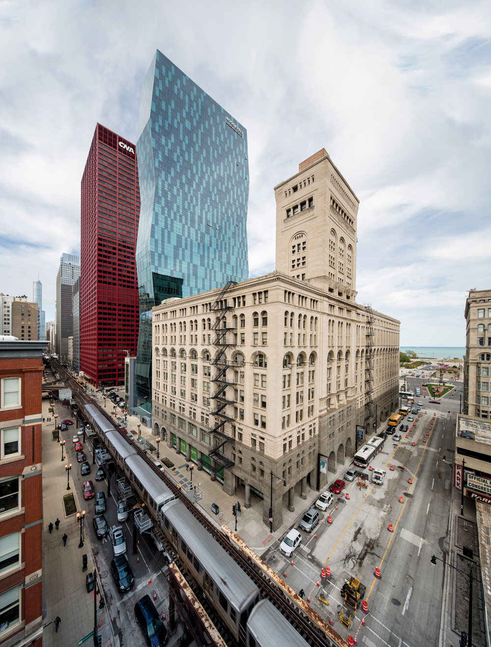
The Building Team for Roosevelt University’s new Wabash Building successfully navigated this minefield, producing a distinctive addition to the South Loop skyline and an appealing new home for the school. Architect VOA Associates, owner’s rep Jones Lang LaSalle, development advisor The John Buck Company, and Power Construction spearheaded a successful functional and aesthetic collaboration that also achieved LEED Gold. The resulting project, at 469 feet in height, is the second-tallest university facility in the U.S. and the sixth-tallest in the world.
From the start, the project was vastly more complex than anything the client had ever attempted. Roosevelt was already occupying the Auditorium Building, a Michigan Avenue icon designed by Adler and Sullivan, as well as a suburban extension campus. To support enrollment growth and program expansion, the university decided to create a tall building that would consolidate many functions while integrating well with the Auditorium.
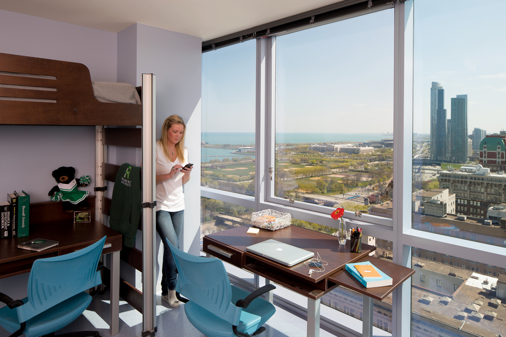
Student residences include 633 beds on 17 floors, mostly in four- and five-person suites consisting of single and double bedrooms sharing a bathroom. Laundry facilities on the 15th floor feature Internet tracking so students can make sure washers and dryers are available before making the trek. Each residential floor has a large study room with breathtaking lake and city views.
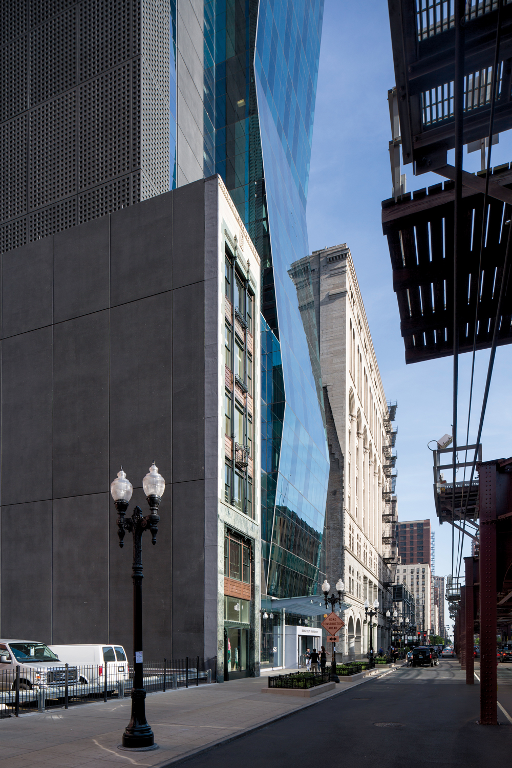
With a footprint of only 17,300 sf, the tight site would need to accommodate a program of ~420,000 sf. A nondescript ’70s high-rise Roosevelt had once used for a dorm was demolished. The attractive façade of the adjacent Fine Arts Annex, a slender six-story structure built in the 1920s, was saved to become the front of a student bookstore.
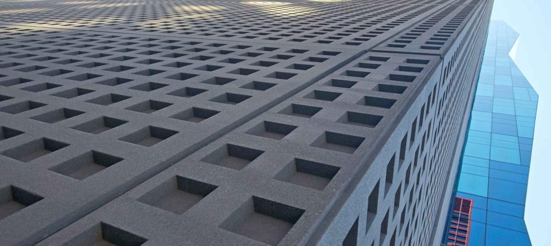
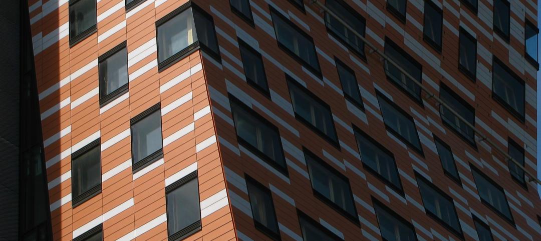
The design solution created a “servant-served” spatial relationship, placing core and support (“servant”) spaces on the north elevation behind a fairly plain precast concrete façade, with unglazed lower floors giving way to a checkerboard window grid higher up. The functional (“served”) spaces are situated on the south side, featuring blue glass and dramatic canted faces inspired by Brancusi’s famed Endless Column sculpture, as well as the faceted façade of the nearby Spertus Institute of Jewish Studies. The servant-served arrangement maximizes spectacular views to the south, east, and west.
Common areas are clustered in the five lowest floors, including a two-story atrium lobby, student services offices, a student union, a dining hall, and a recreation facility. Classroom and lab spaces and a mechanical floor occupy the midsection, topped by 17 stories of residences.
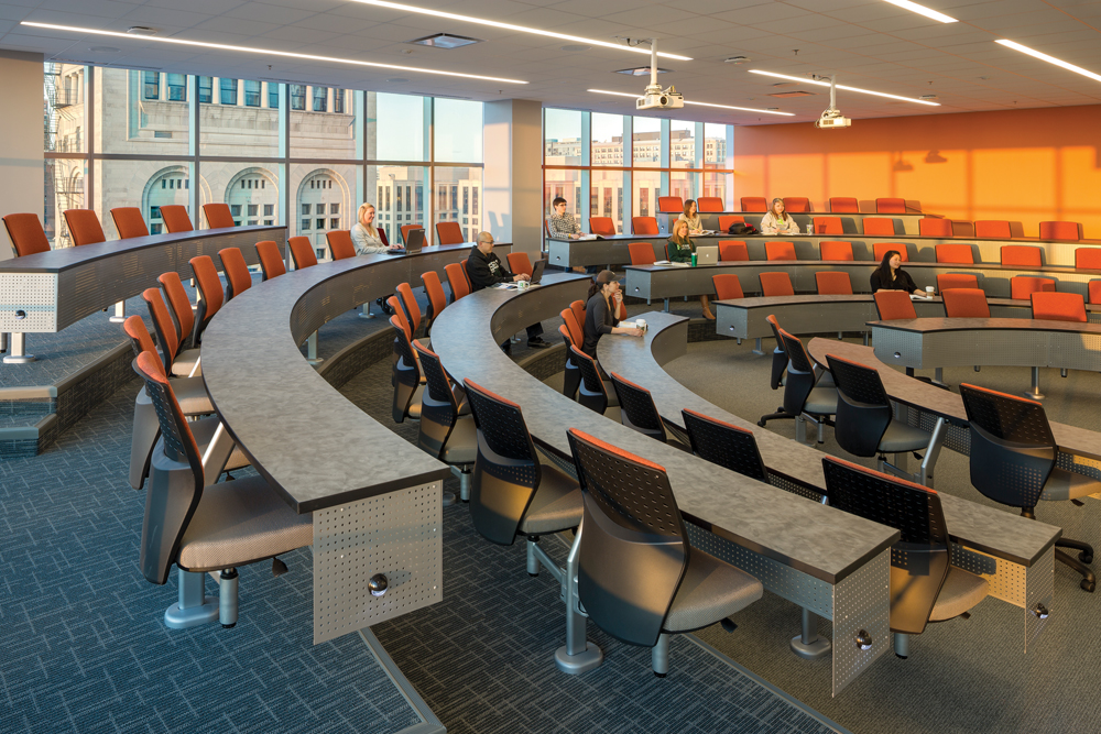
The servant-served organization maximizes clear spans for the large classrooms and labs, including seven classrooms with a capacity of 36 students each, four tiered classrooms seating 60 to 80, and three auditorium classrooms seating 78 to 180. Judiciously placed prefunction spaces serve as interior “quads” for student interaction.
The façade of the slender 1920s building in the foreground was preserved as the front of a new bookstore. The dark, plain north elevation of the new tower, which faces another tall building, delineates the service functions on this side.
Three stories of science labs support instruction and research in biology, chemistry, and physics, as well as office space for science faculty. Roosevelt’s Heller College of Business was also moved to the new skyscraper from a different Loop facility; its students now benefit from a simulated financial trading room and retail store.
Vertical and horizontal circulation within the Roosevelt campus is necessarily complex. Round-the-clock security check-in is required at Floor 14 before students can proceed to the higher levels via dedicated elevators. Hooking the tower onto the Auditorium Building to the south was also tricky but crucial; the older building is still heavily used for classrooms and offices, as well as performances in beautifully restored ArtNouveau theater spaces. Gently sloping hallways now connect the buildings at four points, with generous signage provided to ease wayfinding.
Getting to LEED Gold required an imaginative mix of strategies, from the typical— high-efficiency HVAC, low-flow plumbing, green roofs—to the less common. In the latter category: removable pillow-tops to maximize mattress life cycle, façade patterning intended to deter bird collisions, a food pulper that allows dining hall waste to be hauled off and composted, and a complex network of recycling chutes with an anti-microbial washdown system.
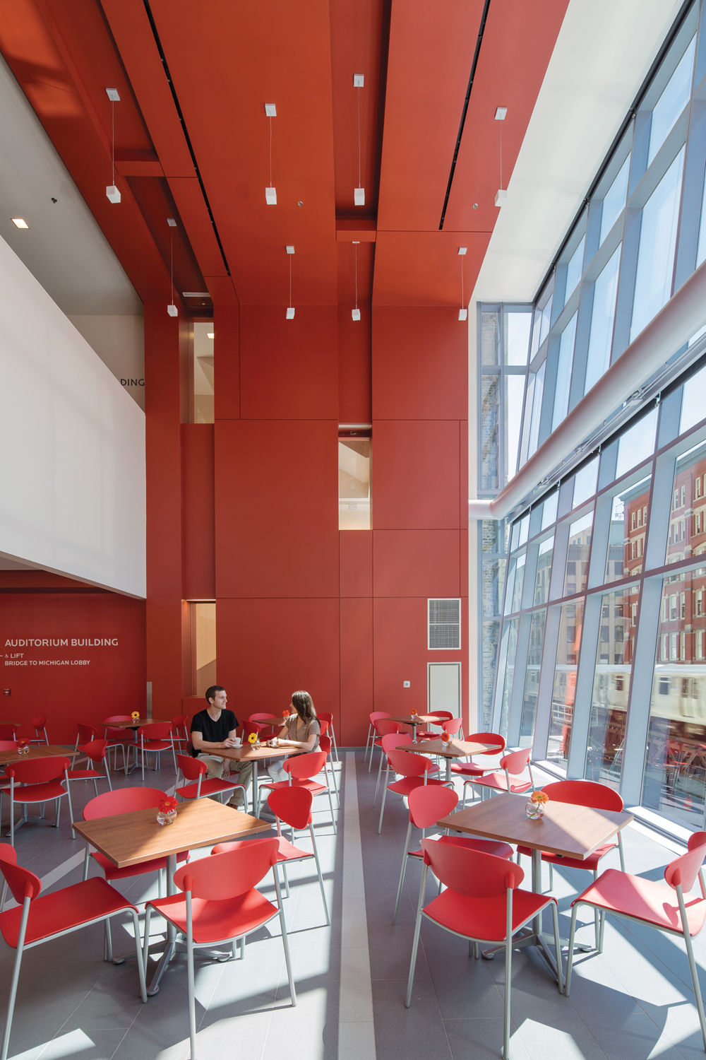
The second-floor dining center seats 300 and offers a mini-mart for snacks and sundries, as well as cold carryout items, hot food, pizza, a deli, a grill station, and a coffee shop.
Structural and logistical issues demanded creative solutions as well, particularly with respect to crane deployment. Many projects on tight urban sites are built around a central crane, resulting in the need to finish the resulting “dead zone” after the crane is dismantled near the end of the job. Engineering-intensive lab spaces in the Wabash Building’s midsection made this scenario particularly unpalatable. Instead, the Building Team devised a method for mounting the crane outside the building footprint, using counterbalance weights and a crane elevator that hugged the façade.
Today, the Wabash Building is a lively, 24/7 community that brings the school’s social justice mission to life, hosting students from 34 states and more than a dozen countries. Chicago Tribune architecture critic Blair Kamin is among the admirers of Roosevelt’s bold experiment: “It achieves a genuine, artful dialogue between past and present … a building of considerable promise.”
This tiered classroom is one of several large, general instructional spaces provided in the building’s middle floors. Thoughtfully planned daylighting is a hallmark of the project.
Project summary
GOLD AWARD
Roosevelt University Wabash Building
Chicago
BUILDING TEAM
Submitting firms: VOA Associates (architect) and Jones Lang Lasalle (owner’s rep)
Development advisor: The John Buck Company
Associate architect: Johnson & Lee Ltd.
Structural: Magnusson Klemencic Associates
MEP: WMA Consulting Engineers
Contractor: Power Construction
GENERAL INFORMATION
Project size: 420,000 sf
Construction cost: $123 million
Construction time: November 2009 (demolition) to March 2012 (completion)
Delivery method: Design/bid/build
Related Stories
Building Technology | Jun 18, 2024
Could ‘smart’ building facades heat and cool buildings?
A promising research project looks at the possibilities for thermoelectric systems to thermally condition buildings, writes Mahsa Farid Mohajer, Sustainable Building Analyst with Stantec.
University Buildings | Jun 18, 2024
UC Riverside’s new School of Medicine building supports team-based learning, showcases passive design strategies
The University of California, Riverside, School of Medicine has opened the 94,576-sf, five-floor Education Building II (EDII). Created by the design-build team of CO Architects and Hensel Phelps, the medical school’s new home supports team-based student learning, offers social spaces, and provides departmental offices for faculty and staff.
Healthcare Facilities | Jun 18, 2024
A healthcare simulation technology consultant can save time, money, and headaches
As the demand for skilled healthcare professionals continues to rise, healthcare simulation is playing an increasingly vital role in the skill development, compliance, and continuing education of the clinical workforce.
Mass Timber | Jun 17, 2024
British Columbia hospital features mass timber community hall
The Cowichan District Hospital Replacement Project in Duncan, British Columbia, features an expansive community hall featuring mass timber construction. The hall, designed to promote social interaction and connection to give patients, families, and staff a warm and welcoming environment, connects a Diagnostic and Treatment (“D&T”) Block and Inpatient Tower.
Concrete Technology | Jun 17, 2024
MIT researchers are working on a way to use concrete as an electric battery
Researchers at MIT have developed a concrete mixture that can store electrical energy. The researchers say the mixture of water, cement, and carbon black could be used for building foundations and street paving.
Codes and Standards | Jun 17, 2024
Federal government releases national definition of a zero emissions building
The U.S. Department of Energy has released a new national definition of a zero emissions building. The definition is intended to provide industry guidance to support new and existing commercial and residential buildings to move towards zero emissions across the entire building sector, DOE says.
Multifamily Housing | Jun 14, 2024
AEC inspections are the key to financially viable office to residential adaptive reuse projects
About a year ago our industry was abuzz with an idea that seemed like a one-shot miracle cure for both the shockingly high rate of office vacancies and the worsening housing shortage. The seemingly simple idea of converting empty office buildings to multifamily residential seemed like an easy and elegant solution. However, in the intervening months we’ve seen only a handful of these conversions, despite near universal enthusiasm for the concept.
Healthcare Facilities | Jun 13, 2024
Top 10 trends in the hospital facilities market
BD+C evaluated more than a dozen of the nation's most prominent hospital construction projects to identify trends that are driving hospital design and construction in the $67 billion healthcare sector. Here’s what we found.
Adaptive Reuse | Jun 13, 2024
4 ways to transform old buildings into modern assets
As cities grow, their office inventories remain largely stagnant. Yet despite changes to the market—including the impact of hybrid work—opportunities still exist. Enter: “Midlife Metamorphosis.”
Affordable Housing | Jun 12, 2024
Studio Libeskind designs 190 affordable housing apartments for seniors
In Brooklyn, New York, the recently opened Atrium at Sumner offers 132,418 sf of affordable housing for seniors. The $132 million project includes 190 apartments—132 of them available to senior households earning below or at 50% of the area median income and 57 units available to formerly homeless seniors.


