Fired clay brick continues to evolve with new color blends, textures, and architectural shapes that inspire innovative and enduring designs. These design trends are evident in the winning projects from the BIA's Brick in Architecture Awards.
Here’s a look at the latest brick design trends based on recent award winners:
1. Unique brick patterns using different depths and orientation
Photos: Scholz Images
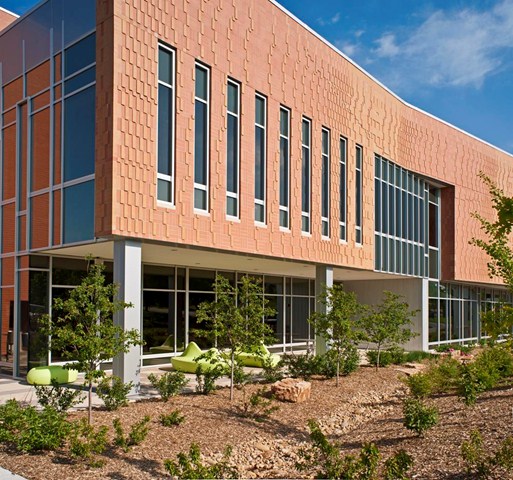
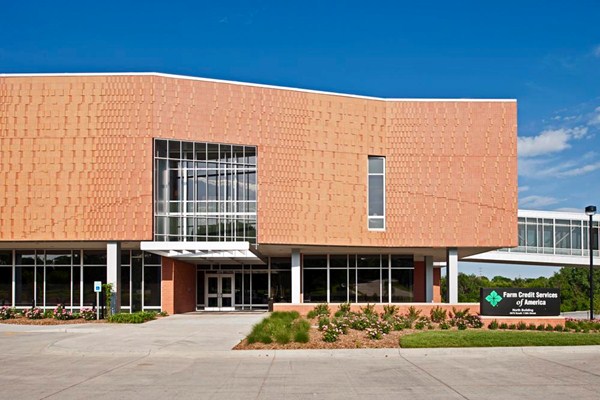
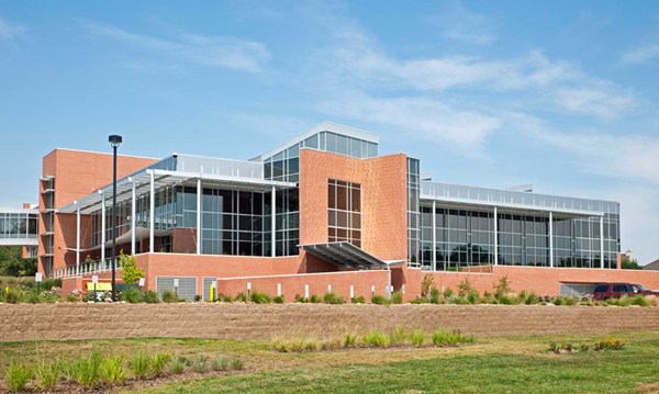
For the west façade of the 77,000-sf Farm Credit Services of America Corporate Office Building 2 in Omaha, Neb., Clark Enersen Partners created an abstract representation of wind blowing through a wheat field—using two brick colors at various depths and orientation. The west façade brick also helps minimize late day glare, while openings in the façade still filter natural light through vertical fins.
2. Gray and white shades of brick
Photos: Slyworks Photography
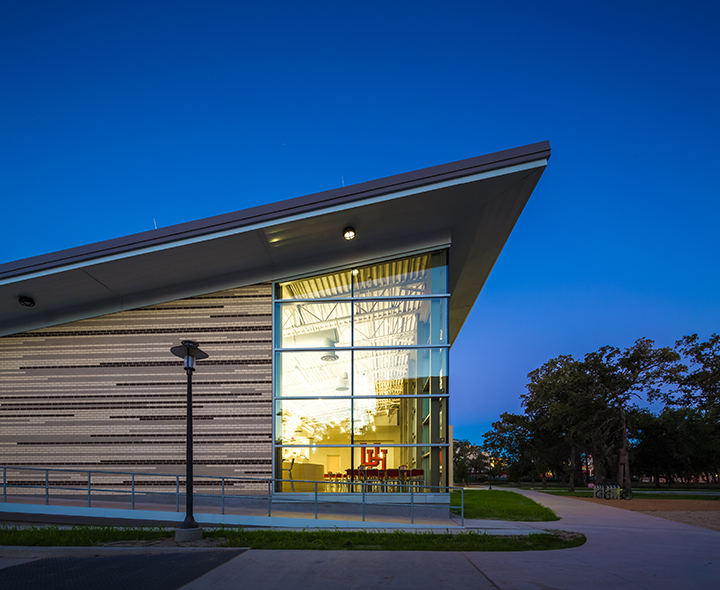
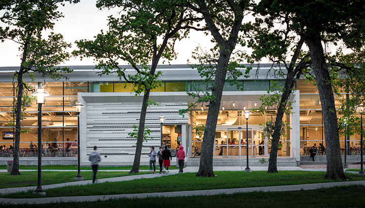
Cougar Woods Dining Hall, a 25,000-sf pavilion on the University of Houston’s main campus, promotes a passive approach to sustainable design. Designed by PageSoutherlandPage, the dining area has extensive glazing on its north side to provide daylighting within the building, while minimizing heat gain. Solid masonry walls with a lighter color were used to protect the southern and western elevations from the sun and reduce the heat island effect.
In another example, Wormley School Rowhouses in Washington, D.C.’s historic Georgetown neighborhood were painted neutral colors to match the existing neighborhood. While maintaining historic integrity, Cunningham | Quill Architects converted a school building into condominiums and a new row of townhouses built on the adjacent schoolyard.
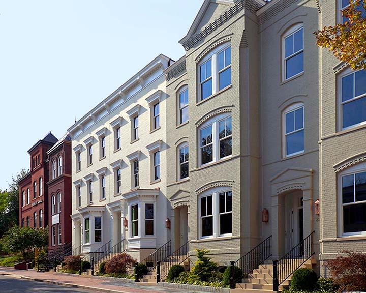
Photo: Chris Morrison
3. Brick for flexibility in color, shape, and form
Photos: Tony Frederick Photography
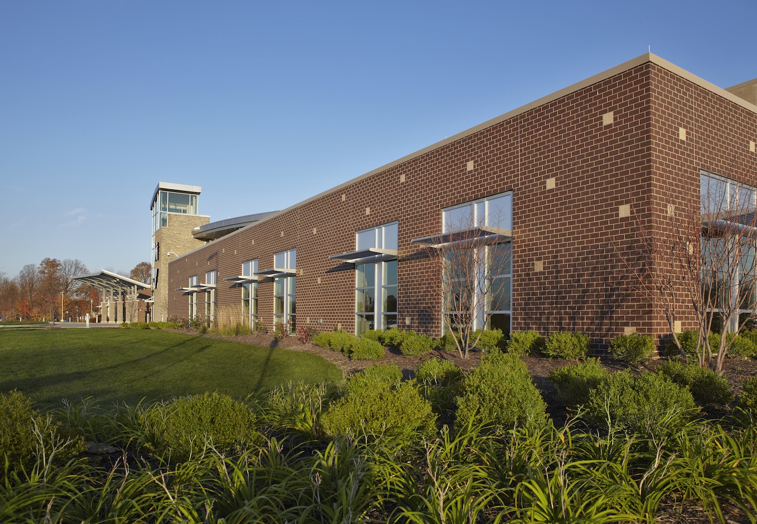
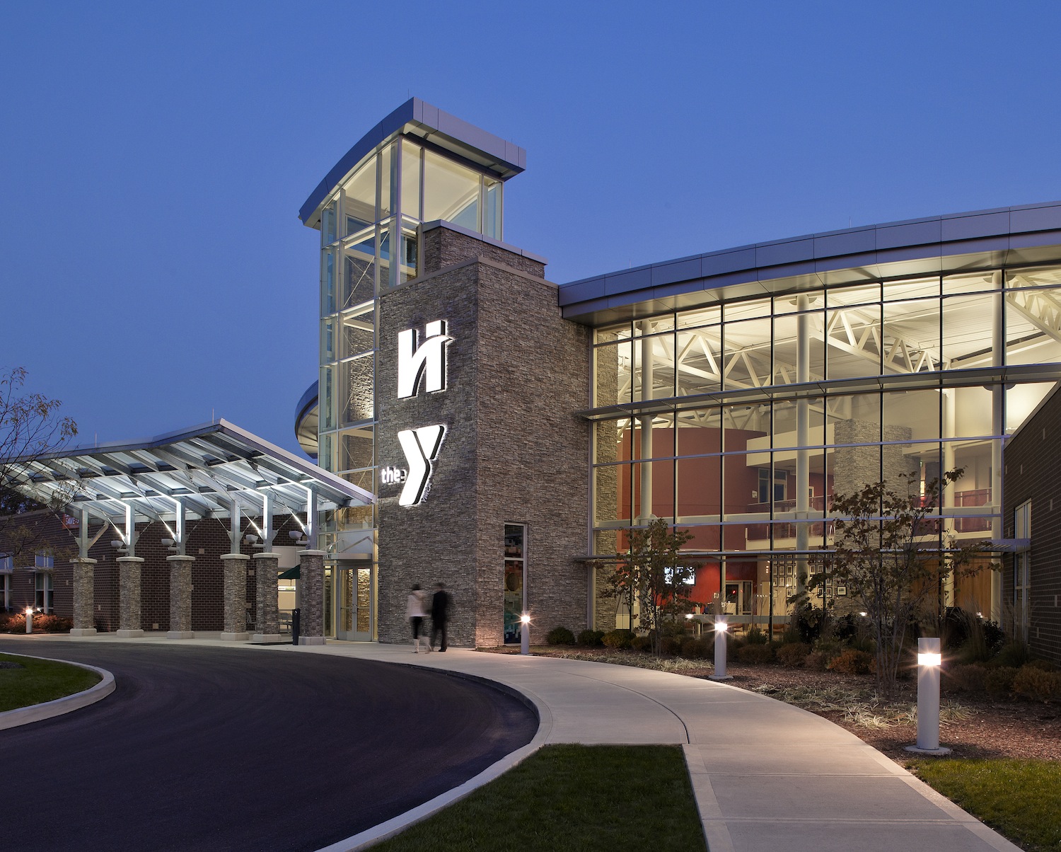
For Hendricks Regional Health YMCA, Avon, Ind., American Structurepoint aimed to celebrate the symbiotic relationship of health and wellness through an integral use of brick and organic forms. Brick was used in areas where there were noise and privacy concerns. A two-tone scheme used a deep brown brick color to anchor the façade and hold up the lighter, buff-colored brick to create a sense of place and familiarity with the hospital brand. Brick easily conformed to the straight, angled, and curved walls throughout the facility.
4. Textures: sanded, artisan, wirecut, and tumbled
Photos: Halkin Architectural Photography
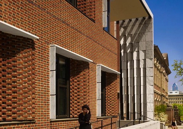
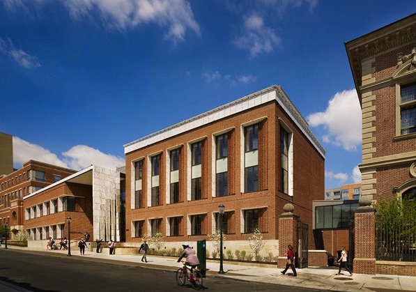
The University of Pennsylvania Law School uses masonry to define the image of a 21st century law school. One of Penn Law’s primary goals was to unify its campus with the addition of the new Golkin Hall. To do so required maintaining the material presence of Silverman Hall, built for the law school in 1900. Kennedy & Violich Architecture used sand-molded brick and a distinctive Flemish bond pattern used on all subsequent buildings.
5. Contrasting brick colors and course patterns
Photos: David Sundberg
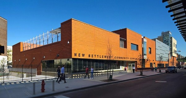
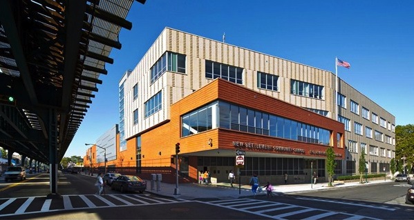
The 172,000-sf New Settlement Campus in Bronx, N.Y., houses three schools for 1,000 PK-12 students on a busy urban block. Dattner Architects interplays massing, materials, and patterning to create scale and interest for the block-long building. A two-story, red brick commons wing parallels an elevated subway train, and intersects a four-story buff brick classroom wing that bends away from the street. The contrasting brick colors and course patterns distinguish the two wings. A graduated vertical pattern of darker projecting brick articulates the classroom wing’s cream-colored brick façade, which is perpendicular to the elevated train to minimize noise.
6. Hinge-shaped face brick
Photos: Ballogg Photography
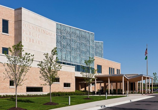
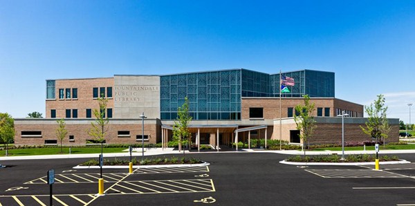
Fountaindale Public Library in Bolingbrook, Ill., is located in a suburban environment at the confluence of the village’s municipal campus, tract housing, and a recreational park. To facilitate the organic shape of the building’s exterior, Nagle Hartray Architecture used an innovative, single modular size hinge-shaped face brick for 28 different inside and outside corner conditions.
7. Brick to introduce new architectural motifs/ornamentation
Photos: Dror Baldinger
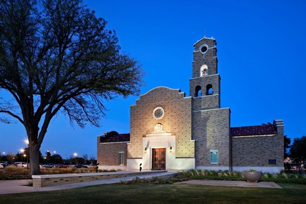
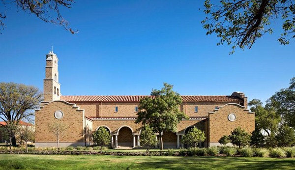
McKinney York Architects designed the 7,000-sf non-denominational Kent R. Hance Chapel, Lubbock, Texas, in the Spanish Renaissance style of the historic sections of campus. The chapel’s bell tower, curved articulation of the gabled parapet walls and ermine patterning of the principal façade are all instances where brick played a decisive role to introduce new architectural motifs, celebrating only the most important architectural elements.
For more brick designs, see the 2014 and 2013 Brick in Architecture Award winners.
Related Stories
Airports | Dec 6, 2016
Phoenix Sky Harbor International Airport creates a destination inside Terminal 3
DWL Architects, SmithGroupJJR, and Corgan design passenger experience that connects to the surrounding city and Sonoran desert landscape.
Airports | Nov 1, 2016
FAA forecasts a modest dip in spending for airports over next five years
Latest report based on surveys of 3,340 existing and proposed public-use airports.
Airports | Aug 31, 2016
Aircraft manufacturing facility innovation from The Austin Company
Austin’s many innovations contributed to the success of our clients by enabling them to operate in more efficient environments, optimize the flexibility of their operations, and meet aggressive schedules.
| Jul 29, 2016
AIRPORT FACILITIES GIANTS: Airports binge on construction during busy year for travel
Terminal construction will grow by nearly $1 billion this year, and it will keep increasing. Airports are expanding and modernizing their facilities to keep passengers moving.
Airports | Jun 1, 2016
LaGuardia Airport’s massive redevelopment begins construction
The development consortium has secured financing for the $4 billion project, and signed an operating lease through 2050.
Airports | Apr 6, 2016
HOK leads joint venture to expand and modernize Hartsfield-Jackson Atlanta International Airport’s domestic passenger terminal
The domestic passenger terminal is just the tip of the spear, as the world’s most traveled airport is about to undergo 20 years and $6 billion worth of changes.
Giants 400 | Jan 29, 2016
AIRPORT TERMINAL GIANTS: KPF, Jacobs, Hensel Phelps among top airport sector AEC firms
BD+C's rankings of the nation's largest airport sector design and construction firms, as reported in the 2015 Giants 300 Report
Metals | Jan 19, 2016
6 ways to use metal screens and mesh for best effect
From airy façades to wire mesh ceilings to screening walls, these projects show off the design possibilities with metal.
| Jan 14, 2016
How to succeed with EIFS: exterior insulation and finish systems
This AIA CES Discovery course discusses the six elements of an EIFS wall assembly; common EIFS failures and how to prevent them; and EIFS and sustainability.
Airports | Dec 13, 2015
Skybridge connects a terminal and airport on each side of the U.S.-Mexico border
Cross Border Xpress is the first phase of a larger development that will include hotels and offices.


