Fired clay brick continues to evolve with new color blends, textures, and architectural shapes that inspire innovative and enduring designs. These design trends are evident in the winning projects from the BIA's Brick in Architecture Awards.
Here’s a look at the latest brick design trends based on recent award winners:
1. Unique brick patterns using different depths and orientation
Photos: Scholz Images
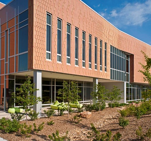
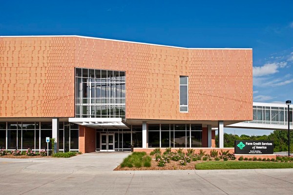
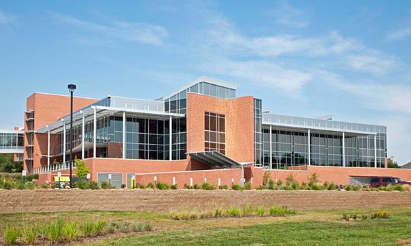
For the west façade of the 77,000-sf Farm Credit Services of America Corporate Office Building 2 in Omaha, Neb., Clark Enersen Partners created an abstract representation of wind blowing through a wheat field—using two brick colors at various depths and orientation. The west façade brick also helps minimize late day glare, while openings in the façade still filter natural light through vertical fins.
2. Gray and white shades of brick
Photos: Slyworks Photography
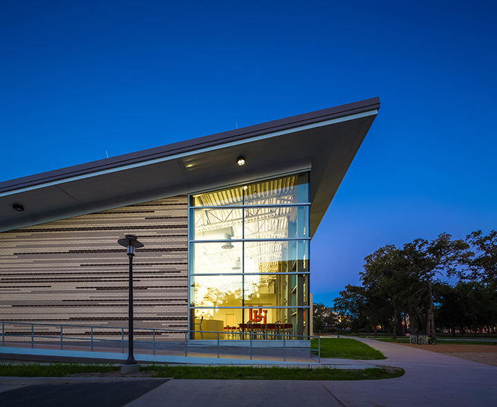
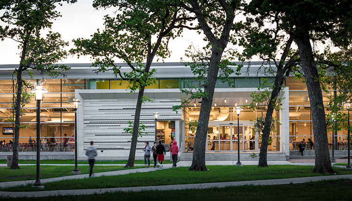
Cougar Woods Dining Hall, a 25,000-sf pavilion on the University of Houston’s main campus, promotes a passive approach to sustainable design. Designed by PageSoutherlandPage, the dining area has extensive glazing on its north side to provide daylighting within the building, while minimizing heat gain. Solid masonry walls with a lighter color were used to protect the southern and western elevations from the sun and reduce the heat island effect.
In another example, Wormley School Rowhouses in Washington, D.C.’s historic Georgetown neighborhood were painted neutral colors to match the existing neighborhood. While maintaining historic integrity, Cunningham | Quill Architects converted a school building into condominiums and a new row of townhouses built on the adjacent schoolyard.
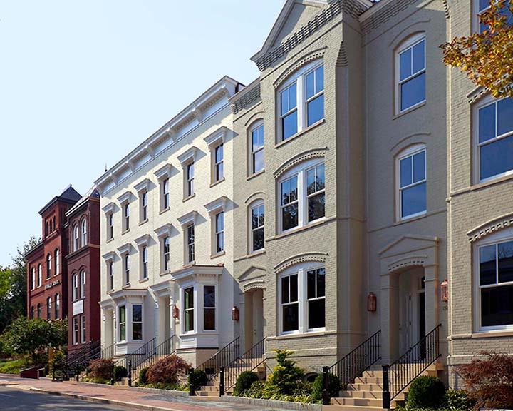
Photo: Chris Morrison
3. Brick for flexibility in color, shape, and form
Photos: Tony Frederick Photography
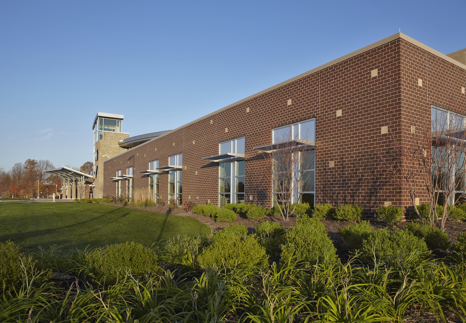
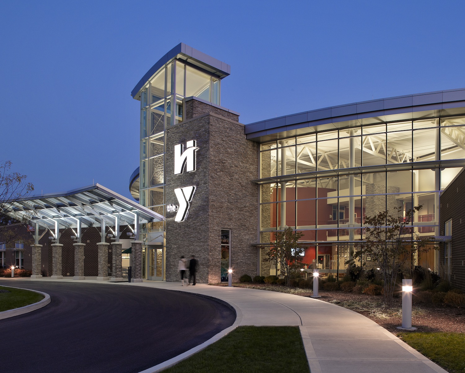
For Hendricks Regional Health YMCA, Avon, Ind., American Structurepoint aimed to celebrate the symbiotic relationship of health and wellness through an integral use of brick and organic forms. Brick was used in areas where there were noise and privacy concerns. A two-tone scheme used a deep brown brick color to anchor the façade and hold up the lighter, buff-colored brick to create a sense of place and familiarity with the hospital brand. Brick easily conformed to the straight, angled, and curved walls throughout the facility.
4. Textures: sanded, artisan, wirecut, and tumbled
Photos: Halkin Architectural Photography
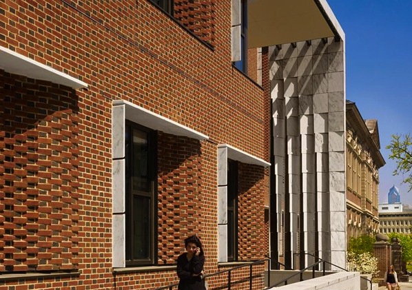
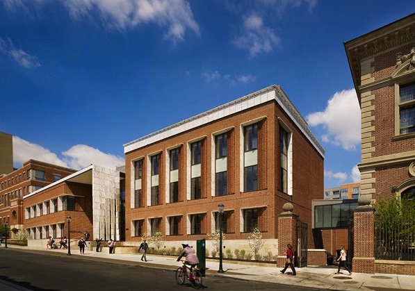
The University of Pennsylvania Law School uses masonry to define the image of a 21st century law school. One of Penn Law’s primary goals was to unify its campus with the addition of the new Golkin Hall. To do so required maintaining the material presence of Silverman Hall, built for the law school in 1900. Kennedy & Violich Architecture used sand-molded brick and a distinctive Flemish bond pattern used on all subsequent buildings.
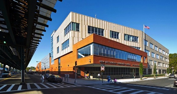
5. Contrasting brick colors and course patterns
Photos: David Sundberg
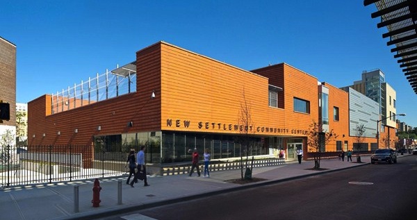
The 172,000-sf New Settlement Campus in Bronx, N.Y., houses three schools for 1,000 PK-12 students on a busy urban block. Dattner Architects interplays massing, materials, and patterning to create scale and interest for the block-long building. A two-story, red brick commons wing parallels an elevated subway train, and intersects a four-story buff brick classroom wing that bends away from the street. The contrasting brick colors and course patterns distinguish the two wings. A graduated vertical pattern of darker projecting brick articulates the classroom wing’s cream-colored brick façade, which is perpendicular to the elevated train to minimize noise.
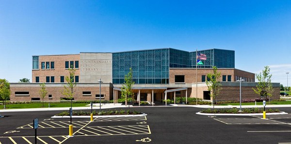
6. Hinge-shaped face brick
Photos: Ballogg Photography
Fountaindale Public Library in Bolingbrook, Ill., is located in a suburban environment at the confluence of the village’s municipal campus, tract housing, and a recreational park. To facilitate the organic shape of the building’s exterior, Nagle Hartray Architecture used an innovative, single modular size hinge-shaped face brick for 28 different inside and outside corner conditions.
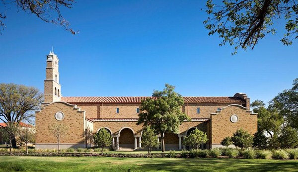
7. Brick to introduce new architectural motifs/ornamentation
Photos: Dror Baldinger
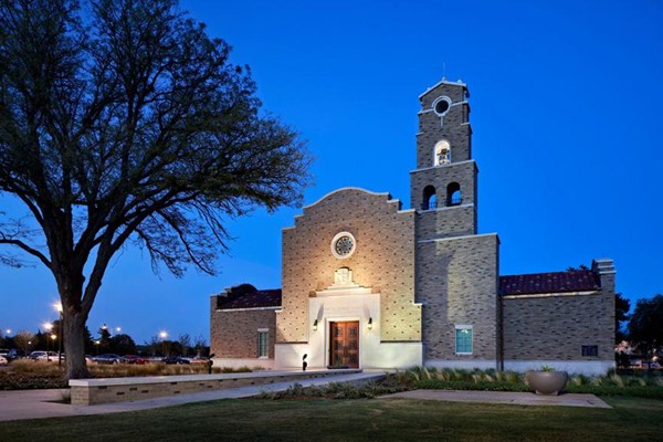
McKinney York Architects designed the 7,000-sf non-denominational Kent R. Hance Chapel, Lubbock, Texas, in the Spanish Renaissance style of the historic sections of campus. The chapel’s bell tower, curved articulation of the gabled parapet walls and ermine patterning of the principal façade are all instances where brick played a decisive role to introduce new architectural motifs, celebrating only the most important architectural elements.
For more brick designs, see the 2014 and 2013 Brick in Architecture Award winners.
Related Stories
| Sep 22, 2014
4 keys to effective post-occupancy evaluations
Perkins+Will's Janice Barnes covers the four steps that designers should take to create POEs that provide design direction and measure design effectiveness.
| Sep 22, 2014
Sound selections: 12 great choices for ceilings and acoustical walls
From metal mesh panels to concealed-suspension ceilings, here's our roundup of the latest acoustical ceiling and wall products.
| Sep 15, 2014
Ranked: Top international AEC firms [2014 Giants 300 Report]
Parsons Brinckerhoff, Gensler, and Jacobs top BD+C's rankings of U.S.-based design and construction firms with the most revenue from international projects, as reported in the 2014 Giants 300 Report.
| Sep 9, 2014
Using Facebook to transform workplace design
As part of our ongoing studies of how building design influences human behavior in today’s social media-driven world, HOK’s workplace strategists had an idea: Leverage the power of social media to collect data about how people feel about their workplaces and the type of spaces they need to succeed.
| Sep 8, 2014
First Look: Foster + Partners, Fernando Romero win competition for Mexico City's newest international airport
Designed to be the world’s most sustainable airport, the plan uses a single, compact terminal scheme in lieu of a cluster of buildings, offering shorter walking distances and fewer level changes, and eliminating the need for trains and tunnels.
| Sep 3, 2014
New designation launched to streamline LEED review process
The LEED Proven Provider designation is designed to minimize the need for additional work during the project review process.
| Sep 2, 2014
Ranked: Top green building sector AEC firms [2014 Giants 300 Report]
AECOM, Gensler, and Turner top BD+C's rankings of the nation's largest green design and construction firms.
| Sep 1, 2014
Ranked: Top federal government sector AEC firms [2014 Giants 300 Report]
Clark Group, Fluor, and HOK top BD+C's rankings of the nation's largest federal government design and construction firms, as reported in the 2014 Giants 300 Report.
| Aug 19, 2014
HOK to acquire 360 Architecture
Expected to be finalized by the end of October, the acquisition of 360 Architecture will provide immediate benefits to both firms’ clients worldwide as HOK re-enters the sports and entertainment market.
| Aug 11, 2014
Air Terminal Sector Giants: Morphing TSA procedures shape terminal design [2014 Giants 300 Report]
The recent evolution of airport terminals has been prompted largely by different patterns of passenger behavior in a post-9/11 world, according to BD+C's 2014 Giants 300 Report.


