Empty churches and shuttered parochial schools are scattered throughout neighborhoods in many older U.S. cities, and Chicago is no exception. Meanwhile, many daycare providers, community organizations, and charter schools are desperate for program space. Could this be evidence of divine providence at work?
The story of Concordia Place illuminates both the difficulties and rewards of trying to match empty buildings with social programs. Concordia Lutheran Church, founded by Swedish Lutherans in 1898 and today a member congregation of the Evangelical Lutheran Church in America, was seeking to expand its highly successful early childhood program, Concordia Place. That program was started in the early 1980s, when three single mothers pleaded with the small, 60-member congregation to provide low-cost childcare.
Located in Chicago’s North Center neighborhood, about six miles northwest of the Loop, Concordia Place had a long waiting list and no space in which to grow. When a shuttered Catholic church, St. Veronica’s, about a mile southwest of Concordia, came on the market, Concordia’s leaders sprung at the opportunity.
Project summary
CONCORDIA PLACE
Chicago, Ill.Building Team
Owner: Concordia Lutheran Church
Owner’s representative: Cotter Consulting
Project planning and development: LL Consulting
Architect, interior design, SE: Holabird & Root
MEP engineer: EME (now KJWW)
Civil engineer: Terra Engineering
Historic preservation consultant: Harboe Architects
Landscape architect: McKay Landscape Architects
Contractor: Bulley & AndrewsGeneral Information
Project size: 28,000 sf
Construction cost: $5.6 million
Delivery method: Design-bid-build
There was talk about razing the structures in order to build condominiums, but the local community would hear nothing of that: They wanted the buildings preserved and repurposed to serve mounting social demands. Concordia members undertook a multi-year fundraising campaign, doubling their regular contributions, mortgaging existing church facilities, and soliciting donations from businesses, foundations, and government sources
Unravelling a hodgepodge of building uses
The property featured an unusual set of structures. St. Veronica Parish was founded in 1904 and a year later dedicated a combination church-school building. What looked like a three-story brick-and-limestone school actually contained a sanctuary on the ground floor, classrooms on the floor above, and a large community hall on the third. Gone was an old convent in a wood-frame penthouse above it all; it was destroyed by fire years ago.
In contrast to the modest church-school structure, the rectory, built a decade later, was an imposing red brick Tudor design by noted ecclesiastical architect Henry Schlacks. The archdiocese closed both church and school and sold the property to the city of Chicago in 1989. For a time, it was used as overflow space for a nearby public school, but within a few years it was vacant and subject to repeated vandalism.
Such combination church-school buildings may be the most readily adaptable of church properties, as they usually have no bell towers, large rose windows, or tall, voluminous naves. The lack of the typical church basement meant that the main level was just up from the sidewalk, making ADA compliance easier to achieve.
When Concordia Lutheran eventually purchased the property, the first two floors of the church-school building prooved perfect for their early childhood and preschool program. But according to the church’s pastor, Reverend Nicholas J. Zook, the leaders wondered what to do with the cavernous third floor. They surveyed the community and found that, due to heightened gang activity in the neighborhood, teen programs would be welcomed. There was also a large population of seniors and non-English-speaking adults with unmet needs.
Thus, it was envisioned that the so-called “bonus space” of the third floor could house a community center that would offer after-school and summer camp programs for ages six to 12, leadership development for teens, English classes for adults, and wellness programs for seniors.
Keeping program needs and preservation in mind
Local architects Holabird & Root were charged with meeting the varied programmatic needs of these diverse user groups while preserving the historic exteriors. Careful site planning made use of virtually every square inch of the property. “We wanted to get as much space as possible for the kids to play in, but we also wanted to make a welcoming gesture to the public,” says Maria Segal, RA, then Holabird & Root’s early childhood design specialist. (She is now with Blender Architecture, Chicago.)
General contractor Bulley & Andrews demolished a decrepit 1950s addition and replaced it with a single-story annex. Its colors and materials—soft red and light sage green composite cement panels—mediate between the red brick rectory and the yellow brick church-school building. Siting the annex at the back of the lot created a courtyard that is now used for both school and community events, including a farmers’ market run by the after-school teens.
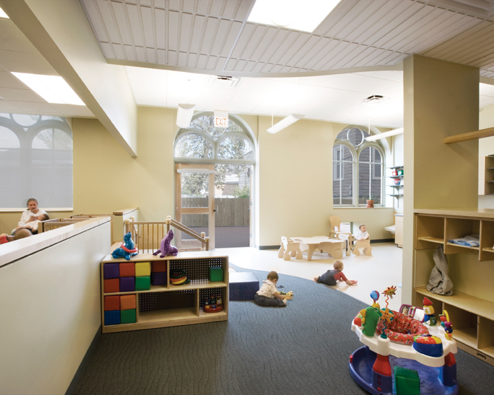
The high-ceilinged annex is used for children’s large-motor activities as well as banquets, community meetings, and worship services. Extensive glazing provides a visual connection to the outdoors and makes it glow during evening events. A playground for the preschool children is just south of the annex, and a fenced play area for toddlers is tucked into the north part of the site, offering direct access from those classrooms.
Because the church complex was rated orange on the Chicago Historic Resources Survey, the project was able to obtain state funds. That triggered the involvement of the Illinois Historic Preservation Agency, which directed Concordia to preserve all existing window openings. This was at odds with Concordia’s desire to change some of the windows into glass-paned doors for the first floor classrooms.
The IHPA and Concordia reached a compromise: alternating windows were changed into doors, and small square windows were punched into the walls below the sills of the remaining windows. The original wood windows were restored and double-glazed.
Except for a stairway in the southeast corner, the interior of the church-school was gutted. Folding wooden doors that divided a large room on the third floor were reused for the same purpose.
The archdiocese had removed about half of the stained glass windows before selling the property. Those that remained were removed from the first-floor sanctuary and placed in backlit frames in the historic stairwell and in the third-floor teen room, which can also serve as a chapel. The IHPA did not require the stained glass to be preserved, but Reverend Zook insisted that it be done anyway, as a gesture “to show continuity with this place as an anchor in the community.”
The interior materials palette is in neutral, soothing colors with natural materials, such as birch plywood, used wherever possible. “That way the child brings the life and color to the spaces,” Segal says.
Reverend Zook praises the 28,000-sf, $5.6 million project, for its maximization of natural light and for providing and an abundance of storage areas from otherwise useless space, which helps maximize the flexibility of the rooms.
Keeping the scale right
A child-appropriate scale was also achieved despite the high ceilings by breaking down the scale of the classrooms with alcoves, cubbies, and lofts. Activity areas are defined by changes in ceiling and floor treatments. Low, square windows provide views into adjacent classrooms as well as to the outdoors. During construction, a number of cast-iron columns were discovered; these columns had to be reinforced with a secondary set of steel supports.
The third floor has an array of spaces whose flexibility has contributed significantly to the building’s success as a community center. Reverend Zook dreamed of a grand lobby on the first floor, but that space was needed for classrooms. Instead, the project team created a great lobby upstairs, where a pitched-roof skylight structure provides abundant north light, and a café serves as a multipurpose space used throughout the day by seniors, adults, and teens. New doors can close off the corridor to separate the licensed preschool spaces from the community areas
This kind of mixed-use facility is a model for the pooling of community resources that is now often necessitated by tight budgets, especially for nonprofit entities like Concordia.
Two campuses, one mission
Renovating the buildings and constructing the annex resulted in a dramatic expansion of Concordia’s mission and program. Concordia Place’s two campuses now serve a multi-age population from babies to senior citizens, providing more than 300 children (95% of whom are not Lutheran) with childcare and after-school programs. Seventy percent of the children in the new program come from minority families, nearly half of which are headed by single parents.
Reverend Zook feels that the marginal added costs of preservation were a demonstration of Concordia’s “good-faith relationship to the community.” Instead of being lost to the wrecking ball, this former church serves a new organization’s mission as a place where, in the minister’s words, “The church’s witness of outreach is grounded in her service to the larger community of neighbors in which she lives.” +
--
Laurie Petersen is a regular contributor to Chicago Architect, the official publication of AIA Chicago, from which this article was adapted.
Related Stories
| Feb 11, 2011
RS Means Cost Comparison Chart: Office Buildings
This month's RS Means Cost Comparison Chart focuses on office building construction.
| Feb 11, 2011
Sustainable features on the bill for dual-building performing arts center at Soka University of America
The $73 million Soka University of America’s new performing arts center and academic complex recently opened on the school’s Aliso Viejo, Calif., campus. McCarthy Building Companies and Zimmer Gunsul Frasca Architects collaborated on the two-building project. One is a three-story, 47,836-sf facility with a grand reception lobby, a 1,200-seat auditorium, and supports spaces. The other is a four-story, 48,974-sf facility with 11 classrooms, 29 faculty offices, a 150-seat black box theater, rehearsal/dance studio, and support spaces. The project, which has a green roof, solar panels, operable windows, and sun-shading devices, is going for LEED Silver.
| Feb 11, 2011
BIM-enabled Texas church complex can broadcast services in high-def
After two years of design and construction, members of the Gateway Church in Southland, Texas, were able to attend services in their new 4,000-seat facility in late 2010. Located on a 180-acre site, the 205,000-sf complex has six auditoriums, including a massive 200,000-sf Worship Center, complete with catwalks, top-end audio and video system, and high-definition broadcast capabilities. BIM played a significant role in the building’s design and construction. Balfour Beatty Construction and Beck Architecture formed the nucleus of the Building Team.
| Feb 11, 2011
Kentucky’s first green adaptive reuse project earns Platinum
(FER) studio, Inglewood, Calif., converted a 115-year-old former dry goods store in Louisville, Ky., into a 10,175-sf mixed-use commercial building earned LEED Platinum and holds the distinction of being the state’s first adaptive reuse project to earn any LEED rating. The facility, located in the East Market District, houses a gallery, event space, offices, conference space, and a restaurant. Sustainable elements that helped the building reach its top LEED rating include xeriscaping, a green roof, rainwater collection and reuse, 12 geothermal wells, 81 solar panels, a 1,100-gallon ice storage system (off-grid energy efficiency is 68%) and the reuse and recycling of construction materials. Local firm Peters Construction served as GC.
| Feb 11, 2011
Former Richardson Romanesque hotel now houses books, not beds
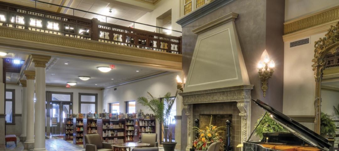
The Piqua (Ohio) Public Library was once a late 19th-century hotel that sat vacant and deteriorating for years before a $12.3 million adaptive reuse project revitalized the 1891 building. The design team of PSA-Dewberry, MKC Associates, and historic preservation specialist Jeff Wray Associates collaborated on the restoration of the 80,000-sf Richardson Romanesque building, once known as the Fort Piqua Hotel. The team restored a mezzanine above the lobby and repaired historic windows, skylight, massive fireplace, and other historic details. The basement, with its low ceiling and stacked stone walls, was turned into a castle-like children’s center. The Piqua Historical Museum is also located within the building.
| Feb 11, 2011
Justice center on Fall River harbor serves up daylight, sustainable elements, including eucalyptus millwork
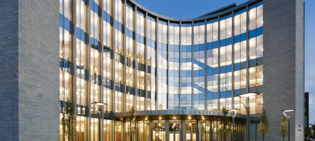
Located on historic South Main Street in Fall River, Mass., the Fall River Justice Center opened last fall to serve as the city’s Superior and District Courts building. The $85 million facility was designed by Boston-based Finegold Alexander + Associates Inc., with Dimeo Construction as CM and Arup as MEP. The 154,000-sf courthouse contains nine courtrooms, a law library, and a detention area. Most of the floors have the same ceiling height, which will makes them easier to reconfigure in the future as space needs change. Designed to achieve LEED Silver, the facility’s elliptical design offers abundant natural daylight and views of the harbor. Renewable eucalyptus millwork is one of the sustainable features.
| Feb 11, 2011
Research facility separates but also connects lab spaces
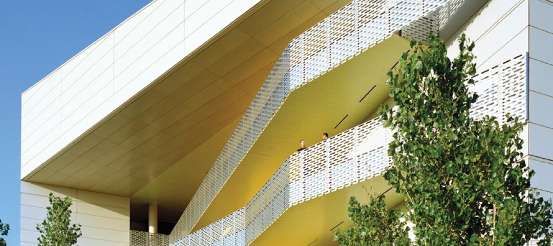
California State University, Northridge, consolidated its graduate and undergraduate biology and mathematics programs into one 90,000-sf research facility. Architect of record Cannon Design worked on the new Chaparral Hall, creating a four-story facility with two distinct spaces that separate research and teaching areas; these are linked by faculty offices to create collaborative spaces. The building houses wet research, teaching, and computational research labs, a 5,000-sf vivarium, classrooms, and administrative offices. A four-story outdoor lobby and plaza and an outdoor staircase provide orientation. A covered walkway links the new facility with the existing science complex. Saiful/Bouquet served as structural engineer, Bard, Rao + Athanas Consulting Engineers served as MEP, and Research Facilities Design was laboratory consultant.
| Feb 11, 2011
A feast of dining options at University of Colorado community center, but hold the buffalo stew
The University of Colorado, Boulder, cooked up something different with its new $84.4 million Center for Community building, whose 900-seat foodservice area consists of 12 micro-restaurants, each with its own food options and décor. Centerbrook Architects of Connecticut collaborated with Denver’s Davis Partnership Architects and foodservice designer Baker Group of Grand Rapids, Mich., on the 323,000-sf facility, which also includes space for a career center, international education, and counseling and psychological services. Exterior walls of rough-hewn, variegated sandstone and a terra cotta roof help the new facility blend with existing campus buildings. Target: LEED Gold.
| Feb 11, 2011
Chicago high-rise mixes condos with classrooms for Art Institute students
The Legacy at Millennium Park is a 72-story, mixed-use complex that rises high above Chicago’s Michigan Avenue. The glass tower, designed by Solomon Cordwell Buenz, is mostly residential, but also includes 41,000 sf of classroom space for the School of the Art Institute of Chicago and another 7,400 sf of retail space. The building’s 355 one-, two-, three-, and four-bedroom condominiums range from 875 sf to 9,300 sf, and there are seven levels of parking. Sky patios on the 15th, 42nd, and 60th floors give owners outdoor access and views of Lake Michigan.
| Feb 11, 2011
Iowa surgery center addresses both inpatient and outpatient care
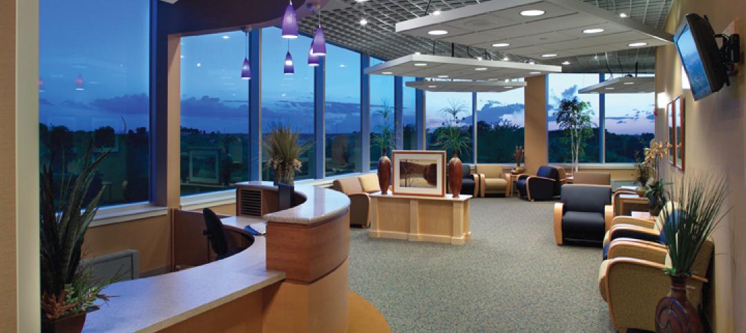
The 12,000-person community of Carroll, Iowa, has a new $28 million surgery center to provide both inpatient and outpatient care. Minneapolis-based healthcare design firm Horty Elving headed up the four-story, 120,000-sf project for St. Anthony’s Regional Hospital. The center’s layout is based on a circular process flow, and includes four 800-sf operating rooms with poured rubber floors to reduce leg fatigue for surgeons and support staff, two substerile rooms between each pair of operating rooms, and two endoscopy rooms adjacent to the outpatient prep and recovery rooms. Recovery rooms are clustered in groups of four. The large family lounge (left) has expansive windows with views of the countryside, and television monitors that display coded information on patient status so loved ones can follow a patient’s progress.


