Empty churches and shuttered parochial schools are scattered throughout neighborhoods in many older U.S. cities, and Chicago is no exception. Meanwhile, many daycare providers, community organizations, and charter schools are desperate for program space. Could this be evidence of divine providence at work?
The story of Concordia Place illuminates both the difficulties and rewards of trying to match empty buildings with social programs. Concordia Lutheran Church, founded by Swedish Lutherans in 1898 and today a member congregation of the Evangelical Lutheran Church in America, was seeking to expand its highly successful early childhood program, Concordia Place. That program was started in the early 1980s, when three single mothers pleaded with the small, 60-member congregation to provide low-cost childcare.
Located in Chicago’s North Center neighborhood, about six miles northwest of the Loop, Concordia Place had a long waiting list and no space in which to grow. When a shuttered Catholic church, St. Veronica’s, about a mile southwest of Concordia, came on the market, Concordia’s leaders sprung at the opportunity.
Project summary
CONCORDIA PLACE
Chicago, Ill.Building Team
Owner: Concordia Lutheran Church
Owner’s representative: Cotter Consulting
Project planning and development: LL Consulting
Architect, interior design, SE: Holabird & Root
MEP engineer: EME (now KJWW)
Civil engineer: Terra Engineering
Historic preservation consultant: Harboe Architects
Landscape architect: McKay Landscape Architects
Contractor: Bulley & AndrewsGeneral Information
Project size: 28,000 sf
Construction cost: $5.6 million
Delivery method: Design-bid-build
There was talk about razing the structures in order to build condominiums, but the local community would hear nothing of that: They wanted the buildings preserved and repurposed to serve mounting social demands. Concordia members undertook a multi-year fundraising campaign, doubling their regular contributions, mortgaging existing church facilities, and soliciting donations from businesses, foundations, and government sources
Unravelling a hodgepodge of building uses
The property featured an unusual set of structures. St. Veronica Parish was founded in 1904 and a year later dedicated a combination church-school building. What looked like a three-story brick-and-limestone school actually contained a sanctuary on the ground floor, classrooms on the floor above, and a large community hall on the third. Gone was an old convent in a wood-frame penthouse above it all; it was destroyed by fire years ago.
In contrast to the modest church-school structure, the rectory, built a decade later, was an imposing red brick Tudor design by noted ecclesiastical architect Henry Schlacks. The archdiocese closed both church and school and sold the property to the city of Chicago in 1989. For a time, it was used as overflow space for a nearby public school, but within a few years it was vacant and subject to repeated vandalism.
Such combination church-school buildings may be the most readily adaptable of church properties, as they usually have no bell towers, large rose windows, or tall, voluminous naves. The lack of the typical church basement meant that the main level was just up from the sidewalk, making ADA compliance easier to achieve.
When Concordia Lutheran eventually purchased the property, the first two floors of the church-school building prooved perfect for their early childhood and preschool program. But according to the church’s pastor, Reverend Nicholas J. Zook, the leaders wondered what to do with the cavernous third floor. They surveyed the community and found that, due to heightened gang activity in the neighborhood, teen programs would be welcomed. There was also a large population of seniors and non-English-speaking adults with unmet needs.
Thus, it was envisioned that the so-called “bonus space” of the third floor could house a community center that would offer after-school and summer camp programs for ages six to 12, leadership development for teens, English classes for adults, and wellness programs for seniors.
Keeping program needs and preservation in mind
Local architects Holabird & Root were charged with meeting the varied programmatic needs of these diverse user groups while preserving the historic exteriors. Careful site planning made use of virtually every square inch of the property. “We wanted to get as much space as possible for the kids to play in, but we also wanted to make a welcoming gesture to the public,” says Maria Segal, RA, then Holabird & Root’s early childhood design specialist. (She is now with Blender Architecture, Chicago.)
General contractor Bulley & Andrews demolished a decrepit 1950s addition and replaced it with a single-story annex. Its colors and materials—soft red and light sage green composite cement panels—mediate between the red brick rectory and the yellow brick church-school building. Siting the annex at the back of the lot created a courtyard that is now used for both school and community events, including a farmers’ market run by the after-school teens.
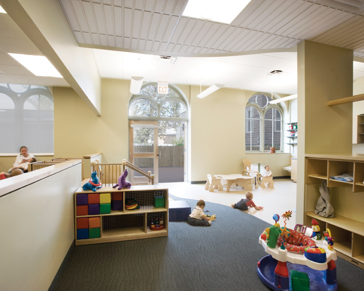
The high-ceilinged annex is used for children’s large-motor activities as well as banquets, community meetings, and worship services. Extensive glazing provides a visual connection to the outdoors and makes it glow during evening events. A playground for the preschool children is just south of the annex, and a fenced play area for toddlers is tucked into the north part of the site, offering direct access from those classrooms.
Because the church complex was rated orange on the Chicago Historic Resources Survey, the project was able to obtain state funds. That triggered the involvement of the Illinois Historic Preservation Agency, which directed Concordia to preserve all existing window openings. This was at odds with Concordia’s desire to change some of the windows into glass-paned doors for the first floor classrooms.
The IHPA and Concordia reached a compromise: alternating windows were changed into doors, and small square windows were punched into the walls below the sills of the remaining windows. The original wood windows were restored and double-glazed.
Except for a stairway in the southeast corner, the interior of the church-school was gutted. Folding wooden doors that divided a large room on the third floor were reused for the same purpose.
The archdiocese had removed about half of the stained glass windows before selling the property. Those that remained were removed from the first-floor sanctuary and placed in backlit frames in the historic stairwell and in the third-floor teen room, which can also serve as a chapel. The IHPA did not require the stained glass to be preserved, but Reverend Zook insisted that it be done anyway, as a gesture “to show continuity with this place as an anchor in the community.”
The interior materials palette is in neutral, soothing colors with natural materials, such as birch plywood, used wherever possible. “That way the child brings the life and color to the spaces,” Segal says.
Reverend Zook praises the 28,000-sf, $5.6 million project, for its maximization of natural light and for providing and an abundance of storage areas from otherwise useless space, which helps maximize the flexibility of the rooms.
Keeping the scale right
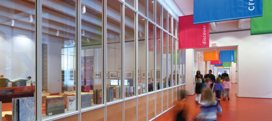
A child-appropriate scale was also achieved despite the high ceilings by breaking down the scale of the classrooms with alcoves, cubbies, and lofts. Activity areas are defined by changes in ceiling and floor treatments. Low, square windows provide views into adjacent classrooms as well as to the outdoors. During construction, a number of cast-iron columns were discovered; these columns had to be reinforced with a secondary set of steel supports.
The third floor has an array of spaces whose flexibility has contributed significantly to the building’s success as a community center. Reverend Zook dreamed of a grand lobby on the first floor, but that space was needed for classrooms. Instead, the project team created a great lobby upstairs, where a pitched-roof skylight structure provides abundant north light, and a café serves as a multipurpose space used throughout the day by seniors, adults, and teens. New doors can close off the corridor to separate the licensed preschool spaces from the community areas
This kind of mixed-use facility is a model for the pooling of community resources that is now often necessitated by tight budgets, especially for nonprofit entities like Concordia.
Two campuses, one mission
Renovating the buildings and constructing the annex resulted in a dramatic expansion of Concordia’s mission and program. Concordia Place’s two campuses now serve a multi-age population from babies to senior citizens, providing more than 300 children (95% of whom are not Lutheran) with childcare and after-school programs. Seventy percent of the children in the new program come from minority families, nearly half of which are headed by single parents.
Reverend Zook feels that the marginal added costs of preservation were a demonstration of Concordia’s “good-faith relationship to the community.” Instead of being lost to the wrecking ball, this former church serves a new organization’s mission as a place where, in the minister’s words, “The church’s witness of outreach is grounded in her service to the larger community of neighbors in which she lives.” +
--
Laurie Petersen is a regular contributor to Chicago Architect, the official publication of AIA Chicago, from which this article was adapted.
Related Stories
| Feb 11, 2011
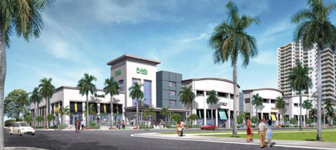
Grocery store anchors shopping center in Miami arts/entertainment district
18Biscayne is a 57,200-sf urban retail center being developed in downtown Miami by commercial real estate firm Stiles. Construction on the three-story center is being fast-tracked for completion in early 2012. The project is anchored by a 49,200-sf Publix market with bakery, pharmacy, and café with outdoor seating. An additional 8,000 sf of retail space will front Biscayne Boulevard. The complex is in close proximity to the Adrienne Arsht Center for the Performing Arts, the downtown Miami entertainment district, and the Omni neighborhood, one of the city’s fast-growing residential areas.
| Feb 11, 2011
Chicago architecture firm planning one of China’s tallest towers
Chicago-based Goettsch Partners was commissioned by developer Guangzhou R&F Properties Co. Ltd. to design a new 294,570-sm mixed-use tower in Tianjin, China. The Tianjin R&F Guangdong Tower will be located within the city’s newly planned business district, and at 439 meters it will be one of China’s tallest buildings. The massive complex will feature 134,900 sm of Class A office space, a 400-key, five-star hotel, 55 condominiums, and 8,550 sm of retail space. The architects are designing the tower with multi-story atriums and a high-performance curtain wall to bring daylight deep into the building, thereby creating deeper lease spans. The project is currently finishing design.
| Feb 11, 2011
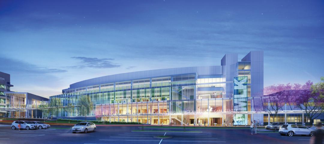
Two projects seek to reinvigorate Los Angeles County medical center
HMC Architects designed two new buildings for the Los Angeles County Martin Luther King, Jr., Medical Center as part of a $360 million plan to reinvigorate the campus. The buildings include a 120-bed hospital, which involves renovation of an existing tower and several support buildings, and the construction of a new multi-service ambulatory care center. The new facilities will have large expanses of glass at all waiting and public areas for unobstructed views of downtown Los Angeles. A curved glass entrance canopy will unite the two buildings. When both projects are completed—the hospital in 2012 and the ambulatory care center in 2013—the campus will have added more than 460,000 sf of space. The hospital will seek LEED certification, while the ambulatory care center is targeting LEED Silver.
| Feb 11, 2011
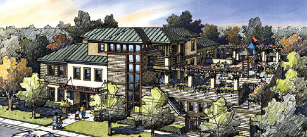
Sustainable community center to serve Angelinos in need
Harbor Interfaith Services, a nonprofit serving the homeless and working poor in the Harbor Area and South Bay communities of Los Angeles, engaged Withee Malcolm Architects to design a new 15,000-sf family resource center. The architects, who are working pro bono for the initial phase, created a family-centered design that consolidates all programs into a single building. The new three-story space will house a resource center, food pantry, nursery and pre-school, and administrative offices, plus indoor and outdoor play spaces and underground parking. The building’s scale and setbacks will help it blend with its residential neighbors, while its low-flow fixtures, low-VOC and recycled materials, and energy-efficient mechanical equipment and appliances will help it earn LEED certification.
| Feb 11, 2011
Texas megachurch inspired by yesteryear’s materials, today’s design vocabulary
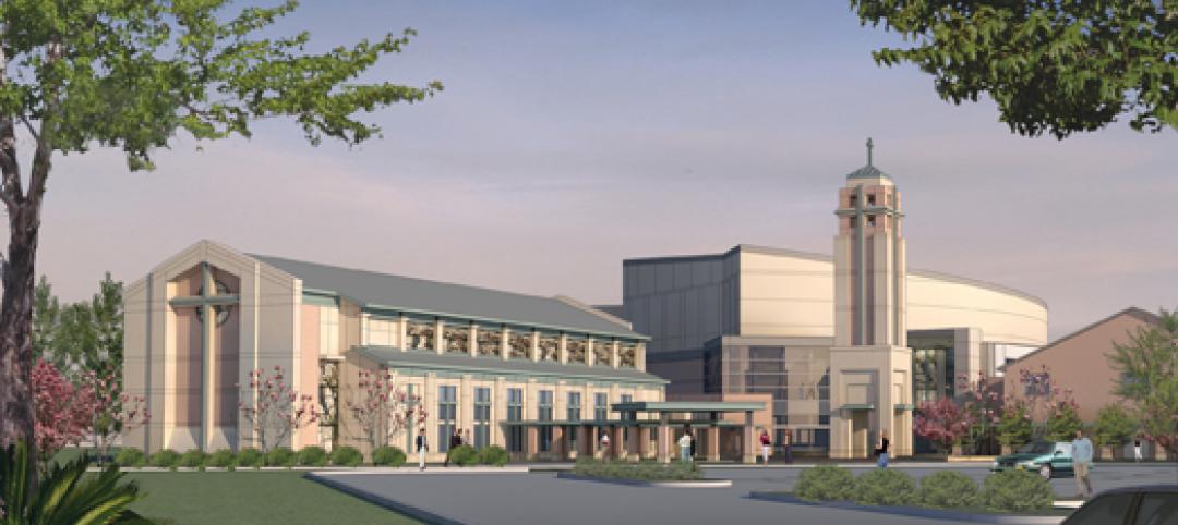
The third phase of The First Baptist Church of Pasadena, Texas, involves construction of a new 115,000-sf worship center addition. Currently in design by Zeigler Cooper, the project will include a 2,500-seat worship center (with circular layout and space for a 50-person orchestra and 200-person choir), a 500-seat chapel (for weddings, funerals, and special events), and a prayer room. The addition will connect to the existing church and create a Christian Commons for education, administration, music, and fellowship. The church asked for a modern design that uses traditional materials, such as stone, brick, and stained glass. Construction is scheduled to begin this summer.
| Feb 11, 2011
Apartment complex caters to University of Minnesota students
Twin Cities firm Elness Swenson Graham Architects designed the new Stadium Village Flats, in the University of Minnesota’s East Bank Campus, with students in mind. The $30 million, six-story residential/retail complex will include 120 furnished apartments with fitness rooms and lounges on each floor. More than 5,000 sf of first-floor retail space and two levels of below-ground parking will complete the complex. Opus AE Group Inc., based in Minneapolis, will provide structural engineering services.
| Feb 11, 2011
Four-story library at Salem State will hold half a million—get this—books!
Salem State University in Massachusetts broke ground on a new library and learning center in December. The new four-story library will include instructional labs, group study rooms, and a testing center. The modern, 124,000-sf design by Boston-based Shepley Bulfinch includes space for 500,000 books and study space for up to a thousand students. Sustainable features include geothermal heating and cooling, rainwater harvesting, and low-flow plumbing fixtures.
| Feb 11, 2011
Green design, white snow at Egyptian desert retail complex
The Mall of Egypt will be a 135,000-sm retail and entertainment complex in Cairo’s modern 6th of October district. The two-story center is divided into three themed zones—The City, which is arranged as a series of streets lined with retail and public spaces; The Desert Valley, which contains upscale department stores, international retailers, and a central courtyard for music and other cultural events; and The Crystal, which will include leisure and entertainment venues, including a cinema and indoor snow park. RTKL is designing the massive complex to LEED Silver standards.
| Feb 10, 2011
7 Things to Know About Impact Glazing and Fire-rated Glass
Back-to-basics answers to seven common questions about impact glazing and fire-rated glass.
| Feb 10, 2011
Medical Data Center Sets High Bar for BIM Design Team
The construction of a new data center becomes a test case for BIM’s ability to enhance project delivery across an entire medical campus.


