Standout architecture is about creating exceptional space, whether the project is large or small.
AIA Chicago recently named the winners of its annual Small Project Awards. The program raises public awareness of the valuable work architects bring to even the smallest works, and promotes small and emerging architectural firms as a resource for design excellence.
This year’s jury includes: Chris Cooper, AIA, Cooper Joseph Studio, New York, N.Y.; Carolyn Armenta Davis, Hon. AIA, architectural historian and writer, Chicago; Chris Force, Chicago; Mark Peters, AIA, Studio Dwell, Chicago; and Vladimir Radunty, AIA, SIDE Architecture, Chicago.
The 2014 winners are (project descriptions and photos courtesy of AIA Chicago):
The Wave
Location / Chicago
Architect of Record / dSPACE Studio
Client / Lakeview Chamber of Commerce
Photos by Evan Thomas / Studio Thomas
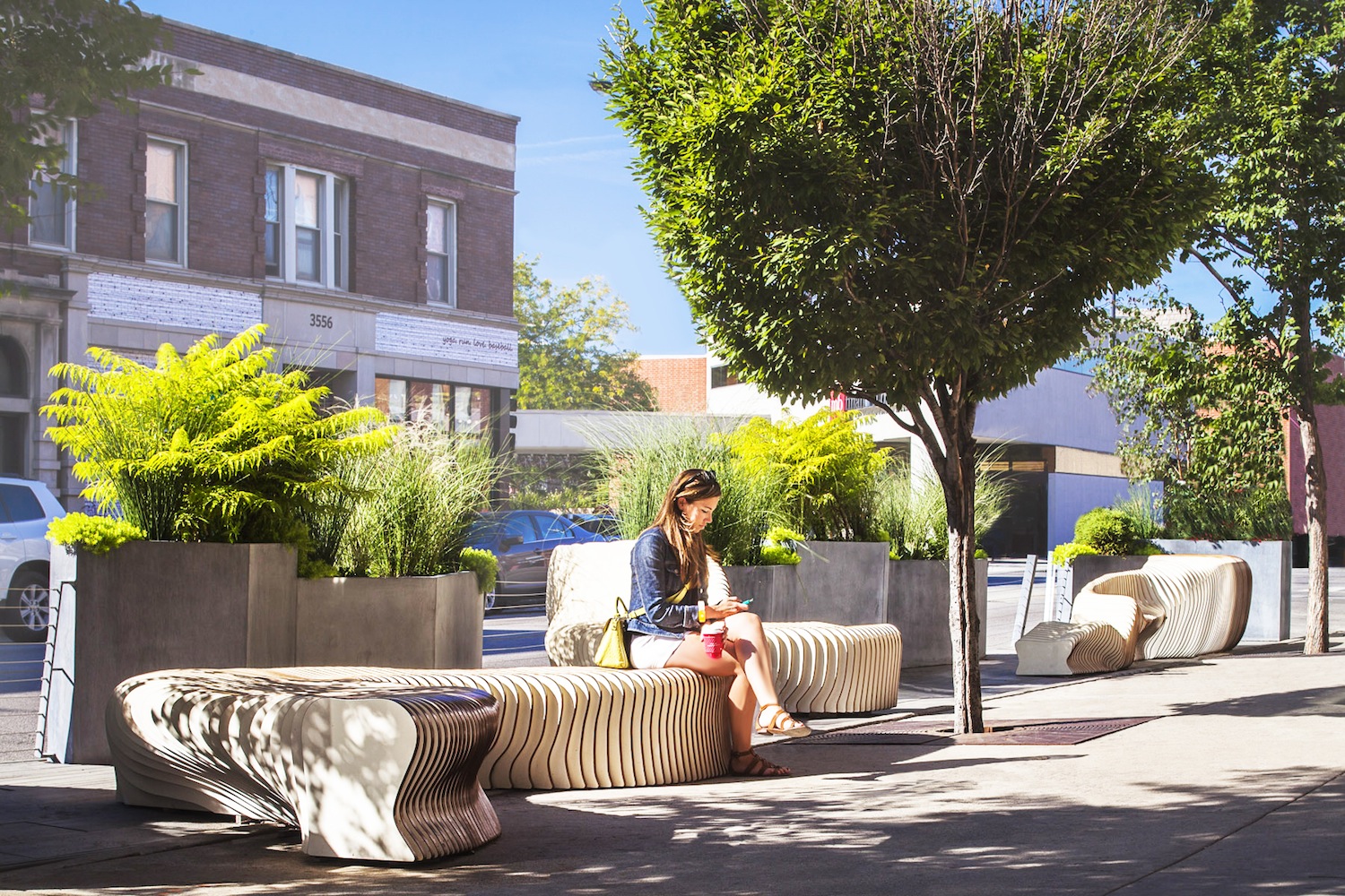
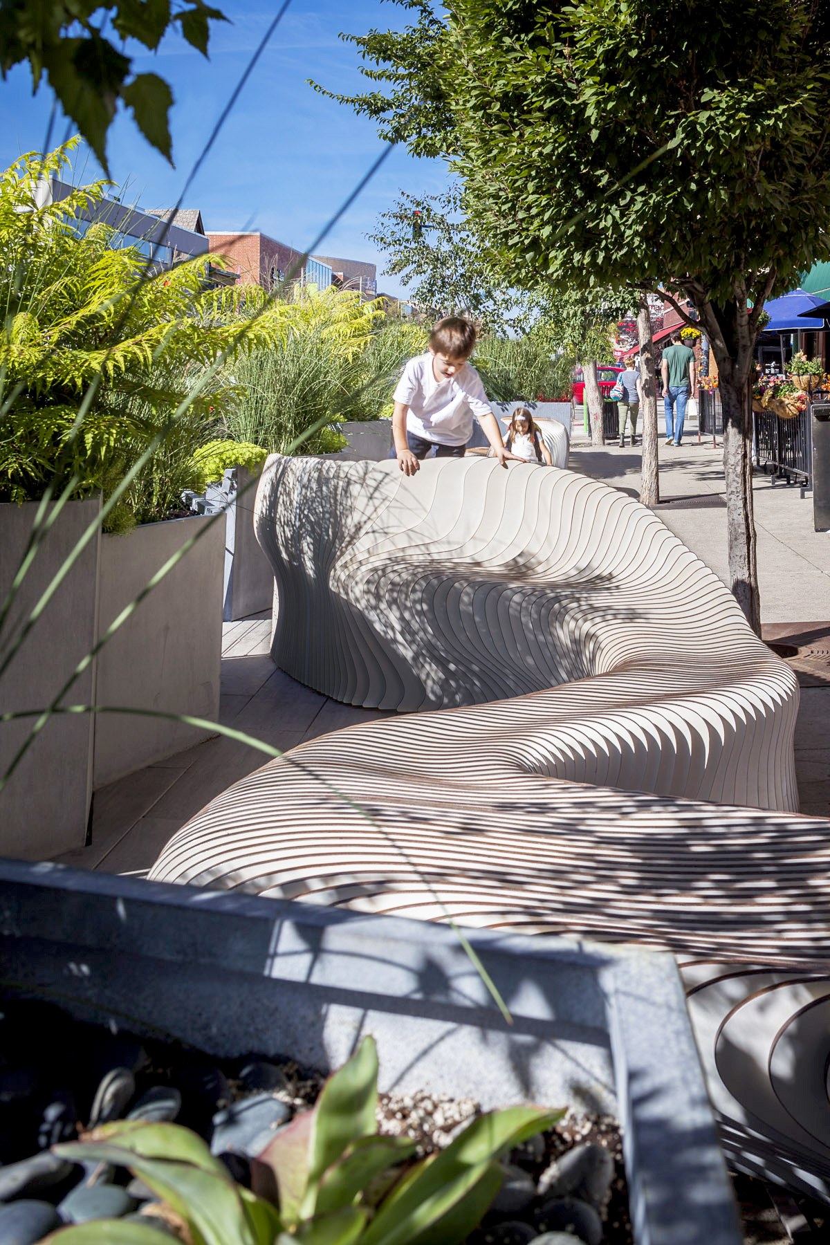
The Wave is three-dimensional art that is simultaneously a bench, chaise lounge, picnic table, laptop station and playground. Part of the City of Chicago’s “Make Way for People” initiative, wherein parking spots are taken over as “People Spots” for pedestrians, the structure invites social interaction from passersby with its undulating form.
Nine aluminum planters with cable rail infill evoke a park-like setting and enclose the area from street traffic. Made from 316 unique “fins,” cut from 4-by-8-foot sheets of marine-grade mahogany plywood, the object is fastened together by stainless steel rods with concealed bolts. “It is refreshing to see something so expressive with the space,” a juror said. “It’s good design which animates the heart of the city,” another juror added.
Two Barns
Location / Denver, Colo.
Architect of Record / Paul Preissner Architects
Client / Biennial of the Americas
Contractor / Powalski and Associates
Photos by Paul Preissner
A temporary structure that served as a stage for the Music for Animals festival—part of the 2013 Biennial of the Americas—these two “barns” existed for just six hours. The two barns played host to a performance by Nick Cave, an opera for dogs and an art installation of edible plants by artist Viviane Le Courtois. The odd orientation of the pop-up structures created eight architectural spaces in all, revealing a depth and understanding of “light, space and composition and how it all works together,” a juror said.
The $12,500 structure was composed of only two elements—simple Galvalume-coated prefabricated steel panels and distinctive “pink kimono” paint for the interiors. “Exceptional use of off-the-shelf products,” a juror said, before adding, “and, wow, what a cool space to see Nick Cave.”
Ping Tom Park Boathouse
Location / Chicago
Architect of Record / Johnson & Lee Architects and Planners
Client / Chicago Park District
Contractor / F.H. Paschen, S.N. Nielsen
Photos by Ballogg Photography
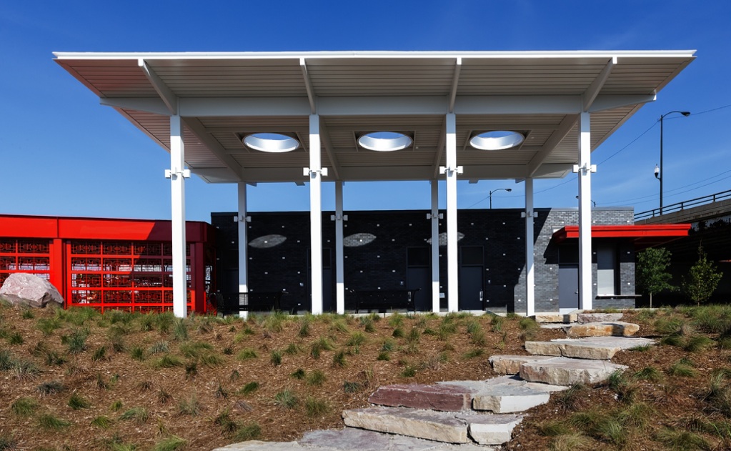
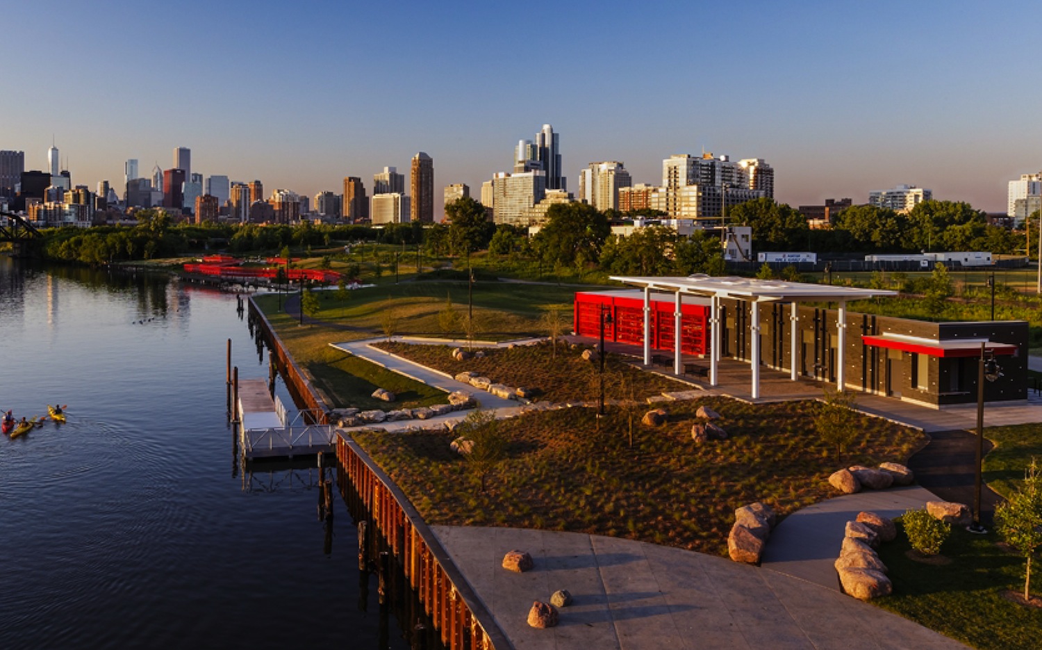
This Chinatown riverside project is the first boathouse in Mayor Rahm Emanuel’s plan to promote recreation on the Chicago River. Distinct components of the facility include a storage shed for kayaks and canoes; a comfort station and vending area; a porte-cochère resting ground; and a landscape path from the boathouse to the river. “Wonderfully sited and reflects the city’s desire to engage the river,” a juror said. Each part of the design employs a color and detailing all its own: The deep red steel storage shed enclosed with decorative screens and rolling shutters doors; the black masonry of the comfort station; the white steel canopy of the porte-cochère. The colors are intended to complement one another yet signal the functionality of each part on its own. “Everything is relational and in dialogue with each other, including the river,” a juror said.
Harbert Cottage
Location / Harbert, Mich.
Architect of Record / Searl Lamaster Howe Architects
Client / Withheld
Contractor / Estkowski Construction
Photos by Tony Soluri
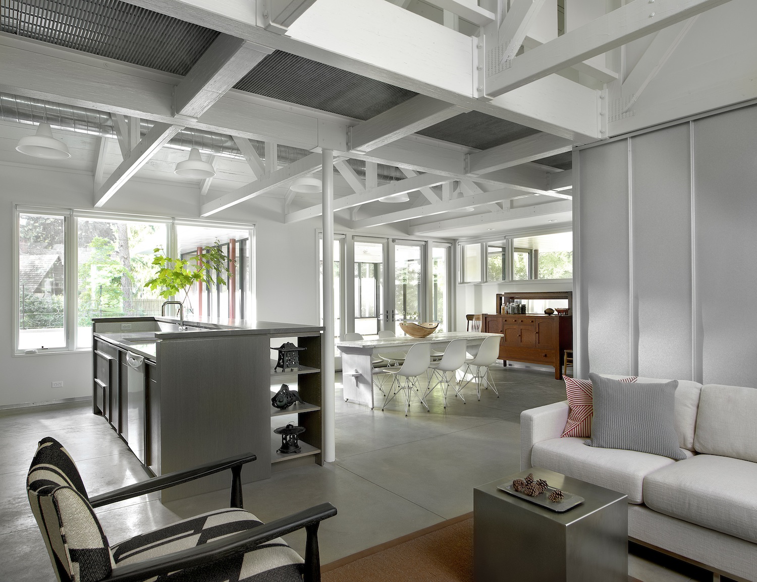
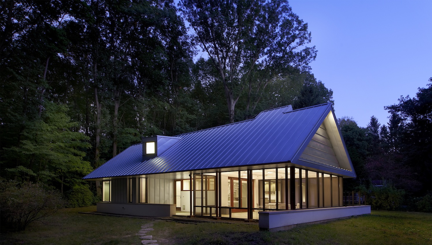
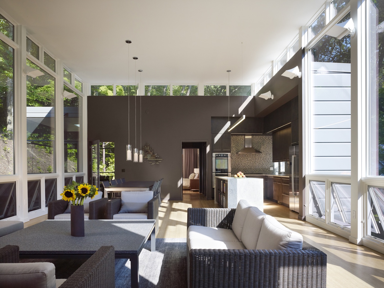
This project was an opportunity to reengineer and reinvigorate a classic American ranch house. The 1974 home was showing signs of its age with the roof caving in and a slowly-sinking slab. Its renovation was shaped by principles of simplicity, ease, durability and environmental responsiveness to the site. The architects designed a rehabilitation that revealed the building’s construction, crafting a new roof formed using basic mass-produced trusses, and adding clerestories to flood the interior with light.
“This is just an excellent use of prefab materials,” a juror said. “The place explodes with light,” added another. Coupled with generous overhangs, the detailing of the roof minimizes the need for air conditioning and a new geothermal system further minimizes energy consumption.
Atrium House
Location / Chicago
Architect of Record / dSPACE Studio
Client / Eric & Nicolette Nijensohn
Contractor / Z-Builders Inc.
Photos by Evan Thomas, Studio Thomas
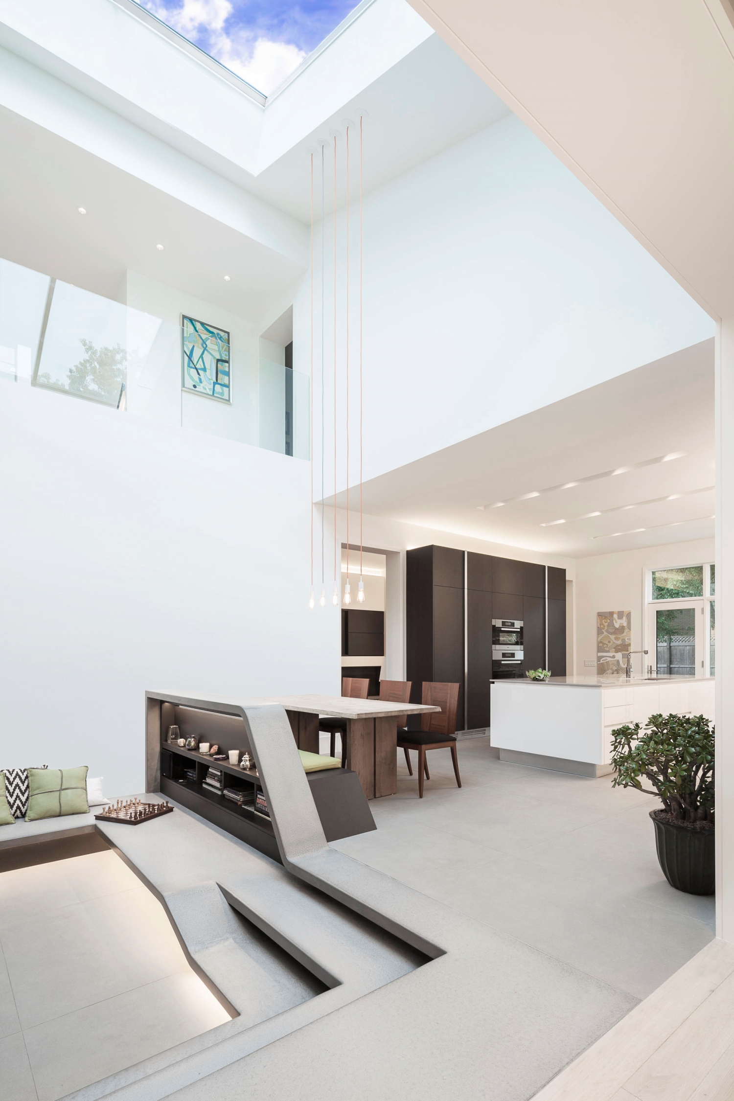
This decidedly quirky design by Chicago architect Marcel Freides had not been updated since its completion in 1978. In crafting a complete overhaul of the interior, the architects took their lead from the home’s literal centerpiece, an atrium that had acted as little more than an enclosed lightwell. By hanging a sleek new staircase within the atrium space, enlarging the glass opening at its top and removing some walls to open it into the surrounding rooms, they “made it more of a focal point,” a judge said.
“It’s a great space and it suffuses the home with natural light, which is always a problem in these urban environments.” Formerly somewhat barren, the atrium’s ground level became a lively family space, surrounded by a rock garden in a custom blackened steel planter and with its staircase morphing into banquettes. The detailing, one juror said, “is not about demonstrating detail but about bringing things together very simply.”
Cell Table
Location / Chicago
Architect of Record / Dirk Denison Architects
Client / Withheld
Photos by Michelle Litvin Photography
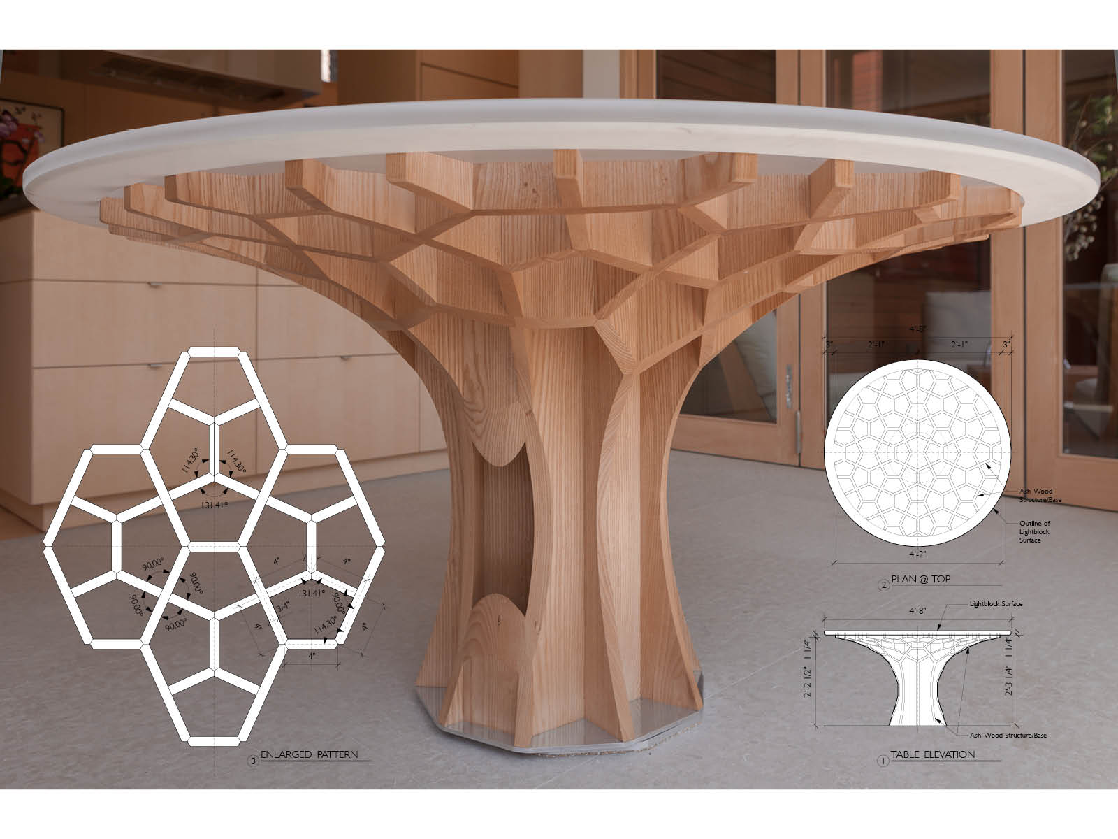
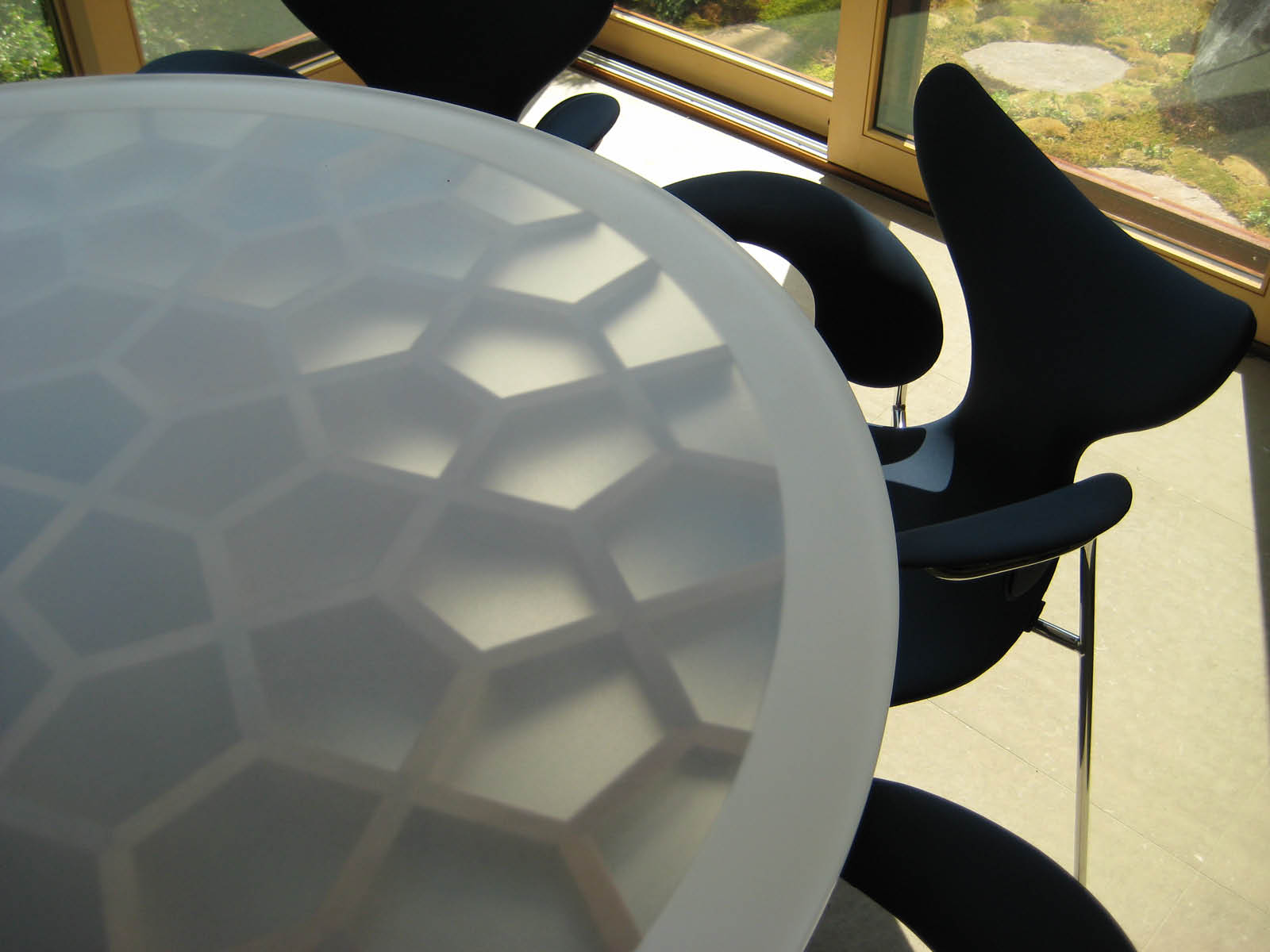
The cell patterns and structures found in coral reefs provided the model for this table, designed for the dining space in a client’s home. Because of the complexity of the design, the base was fabricated as extruded “tubes” of quartered ash.
Then a five-axis computer-controlled router followed the dictates of a 3-D digital model to machine the tubes into their ultimate forms. “There’s a lot of discipline that went into that,” one juror said. “Because of the way they carved into the sides of the honeycomb, they ultimately get a very sinuous profile.” The jurors also noted that the visible wood grain reinforces the cellular imagery. “It’s very organic, but made precisely,” a juror said.
The Club For Modern Fashions
Location / Chicago
Architect of Record / Vinci Hamp Architects
Client / The Arts Club of Chicago
Photos by Bill Zbaren and VHA
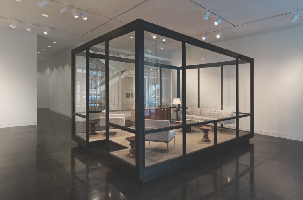
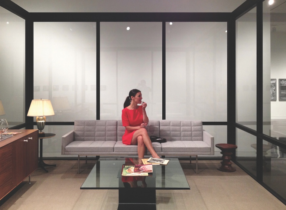
A temporary Miesian pavilion inserted within the Arts Club of Chicago in 2013 was a hit with jurors, one of whom dubbed it “an expressive vitrine.” Conceived as a container for an exhibit on modernist style called “Two Clubs at the Arts Club of Chicago,” the 12-by-16-foot demountable wood and glass structure stood near an authentic Mies structure, the club’s staircase, and looked like an isolated bay in one of his buildings.
Stocked with modernist furniture, the box helped visitors appreciate the fashions being shown in their vintage context, as if in a stylish living room of the day. The pavilion framed the exhibit expertly by blending with its subject, jurors agreed. In addition, one juror applauded the fact that the pavilion was elevated on a recessed, unseen base “to reinforce the lightness of the Miesian box.”
Grace
Location / Chicago
Architect of Record / Lawton Stanley Architects
Client / Grace Restaurant
Contractor / SAP Design
Photos by Huge Galdones and Anthony Tahlier
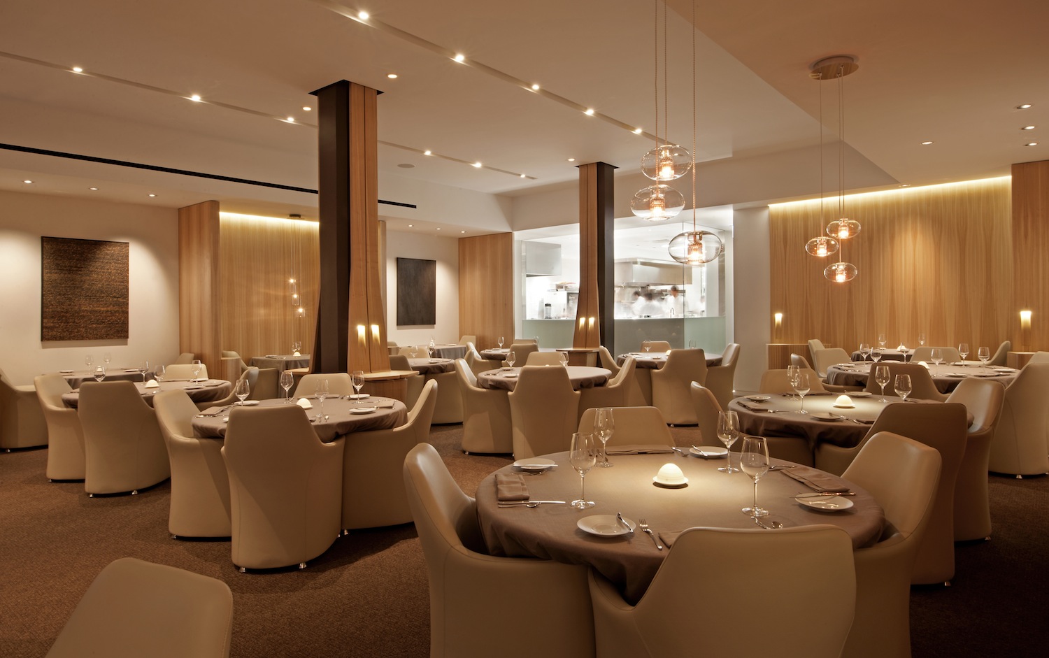
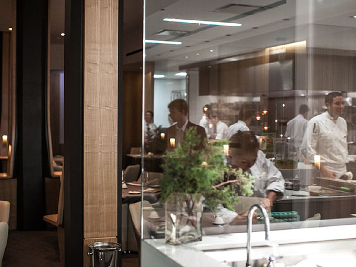
This restaurant interior distinguished itself by the restraint that guided selections of color and materials. “There was a command of the palette throughout the restaurant,” one juror noted. “This kind of follow-through creates an excellent atmosphere for dining.” The cuisine at the West Loop restaurant focuses on an honest expression of each ingredient’s natural flavor.
The architects attempted to reflect that authenticity by using materials in a minimally finished state—brown ash, honed stone, un-dyed wool and leather, oil-rubbed bronze, and patinated steel. “It’s a demonstration of high design mirroring the personality of the work that’s being done in the space,” a juror said. The jury singled out the integration of columns into the furnishings for special attention.
Little You
Location / Chicago
Architect of Record / Bureau of Architecture and Design
Client / Little You Inc.
Contractor / LG Development + Construction
Photos by Michael McAtee
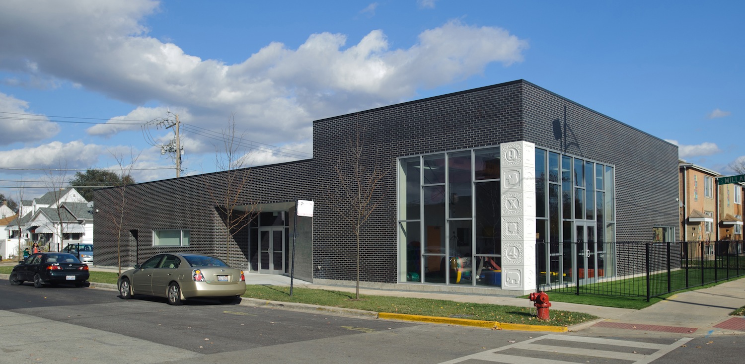
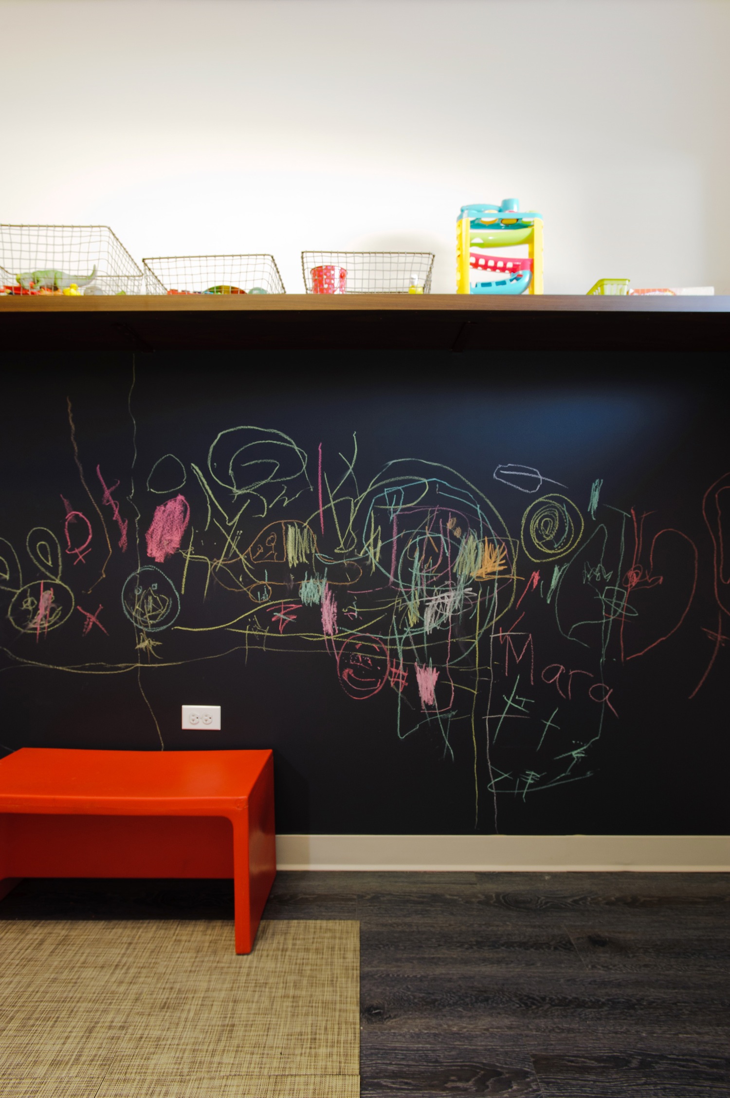
For a street corner site on Chicago’s Southwest Side, the architects created an inviting and sunny home for an organization that provides speech, occupational and developmental therapy services for children. Their budget was modest—$154 per square foot—but their results impressive. The entrance, where the facade peels back, has a tactile sense that comes from its board-formed concrete construction that children will want to touch, as do the oversized toy blocks that make up a corner column.
Once inside, children and their parents find “transparency and light, a place that children will enjoy being in,” a juror said. Resilient, kid-proof spaces with clean, modern lines and splashes of color that don’t go crazy gave Little You “a grown-up presence on a budget,” as one juror put it.
Onward Reception Wall
Location / Chicago
Architect of Record / Longo Park Design Workshop
Client / Onward Coworking
Photos by Shelby Kroger of Shelby Kroger Photography
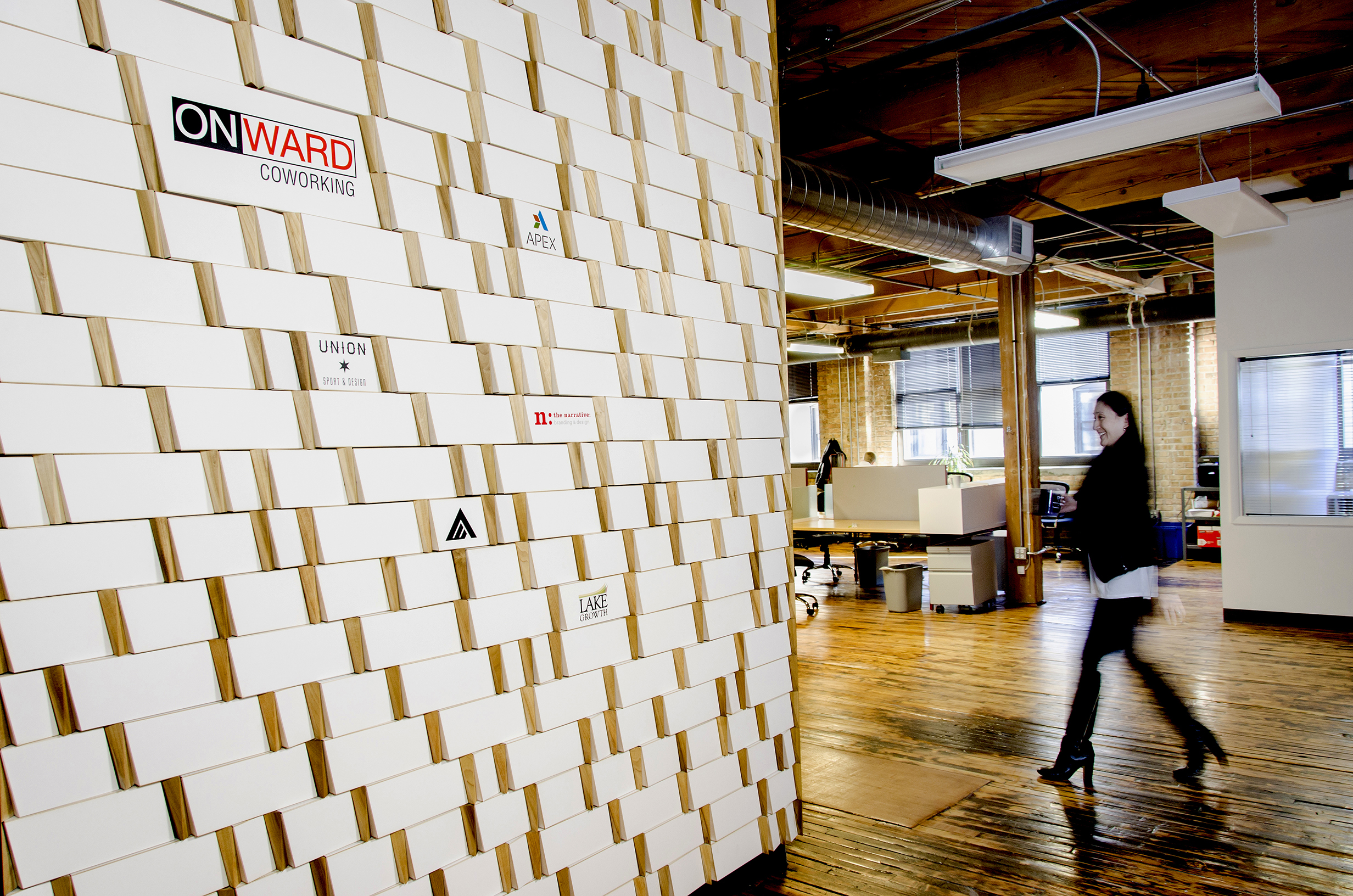
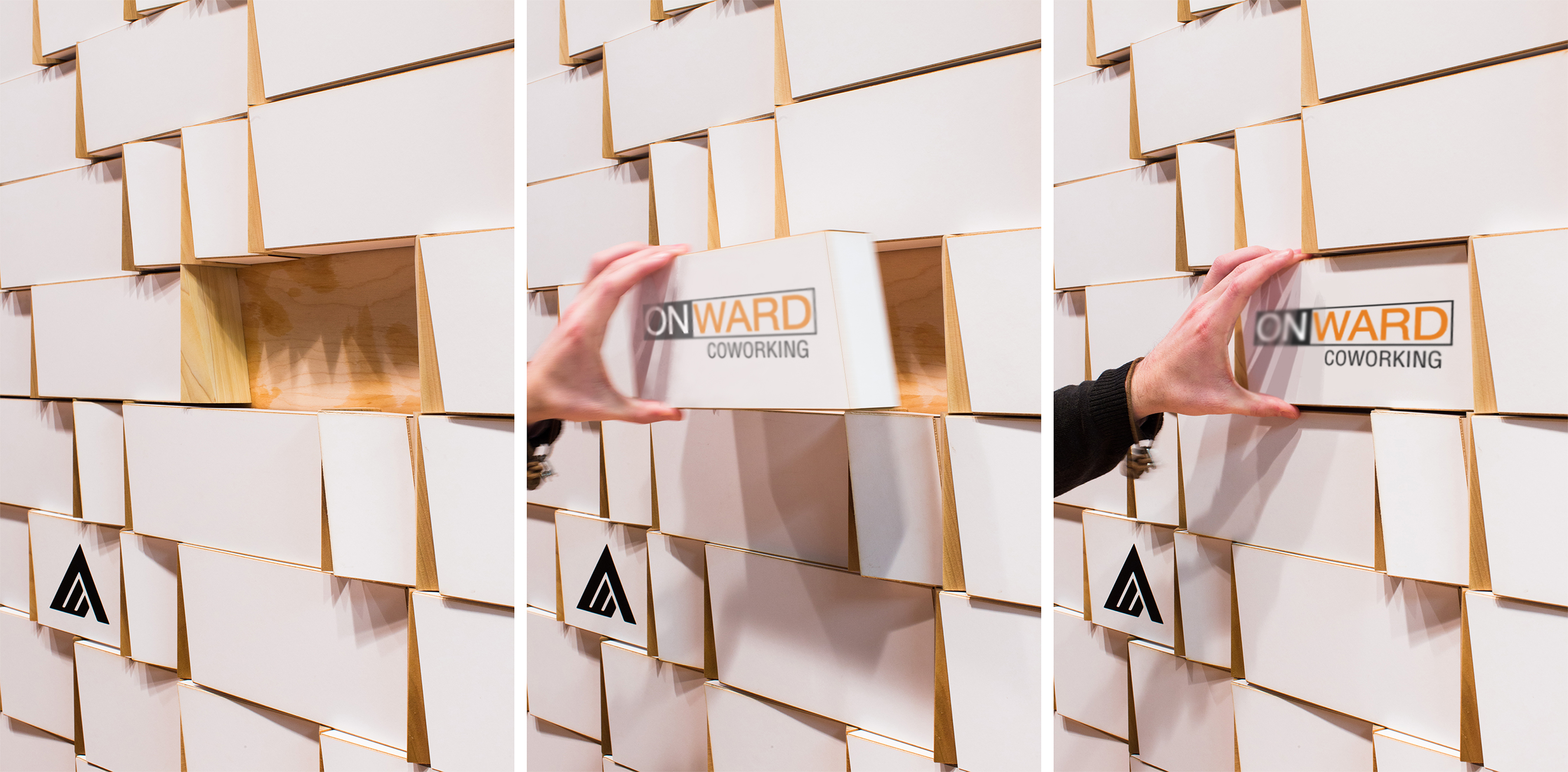
Jurors were smitten with the designers’ “clever use of exceptionally inexpensive materials” in this wall designed to have the names of participating firms in a coworking space inserted and removed cheaply. Coworking, a contemporary version of shared office space, can be a transitory setup for small enterprises. As they come and go by Onward Coworking, their logos can be traded into and out of the reception area’s main wall on interchangeable laser cut from typical mat board. Designed by the architects when they were tenants at Onward
Coworking and completed for $2,500, the wall “sets the right tone,” a juror said. “These don’t read as cardboard elements, but they’re low-cost and appropriate for an environment that changes frequently.”
Woodland Dune Home
Location / Bridgman, Mich.
Architect of Record / Kuklinski + Rappe Architects
Client / Withheld
Contractor / Olson Brothers Construction
Photos by Steve Hall, Hedrich Blessing
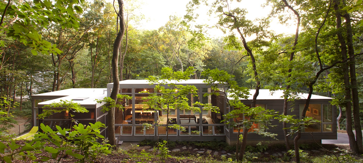
This weekend home built on a steep, forested dune drew the jurors in with the architects’ skillful use of what one called “off-the-shelf products” such as windows and doors in a design that “pulls together coherently without the [expense] of everything being made custom.” It was completed for $245/square feet, and the design also minimized cost of another kind: the cost to the site.
To reduce disturbance of the fragile site, the design has three overlapping pavilions that all cantilever from a retaining wall that runs along the uphill side of the house. Sustainable strategies include siting that maximizes sun exposure in winter, preservation of deciduous trees on the site for shade in summer, recycled metal siding and a thermally modified domestic wood rainscreen. “There’s a high level of respect for the environment,” a juror said, “and it must be a very nice place to spend the weekend.”
Safe House
Location / Joplin, Mo.
Architect of Record / Wrap Architecture
Client / AIA Designing Recovery Competition 2013
Photo © Wrap Architecture
Graphic Courtesy of Quad-Lock Building Systems Ltd., Drawing © Wrap Architecture
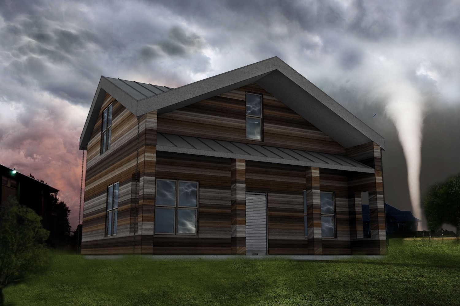
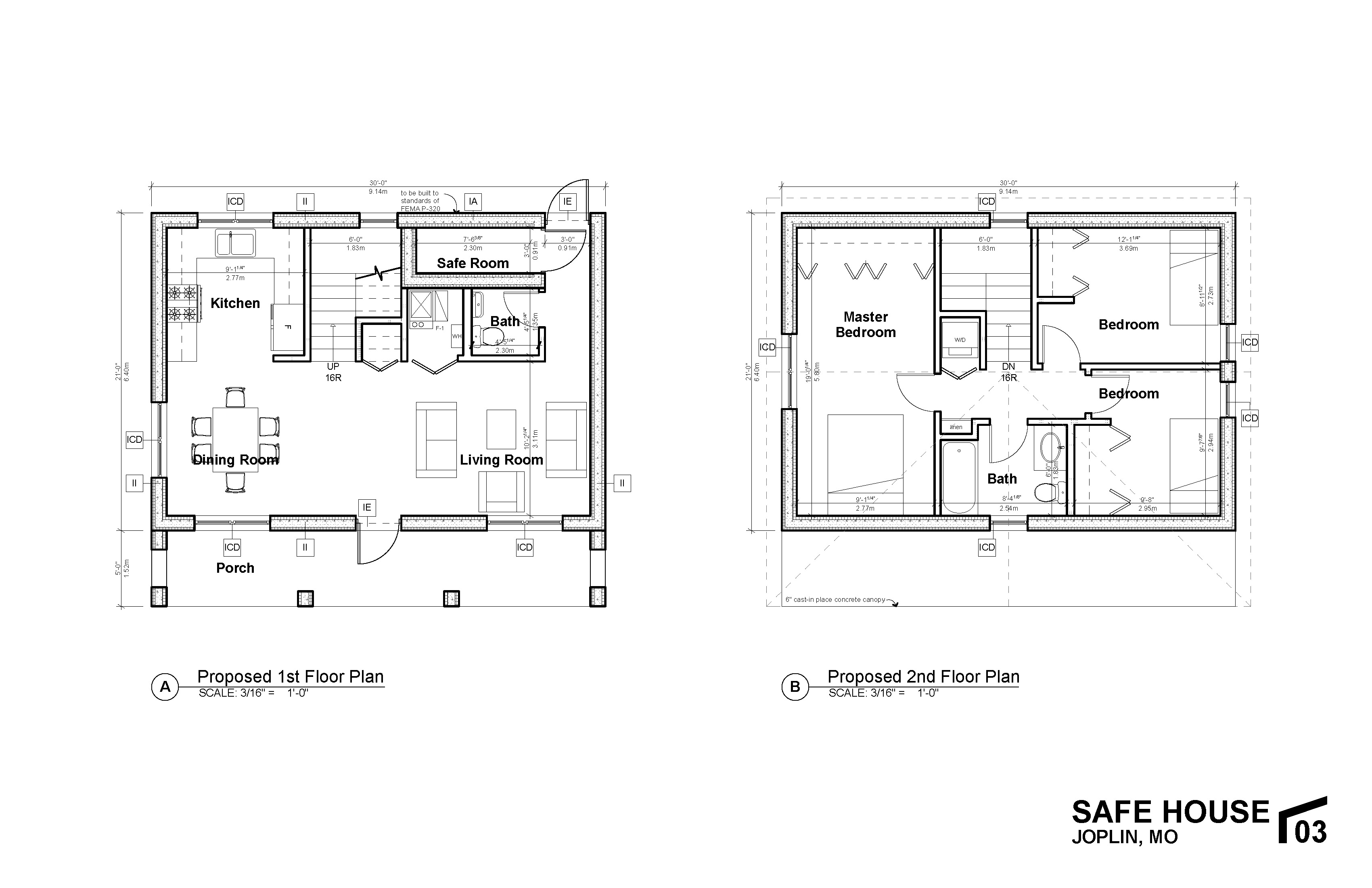
The challenge of designing a house that can withstand disastrous storms—and in particular, high winds—meant providing a form that can maintain a continuous structural load path from the roof to the foundation. The architects determined that building with insulated concrete forms could do that and at the same time cut the end users’ energy bills in half.
The design includes a pattern-printed concrete roof, roll-down shutters and fixed stainless steel screens that are rated to wind force of 175 mph. There is also a safe room for secure shelter during a storm event. “It’s a solid plan to combat some of the forces of nature,” a juror said. “It can take any challenges.” Although unbuilt as yet, the design, jurors agreed, is “an ambitious effort on a small budget.”
Barnsworth Exhibition Center
Location / Plano, Ill.
Architect of Record / Students of IIT College of Architecture
Client / Farnsworth House
Photos by Dave Burk, Hedrich Blessing
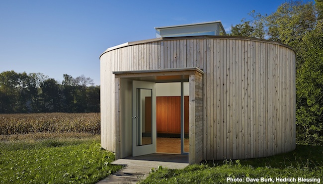
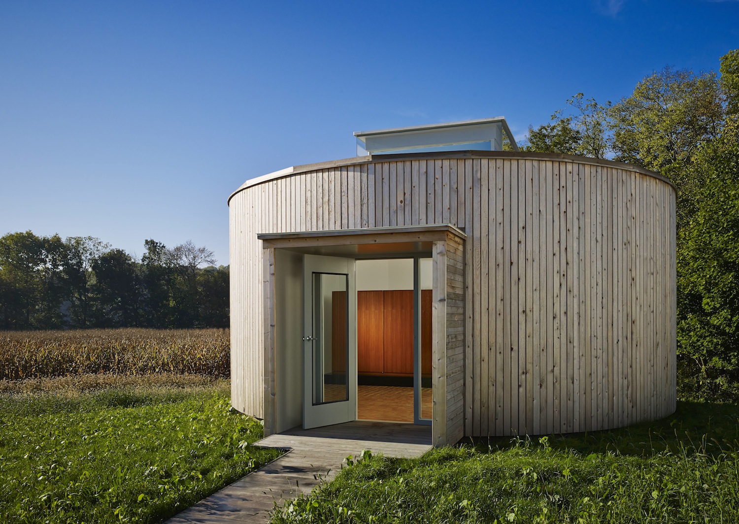
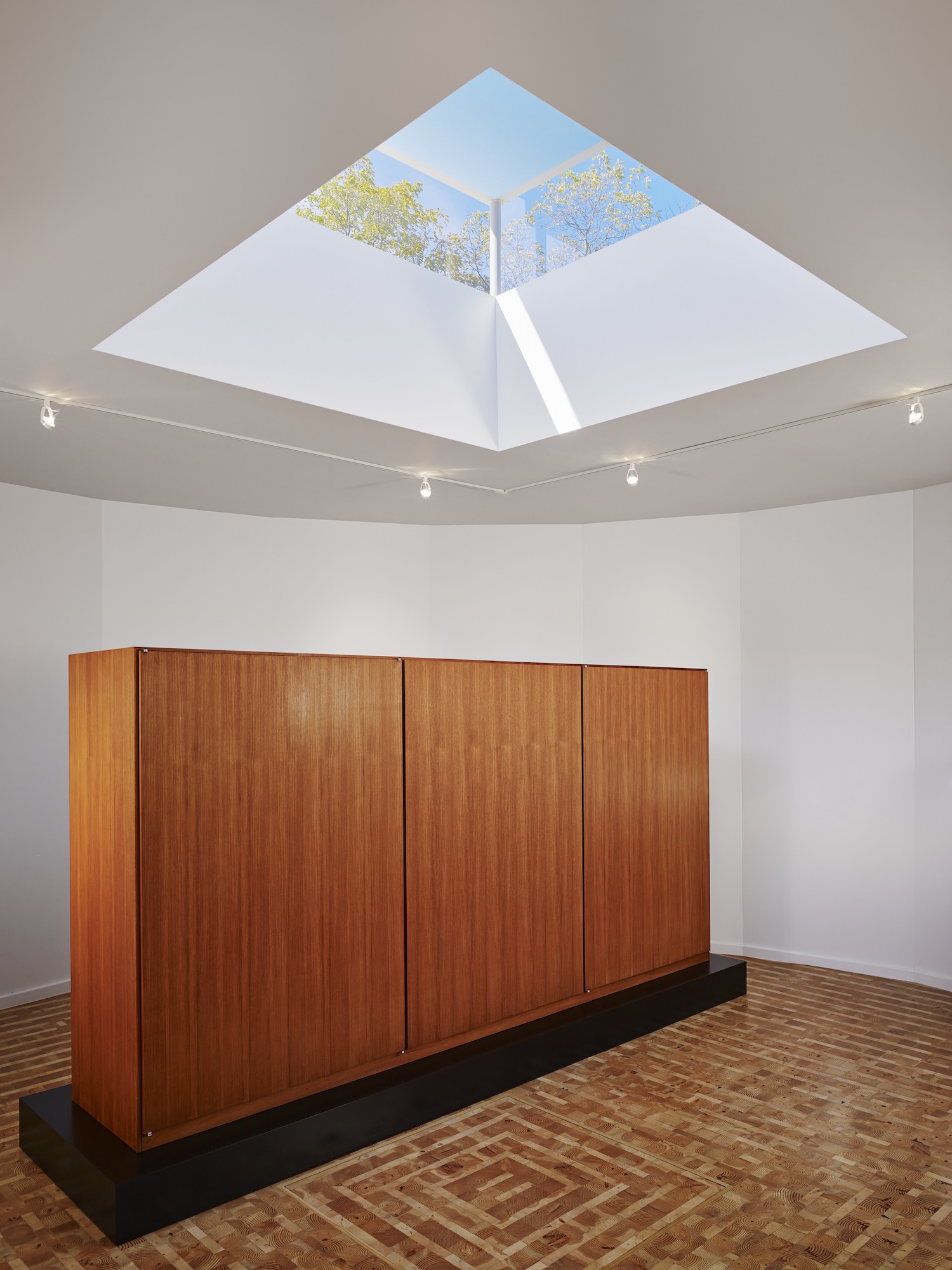
Fourth- and fifth-year architecture students at the Illinois Institute of Technology collaborated to design and build an exhibition and event space for the grounds of the iconic Farnsworth House. Meant to evoke the vernacular architecture in the rural area around the landmark, it is a contemporary take on a round barn, its walls solid to maximize exhibit space inside.
Its cap is a lantern-like projection that brings in abundant natural light. The students’ zeal for the project extended to such things as collecting lumber scraps from the project to make a handsome end-grain floor. The jurors were charmed by many aspects of the project and the thoughtful use of resources.
For more on the AIA Chicago Small Project Awards, visit: http://www.aiachicago.org/spa/
Related Stories
Curtain Wall | Aug 15, 2024
7 steps to investigating curtain wall leaks
It is common for significant curtain wall leakage to involve multiple variables. Therefore, a comprehensive multi-faceted investigation is required to determine the origin of leakage, according to building enclosure consultants Richard Aeck and John A. Rudisill with Rimkus.
MFPRO+ News | Aug 14, 2024
Report outlines how Atlanta can collaborate with private sector to spur more housing construction
A report by an Urban Land Institute’s Advisory Services panel, commissioned by the city’s housing authority, Atlanta Housing (AH), offered ways the city could collaborate with developers to spur more housing construction.
Adaptive Reuse | Aug 14, 2024
KPF unveils design for repositioning of Norman Foster’s 8 Canada Square tower in London
8 Canada Square, a Norman Foster-designed office building that’s currently the global headquarters of HSBC Holdings, will have large sections of its façade removed to create landscaped terraces. The project, designed by KPF, will be the world’s largest transformation of an office tower into a sustainable mixed-use building.
Sustainability | Aug 14, 2024
World’s first TRUE Zero Waste for Construction-certified public project delivered in Calif.
The Contra Costa County Administration Building in Martinez, Calif., is the world’s first public project to achieve the zero-waste-focused TRUE Gold certification for construction. The TRUE Certification for Construction program, administered by Green Business Certification Inc. (GBCI), recognizes projects that achieve exceptional levels of waste reduction, reuse, and recycling.
Modular Building | Aug 13, 2024
Strategies for attainable housing design with modular construction
Urban, market-rate housing that lower-income workers can actually afford is one of our country’s biggest needs. For multifamily designers, this challenge presents several opportunities for creating housing that workers can afford on their salaries.
University Buildings | Aug 12, 2024
Planning for growing computer science programs
Driven by emerging AI developments and digital transformation in the business world, university computer science programs are projected to grow by nearly 15% by 2030.
Energy Efficiency | Aug 9, 2024
Artificial intelligence could help reduce energy consumption by as much as 40% by 2050
Artificial intelligence could help U.S. buildings to significantly reduce energy consumption and carbon emissions, according to a paper by researchers at the Lawrence Berkeley National Laboratory.
Sponsored | Healthcare Facilities | Aug 8, 2024
U.S. healthcare building sector trends and innovations for 2024-2025
As new medicines, treatment regimens, and clinical protocols radically alter the medical world, facilities and building environments in which they take form are similarly evolving rapidly. Innovations and trends related to products, materials, assemblies, and building systems for the U.S. healthcare building sector have opened new avenues for better care delivery. Discussions with leading healthcare architecture, engineering, and construction (AEC) firms and owners-operators offer insights into some of the most promising directions. This course is worth 1.0 AIA/HSW learning unit.
Office Buildings | Aug 8, 2024
6 design trends for the legal workplace
Law firms differ from many professional organizations in their need for private offices to meet confidentiality with clients and write and review legal documents in quiet, focused environments
Data Centers | Aug 8, 2024
Global edge data center market to cross $300 billion by 2026, says JLL
Technological megatrends, including IoT and generative AI, will require computing power to be closer to data generation and consumption, fueling growth of edge IT infrastructure, according to a new JLL report.


