After 11 years of designing medical-surgical nursing units, I recently had the opportunity to spend a day observing one nurse through most of a shift. Don’t get me wrong, I had a solid grasp of the fundamentals of the typical nursing routine, thanks to years of learning from experienced colleagues and user-group meetings. But in eight hours of direct observation, I saw and learned things that had never come up in past conversations. Here are eight valuable lessons I learned from observing a nurse I’ll call Angela:
1. The daily flow of a hospital can conflict with efforts to minimize steps. In general, Angela rounds on an hourly basis and plans her trips for maximum efficiency. The day I observed, however, she faced interruptions from the nurse call, the need to track down other services from the institution, and colleagues requiring assistance. Angela also made frequent “hunting and gathering” trips for meds and supplies.
2. The length of time nurses spend on each task can be very brief. While some tasks required five, 10, or even 20 minutes, Angela completed many in just 30-90 seconds. Typically, mornings and mealtimes are the highest-activity periods that require frequent rounding and response to the nurse call. The mid-afternoon is slow. During the high-activity times, nurses changed tasks rapidly, often spending less than one minute on each activity. During low-activity times, when patients were either sleeping or did not need medication, nurses were able to sit for 20-30 minutes and catch up on documentation.
‘Most collaboration took place in the busy, noisy corridor. Although quieter spaces were available, the doctors, nurses, AND EVS staff did not use them because they were not convenient.’
— Carolyn Fleetwood Blake, GS&P
3. The med room is the most frequently visited room. During my observation, medication was by far the most frequent cause of nurse calls or scheduled visits to patient rooms. Our strategy of providing one nourishment room and two medication and clean supply rooms per unit is valid. However, if budget or space limitations force us to choose between two clean supply rooms or two medication rooms, the med rooms should win.
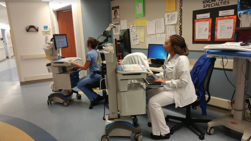
4. Doors get in the way. This lesson poses a thorny design problem for AEC teams. Doors are required for functional reasons and code requirements, but the frequency and short duration of many trips can also make them a major inconvenience and a safety hazard for hospital staff. At times, Angela parked her computer-on-wheels (COW) in the corridor because a doorway created too much of a barrier. This practice could become a serious safety issue if nurses did not scan medications immediately after retrieving them from the Pyxis drawers. Potential solutions include a wall-mounted computer in the med room, hip latches, or well-calibrated door-closers.
5. Nurses spend a lot of time on the phone. During my eight-hour visit, Angela made or received 26 phone calls. She was often called out of patient rooms in order to answer the phone, and most calls took place in the substations and involved the pharmacy, doctors, or social services. The amount of time Angela spent on the phone was a revelation: Should we provide more phones in facilities where existing conditions do not allow for nurse perches outside of each room? While I’ve never heard it mentioned in a user-group meeting, making such a large number of calls in inconvenient or noisy locations could interfere with patient care.
6. There was no giant shift change meeting. I kept waiting for the shift change meeting, and was disappointed. Instead of gathering as a large group, the nurses going off shift paired up with the nurses just getting to work and made the rounds of the patient rooms. The day-shift nurses introduced the night-shift nurses to the patients and gave summaries of what had occurred during the day. The largest group conversation I saw was a group of residents who met in the main corridor, even though there was enough space in the nearby dictation room. Most collaboration took place in the busy, noisy corridor. Although quieter spaces were available, the doctors, nurses, and EVS staff did not use them because they were not convenient. This leads to my next point.
7. Things that are not convenient aren’t used. Nurses stand all day, which leads to back pain and sore feet, but the armless task chairs available in the substations were often not used. Using the chairs required lowering the COW to seated height, pulling out a chair, sitting down, then raising the COW again at the end of documentation. For a 30-90-second task, this was just too much trouble.
On the other hand, being able to sit for those few seconds at a time throughout the day would add up. Nurses might benefit more from a tall “kitchen stool” type of approach. I have participated in many med/surg user group meetings, including ones focused on furniture planning, yet I have never heard a nurse comment about the task chair being inconvenient. Although many hospitals are getting away from using COWs, this is a perfect example of pertinent information gained from direct observation that would not have come up in a planning meeting.
8. Shadow your clients’ clinical staff. Many clinicians involved in user groups have worked at only a few facilities or have accepted workarounds and ineffective designs as “the way things are.” Designers are often familiar with a much broader spectrum of facilities and can recommend the best approach from a variety of possible solutions to a problem—but only if we know about the problem in the first place.
About the author:
Carolyn Fleetwood Blake, IIDA, LEED AP, EDAC, is an Interior Designer in GS&P’s Jacksonville, Fla., Healthcare Studio.
More from Author
Gresham Smith | Oct 16, 2024
How AI can augment the design visualization process
Blog author Tim Beecken, AIA, uses the design of an airport as a case-study for AI’s potential in design visualizations.
Gresham Smith | Aug 17, 2023
How to design for adaptive reuse: Don’t reinvent the wheel
Gresham Smith demonstrates the opportunities of adaptive reuse, specifically reusing empty big-box retail and malls, many of which sit unused or underutilized across the country.
Gresham Smith | May 24, 2023
Designing spaces that promote enrollment
Alyson Mandeville, Higher Education Practice Leader, argues that colleges and universities need to shift their business model—with the help of designers.
Gresham Smith | Apr 24, 2023
Smart savings: Commissioning for the hybrid workplace
Joe Crowe, Senior Mechanical Engineer, Gresham Smith, shares smart savings tips for facility managers and building owners of hybrid workplaces.
Gresham Smith | Mar 20, 2023
3 ways prefabrication doubles as a sustainability strategy
Corie Baker, AIA, shares three modular Gresham Smith projects that found sustainability benefits from the use of prefabrication.
Gresham Smith | Jan 19, 2023
Maximizing access for everyone: A closer look at universal design in healthcare facilities
Maria Sanchez, Interior Designer at Gresham Smith, shares how universal design bolsters empathy and equity in healthcare facilities.
Gresham Smith | Dec 20, 2022
Designing for a first-in-the-world proton therapy cancer treatment system
Gresham Smith begins designing four proton therapy vaults for a Flint, Mich., medical center.
Gresham Smith | Nov 21, 2022
An inside look at the airport industry's plan to develop a digital twin guidebook
Zoë Fisher, AIA explores how design strategies are changing the way we deliver and design projects in the post-pandemic world.
Gresham Smith | Feb 13, 2022
Helping maximize project dollars: Utility coordination 101
In this post, I take a look at the utility coordination services our Transportation group offers to our clients in an attempt to minimize delays and avoid unforeseen costs.
Gresham Smith | May 7, 2021
Private practice: Designing healthcare spaces that promote patient privacy
If a facility violates HIPAA rules, the penalty can be costly to both their reputation and wallet, with fines up to $250,000 depending on the severity.


