We’ve all seen them: buildings that stand out – in a bad way. Developers can follow every best practice out there, but if an urban building isn’t grounded in the region’s character, it will end up feeling generic and out-of-place.
The increasing popularity of urban infill is creating great opportunities to improve how cities look and feel, but it also comes with its own set of challenges. To do urban infill the right way, it’s essential to slow down and pay proper attention to the context of an urban environment.
Trends in the consumer market are making density more desirable. The automobile, once lauded for the freedom it afforded, is now considered a detriment as commute times and transportation costs explode. On a larger scale, infrastructure costs are increasing, and people are valuing walkability, convenience, and social interaction more so than wide open spaces. Car-centric areas become less favorable every day, and the trend is almost certain to continue. (Consider this recent news that today’s teenagers are hardly interested in getting their driver’s licenses.)
As urban populations grow, so does the need to better utilize existing infrastructure. That’s where urban infill comes in, saving us from sprawl, making the streetscape a richer experience, and driving the creation of all sorts of new services, shops, and attractions.
Challenges and Best Practices
Developers, and the architects and planners they hire, should strive to approach infill projects with an understanding of commonly acknowledged urban-design principals. Some of them include:
• Buildings themselves should form the street edge, not parking or landscaping.
• Orient the design toward the pedestrian experience. Designing for the sky might make for a beautiful architectural rendering but can ignore the experience for the vast majority of users. Aim for open and inviting ground-floor spaces with no blank walls and no hidden corners, which are disconcerting and uninviting. For tall buildings, consider an articulated base with a step back to allow tall structures to address the scale at the street better without dwarfing its users and neighbors.
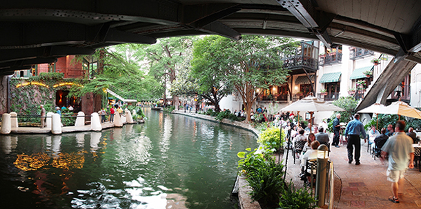
• Create sidewalks that not only promote easy travel, but also serve as a connection of the indoors and outdoors. Al fresco dining and merchant displays promote a hospitable, friendly atmosphere.
• Thoughtfully integrate landscaping that promotes protection of the pedestrian from the car or from the sun, and green elements that can soften the hard materials of an urban environment.
Embracing a Region’s Character
But, as I mentioned earlier, applying the above principals can only get you so far. If proper attention isn’t paid to the regional context, a building can end up feeling sterile and void of character. When you add a building to an old city, or really any city, it becomes part of its identity. The building should respond to what is already there in a way that is thoughtful but also progressive.
Unlike suburban areas, where buildings tend to be more detached from one another and possess less of a defining character, urban areas give us loads of context that we should make an effort to respect. Our built environment is our history, and that history should be preserved no matter the extent of urban infill. It’s the subtle things that make a place what it is.
Colors. Similar characteristics exist in both Charleston, S.C., and New Orleans, but Charleston's subdued stucco and limestone facades are far different than the multicolor experience that is New Orleans. Likewise, the deep reds of old town Philadelphia cannot be separated from one’s perception of the place.
Scale. This should go without saying, but it is all too often ignored. Anyone can point to a building that is obviously out of place, but the problem can be as much about details as it is about massing. As an example, the desire to have a tall ground floor is greater in a hot southern climate than in a moderate one. And the width of a sidewalk is different in front of a row house than in front of a restaurant.
Texture. What does your eye see and your foot feel? The rounded ballast stones of Savannah streets are a very different texture than the flat cobblestones of Philly. How do indigenous trees change your perception of light and scale?
Details. In your city, do existing storefronts recess at the entry or are they flush with the street? How do buildings deal with slopes? Asheville, N.C., has a different answer than Seattle. On the levels above the street, how does one get outside? Some cities like New Orleans prefer ornate balconies, while cities like Nashville, Tenn., don't have projections and use the interior of the building as the balcony.
Smells. This may make people scoff, but cities can have a positive association with smell. The way thousands of tulips smell in Amsterdam has no equal, and many southerners are familiar with the sweet aroma of a Magnolia tree. Even the cuisine of cities plays a role in our subtle perceptions, like the smell of the low-country cooking wafting through the streets of Charlestown.
These are subtle design details that have a powerful ability to make a building look or feel “right” in a certain area. Context tells us whether a design fits in and guides our decisions.
No, we don’t want to freeze-frame time and have every building look like it’s of the same era. We just want for a city’s buildings to at least share some regional characteristics that make a place a place. Infill is an architecture of reassurance. That’s why European cities work so well. Their modern buildings, while aggressive, don’t shock the senses. They’re still contextually sensitive with an organic link to their history.

New residential buildings on Amsterdam’s waterfront respect and echo the design of their historic counterparts while still embracing modernism. Photo courtesy GS&P
What’s most important is being cognizant that buildings last a long time. And each long-lasting addition shapes the city’s character. Urban infill has the ability to prevent a building or space from becoming useless, and by being purposeful and thoughtful in the way we approach these projects, developers, architects, and planners can work together to help each new project become an intrinsic part of an evolving city that never forgets its roots.
About the Author
Joe Bucher, AIA, is a Senior Architect in GS&P’s Corporate + Urban Design market. He has 12 years of design experience in multiple regions with numerous project types including corporate, multifamily, mixed-use, retail, adaptive re-use, academic, civic, hospitality, institutional and land planning. Complex urban projects form the core of his expertise, and he’s led several award-winning teams by focusing on community design, sustainability, and emphasizing client service. More on Bucher.
More from Author
Gresham Smith | Oct 16, 2024
How AI can augment the design visualization process
Blog author Tim Beecken, AIA, uses the design of an airport as a case-study for AI’s potential in design visualizations.
Gresham Smith | Aug 17, 2023
How to design for adaptive reuse: Don’t reinvent the wheel
Gresham Smith demonstrates the opportunities of adaptive reuse, specifically reusing empty big-box retail and malls, many of which sit unused or underutilized across the country.
Gresham Smith | May 24, 2023
Designing spaces that promote enrollment
Alyson Mandeville, Higher Education Practice Leader, argues that colleges and universities need to shift their business model—with the help of designers.
Gresham Smith | Apr 24, 2023
Smart savings: Commissioning for the hybrid workplace
Joe Crowe, Senior Mechanical Engineer, Gresham Smith, shares smart savings tips for facility managers and building owners of hybrid workplaces.
Gresham Smith | Mar 20, 2023
3 ways prefabrication doubles as a sustainability strategy
Corie Baker, AIA, shares three modular Gresham Smith projects that found sustainability benefits from the use of prefabrication.
Gresham Smith | Jan 19, 2023
Maximizing access for everyone: A closer look at universal design in healthcare facilities
Maria Sanchez, Interior Designer at Gresham Smith, shares how universal design bolsters empathy and equity in healthcare facilities.
Gresham Smith | Dec 20, 2022
Designing for a first-in-the-world proton therapy cancer treatment system
Gresham Smith begins designing four proton therapy vaults for a Flint, Mich., medical center.
Gresham Smith | Nov 21, 2022
An inside look at the airport industry's plan to develop a digital twin guidebook
Zoë Fisher, AIA explores how design strategies are changing the way we deliver and design projects in the post-pandemic world.
Gresham Smith | Feb 13, 2022
Helping maximize project dollars: Utility coordination 101
In this post, I take a look at the utility coordination services our Transportation group offers to our clients in an attempt to minimize delays and avoid unforeseen costs.
Gresham Smith | May 7, 2021
Private practice: Designing healthcare spaces that promote patient privacy
If a facility violates HIPAA rules, the penalty can be costly to both their reputation and wallet, with fines up to $250,000 depending on the severity.


