A decade or two ago, design for higher-education institutions centered primarily on traditional classrooms and dormitories. But today’s college students have greater expectations: for connectivity, for comfort, for inspiration. To deliver facilities that enable living and learning in this new academic landscape, designers are thinking out-of-the-box (and off-the-campus, as private developers offer increasingly appealing live/learn/play alternatives right next door). The New Student blog series discusses higher-ed design trends and best practices for supporting the millennial generation.
I’m excited to conclude GS&P’s The New Student blog series by discussing what I feel is potentially the most important social aspect of millennials’ university experience: dining. Don’t get me wrong – I realize that today’s college students are more on-the-go than ever, and on-the-go food must be available to them. But meals are still a central part of daily life, with studying, meetings, friendships and relationships happening around the table. When I think back to my own experience at the University of Tennessee years ago, it’s one of the primary things that hasn’t changed between then and now. The dining halls, cafeterias and bistros (come to think of it, bistros didn’t yet exist on the University of Tennessee campus when I was a student) may look quite different, and technology and amenities may support a far more pleasing experience, but the camaraderie and collaboration that happens in these spaces is, refreshingly, the same.
What I’ll talk about today are the key design elements that appeal to millennials who, as we’ve made clear in this series, expect an elevated campus-wide experience. This is a generation that can afford to visit some of the city’s finest restaurant offerings when they venture off-campus, and a generation that can commend or condemn a meal with a quick Yelp! Review, so we have to design for their evolved tastes. Here’s a look at the most important things we bear in mind:
Location, location, location!
A prime location is the baseline goal with any modern campus-dining facility. Its importance is on par with opening a retail store on street-level, in the most highly trafficked part of the city. For the dining spaces I’ve designed with GS&P, our team has aimed for a “corner of Main & Main” location whenever possible. It should be at the center of activity, highly convenient and easily accessed as students traverse campus on foot or bicycle.
Visibility
There’s another component of “good location” that’s not as obvious. We’ve learned through conversations with millennial students that campus dining is, more than anything else, about seeing and being seen. So in addition to making sure the facility itself is easily accessed, it’s important that the arrangement of seating inside the space is optimized for visibility. We strive to maximize sight lines with interior design, so students already seated can see who’s entering the cafeteria, and students entering can see what friends have already arrived and where they should pull up a chair. Visibility elevates the dining space to a social center.
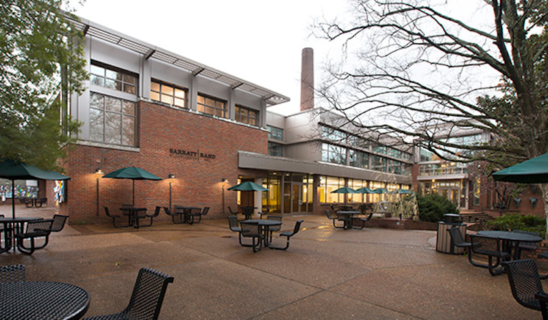
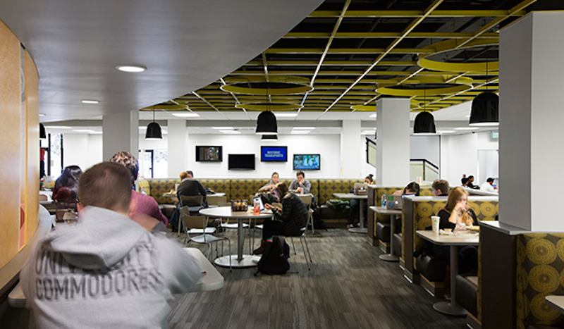 Campus dining spaces aren't only about food; they're a hub for studying, camaraderie and connectivity. Photo courtesy of GS&P.
Adaptability
One more important element of a university dining space, evidenced by research in the form of surveys and conversations with students, is adaptability. We touched on the idea of flexibility during our first blog post about classrooms and study areas, and because dining spaces are often some of the most popular places to meet with classmates, adaptability is equally important in the cafeteria. We introduce a variety of seating options like tables with chairs that can quickly added or removed, booth seating for a sense of privacy, and even tiered seating for group meetings and presentations. And we’ve designed spaces that can evolve throughout the day. At Vanderbilt University, the Chef James Bistro transforms after breakfast and lunch into a performance area around dinnertime. We included a stage for concerts and speeches, and the space truly comes alive as entertainment, rather than meals, becomes the focus.
Style
The style element in a campus dining space is often the greatest challenge. To some degree, we aim for a timeless aesthetic with durable materials, because we know universities can’t re-invent their food service locations every few years and it’s difficult to keep such high-traffic, high-use areas clean. But we still want it to feel modern and on-trend, in order to appeal to millennials – it’s a delicate balance to strike, with the right combination of colors, furniture and other materials helping us achieve our goal. And we also bring in our Branded Environments designers to help us strategically incorporate the university’s branding and identity throughout the space.
If you’ve read the other posts in our series, you’ve likely noticed a theme in millennial-focused design. No matter the type of space – library, classroom, apartment, retail store or dining hall – today’s students want convenience, quality and flexibility. By designing with those elements in mind, universities can achieve the dynamic spaces that millennials want.
More from Author
Gresham Smith | Oct 16, 2024
How AI can augment the design visualization process
Blog author Tim Beecken, AIA, uses the design of an airport as a case-study for AI’s potential in design visualizations.
Gresham Smith | Aug 17, 2023
How to design for adaptive reuse: Don’t reinvent the wheel
Gresham Smith demonstrates the opportunities of adaptive reuse, specifically reusing empty big-box retail and malls, many of which sit unused or underutilized across the country.
Gresham Smith | May 24, 2023
Designing spaces that promote enrollment
Alyson Mandeville, Higher Education Practice Leader, argues that colleges and universities need to shift their business model—with the help of designers.
Gresham Smith | Apr 24, 2023
Smart savings: Commissioning for the hybrid workplace
Joe Crowe, Senior Mechanical Engineer, Gresham Smith, shares smart savings tips for facility managers and building owners of hybrid workplaces.
Gresham Smith | Mar 20, 2023
3 ways prefabrication doubles as a sustainability strategy
Corie Baker, AIA, shares three modular Gresham Smith projects that found sustainability benefits from the use of prefabrication.
Gresham Smith | Jan 19, 2023
Maximizing access for everyone: A closer look at universal design in healthcare facilities
Maria Sanchez, Interior Designer at Gresham Smith, shares how universal design bolsters empathy and equity in healthcare facilities.
Gresham Smith | Dec 20, 2022
Designing for a first-in-the-world proton therapy cancer treatment system
Gresham Smith begins designing four proton therapy vaults for a Flint, Mich., medical center.
Gresham Smith | Nov 21, 2022
An inside look at the airport industry's plan to develop a digital twin guidebook
Zoë Fisher, AIA explores how design strategies are changing the way we deliver and design projects in the post-pandemic world.
Gresham Smith | Feb 13, 2022
Helping maximize project dollars: Utility coordination 101
In this post, I take a look at the utility coordination services our Transportation group offers to our clients in an attempt to minimize delays and avoid unforeseen costs.
Gresham Smith | May 7, 2021
Private practice: Designing healthcare spaces that promote patient privacy
If a facility violates HIPAA rules, the penalty can be costly to both their reputation and wallet, with fines up to $250,000 depending on the severity.

