“Signage is the wow moment of arrival – it’s how you know that you are there.”
This is a direct quote from a session on wayfinding at a NAI (National Association of Interpretation) Conference that I recently attended. At the time I thought what a sad statement. Not that I have anything against signage. It is, after all, a critical component of wayfinding. The thing I objected to is the all too common belief that signage is wayfinding. In fact, the best type of wayfinding is that which is intuitive.
Intuitive wayfinding is much like navigating via waypoints—moving from point to point to point. The skill in designing intuitive wayfinding is understanding the visual and physical clues that help pull people through a space without the need for intensive signage. In doing so, the interpretive journey is much less stressful and therefore, much more enjoyable.
The most ideal form of intuitive wayfinding is to have a visible destination. This could be the ultimate destination, or it could be a waypoint that helps guide one to their ultimate destination. This strategy requires that each destination is clear and that successive destinations are revealed as one moves along a path. A good example of this strategy can be seen at the Ford Orientation Center at George Washington’s Mount Vernon. As visitors enter the building, they are immediately drawn to a grouping of statues of the first family. As they arrive at the statues, the rest of the space is revealed with a direct view to other interpretive opportunities throughout the building, thereby intuitively moving visitors through the building and toward their ultimate destination—George Washington’s estate and mansion.
 Upon entering the Ford Orientation Center, visitors gravitate to the life-size bronze statues of George & Martha Washington and their grandchildren. They are then naturally drawn to the lower lobby which features Mount Vernon in Miniature and a series of stained-glass panels depicting crucial moments in Washington’s life before entering one of two theaters to watch a 20-minute orientation film.
Understanding human nature is important to intuitive wayfinding as well. In the interpretive world, there is a commonly held belief that people’s intuition is to turn or move to the right. It’s a bit of a “chicken and egg” discussion as to whether our environments have conditioned us to turn right versus some subliminal tendency. However, I do think it is fair—at least in the United States—to assume people tend to move to the right, given equal choices. Other examples of human nature include the tendency to follow/stay on the widest, most improved path and the fact that people tend to be more aware of things at eye level—think of merchandising at your local supermarket. When designing spaces to be intuitively navigated, it is important to consider all of these and other aspects of human nature.
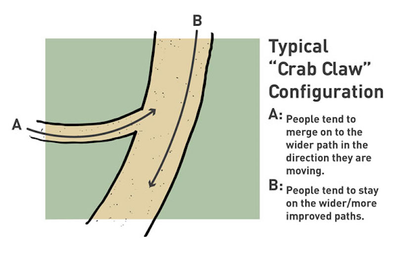 The “Crab Claw” configuration illustrates the natural human tendency to stay on or follow the widest, most improved path.
Skillfully incorporated, the use of views and light levels can also be utilized. Viewsheds are a particularly effective tool for moving people through buildings and orienting them to their surroundings. This strategy is currently being used in the new Pikes Peak Visitor Center, where the spectacular views are incorporated to help orient visitors arriving on different levels of the building. With regard to lighting, people are generally more comfortable in, and will choose well lighted areas. This is an important consideration, especially in interpretive spaces, where dramatic lighting is often utilized. Knowing these tendencies is important when trying to intuitively move people through space. For example, if one has a choice to go into a well lit room or one that is dimly lit, they will typically opt for the lighter space.
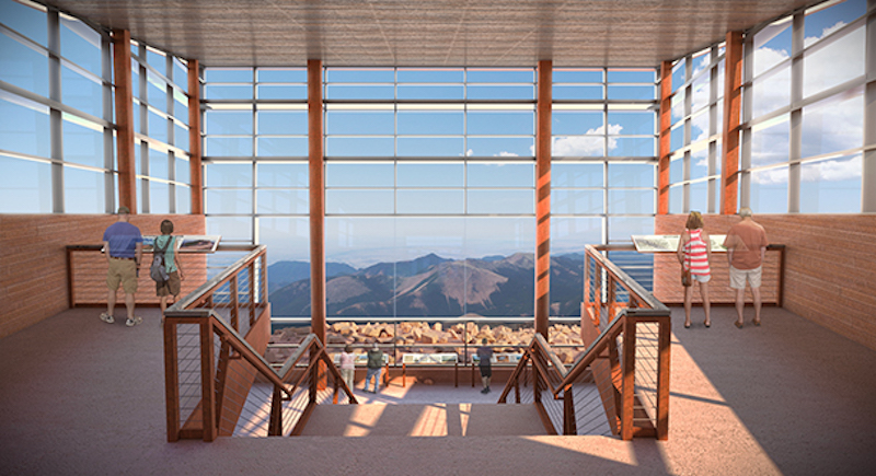 The boundless sky and perfectly framed views of Mt. Rosa draw visitors to the main floor of the Pikes Peak Visitor Center where they can access exhibits, dining, a gift shop, and restrooms.
Wayfinding is a critical component of every interpretive journey. Certainly signage plays a role in informing and directing visitors through space. However, the most successful wayfinding is that which is intuitive, allowing for a more relaxed and therefore satisfying experience.
Alan Reed is GWWO’s President and Design Principal. He is a regular speaker on topics related to interpretive center design, including contextual design, and in 2011 he was elevated to the AIA College of Fellows specifically in recognition of his work on interpretive center facilities nationwide.
More from Author
GWWO | Jan 8, 2024
Achieving an ideal visitor experience with the ADROIT approach
Alan Reed, FAIA, LEED AP, shares his strategy for crafting logical, significant visitor experiences: The ADROIT approach.
GWWO | Jan 18, 2023
Building memory: Why interpretive centers matter in an era of social change
The last few years have borne witness to some of the most rapid cultural shifts in our nation’s long history. If the experience has taught us anything, it is that we must find a way to keep our history in view, while also putting it in perspective.
GWWO | Aug 17, 2022
Focusing on building envelope design and commissioning
Building envelope design is constantly evolving as new products and assemblies are developed.
GWWO | Aug 5, 2022
A time and a place: Telling American stories through architecture
As the United States enters the year 2026, it will commence celebrating a cycle of Sestercentennials, or 250th anniversaries, of historic and cultural events across the land.
GWWO | Feb 7, 2019
Designing for the birds is not just for the birds
We’ve all seen it. A dead bird laying on the sidewalk next to a building. Or, maybe we’ve heard it. The loud bang of a bird flying into your window.
GWWO | Jul 6, 2017
Achieving an ideal visitor experience: The ADROIT approach
The most meaningful experiences are created through a close collaboration between architects, landscape architects, and exhibit designers.
GWWO | Sep 6, 2016
Letting your resource take center stage: A guide to thoughtful site selection for interpretive centers
Thoughtful site selection is never about one factor, but rather a confluence of several components that ultimately present trade-offs for the owner.
GWWO | Mar 13, 2014
Do you really 'always turn right'?
The first visitor center we designed was the Ernest F. Coe Visitor Center for the Everglades National Park in 1993. I remember it well for a variety of reasons, not the least of which was the ongoing dialogue we had with our retail consultant. He insisted that the gift shop be located on the right as one exited the visitor center because people “always turn right.”
GWWO | Dec 19, 2013
Mastering the art of crowd control and visitor flow in interpretive facilities
To say that visitor facility planning and design is challenging is an understatement. There are many factors that determine the success of a facility. Unfortunately, visitor flow, the way people move and how the facility accommodates those movements, isn’t always specifically considered.
GWWO | Nov 7, 2013
Fitness center design: What do higher-ed students want?
Campus fitness centers are taking their place alongside student centers, science centers, and libraries as hallmark components of a student-life experience. Here are some tips for identifying the ideal design features for your next higher-ed fitness center project.

