To say that visitor facility planning and design is challenging is an understatement. There are many factors that determine the success of a facility, most of which center on the visitor experience and the ability of the facility and staff to deliver the message of the site. Unfortunately, visitor flow, the way people move and how the facility accommodates those movements, isn’t always specifically considered.
Further, when a facility fails to properly manage visitor flow, it often leads to a disappointing visitor experience. It’s on the extreme (busiest or slowest) days that the critical importance of this aspect of design is revealed. Interpretive facilities must be able to graciously handle large crowds at peak times and yet not feel cavernous or intimidating to small groups that visit during an off-season day.
In this three part series, I’ll identify and explore the impact that facility planning and design decisions have on crowd control, visitor flow and overall visitor experience and will highlight techniques for use in the planning of new facilities as well as improving existing facilities.
First, let’s discuss the various types of resources and how they impact visitor flow. We can identify resources on an increasing scale, from a single focus resource to a multiple focus resource. An example of a single focus resource is the Lincoln Cabin, where Abraham Lincoln spent his early years in Kentucky. The cabin is the only resource on the site and therefore the sole visitor destination.
More Posts from the GWWO Blog
The Alphabet Soup of Architecture
Trade-offs in Historic Architecture
What Makes a Top Workplace?
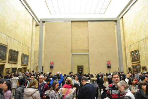
By comparison the Mona Lisa would be considered a predominant focus—while it may not be the only reason to go to the Louvre, virtually everyone plans to see it before they leave. A multi-focus resource normally includes a large collection like the Metropolitan Museum of Art, where there are many equally significant resources. Challenges with each type of resource range from the visitor’s ability to see the resource at its greatest advantage; to having a personal, perhaps intimate experience with the resource without being impacted by other visitors.
Equally important to understanding the type of resource, is an understanding of the venue that houses the resource. Simply stated, if the resource is the “what” that is being interpreted, the venue is “where” it’s being interpreted. Venues can be classified in the same manner as resources. An example of a single focus venue is again, the Lincoln Cabin. The cabin itself (resource) is enshrined in a Neoclassic stone building (venue) that is the only destination at the site, hence a single focus resource within a single focus venue.
A good example of a multi-focus venue might be Gettysburg National Military Park, where multiple venues are used to interpret the battle and its significance in our history and development as a country. The many venues that exist in Gettysburg include the Visitor Center, the David Wills House, the National Cemetery, the Seminary Building, the Gettysburg Train Station, the various battlefields and so on. Each of these venues, in turn, house various resources. Generally, the more venue options available, the easier it is to control crowds.
Another factor in understanding and impacting visitor flow is identifying the nature of visitation to the venue and resource(s). Asking questions about how visitors arrive (on foot, bicycles, cars, RV and/or buses) and what their group looks like when they arrive (individual, family, school group, etc.) helps to develop a clearer picture as visitor groups vary and each has its own needs and desired outcomes. It’s important for institutions to keep accurate statistics on visitor demographics such as how many visitors, who they are, when they’re coming, and when attendance spikes.
Using this information, designers can develop approaches to managing crowds and make the visitor experience enjoyable regardless of the number of visitors on site. The most common techniques employed to control crowds are pacing, pulsing, and controlling the characteristics of path. We talk about these soon in Part 2.
Alan E. Reed, FAIA, LEED AP, is President and Design Principal of GWWO Inc./Architects
More from Author
GWWO | Jan 8, 2024
Achieving an ideal visitor experience with the ADROIT approach
Alan Reed, FAIA, LEED AP, shares his strategy for crafting logical, significant visitor experiences: The ADROIT approach.
GWWO | Jan 18, 2023
Building memory: Why interpretive centers matter in an era of social change
The last few years have borne witness to some of the most rapid cultural shifts in our nation’s long history. If the experience has taught us anything, it is that we must find a way to keep our history in view, while also putting it in perspective.
GWWO | Aug 17, 2022
Focusing on building envelope design and commissioning
Building envelope design is constantly evolving as new products and assemblies are developed.
GWWO | Aug 5, 2022
A time and a place: Telling American stories through architecture
As the United States enters the year 2026, it will commence celebrating a cycle of Sestercentennials, or 250th anniversaries, of historic and cultural events across the land.
GWWO | Feb 7, 2019
Designing for the birds is not just for the birds
We’ve all seen it. A dead bird laying on the sidewalk next to a building. Or, maybe we’ve heard it. The loud bang of a bird flying into your window.
GWWO | Jul 6, 2017
Achieving an ideal visitor experience: The ADROIT approach
The most meaningful experiences are created through a close collaboration between architects, landscape architects, and exhibit designers.
GWWO | Mar 1, 2017
Intuitive wayfinding: An alternate approach to signage
Intuitive wayfinding is much like navigating via waypoints—moving from point to point to point.
GWWO | Sep 6, 2016
Letting your resource take center stage: A guide to thoughtful site selection for interpretive centers
Thoughtful site selection is never about one factor, but rather a confluence of several components that ultimately present trade-offs for the owner.
GWWO | Mar 13, 2014
Do you really 'always turn right'?
The first visitor center we designed was the Ernest F. Coe Visitor Center for the Everglades National Park in 1993. I remember it well for a variety of reasons, not the least of which was the ongoing dialogue we had with our retail consultant. He insisted that the gift shop be located on the right as one exited the visitor center because people “always turn right.”
GWWO | Nov 7, 2013
Fitness center design: What do higher-ed students want?
Campus fitness centers are taking their place alongside student centers, science centers, and libraries as hallmark components of a student-life experience. Here are some tips for identifying the ideal design features for your next higher-ed fitness center project.

