Art is a powerful tool that inspires well-being and helps improve patient experiences and outcomes. Yet with many hospital projects, it can be a construction-phase afterthought, resulting in an applied feeling to the artwork. Recently, I was proud to serve as an interior designer on UF Health North’s 92-bed patient tower—the newest addition to its North Jacksonville Florida campus. In today’s post, using this GS&P-designed project as a case study, I take a look at what can happen when art is integrated into the earliest stages of planning, and interior designers take an active, collaborative approach to move it far beyond the confines of a frame.
Developing a Clear Aesthetic Concept
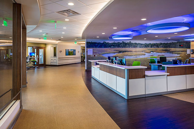
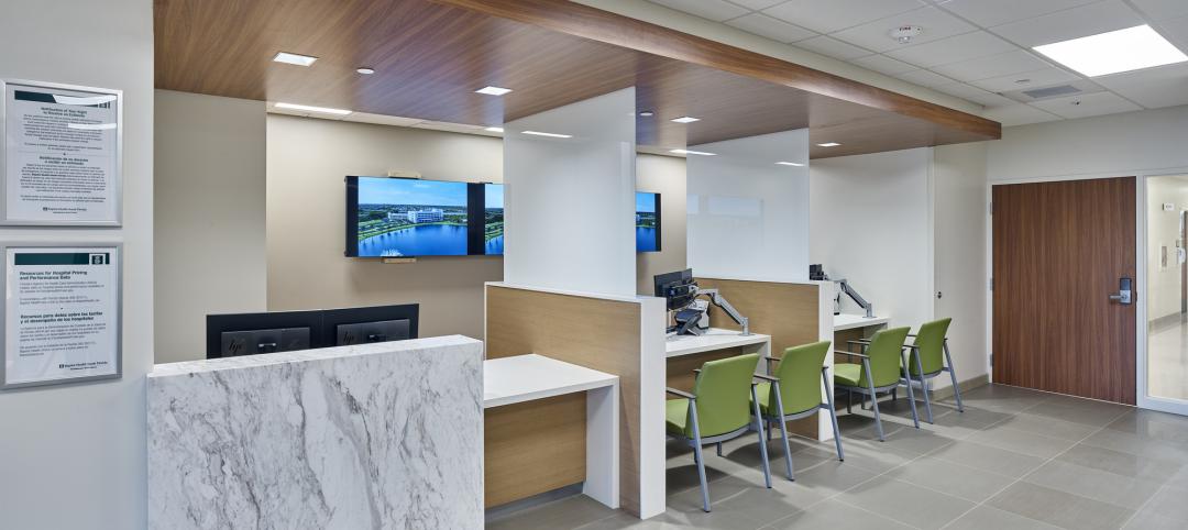
GS&P interior designers and the art consultant for this project had the advantage of working together on the first phase of the UF Health North campus—a six-story, 200,000-square-foot ambulatory care and medical office complex. Drawing inspiration from the natural surroundings, our team developed a clear aesthetic concept for the medical center’s interiors, with geometric forms that interpreted the site’s protected wetlands and the nearby Intracoastal Waterway. In keeping with the contemporary feel of the building, color photography of the region was selected as artwork. Hundreds of photographs taken by locally and nationally recognized photographers were used. To maximize impact, the images were printed on wood, metal and acrylic, and organized into large-scale collages, which created pleasing groupings of wildlife, botanicals and scenery, and combined the various textures of substrates. This creative approach to the artwork harmonized with the overall interior design aesthetic as well as the architecture and furnishings.
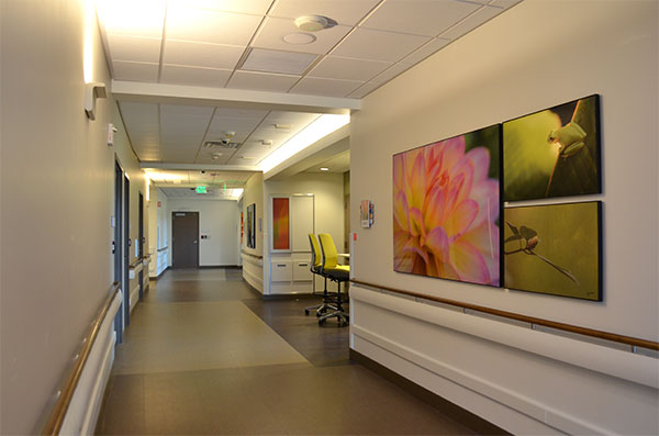 Images chosen from the North Florida landscape feature wildlife, water, sky and botanicals.
A Coordinated Effort
When work on the patient tower at UF Health North began, GS&P interior designers pushed the artwork concept even further, using it as a wayfinding cue that blended seamlessly with the architectural aesthetic and transcended static two-dimensional images. Florida’s waterways became the organizing concept, with the theme for each floor tracing the journey of water from artesian springs to the sky. Since the design team was involved with the project from the programming phase, the vision for the artwork manifested early in schematic design, and the aesthetic and artwork concepts were developed concurrently. We used lighting, millwork, building materials, finishes, floor patterns and architecture to articulate a unified vision.
 LED fixtures were used throughout the facility, both for accent and “workhorse” lighting.
GS&P interior designers adopted a hands-on approach early in the planning process for the new patient tower, coordinating an extensive level of collaboration among the various disciplines to make sure the artwork they conceived was executed as intended. One example of the high degree of coordination involved the dramatic ceiling sculpture that connects the tower’s first-floor lobby with the mezzanine. Initially, the design team developed the concept of bubbles rising from a spring and considered incorporating organic glass rings as suggested by the art consultant. Using Building Information Modeling, we created a curving, ascending shape for the sculpture as the basis for design. In the interim, the art consultant worked with the glass artist to engineer hardware sturdy enough to prevent the 20-pound rings from falling should the glass break. After months of unsuccessful research with fabricators, the art consultant suggested abandoning the glass-ring concept and commissioning a local metal artist instead. The design team ultimately decided on irregularly-shaped metal rings with stained color on the inside to capture the original intent of the sculpture and resolve the weight issue. A track-lighting system was used for the all-important supporting piece. This distinctive sculpture highlights just one example of the extensive coordination required by interior designers in order to bring their vision from concept to installation. Had interior design and artwork efforts been relegated to a later phase of design, this scale of artwork would simply not have been feasible.
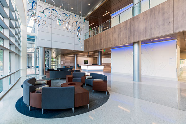 A dramatic ceiling sculpture that connects the patient tower’s first-floor lobby with the mezzanine suggests bubbles rising from a spring.
An Inside-Outside Approach
The patient tower at UF Health North serves as a powerful example of a complete merger between art and design. GS&P architects and interior designers took a unique inside-outside approach during the early stages of planning, with both disciplines working in tandem to ensure the exterior and interior of the building was perceived as one expression. At the main lobby’s public elevators, GS&P architects created five stories of glass overlooking the entry drive. The design team used this transparency to create a monumental art piece that could be experienced both from the building’s exterior and interior. We also used an aerial photograph of the St. Johns River to model an abstract relief pattern that traces the river’s winding course. This pattern continues up the five elevator lobbies and is illuminated with color-changing LEDs that are visible from the exterior at night.
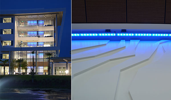 Visible from the exterior at night, a five-story relief panel links each family waiting area and represents the St. John’s river as it carries water from the springs to the sea.
Another opportunity for a substantial piece occurred with the first and second floor corridors that overlook the courtyard and provide lengthy expanses of wall space. Instead of repeating the photo collages at this location, the interiors team chose to create ribbons of color that would be visible from the exterior at night. We selected the substrate as well as a custom-printed wall covering and tasked the art consultant with finding an exciting image or series of images. The consultant suggested cutting a dynamic painting of water into horizontal slices and using those sections for the ribbons. Coordination efforts for this art piece involved multiple conversations among the art consultant, the artist, the custom-wallcovering manufacturer, the contractor and the installer. The scale of the piece at 227 feet provides multiple experiences for viewers as they travel down the corridors, look up from the courtyard at night, or even look across the courtyard area from the medical center.
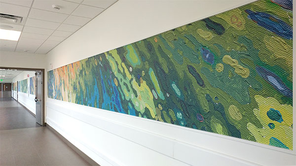
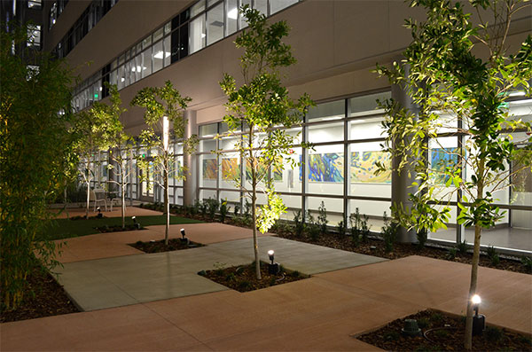
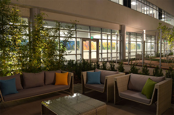 A dynamic painting of water cut into horizontal slices creates unique ribbons of color that provide multiple experiences for visitors.
A Powerful Sense of Place
To move beyond a finishing touch to a complete, crafted experience, artwork must be thought of early and often during the design process. Interior designers must be given agency to drive the artwork concept and coordinate large numbers of contributors and disciplines throughout the life cycle of the project. The end result of this integrated approach is a powerful sense of place, and a whole that is much greater than the sum of its parts.
More from Author
Gresham Smith | Oct 16, 2024
How AI can augment the design visualization process
Blog author Tim Beecken, AIA, uses the design of an airport as a case-study for AI’s potential in design visualizations.
Gresham Smith | Aug 17, 2023
How to design for adaptive reuse: Don’t reinvent the wheel
Gresham Smith demonstrates the opportunities of adaptive reuse, specifically reusing empty big-box retail and malls, many of which sit unused or underutilized across the country.
Gresham Smith | May 24, 2023
Designing spaces that promote enrollment
Alyson Mandeville, Higher Education Practice Leader, argues that colleges and universities need to shift their business model—with the help of designers.
Gresham Smith | Apr 24, 2023
Smart savings: Commissioning for the hybrid workplace
Joe Crowe, Senior Mechanical Engineer, Gresham Smith, shares smart savings tips for facility managers and building owners of hybrid workplaces.
Gresham Smith | Mar 20, 2023
3 ways prefabrication doubles as a sustainability strategy
Corie Baker, AIA, shares three modular Gresham Smith projects that found sustainability benefits from the use of prefabrication.
Gresham Smith | Jan 19, 2023
Maximizing access for everyone: A closer look at universal design in healthcare facilities
Maria Sanchez, Interior Designer at Gresham Smith, shares how universal design bolsters empathy and equity in healthcare facilities.
Gresham Smith | Dec 20, 2022
Designing for a first-in-the-world proton therapy cancer treatment system
Gresham Smith begins designing four proton therapy vaults for a Flint, Mich., medical center.
Gresham Smith | Nov 21, 2022
An inside look at the airport industry's plan to develop a digital twin guidebook
Zoë Fisher, AIA explores how design strategies are changing the way we deliver and design projects in the post-pandemic world.
Gresham Smith | Feb 13, 2022
Helping maximize project dollars: Utility coordination 101
In this post, I take a look at the utility coordination services our Transportation group offers to our clients in an attempt to minimize delays and avoid unforeseen costs.
Gresham Smith | May 7, 2021
Private practice: Designing healthcare spaces that promote patient privacy
If a facility violates HIPAA rules, the penalty can be costly to both their reputation and wallet, with fines up to $250,000 depending on the severity.

