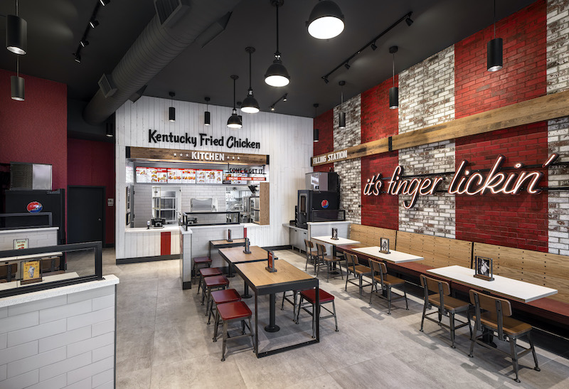
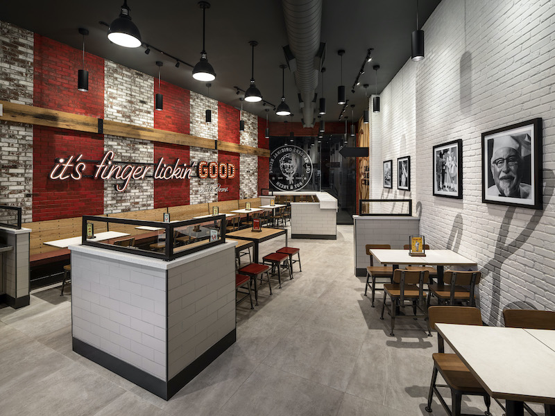
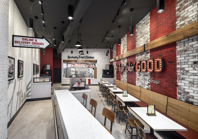
Located in the Bronx, KFC’s new urban inline restaurant design reflects the borough’s fast-paced, eclecticism with bolder accents and unique features evolved from the brand’s traditional American Showman restaurant design.
The project’s overall aesthetic reflects a juxtaposition between Colonel Sanders-inspired hospitality and the hustle and bustle of the Bronx. Upon entering the building, guests are greeted by a large Colonel Sanders wood focal wall and signage that features the brand’s “it’s finger lickin’ good” tagline. A brick accent wall serves as the backdrop for KFC’s signature red stripes to create a beacon visible from both the inside and the outside.
“Working with a brand historically known for its southern hospitality, we created a design that maintained the iconic experience, but also looked to fold in a distinctly edgier attitude to deliver on the feistiness of what guests see from KFC in commercials and on social media.”
See Also: World’s first drive-thru only restaurant in Australia
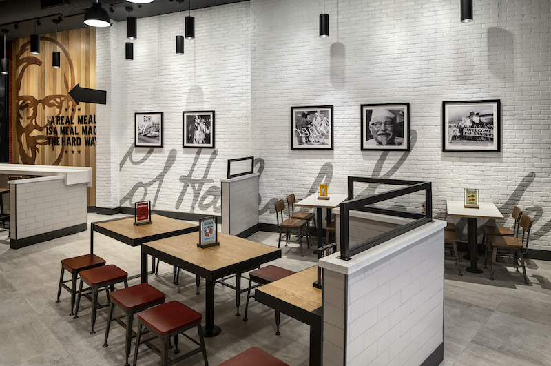
The seating arrangements and ordering options were designed for the on-the-go mentality of New Yorkers. The restaurant has bar seating for solo diners and a designated pick-up area for mobile and to-go orders.
The design gives the brand a modern look that captures the Colonel’s vintage flavor and marks a continued strategy to create more alternate and non-traditional formats that connect KFC with its consumers in differentiated markets.
Related Stories
| Jun 30, 2014
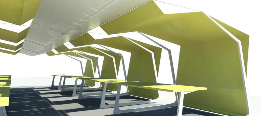
4 design concepts that remake the urban farmer's market
The American Institute of Architects held a competition to solve the farmer's markets' biggest design dilemma: lightweight, bland canopies that although convenient, does not protect much from the elements.
| Jun 20, 2014
Sterling Bay pulled on board for Chicago Old Main Post Office project
Sterling Bay Cos. and Bill Davies' International Property Developers North America partner up for a $500 million restoration of Chicago's Old Main Post Office
| Jun 19, 2014
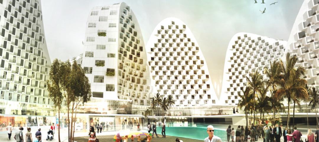
First look: JDS Architects' roller-coaster-like design for Istanbul waterfront development
The development's wavy and groovy design promises unobstructed views of the Marmara Sea for every unit.
| Jun 18, 2014
Study shows walkable urbanism has positive economic impact
Walkable communities have a higher GDP, greater wealth, and higher percentages of college grads, according to a new study by George Washington University.
| Jun 18, 2014
Arup uses 3D printing to fabricate one-of-a-kind structural steel components
The firm's research shows that 3D printing has the potential to reduce costs, cut waste, and slash the carbon footprint of the construction sector.
| Jun 16, 2014
6 U.S. cities at the forefront of innovation districts
A new Brookings Institution study records the emergence of “competitive places that are also cool spaces.”
| Jun 13, 2014
First look: BIG's spiraling museum for watchmaker Audemars Piguet
The glass-and-steel pavilion's spiral structure acts as a storytelling device for the company's history.
| Jun 12, 2014
Austrian university develops 'inflatable' concrete dome method
Constructing a concrete dome is a costly process, but this may change soon. A team from the Vienna University of Technology has developed a method that allows concrete domes to form with the use of air and steel cables instead of expensive, timber supporting structures.
| Jun 11, 2014
Bill signing signals approval to revitalize New Orleans’ convention center corridor
A plan to revitalize New Orleans' Convention Center moves forward after Louisiana governor signs bill.
| Jun 9, 2014
Green Building Initiative launches Green Globes for Sustainable Interiors program
The new program focuses exclusively on the sustainable design and construction of interior spaces in nonresidential buildings and can be pursued by both building owners and individual lessees of commercial spaces.


