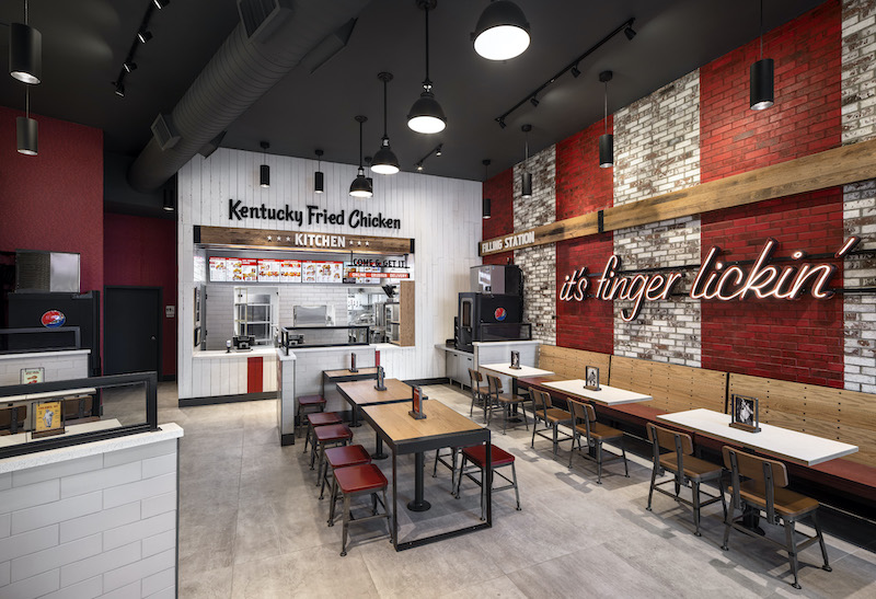
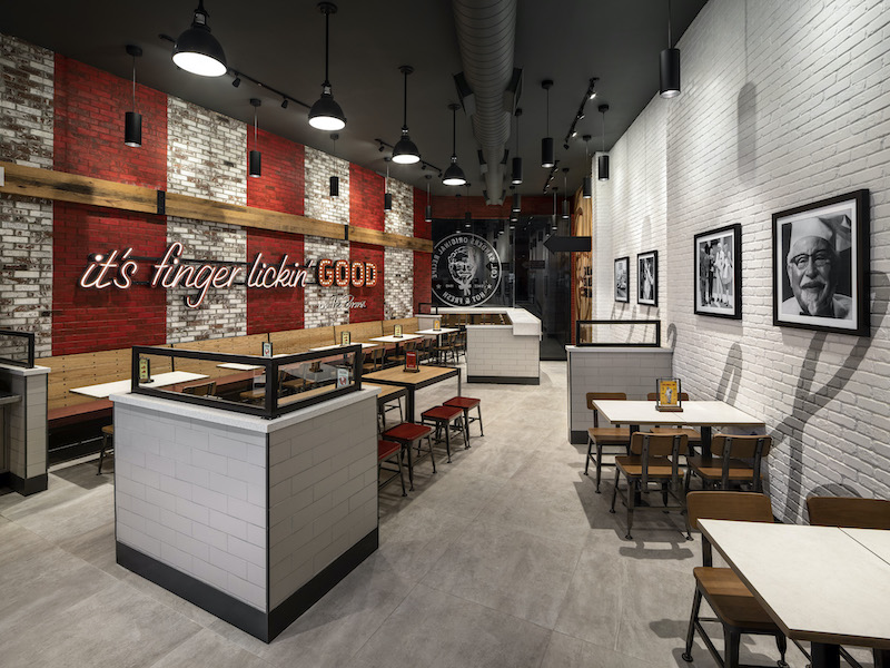
Located in the Bronx, KFC’s new urban inline restaurant design reflects the borough’s fast-paced, eclecticism with bolder accents and unique features evolved from the brand’s traditional American Showman restaurant design.
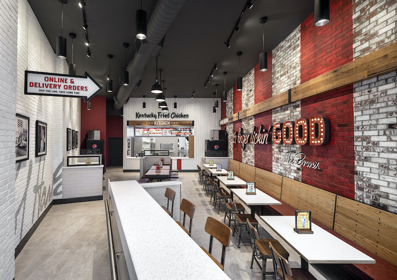
The project’s overall aesthetic reflects a juxtaposition between Colonel Sanders-inspired hospitality and the hustle and bustle of the Bronx. Upon entering the building, guests are greeted by a large Colonel Sanders wood focal wall and signage that features the brand’s “it’s finger lickin’ good” tagline. A brick accent wall serves as the backdrop for KFC’s signature red stripes to create a beacon visible from both the inside and the outside.
“Working with a brand historically known for its southern hospitality, we created a design that maintained the iconic experience, but also looked to fold in a distinctly edgier attitude to deliver on the feistiness of what guests see from KFC in commercials and on social media.”
See Also: World’s first drive-thru only restaurant in Australia
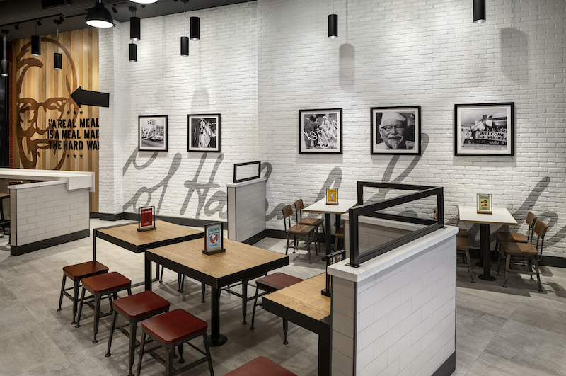
The seating arrangements and ordering options were designed for the on-the-go mentality of New Yorkers. The restaurant has bar seating for solo diners and a designated pick-up area for mobile and to-go orders.
The design gives the brand a modern look that captures the Colonel’s vintage flavor and marks a continued strategy to create more alternate and non-traditional formats that connect KFC with its consumers in differentiated markets.
Related Stories
| Feb 8, 2012
Mega-malls expanding internationally
Historically, malls have always been the icons of America – the first mall ever was built in Minneapolis in 1956.
| Jan 15, 2012
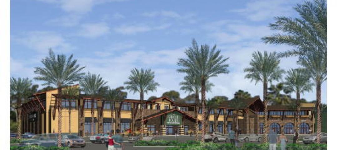
Smith Consulting Architects designs Flower Hill Promenade expansion in Del Mar, Calif.
The $22 million expansion includes a 75,000-square-foot, two-story retail/office building and a 397-car parking structure, along with parking and circulation improvements and new landscaping throughout.
| Jan 6, 2012
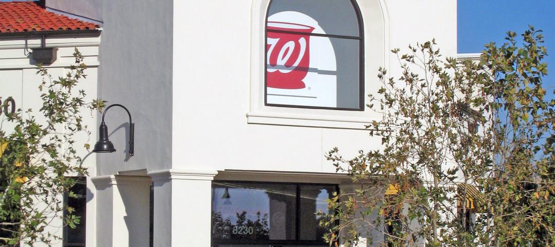
New Walgreen's represents an architectural departure
The structure's exterior is a major departure from the corporate image of a traditional Walgreens design.
| Jan 6, 2012
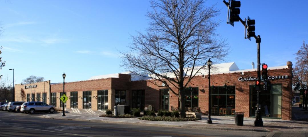
Summit Design+Build completes Park Place in Illinois
Summit was responsible for the complete gut and renovation of the former auto repair shop which required the partial demolition of the existing building, while maintaining the integrity of the original 100 year-old structure, and significant re-grading and landscaping of the site.
| Nov 29, 2011
Suffolk Construction breaks ground on Boston residential tower
Millennium Place III is a $220 million, 256-unit development that will occupy a full city block in Boston’s Downtown Crossing.
| Nov 29, 2011
Report finds credit crunch accounts for 20% of nation’s stalled projects
Persistent financing crunch continues to plague design and construction sector.
| Nov 22, 2011
Jones Lang LaSalle completes construction of two new stores in Manhattan
Firm creates new global design standard serving as project manager for Uniglo’s 89,000-sf flagship location and, 64,000-sf store.
| Oct 26, 2011
Shawmut Design and Construction awarded Tag Heuer build in Aventura, Fla.
New store features 1,200 sf fit out at Aventura Mall.
| Oct 3, 2011
Magellan Development Group opens Village Market in Chicago’s Lakeshore East neighborhood
Magellan Development Group and Hanwha Engineering & Construction are joint-venture development partners on the project. The Village Market was designed for Silver LEED certification by Loewenberg Architects and built by McHugh Construction.


